jess161989
Forum Replies Created
-
Forum: Themes and Templates
In reply to: [Extendable] multilanguage menuGreat, thanks!!!! It works ??
Forum: Themes and Templates
In reply to: [Extendable] multilanguage menuI solved this last issue using an additional CSS. One last thing and my menu gets perfect. How can I put a working hamburger menu on the mobile version?
Here is my html structure
<!-- wp:group {"align":"full","style":{"spacing":{"padding":{"top":"clamp(1.5rem, 5vw, 2rem)","right":"clamp(1.5rem, 5vw, 2rem)","bottom":"clamp(1.5rem, 5vw, 2rem)","left":"clamp(1.5rem, 5vw, 2rem)"}}}} -->
<div class="wp-block-group alignfull" style="padding-top:clamp(1.5rem, 5vw, 2rem);padding-right:clamp(1.5rem, 5vw, 2rem);padding-bottom:clamp(1.5rem, 5vw, 2rem);padding-left:clamp(1.5rem, 5vw, 2rem)"><!-- wp:group {"style":{"spacing":{"blockGap":"var:preset|spacing|30"}},"layout":{"type":"flex","flexWrap":"wrap","justifyContent":"space-between"}} -->
<div class="wp-block-group"><!-- wp:group {"style":{"spacing":{"blockGap":"1rem"}},"layout":{"type":"flex","flexWrap":"nowrap"}} -->
<div class="wp-block-group"><!-- wp:site-logo /--></div>
<!-- /wp:group -->

<!-- wp:legacy-widget {"idBase":"nav_menu","instance":{"encoded":"YToyOntzOjg6Im5hdl9tZW51IjtpOjI5O3M6ODoicGxsX2xhbmciO3M6MjoiaXQiO30=","hash":"1c0fd1df45ee44bc1335edc66d9d2973","raw":{"nav_menu":29,"pll_lang":"it"}}} /-->

<!-- wp:legacy-widget {"idBase":"nav_menu","instance":{"encoded":"YToyOntzOjg6Im5hdl9tZW51IjtpOjM3O3M6ODoicGxsX2xhbmciO3M6MjoiZGUiO30=","hash":"252c598b76823d6759c674a10690d36c","raw":{"nav_menu":37,"pll_lang":"de"}}} /-->

<!-- wp:legacy-widget {"idBase":"nav_menu","instance":{"encoded":"YToyOntzOjg6Im5hdl9tZW51IjtpOjM4O3M6ODoicGxsX2xhbmciO3M6MjoiZW4iO30=","hash":"fd228b50878998cf4a4e27051784381f","raw":{"nav_menu":38,"pll_lang":"en"}}} /-->

<!-- wp:social-links {"iconColor":"foreground","iconColorValue":"var(\u002d\u002dwp\u002d\u002dpreset\u002d\u002dcolor\u002d\u002dforeground)","size":"has-small-icon-size","className":"is-style-logos-only ext-hidden tablet:ext-flex","style":{"spacing":{"blockGap":"1rem"}},"layout":{"type":"flex","flexWrap":"nowrap","justifyContent":"right"}} -->
<ul class="wp-block-social-links has-small-icon-size has-icon-color is-style-logos-only ext-hidden tablet:ext-flex"><!-- wp:social-link {"url":"https://www.instagram.com/baita.dei.minatori/","service":"instagram"} /-->

<!-- wp:social-link {"url":"https://www.facebook.com/p/Baita-dei-Minatori-Knopnbolt-H%C3%B6t-100057250937976/","service":"facebook"} /-->

<!-- wp:social-link {"url":"https://wa.me/+393462211078","service":"whatsapp","label":"+393462211078"} /--></ul>
<!-- /wp:social-links --></div>
<!-- /wp:group --></div>
<!-- /wp:group -->
And here the additional CSS I tried
.header {
    display: flex;
    align-items: center;
    justify-content: space-between;
    position: relative; /* Ensure positioning for dropdown */
}

.menu-toggle {
    display: none; /* Hide the checkbox */
}

.hamburger {
    display: none; /* Hide the hamburger icon by default */
    flex-direction: column;
    cursor: pointer;
}

.hamburger .line {
    width: 25px;
    height: 3px;
    background-color: black;
    margin: 4px 0;
}

/* Responsive Styles */
@media (max-width: 768px) {
    .hamburger {
        display: flex; /* Show hamburger icon on mobile */
    }

    .nav {
        display: none; /* Hide navigation by default */
        position: absolute;
        top: 60px; /* Adjust based on your header height */
        left: 0;
        right: 0;
        background-color: white; /* Background color for dropdown */
        z-index: 999;
    }

    .menu-toggle:checked + .hamburger + .nav {
        display: block; /* Show nav when checkbox is checked */
    }

    .menu {
        flex-direction: column; /* Stack menu items vertically */
        padding: 10px 0; /* Add some padding */
        list-style-type: none; /* Remove bullet points */
        margin: 0; /* Remove default margin */
        padding-left: 0; /* Remove default padding */
    }

    .menu li {
        text-align: center; /* Center align menu items */
        padding: 10px 0; /* Add some spacing between items */
    }
}

/* Ensure nav is hidden by default */
.nav {
    display: none; /* Hide navigation by default */
}

/* Show navigation when menu toggle is checked */
.menu-toggle:checked + .hamburger + .nav {
    display: block; /* Show nav when checkbox is checked */
}

/* Responsive Styles */
@media (max-width: 768px) {
    .hamburger {
        display: flex; /* Show hamburger icon on mobile */
    }

    .nav {
        position: absolute;
        top: 60px; /* Adjust based on your header height */
        left: 0;
        right: 0;
        background-color: white; /* Background color for dropdown */
        z-index: 999;
        display: none; /* Hide navigation by default */
    }

    .menu-toggle:checked + .hamburger + .nav {
        display: block; /* Show nav when checkbox is checked */
    }
}

/* Hide the regular navigation by default */
.wp-block-navigation {
    display: none; /* Hide regular navigation */
}

/* Show hamburger menu on mobile */
.hamburger {
    display: flex; /* Show hamburger icon */
}

/* Hide nav by default */
.nav {
    display: none; /* Hide navigation by default */
}

/* Show nav when checkbox is checked */
.menu-toggle:checked + .hamburger + .nav {
    display: block; /* Show nav when checkbox is checked */
}

/* Responsive Styles */
@media (max-width: 768px) {
    .wp-block-navigation {
        display: none; /* Ensure regular nav is hidden on mobile */
    }
}

/* Default styles for mobile */
.nav {
    display: none; /* Hide the regular navigation by default */
}

/* Show the hamburger menu on mobile */
.hamburger {
    display: flex; /* Show hamburger icon on mobile */
}

/* For larger screens, show the regular navigation */
@media (min-width: 769px) {
    .nav {
        display: block; /* Show regular navigation on larger screens */
    }

    .hamburger {
        display: none; /* Hide hamburger icon on larger screens */
    }
}
Is is not working.
Forum: Themes and Templates
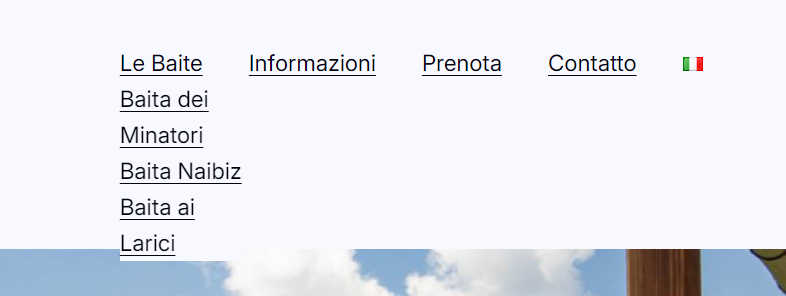
In reply to: [Extendable] multilanguage menuThank you. I also forgot to add subpages to the menu, that is why I did not see them in the drop down menu. I only have one last issue: the layout of the drop down menu isn’t the best at all, it is difficult to be read, see
 Forum: Themes and Templates
In reply to: [Extendable] multilanguage menuSorry, there’s just one thing that is still not working. Submenus. Did I add the CSS correctly?
Forum: Themes and Templates
In reply to: [Extendable] multilanguage menuThat’s great, it’s working! Thanks a lot!
Forum: Themes and Templates
In reply to: [Extendable] multilanguage menuThanks for your reply. However I have another problem. When I am displaying the english or german site, I still see menu labels in italian (which is my main language). It seems to be a problem with the theme, but I am sure there is a way to solve it
Forum: Themes and Templates
In reply to: [Extendable] multilanguage siteForum: Themes and Templates
In reply to: [Extendable] multilanguage siteHi, I have the same problem. I am using Polylang
Forum: Themes and Templates
In reply to: [Extendable] Appearance MenuI am also interested in this topic, I’m not able to create a multilingual menu