Gregory Harrison
Forum Replies Created
-
Shameem, thank you for the CSS code. I added it to my “Additional CSS” WordPress Customizer area and the single product layout below the product image now loads in a single column in my android phone Chrome browser.
I have a couple of additional questions.
Question 1:
For the @media only screen rule is the 480px width the recommended average break point for mobile screens? Will larger mobile screens like newer iPhones still display the layout in a single column or will they revert back to 2 columns?
Question 2
I’ve kept the single product desktop layout as 2 columns. In the desktop 2 column view the “Description” tag label and the description content load in a single column below the product image and the product title and Add to Cart button. This creates a large empty white space in the right column below the Add to Cart button and pushes the product description below the initial screen viewing area. The description can’t be seen on even a large screen unless the screen is scrolled down. Here’s a screen shot of the current single product page desktop layout:
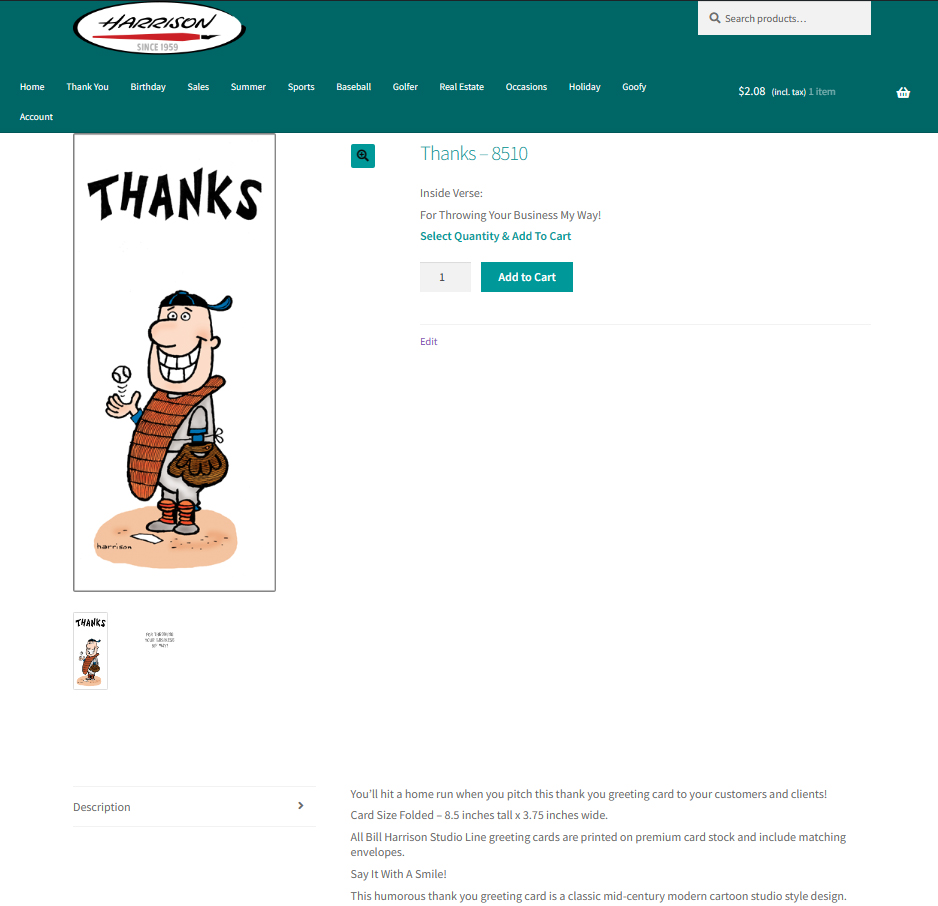
Is there a way to modify the code so for desktop the Description tag label and the description content will load in the right column in the currently empty white space below the Add to Cart button? To make a layout like that work, the Description tag label would need to load above the description content or be hidden. Here’s an example of the layout I’d like to achieve for desktop:

Thank you for your help, Greg Harrison
- This reply was modified 1 year, 7 months ago by Gregory Harrison.
Forum: Themes and Templates
In reply to: [Storefront] Storefront Theme Resize Mobile Product ImageThanks for the reply.
I”ll see if I can find where to modify the
.woocommerce-product-gallery?class and give that a try.