• Resolved rcwatson

    (@rcwatson)


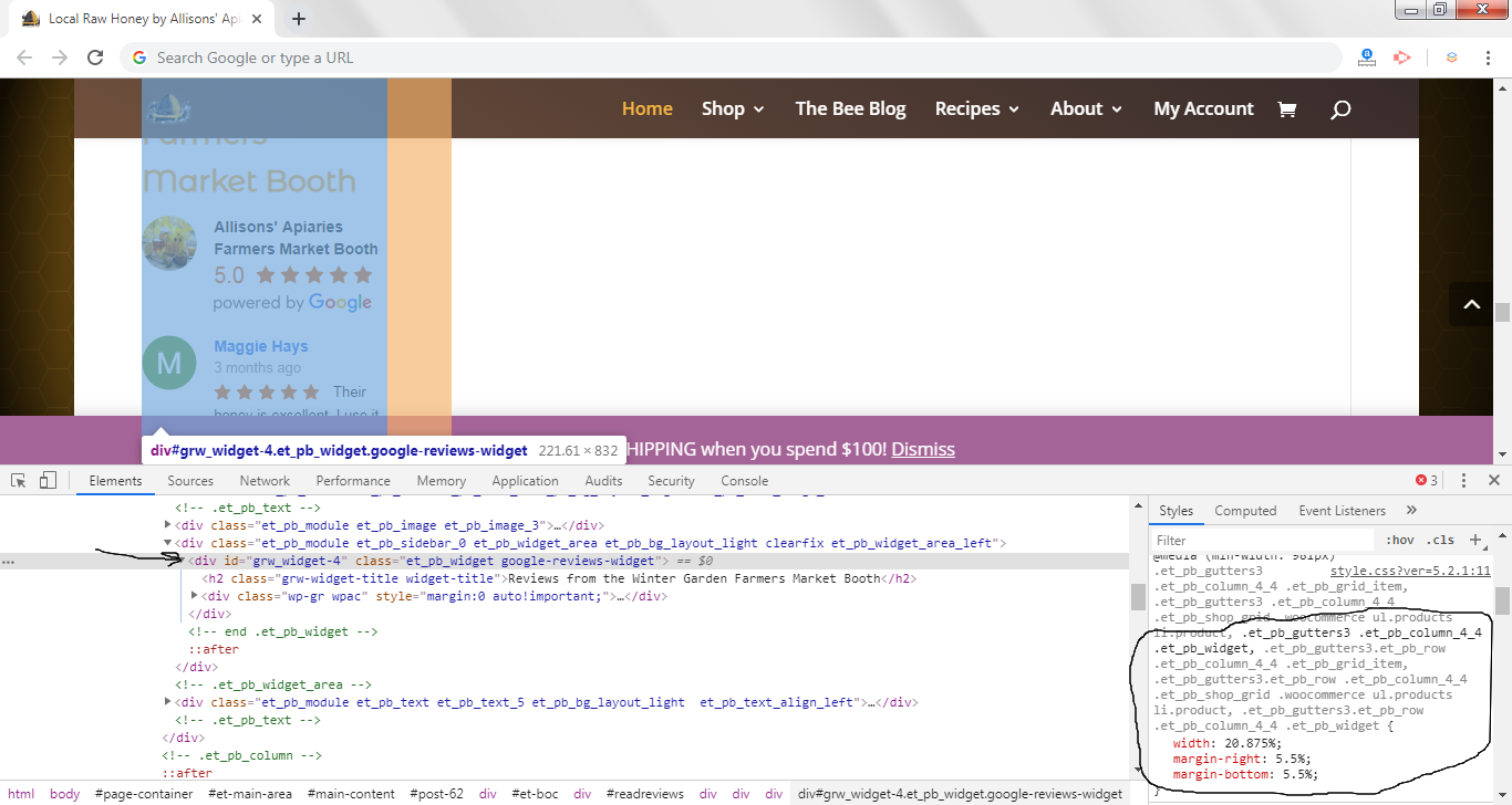
    Is there a way to set the width for this to 100%? It doesn’t seem to accept percentages, only pixel widths. But I need the widget to be responsive on all screens and fill its container. Any idea how?

    The page I need help with: [log in to see the link]

Viewing 4 replies - 1 through 4 (of 4 total)
  • Thread Starter rcwatson

    (@rcwatson)

    Update: I achieved this via stylesheet overrides, but it’d still be great to have the ability to specify 100% as the width in the plugin or widget settings.

    Plugin Author richplugins

    (@richplugins)

    Hi,

    It’s possible if you type 100% value in the ‘Widget width’ field.

    But also, it depends from a parent DOM container, if it’s not a 100% width, the widget will not expand to all width.

    Thanks!

    Thread Starter rcwatson

    (@rcwatson)

    The parent DOM container is 1152px, which is definitely wider than the widget’s default width, so I expect that setting it to 100% will result in a wider widget.

    However, when I entered “100%” in the widget’s “Width” field, it didn’t respond the same way as the CSS, which is why I was confused.

    When I do this via adding “width:100%” to the element in CSS it works fine.

    div#fbrev_widget-3.et_pb_widget.fb-reviews-widget {
    width: 100%;
    }

    Plugin Author richplugins

    (@richplugins)

    Hi,

    Thank you for the information.

    I found the another issue about it. The widget is rendered in the following div:

    <div id=”grw_widget-4″ class=”et_pb_widget google-reviews-widget”>…</div>

    But the Divi style.css has:

    .et_pb_gutters3 .et_pb_column_4_4 .et_pb_widget { width: 20.875%; margin-right: 5.5%; margin-bottom: 5.5%; }

    And it reduce the widget width to 20.8%, so without the additional style, the ‘Widget width’ option will not work:

    Thanks!

Viewing 4 replies - 1 through 4 (of 4 total)
  • The topic ‘Widget at 100% to fill container responsively?’ is closed to new replies.