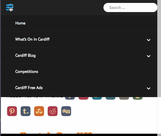
• Hi, great theme apart from the menus with dropdowns are not working. I thought it was just my site https://www.cardiff.guru but looking through the forum I looked at someone elses site also. The same thing happened on their site too. On desktop its fine and mobile phone, but on ipad . If you finger the top level menu it will just go to that page and not have the dropdowns, however you have to keep your finger down on the menu for over a second to release the sub menus – not so good if you don’t know it has sub menus.

    Any advice would be appreciated thanks,
    Ian

Viewing 7 replies - 1 through 7 (of 7 total)
  • Hello Ian,

    In the smaller screen, users are supposed to click on the down arrow of parent menu. As parent menu usually links to a page. Just like your “What’s on Cardiff” menu, which has some information for use to read on https://www.cardiff.guru/whats-on-in-cardiff/.

    That’s why sub-menus will only be expanded after clicking on the down arrow icon. Isn’t this situation really working for you?

    Regards,
    Kharis

    Check out this supporting screencast, please.

    Newsanchor submenu mobile

    Regards,
    Kharis

    Thread Starter coconasher

    (@coconasher)

    Yes on mobiles it’s fine but not on Ipad.
    The menu just has words with no arrows. I will try and add some photos or some kind of link when I get my ipad back later.

    P.S. Also I added another menu item to the main menu – again fine on mobiles and deskyop, but it didnt render correctly on ipad – it went over onto two lines.

    • This reply was modified 6 years, 9 months ago by coconasher.
    Thread Starter coconasher

    (@coconasher)

    Hi, Ive uploaded a video, sorry about quality and sound etc…

    https://www.youtube.com/watch?v=GCWMT-d1sJQ

    This shows my finger making contact with the screen and having to wait until menu changes, or touches and as finger is down for so long it brings up the ipad copy/paste window etc abd some other strange menu jumping,

    Thanks.

    I got it. Thanks!

    It looks like it requires a couple code adjustments. I’ll try what it might be and will update you soon.

    Thank you for your patience.

    Regards,
    Kharis

    Hello there,

    The solution is to change the mobile menu break point behavior, which is currently only be displayed in screen device smaller than 991px. It’s define in the main theme’s script (see main.js), in the below lines of code:

    
    if ( matchMedia( 'only screen and (max-width: 991px)' ).matches ) {
      currMenuType = 'mobile';
    }
    

    to change it to 1024px (your iPad screen width), change the script above to:

    
    if ( matchMedia( 'only screen and (max-width: 1024px)' ).matches ) {
      currMenuType = 'mobile';
    }
    

    However editing the main theme’s script is not recommended as all files will be overridden in the future. Thus you should use a child theme. I’ve made a simple one with the script modification as I mentioned above.

    Regards,
    Kharis

    Thread Starter coconasher

    (@coconasher)

    Hi, thanks for the reply. I implemented that code and the menu just becomes a black blank bar with no text.

    However I have found that this only happens in landscape mode. If the ipad is turned to portrait mode – then the three white bars for the menu do appear.

Viewing 7 replies - 1 through 7 (of 7 total)
  • The topic ‘Theme menus not working on ipad’ is closed to new replies.