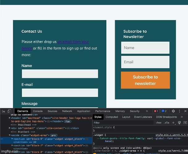
Subscribe form fields not responsive on wide screen
-
I’ve created a simple subscription form and put it in my footer in the widget space.
You can see it at the bottom of the home page on that link to my website.
This would be fine except the widget space is putting three columns of widgets on the footer, so the form needs to be really narrow. Currently it looks like the form fields (not the button) are forcing the widget column to be wider than the other columns. I’m not sure how to control this in CSS and it doesn’t look like the Acymailing settings config for the subscription form let me. Can you help?
Thanks
The page I need help with: [log in to see the link]
- The topic ‘Subscribe form fields not responsive on wide screen’ is closed to new replies.
