Responsive Header (Nav) and Cover Image
-
Hi!
I’m having quite a few issues trouble shooting the nav menu, header and cover image.
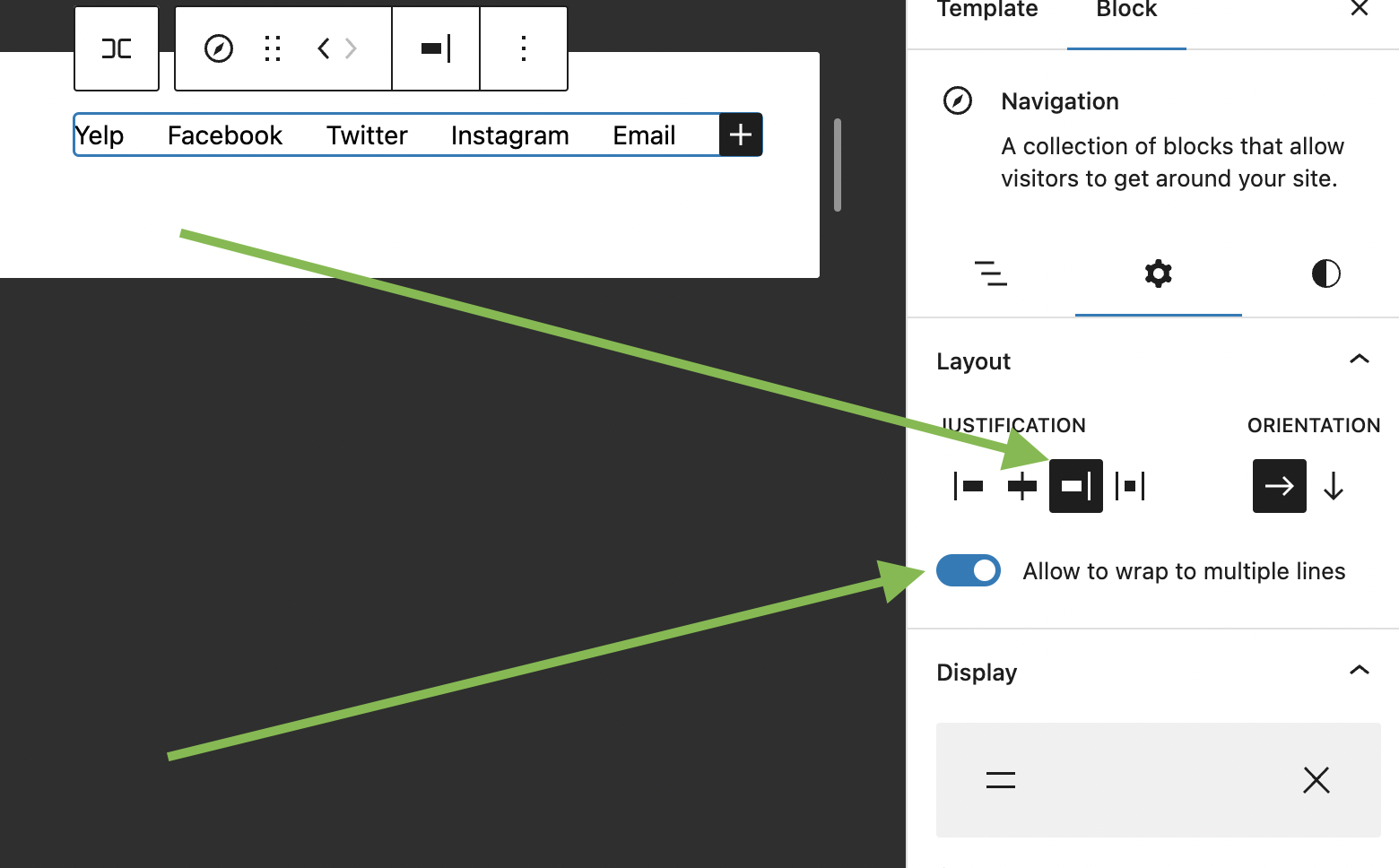
- The menu looks all strange on mobile. In addition, on desktop there is a wide gap between each nav item (Home, Murphy Beds, etc). In addition, I keep trying to move the button more to the right with no luck.
- Cover image with text seems to be unresponsive on mobile including the image, button and text.
The page I need help with: [log in to see the link]
Viewing 1 replies (of 1 total)
Viewing 1 replies (of 1 total)
- The topic ‘Responsive Header (Nav) and Cover Image’ is closed to new replies.
