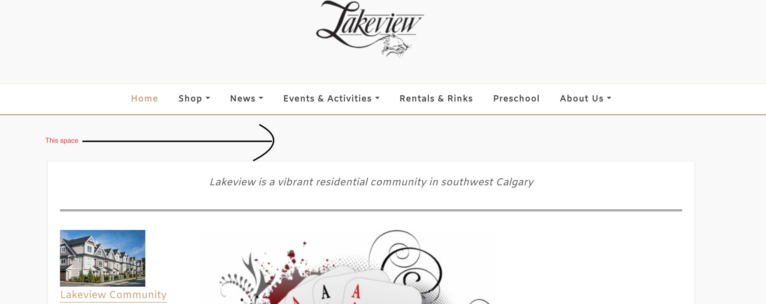
reducing space between areas on page
-
I’m really liking the Atlanta Blog child theme for designexo which I’ve installed on our community association site. Although I have some familiarity with CSS I’m not a programmer so need some help on this. What I’d like to do is greatly tighten up the areas on the front page, so any tips on what tags I need to modify in the “additional CSS” for customization would be greatly appreciated. It’s just the front page I’m finding to be too loose, other pages are fine.
The page I need help with: [log in to see the link]
Viewing 5 replies - 1 through 5 (of 5 total)
Viewing 5 replies - 1 through 5 (of 5 total)
- The topic ‘reducing space between areas on page’ is closed to new replies.

