• Hello.

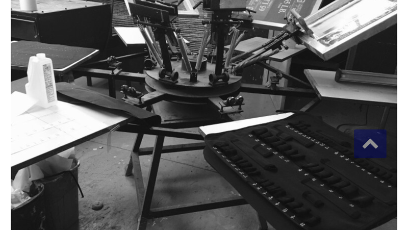
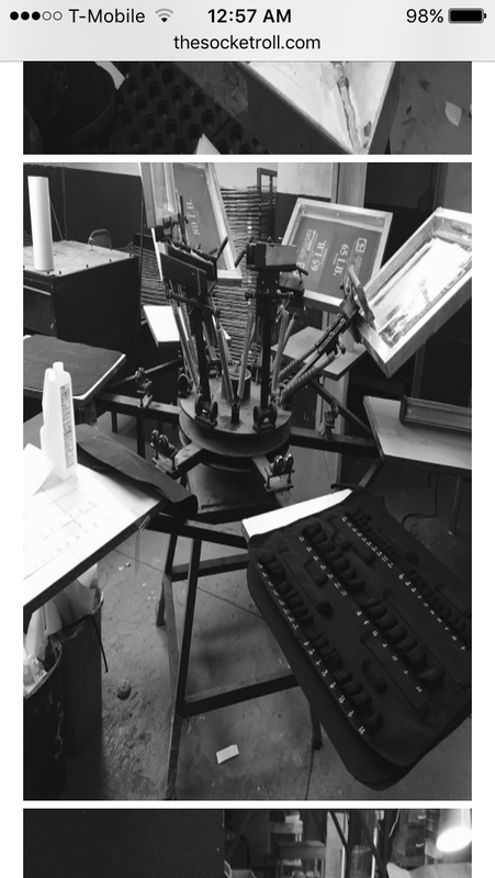
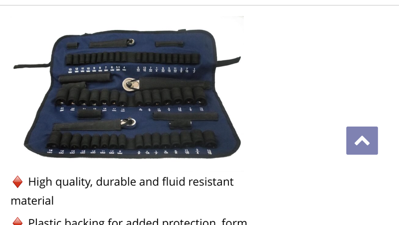
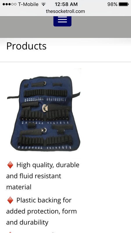
    I am noticing that the mobile version on both iOS and Android is not fully responsive. The images/text and all around content looks squished and does not appear to look “clean” on the page. It looks “squished.”

    Is there any way to fix this? Thanks and please compare to the desktop site as well for the proper way it is setup.

    https://www.thesocketroll.com

    Sincerely,

    Chris

Viewing 8 replies - 1 through 8 (of 8 total)
  • The problem is this rule in your custom CSS:

    
    .carousel-inner img {
       width: 100%;
       height: 450px !important;
       display: block !important;
    }
    

    So when you set the height to a fixed 450px, then it’s not going to scale proportionally as the width shrinks. In fact, on a desktop, the image looks squished vertically because of that fixed height.

    So what you can do for a tablet or cell phone is add a media query that sets the height to auto. Add this to the end of your custom CSS:

    
    @media only screen and (max-width: 768px) {
      .carousel-inner img {
       height: auto !important;
       }
    }
    

    By the way, you have a syntax error which is causing the bottom half of your custom CSS to not be in effect. Look for these lines:

    
    @media only screen and ( min-width: 981px ) {
    .enigma_service_area:hover .enigma_service_iocn i {
        color: white !important;
    }
      @media (max-width:767px){
    .nav.navbar-nav {
      text-align: center !important;
    }
    }
    

    You are missing a closing right brace } before the second media query. That’s causing the rest of the CSS to not work.

    Thread Starter cayindustries

    (@cayindustries)

    Hi and thanks for the info. I think I made the corrections you suggested. I did notice that the pics on the phone seem to be the correct, un-squished, versions on the home screen, but in the CRAFTSMANSHIP page and the main picture on the PRODUCT page the pics still look funny. Any thoughts on these and does and did I make the correction, correctly?

    Thanks again for the assistance.

    Chris

    P.S. What did you think about the product?

    Thread Starter cayindustries

    (@cayindustries)

    UPDATE: the images look good in landscape mode, but not when the phone is vertical.

    Hello

    cayindustries

    please describe using screen-shot what is the issue.

    Thread Starter cayindustries

    (@cayindustries)

    I am including two pics of each with one being vertical and the other in landscape. You can see the difference. This is on an iPhone. Thanks.

    L1
    V1
    L2
    V2
    L3
    V3

    Hello,

    cayindustries

    the images does not diaplay and their link does not work.
    please share working url with correct image

    Thread Starter cayindustries

    (@cayindustries)

    I can see the pics in the post above. Please check and advise. Thanks.

    Thread Starter cayindustries

    (@cayindustries)

    Any additional help on this one?

Viewing 8 replies - 1 through 8 (of 8 total)
  • The topic ‘Not Responsive’ is closed to new replies.