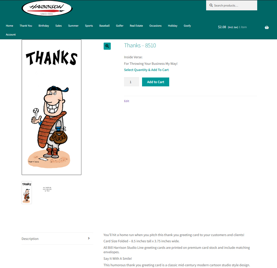
• My site is https://www.harrisongreetings.com and the site uses the Storefront theme.

    Currently for desktop the single product page loads in 2 columns.

    For mobile devices the single page product loads the product image full width at the top and below the product image, the product title and Add to Cart button and the Product Description load in 2 columns.

    On mobile devices the content in those 2 columns below the product image are compressed very tightly creating a non-user friendly layout.

    I would like to modify the single product layout for both mobile devices to 1 column.

    I would also like to know if it’s possible to modify the single product layout for desktop devices to 1 column.

    I have spent quite a bit of time adding code to the Storefront child theme single-product.php file, to the Woocommerce plugin content-single-product.php file and to the WordPress Customizing / Additional CSS area of the site. None of the modifications I’ve made have had an effect on the single product page layout.

    Any help is appreciated.

    The page I need help with: [log in to see the link]

Viewing 3 replies - 1 through 3 (of 3 total)
  • Hi @brickface1

    First, it’s worth noting that directly modifying the Storefront theme’s core files is not recommended, as these changes will be lost whenever the theme is updated. Instead, you should make these changes in a child theme.

    To change the layout of the single product pages to one column on both mobile and desktop devices, you can use CSS media queries. You can add the following CSS code to the “Additional CSS” section in the WordPress Customizer:

    @media only screen and (max-width: 480px) {
    	.storefront-full-width-content.single-product div.product .summary {
    	  width: 100% !important;
    	  float: none !important;
    	}
    }
    

    After you add the above custom CSS, this is how it will look on your mobile:

    You can tweak the CSS similarly to create a 1 column layout for your single product page on desktop view. Here’s the CSS that will adjust your product page layout to 1 column on the desktop view:

    .storefront-full-width-content.single-product div.product .woocommerce-product-gallery {
      width: 100% !important;
      float: none !important;
    }
    
    
    .storefront-full-width-content.single-product div.product .summary {
      width: 100% !important;
      float: none !important;
    }

    I hope this helps! If you have any other questions, feel free to ask.

    Thanks!

    Thread Starter Gregory Harrison

    (@brickface1)

    Shameem, thank you for the CSS code. I added it to my “Additional CSS” WordPress Customizer area and the single product layout below the product image now loads in a single column in my android phone Chrome browser.

    I have a couple of additional questions.

    Question 1:

    For the @media only screen rule is the 480px width the recommended average break point for mobile screens? Will larger mobile screens like newer iPhones still display the layout in a single column or will they revert back to 2 columns?

    Question 2

    I’ve kept the single product desktop layout as 2 columns. In the desktop 2 column view the “Description” tag label and the description content load in a single column below the product image and the product title and Add to Cart button. This creates a large empty white space in the right column below the Add to Cart button and pushes the product description below the initial screen viewing area. The description can’t be seen on even a large screen unless the screen is scrolled down. Here’s a screen shot of the current single product page desktop layout:

    Is there a way to modify the code so for desktop the Description tag label and the description content will load in the right column in the currently empty white space below the Add to Cart button? To make a layout like that work, the Description tag label would need to load above the description content or be hidden. Here’s an example of the layout I’d like to achieve for desktop:

    Thank you for your help, Greg Harrison

    Saif

    (@babylon1999)

    Hello @brickface1,

    For the @media only screen rule is the 480px width the recommended average break point for mobile screens? Will larger mobile screens like newer iPhones still display the layout in a single column or will they revert back to 2 columns?

    Yes, 480px should cover most phones. If you’d like to cover tablets as well, you can include another breakpoint like this:

    @media only screen and (min-width: 480px) and (max-width: 767px){ 
    
    //do stuff
    
    }

    Is there a way to modify the code so for desktop the Description tag label and the description content will load in the right column in the currently empty white space below the Add to Cart button? To make a layout like that work, the Description tag label would need to load above the description content or be hidden. Here’s an example of the layout I’d like to achieve for desktop:

    This is happening because of the aspect ratio of the image. I visited the page to see if there was any possible solution but I noticed you’ve added a print-on-demand feature, which makes the layout look similar to what you want. :?)

    Let us know if you have any other questions.

Viewing 3 replies - 1 through 3 (of 3 total)
  • The topic ‘Modify Storefront Theme single product layout to single column for mobile device’ is closed to new replies.