Viewing 5 replies - 1 through 5 (of 5 total)
  • Pradnya

    (@pradnyajegstudio)

    Hi @psycholoogmarieke,

    Please make sure that the hover padding is also set for tablet devices. It appears that you have added the hover padding specifically for the desktop view, but it is overriding the normal tablet value when hovering, as there are no specified values for tablet hover.

    Thread Starter psycholoogmarieke

    (@psycholoogmarieke)

    thank you. solved that as well..

    last question regarding the boxes. this one is smaller than the rest, only on phone. i also cant find the settings for that.. https://ibb.co/6Pd9RRG

    Plugin Author Yoga

    (@yogajegstudio)

    Hi @psycholoogmarieke

    I suggest checking the mobile settings for both the icon box block and the column block.
    It’s possible that there may be some margin or padding settings causing the problem.
    For a visual reference, please refer to the screenshot below:

    This will help you identify and adjust any margin or padding settings that might be affecting the layout on mobile devices, without affecting the desktop margin or padding.
    If you have any further questions or need additional assistance, feel free to ask.

    Thank you.

    Thread Starter psycholoogmarieke

    (@psycholoogmarieke)

    thanks! found it

    Plugin Author Yoga

    (@yogajegstudio)

    You’re welcome!
    If you have any further questions or need any more assistance, please don’t hesitate to reach out.

    Thank you.

Viewing 5 replies - 1 through 5 (of 5 total)
  • The topic ‘mobile hover moving of the boxes
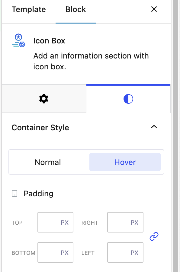
’ is closed to new replies.