• Resolved RAJIV VERMA

    (@hackernewbie)


    I just moved to the Able theme…everything seems to work fine except the header, when viewing a particular post, drops down from where it should be.

    For example, have a look here to see what I am talking about.

    It seems to work fine when we are in the homepage or any particular category!

    The blog I need help with is webguy.in.

Viewing 4 replies - 1 through 4 (of 4 total)
  • Moderator Kathryn Presner

    (@zoonini)

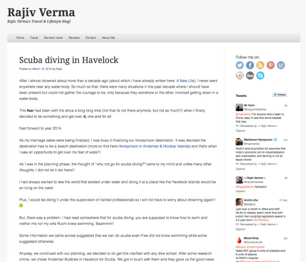
    I’m not seeing anything obviously wrong with the header on that page, here’s what it looks like in Firefox 36.0.4 on a Macbook Air running 10.9.5:

    Scuba diving in havelock islands Rajiv Verma

    Are you still seeing the issue? If so, let me know:

    – browser and version
    – device
    – operating system

    If you’re not sure what you’re running, visit https://supportdetails.com/

    Thread Starter RAJIV VERMA

    (@hackernewbie)

    Thanks a lot Kathryn, for taking time to have a look at it.
    The issue is fixed now, it was the ‘Social Comments’ plugin that was causing the header texts to break out from the headers.

    Disabling the plugin helped!

    Moderator Kathryn Presner

    (@zoonini)

    Glad you found the culprit and that you’re all set!

    Thread Starter RAJIV VERMA

    (@hackernewbie)

    Thanks Kathryn ??

Viewing 4 replies - 1 through 4 (of 4 total)
  • The topic ‘Mis-placed header text’ is closed to new replies.