• Resolved Alison

    (@anonymical7)


    Hello, I am developing with twenty-twenty-three, but I cannot seem to get the menu to sit above the other content when it’s in Mobile View. When in **mobile view**, no matter the profile, if you click on the menu it is sitting behind the content text about the organisation. https://easlce.m3designs.info/

    Oddly the same issue does not happen on this page. https://easlce.m3designs.info/about-us/our-logo/

    Any ideas how to make it sit atop everything? I maybe have confused some Z-Index setting but I cannot find what’s amiss.

    Advice would be very appreciated! :-$

    A- xo

    The page I need help with: [log in to see the link]

Viewing 7 replies - 1 through 7 (of 7 total)
  • Moderator Kathryn Presner

    (@zoonini)

    Hi @anonymical7 – I think the quickest thing to check would be that you’ve set the background colour of the Navigation block to your turquoise blue colour, instead of “transparent.”

    Select the Navigation block and view the Style settings, do you have a colour set as Background, like this?

    If you’re not sure, feel free to share a screenshot here, like mine above.

    Thread Starter Alison

    (@anonymical7)

    Thanks Kathryn!, I tried that, but sadly it didn’t work. It may have something to do with my customisations?

    See this extra CSS I added

    .wp-block-search__input {
        -webkit-appearance: initial;
        appearance: auto;
        border: 1px solid #949494;
        flex-grow: 1;
        margin-left: 0;
        margin-right: 0;
        min-width: 3rem;
        padding: 8px;
    	  background-color: #b6f1da;
        /* text-decoration: unset!important; */
    }
    .wp-block-search__label,.searchtext {
      width: 100%;
    line-height: 3;
    text-align: right!important;
    }
    
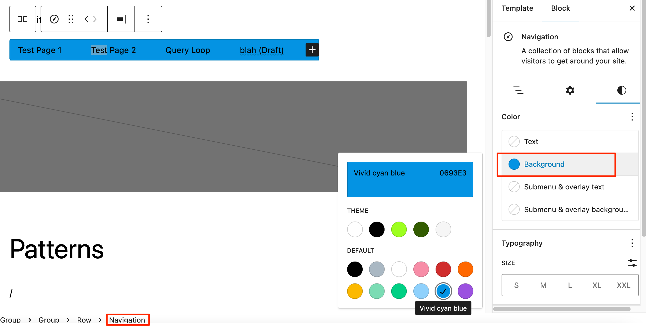
    .wp-block-navigation__submenu-container>.wp-block-navigation-item>.wp-block-navigation-item__content  {
    height: auto;
    min-width: 250px!important;
    opacity:.9!important;
    overflow: visible;
    visibility: visible;
    width: auto;
    font-size:15px;
    }
    
    .startingpointblockhome
    max-width: var(--wp--style--global--content-size);
    padding-left: 50px!important;
    padding-right: 50px!important;
    }
    
    @media screen and (max-width: 768px) {
      /* CSS code for screens smaller than 768px */
    }
    
    .wp-block-navigation__responsive-container-close, .wp-block-navigation__responsive-container-open {
    background-color: #C1F3FF;
    border: none;
    color: currentColor;
    cursor: pointer;
    margin: 0;
    padding: 0px;
    text-transform: inherit;
    vertical-align: middle;
    }
    .wp-block-navigation__responsive-container.is-menu-open {
    animation: overlay-menu__fade-in-animation .1s ease-out;
    animation-fill-mode: forwards;
    background-color: inherit;
    display: flex;
    flex-direction: column;
    overflow: auto;
    padding: var(--wp--style--root--padding-top,2rem) var(--wp--style--root--padding-right,2rem) var(--wp--style--root--padding-bottom,2rem) var(--wp--style--root--padding-left,2rem);
    width:500px;
    z-index: 100000;
    text-align: left;
    }
    .wp-block-navigation__responsive-container.is-menu-open .wp-block-navigation__responsive-container-content .wp-block-navigation-item, .wp-block-navigation__responsive-container.is-menu-open .wp-block-navigation__responsive-container-content .wp-block-navigation__container, .wp-block-navigation__responsive-container.is-menu-open .wp-block-navigation__responsive-container-content .wp-block-page-list {
        align-items: var(--navigation-layout-justification-setting,initial);
        display: flex;
        flex-direction: column;
    }
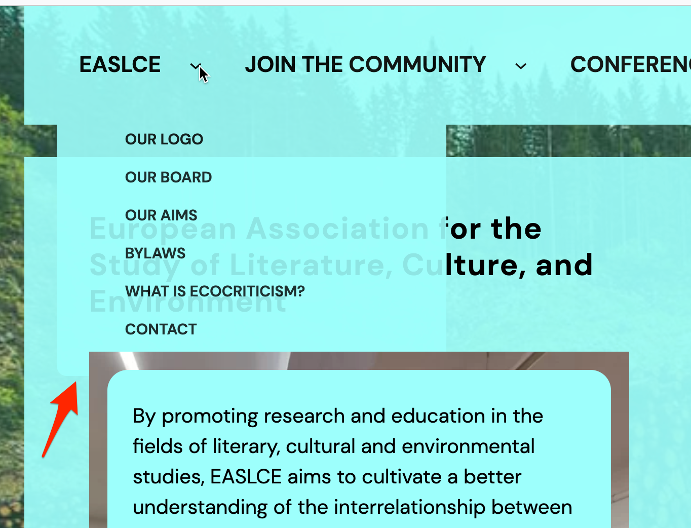
    .wp-block-navigation .has-child .wp-block-navigation__submenu-container {
    align-items: normal;
    background-color: inherit;
    color: inherit;
    display: flex;
    flex-direction: column;
    left: -50px;
    overflow: hidden;
    position: absolute;
    top: 100%;
    transition: opacity .1s linear;
    visibility: hidden;
    width: 0;
    z-index: 2;
    border-radius:20px 10px 10px 10px;
    }
    .wp-container-3.wp-container-3 {
    gap: var(--wp--preset--spacing--30);
    opacity: 0.9!important;
    }
    .wp-container-7.wp-container-7 {
    gap: var(--wp--preset--spacing--30);
    opacity: .8!important;
    }

    Moderator Kathryn Presner

    (@zoonini)

    Thanks for that! I think there’s a conflict between the z-index on the menu block and the cover block. Since there’s no cover block near the top of this page – https://easlce.m3designs.info/about-us/our-logo/ – that’s why you don’t see the issue there.

    You can see the overlap issue on the desktop menu as well, so the problem isn’t isolated to mobile:

    Where did you add that custom CSS? I’m not finding it in either the Customizer Additional CSS area or in the Global Styles’ CSS editor. You could always try removing it temporarily as a test and see if the conflict goes away. I’m going to keep looking a bit more in the meantime.

    Moderator Kathryn Presner

    (@zoonini)

    I think this is a bug, there are two related (possibly duplicate) tickets:

    https://github.com/WordPress/gutenberg/issues/45353

    https://github.com/WordPress/gutenberg/issues/49668

    Are you able to change your structure so the Navigation block is not inside a Cover block? That should solve the issue.

    Thread Starter Alison

    (@anonymical7)

    You are awesome Kathryn, thanks so much! I will try to get back to this later today and try out the structural changes. I wanted to keep the structure but I saw in one of the bug reports it was suggested I use the media text block combo and the issue disappeared. I will try that next and report back. https://github.com/WordPress/gutenberg/issues/45353

    I will see if I can get the same look doing this: “I recommend the user to use another block (Media and Text), and the issue was resolved.”

    Moderator Kathryn Presner

    (@zoonini)

    Great, let me know how it goes!

    Moderator Kathryn Presner

    (@zoonini)

    I’ll go ahead and mark this thread as resolved. If you still need help with this, feel free to reply here or start a new thread. Thanks!

Viewing 7 replies - 1 through 7 (of 7 total)
  • The topic ‘Menu Z index on Mobile Views’ is closed to new replies.