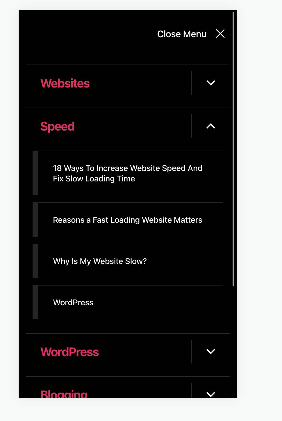
• Hi, I’m having a responsive issue.
    The mobile version is no enhiritng the desktop menu item font size thus causing the items to wrap in multiple lines.
    How can I fix this please?
    Here is the website incase you want to take a look.
    https://www.onlinebusinessconsultants.net/

    • This topic was modified 2 years, 2 months ago by Manny.
Viewing 4 replies - 1 through 4 (of 4 total)
  • Hi @mannyo! I am seeing that you used the following custom CSS to adjust the size of the menu items on desktop:

    .primary-menu a {
        font-size: 14px !important;
    }

    You will want to use a different code to style links on the mobile menu. Something like this:

    
    /* Top level menu items */
    .mobile-menu a {
        font-size: 21px !important;
    }
    /* Child menu items */
    .mobile-menu .sub-menu a {
       font-size: 14px !important;
      line-height:18px;
    }
    

    Once you add the code above, it should look like this:

    Screen Shot on 2022 09 20 at 15 34 39

    Please note that some of those menu items are very long and you probably do not want to reduce the font size that much, but you can always adjust the value un line-height to match your preference.

    Do let me know if you have any questions or if you encounter any difficulties in doing this.

    • This reply was modified 2 years, 2 months ago by Alvaro Gómez.
    Thread Starter Manny

    (@mannyo)

    @mrfoxtalbot
    Thanks for replying but the issues is not really the length it that the theme is not that responsive.

    The CSS doesn’t work, it only looks like it works when you resize your screen manually but when you are on an actually phone or use google chrome mobile.
    See attached:
    menufontsizeissues<br />virtual coin<br />

    • This reply was modified 2 years, 2 months ago by Manny.
    • This reply was modified 2 years, 2 months ago by Manny.
    • This reply was modified 2 years, 2 months ago by Manny.
    • This reply was modified 2 years, 2 months ago by Manny.
    • This reply was modified 2 years, 2 months ago by Manny.
    Thread Starter Manny

    (@mannyo)

    @mrfoxtalbot

    The below seems to work better.
    /* Child mobile menu items */
    .mobile-menu .sub-menu a {
    -webkit-text-size-adjust: 75%;
    }
    I have noticed that with this theme that adding “-webkit-text-size-adjust;” gets the job done sometimes when other CSS fails.

    Thank you for your reply @mannyo. I am still not 100% sure I understand the issue you are running into on mobile. Were you able to fix it with the CSS you shared? Thanks again for sharing!

Viewing 4 replies - 1 through 4 (of 4 total)
  • The topic ‘Menu Items wrapping into multiple line on mobile’ is closed to new replies.