Meets my code quality requirements, however… it’s not responsive
-
The styling options built into the UI are unusable for me. I’ve chosen the list layout, and I wanted to limit the width to 450px. I liked the slider option, but unfortunately, it doesn’t work at all on a mobile device. Only the “left hand side” is visible, due to CSS. The list works on all devices. It would be cool if there was an option to use slider on large screens, and list on small screens.
The UI says that it sets max-width, but it does not set max-width. It sets width, with !important. NONONO. WTF do you need the !important for, and why would you use width instead of max-width? You already have very spesific selectors, if the users theme overrides those, they either have a good reason to do so, or they don’t know what they’re doing. Either way, !important is not the way to go.
That does not work, at all, on responsive sites. Changing the max-width property to width manually fixes the layout issues, so please, stop using !important, and start using max-width over width.
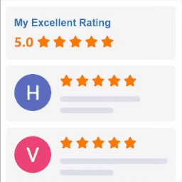
While I am at it making “demands” (hope you consider this as constructive feedback), it would be nice if it was possible to remove the company name, “review us on google” and “powered by google” elements from the widgets from the UI. The review us button breaks on my site for whatever reason, “powered by google” is not a message we want to send, and the company name just looks redundant and ugly. I am aware that I can just hide the header altogether, but if I do that, I lose the star rating too. We’re at 4.9 with 30 reviews, so I’d like to showcase that part.
I built the site from scratch, so I have the ability to tweak things to my liking, but it’s not like I want to write more code than I have to.
Should you take this feedback and improve upon an already good plugin, you’ll get 5 stars and a recommendation.
+++ for not using jQuery. I’ve removed jQuery from my sites for the past 10 years, and so many plugins insist on adding it back.
- The topic ‘Meets my code quality requirements, however… it’s not responsive’ is closed to new replies.