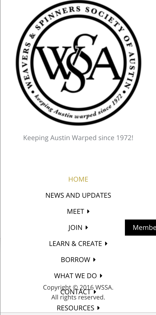
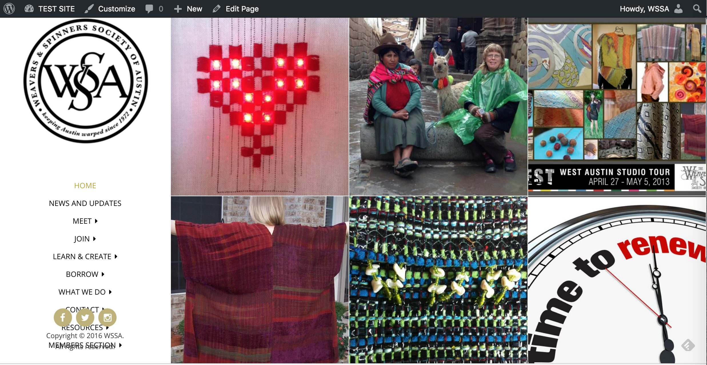
• Hi, I just used Morphology Lite for a satellite website for our group. Love it so much that I’m thinking of moving the main site to it as well. I have a test site I’m experimenting with to troubleshoot any glitches in the move. We have a pretty extensive main nav (9 items with sub-items) and it’s colliding with the social menu/ copyright area. That left column area doesn’t scroll. Is it supposed to? I’m considering getting the non-free version for our main site, so if this is just a limitation of the ‘Lite’ site it would be good to know.

    Fantastic documentation with this theme, but I couldn’t find anything on this there.

    Thank you!

Viewing 15 replies - 1 through 15 (of 15 total)
  • Theme Author Shaped Pixels

    (@shaped-pixels)

    First, I want to say sorry for late reply….the wordpress site here is redesigning their forums and the RSS feed notifications are currently not working. I also want to say thank you for your kind comments ??

    Anyway, I’m here to help. Next thing if possible, do you have a link where your site is?

    Regarding the menu, you should be fine with 9 menu items that have submenus, but is it the main menu items that is the problem or the submenus? Correct on the no-scroll, which is by design. One note that if you need additional vertical space, there are ways to accommodate that; I can help out with that if we need to do that.

    • This reply was modified 8 years, 6 months ago by Shaped Pixels.
    Thread Starter wssaustin

    (@wssaustin)

    Oh gosh, no apologies necessary! It’s a weekend! and a holiday at that!

    The site is at https://wssaustin.org/wordpresstest/ . It’s a rather chaotic thing.. I’ve used it for years to test out themes. Only that first page with the grid makes any sense. It’s the main menu that’s a problem, not the submenus. I’m attaching a screenshot. If you look at the bottom, the last two menu items are on top of the copyright and social menu area. There is one more menu item that can’t be seen.

    The site I’d be migrating is here https://wssaustin.org, it’s on a child theme of WP2012.

    many thanks.

    screenshot WSSA  navigation

    • This reply was modified 8 years, 6 months ago by wssaustin.
    Theme Author Shaped Pixels

    (@shaped-pixels)

    Thanks for the screenshot and link. My guess is that you are viewing this on a small resolution screen? For the footer info to fall under the main menu, it means that the window is very short.

    Thread Starter wssaustin

    (@wssaustin)

    I’m on a Mac Book Pro, 2 years old. So not particularly low res. The site I set up at atxfibershed.org using Morphology looks fine on the same computer. But that one was set up initially on Morphology and this was set up on another theme first. Something glitched when I changed the theme.

    Theme Author Shaped Pixels

    (@shaped-pixels)

    Is it possible to take a “full” screenshot? I need to see what you are seeing in full.

    Thread Starter wssaustin

    (@wssaustin)

    Sure or you can go to the link too and maybe see more.
    I’ve tinkered with it a bit since the last screen shot. I took the seal/ logo down to 225 px. And added the social menu to get the full effect.

    But here’s the full screen
    full screen wssa test site

    Thread Starter wssaustin

    (@wssaustin)

    I could make the logo smaller and free up space, but for some reason it gets blurry when it’s sized down past about 225 px square, and it’s not enough to get the whole menu to fit.

    Theme Author Shaped Pixels

    (@shaped-pixels)

    Thanks again for the screenshot…and yes, I went to the site to shrink my browser window to try and match your screenshot. It looks like the height of your window is only like 768px. If that is the case, then it means the height resolution is too small.

    I just put your site and the Morphology Lite demo site into an online responsive viewing test on different screens, including macbooks and macbook air. Both displays on both sites look good. I used this testing tool

    What is your screen’s current resolution width x height, also, is your macbook pro 13 or 15″?

    • This reply was modified 8 years, 6 months ago by Shaped Pixels.
    Thread Starter wssaustin

    (@wssaustin)

    it’s a 13″. My resolution is 1280×800. That’s the default resolution for this Mac.

    • This reply was modified 8 years, 6 months ago by wssaustin.
    Theme Author Shaped Pixels

    (@shaped-pixels)

    ah…OK, that is probably why then if it’s that resolution. The 1280 in width is fine and responsive themes (in general) are based on the width of the window. Your height, however, is very small which is why the sidebar footer is sliding up below the menu.

    One option is to go to the Appearance >> Customize >> Site Options, and then look for the Show Side Column Footer setting and uncheck the box next to it. The thing is, it depends on how many people are going to be viewing the site in that low of resolution, or you can disable it only for yourself if you are using your laptop to put the site together.

    Another option is to gain more space, your logo would have be smaller; use custom CSS to change the width (just the width) of it and make it as max-width (to maintain responsive sizing). Something like:

    .custom-logo {
       max-width: 75%;
    }

    You can also adjust the spacing between the logo and the menu by doing this:

    @media (min-width: 68em) {
    .main-navigation {
        padding: 0 0 8%;
    }
    }
    • This reply was modified 8 years, 6 months ago by Shaped Pixels.
    Thread Starter wssaustin

    (@wssaustin)

    That is the standard resolution for a very common laptop. I sent my link around to some friends and the same thing happens there. I can change the resolution on my screen of course, but that’s not going to solve the issue on other people’s screens.

    So — I think gaining space is the way to go. Would you mind reminding me where the custom CSS goes?

    marie

    Theme Author Shaped Pixels

    (@shaped-pixels)

    Hi Marie…. you have a few choices of where to add custom CSS:

    1. If you are using jetpack, you can use their Custom CSS feature
    2. If you are using a child theme, you can add it to the style.css file
    3. If you use a CSS plugin like Simple Custom CSS, you can use that.

    Thread Starter wssaustin

    (@wssaustin)

    Fantastic. Works great. And I like the logo smaller anyway. I had uploaded a smaller version but it got blurry.

    Many thanks.

    marie

    Theme Author Shaped Pixels

    (@shaped-pixels)

    You are very welcome. Sometimes little tweaks and adjustments are required, regardless of a theme being used. It will always depend on the end-user’s own needs and requirements as everyone has something specific they need.

    Laptops can be a bit finicky when it comes to viewing certain types of themes; vertical sidebars with navigation like morphology can sometimes create a challenge for small screen sizes because you need a portion of the screen area to display a logo, a vertical menu, and any footer information that is located in the side column too.

    However, what really counts here is that you got it working ??

    Thread Starter wssaustin

    (@wssaustin)

    Sure. And that’s why it’s good that you responded so quickly to my question. I’m finding more and more of our users are accessing out site on small screens.. phones mostly and almost everyone uses a laptop. So it’s good to know that side column themes can be an issue. It looks good now though.

Viewing 15 replies - 1 through 15 (of 15 total)
  • The topic ‘main nav colliding with social menu’ is closed to new replies.