Issue with font size changing on mobile
-
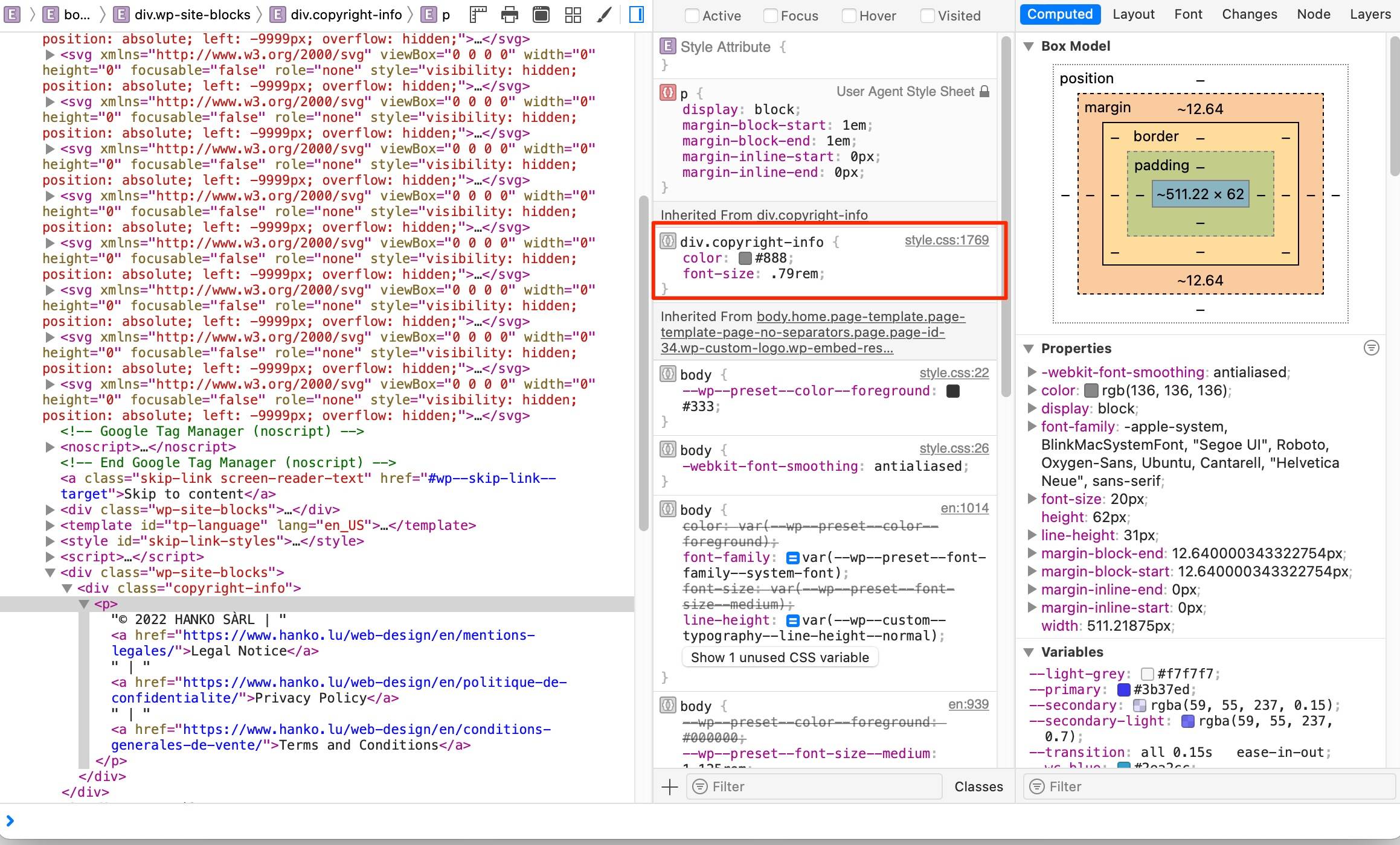
I’m currently building a new WordPress website with a child theme based of the official Twenty Twenty-Two theme. For some reason, when looking at the website on my phone, on landscape mode, some text will enlarge, whereas some text displays in the correct size.
Here’s the URL: https://www.hanko.lu/web-design
And here’s a screenshot of some problematic text: “? 2022 HANKO SàRL | Legal Notice | Privacy Policy | Terms and Conditions”. On the left, it is enlarged whereas on the right it has the size that I defined.
I’ve tried to find out what could be causing this using Chrome’s developer tools, but after searching for hours, messing with CSS values and media queries, I did not find the source if the problem. If I remove all my custom CSS, the problem still occurs, so this issue must be inherent to this theme. Moreover, the problem does not show up on a computer, even if I use “device emulation” in the developer tools, the text does not enlarge like it does on my phone.
Any ideas about what could be causing this?
The page I need help with: [log in to see the link]
- The topic ‘Issue with font size changing on mobile’ is closed to new replies.
