Issue with break point setting
-
Not sure where the issue is exactly originated, so I try my luck here.
Google tells me I have an issue with mobile friendly layout: fonts size is too small.
I checked and indeed, at 480px and below viewport width the font size is being lowered to something I find too small for myself. Smaller than I defined it anyway.
The responsive breakpoints I defined in Elementor are 767px for mobile and 1024px for tablet.
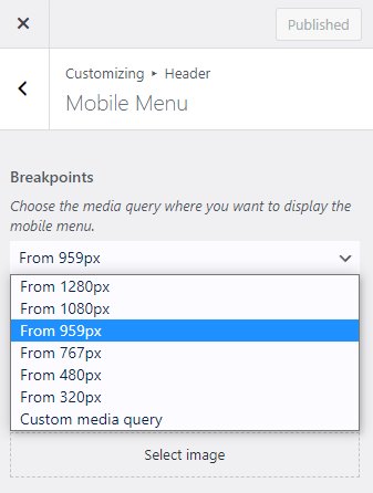
The theme I use is OceanWP and the only breakpoint setting I can find there is for the mobile menu in the Header section of the customizer, and is set to 1280px.So my question basically is: Where else could a breakpoint be defined? At 480px happens something and I need to find out where this can be changed…
Running WordPress 6.3.1 with OceanWP Child Theme and ElementorPro 3.15.1
Many thanks!
The page I need help with: [log in to see the link]
- The topic ‘Issue with break point setting’ is closed to new replies.
