• Resolved ketanco

    (@ketanco)


    My site, I am using theme 2023

    There is plenty of unused white space above the logo at homepage. How can I reduce the height of this white space above the logo? I tried on page editor but did not see how.

    • This topic was modified 1 year, 7 months ago by James Huff. Reason: link moved to proper field

    The page I need help with: [log in to see the link]

Viewing 13 replies - 1 through 13 (of 13 total)
  • Thread Starter ketanco

    (@ketanco)

    anyone? ))

    Hi @ketanco!

    You should be able to remove that white space setting the header’s padding to zero (0) in the “Layout” options under your Site styles, as seen in this screencast:

    Let me know if that helps!

    Thread Starter ketanco

    (@ketanco)

    Thanks Alvaro but how do you get to that place where you click layout in the very beginning? I do not see that. I am using 2023, which uses block editor.

    When I switched from twentytwentytwo, twentytwentythree kept the metadata in the header -which is great-, but also converted it into two paragraphs, that pushed the content below fold after a minor edit.

    I have a backup of the metadata, so I replaced the paragraphed content with the original, and the white space is gone.

    Moderator Kathryn Presner

    (@zoonini)

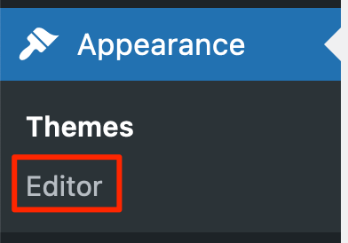
    Hi @ketanco – you can get there by going to:

    Appearance > Editor

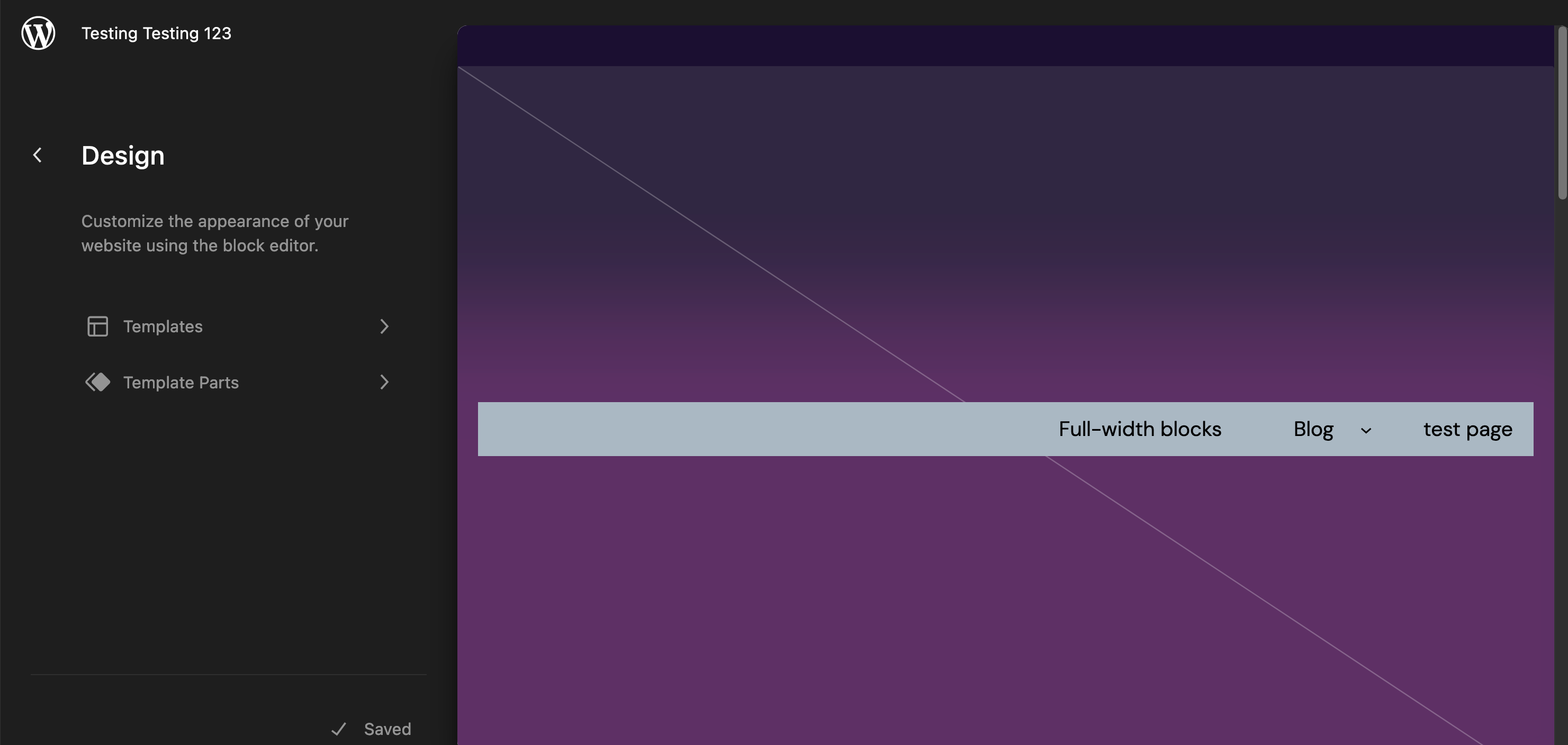
    That will bring you here:

    Next, click anywhere in the preview on the right to open the Site Editor.

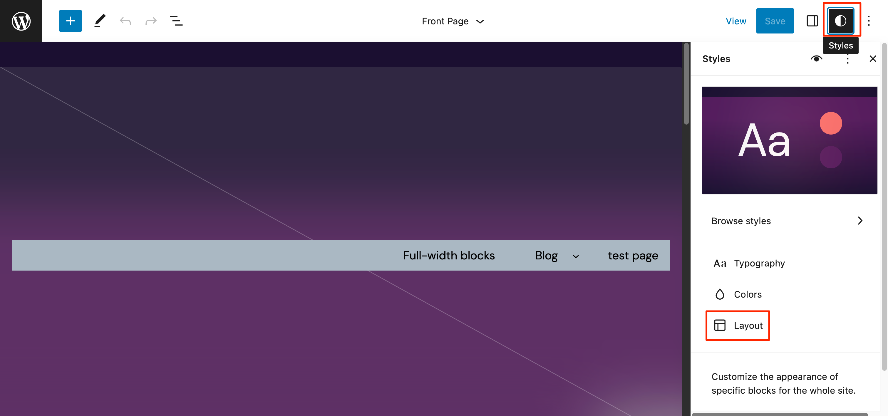
    Finally, click the Styles icon near the top right, and then you’ll see the Layout option below.

    Let me know how it goes!

    @gmac4247 – your issue is different than the one the OP (original poster) was experiencing, and I’m glad you got it sorted. Feel free to start a new thread if you need help with anything else.

    Thread Starter ketanco

    (@ketanco)

    Yes I now see how to do it thanks, but seeing what it does, I think I could not properly communicate what I wanted to do.

    What you show me reduces the vertical distance between very top of the screen and the “Hakkimizda / About Us” link. That is not what I want. That vertical distance can stay.

    The vertical distance I want to reduce is the vertical distance between the top of the logo and the bottom of the InsaatBilgi or “Hakkimizda / About Us” link. How can I do that?

    The vertical distance I want to reduce is the vertical distance between the top of the logo and the bottom of the InsaatBilgi or “Hakkimizda / About Us” link. How can I do that?

    Hi @ketanco I want to make sure we are on the same page, you want to reduce the space on top of the logo and below the menu Hakk?m?zda / About Us so that the logo is at the top and the menu is at the bottom?

    Or do you want to remove the white area shown above the logo and menu in the screenshot below?

    Screenshot 2023 04 25 at 10 09 55
    Thread Starter ketanco

    (@ketanco)

    i said nothing about moving menu to the bottom

    all I want is to reduce the un-used white area between the logo and the menu above. in other words, as i said, reduce the vertical distance between top of logo and bottom of the menu. so the menu stays as it is. just the logo moves up a little. that is all. so that the useless white area above the logo is smaller.

    Hi @ketanco I see, the best way to achieve that would be to first remove all the white space in the header using the layout option in Global Styles as Alvaro mentioned before.

    Go to Global Styles click the Styles icon near the top right, and then you’ll see the Layout, then add 0 to all the padding options.

    This will remove the white space around the header, but to add more space above the menu you can turn the row-block inside the header into a column. The column will easily allow you to add a spacer block above your menu.

    Thread Starter ketanco

    (@ketanco)

    adding zero padding to top is not what I want. that only moves up the menu. menu must stay. only the logo must move up. in that useless white space there is this field for the page title i had deleted. i cannot get rid of that empty field. if i did that would also reduce the white are and solve the problem. i guess i must do it by adding code. where and what?

    adding zero padding to top is not what I want. that only moves up the menu.

    There was a little confusion about which area you are referring to because usually, the logo would be in the header area around the Site Title ?n?aatBilgi area. After going over our conversation again it seems like you are referring to the image below.

    Screenshot 2023 04 27 at 16 22 24

    If that is the case you can remove top padding for this block in the editor as well. The image is inside a Group Block and you can reduce the top-padding in the block settings as shown in the short video below:

    If that is not the logo, kindly take a screenshot of what you are referring to as the logo. You can add the screenshot to this site https://snipboard.io/ once done the site will provide you with a new link which you can share here.

    Thread Starter ketanco

    (@ketanco)

    I do not even see this screen. When I click editor on my dashboard, this is what I see. … well how can I add my screenshot here? I cannot even see that. It says add picture from url. Well my screenshot happens to be in my computer i did not make a website url for my screenshot. this editor is extremely counterintuitive

    Moderator Kathryn Presner

    (@zoonini)

    To share a screenshot, you can either follow the instructions at https://snipboard.io/ and paste the resulting URL here. If you prefer to embed an image you already have on your computer, follow this step-by-step guide.

Viewing 13 replies - 1 through 13 (of 13 total)
  • The topic ‘How to reudce whitespace above logo’ is closed to new replies.