@catvanto re: “vendors contacting us” – you’re being very gracious about it, but if you’re getting unsolicited offers due to your thread here, please do let me know, as that’s a violation of forum guidelines, and I’d like to look into it further.
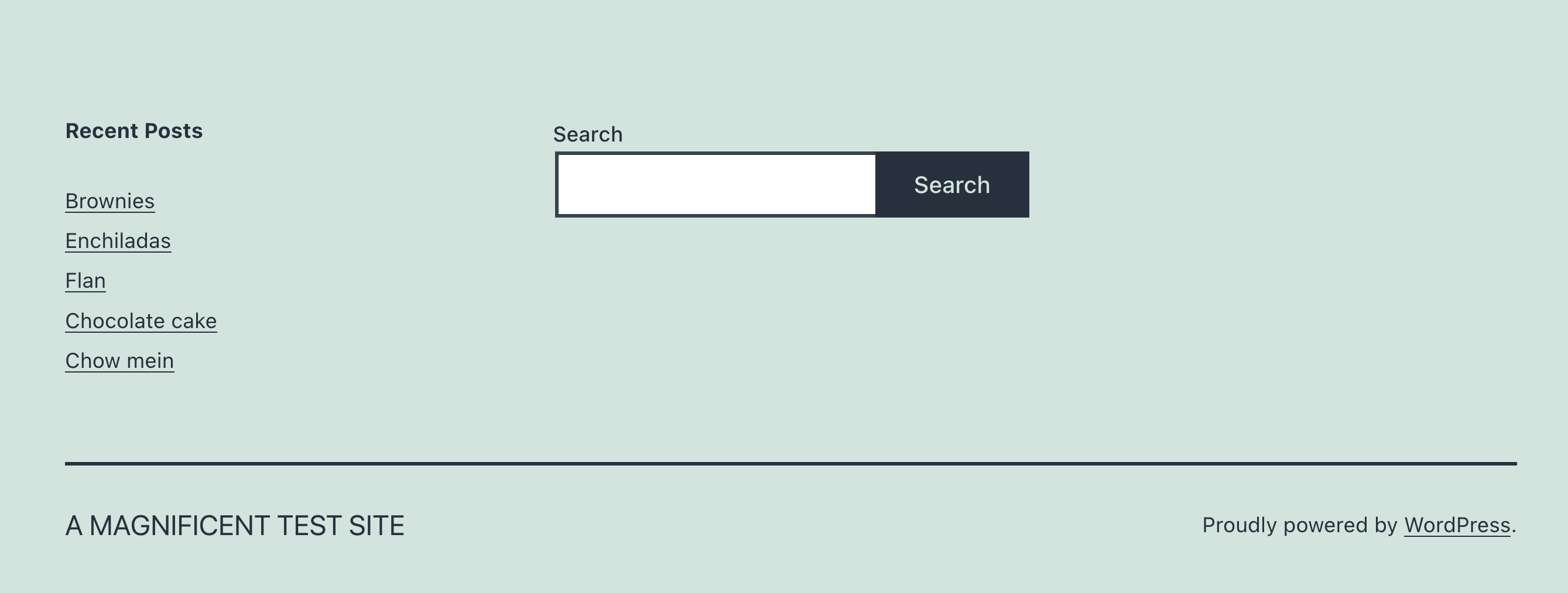
I did try to put a spacer block to the left of it, but it pushed the search bar to the right (instead of to the center). I tried to put the search bar between two spacer blocks, but I wasn’t able to drag and drop the second spacer block to the right – it kept going underneath.
Hmm, it sounds like your browser window might be narrower than mine.
Another way to achieve this – if you don’t plan to have any other items in the footer alongside the search bar – would be through custom CSS:
/* Widget area - make a single column, center search box */
.widget-area {
  grid-template-columns: none;
}
.widget-area .widget_search {
  margin: 0 auto;
}
You can add this to the CSS editor at Appearance > Customize > Additional CSS.
Let me know how it goes!

