• Resolved oakleaf101

    (@oakleaf101)


    How can I completely remove all Parallax and get the home page to look and act exactly like any other, normal page in twenty-seventeen theme? what code lines should I cut or comment out?
    I want a normal page, with a small header picture with site title, then the nav menu and the article.
    I was able to partially hide the parallax by making the header image shorter with code:
    height: 35vh !important;
    And by making the top menu NOT sticky. But you can still see a bit of the background pic on either side of the screen which is especially a problem on mobile. There I want the article 100% screen wide!
    Moreover, even on desktop the homepage header pic is stretched and not nice, though it looks perfect on all the other pages. The site is:
    https://client1vexper.nginxweb.top/
    thanks for any help.

    The page I need help with: [log in to see the link]

Viewing 12 replies - 1 through 12 (of 12 total)
  • Moderator jordesign

    (@jordesign)

    Hi @oakleaf101

    This CSS code will help with making the image in the header behave as you mention (scrolling/not parallax and scaling correctly.

    /* Set header background to scroll */
    .has-header-image .custom-header-media img {
    position:relative
    }

    In terms of the spacing around the content – using this CSS should make it all 100% wide.

    /* Remove padding on body of pages */
    body.page {
    	padding:0;
    }

    Could you please give those a try?

    Thread Starter oakleaf101

    (@oakleaf101)

    Great! They worked! Thanks… BUT one related, minor, issue to it remains:
    If you visit my site (linked above) and starrt to slowly scroll down, you’ll note that when the end of the header(the begin of the nav bar) reaches the top of screen, the page suddenly jumps and jags back downward an inch or 2, in an irritating way. any ideas?

    It’s possible one of my other added css code fixes causes this:
    /* Make header image area shorter */
    .has-header-image.twentyseventeen-front-page .custom-header,
    .has-header-video.twentyseventeen-front-page .custom-header,
    .has-header-image.home.blog .custom-header,
    .has-header-video.home.blog .custom-header {
    height: 35vh !important;
    }

    /* make top Nav menu NOT sticky */ 
    .site-navigation-fixed.navigation-top { / bottom: auto; / position: relative; / left: 0; / / right: 0; / / top: 0; / / width: 100%; / / z-index: 7; */
    }
    Thread Starter oakleaf101

    (@oakleaf101)

    And now a new issue results: On mobile only, home page only, the Nav bar’s height becomes extremely magnified: many lines of emptiness. (But remains normal as 1 line on all other pages, or desktop’s home.)
    Maybe I could do a media query that limits the vh height of the nav bar?

    Thread Starter oakleaf101

    (@oakleaf101)

    In addition, the tagline and Site Title no longer appear on the mobile view home page! just the back image. Again all works fine on other pages.

    Every problem i’ve had with this theme is with the home page. If we could just get the home page to use the same code and template as all other pages, then no more issues. Any way to do this? edit a template?

    WP2017 has the best nav bar in the biz, but its home page has many issues.

    Moderator jordesign

    (@jordesign)

    Hi @oakleaf101 – it does sound like the issues are related to the CSS adjustments to the header. If you remove the custom CSS – do those issues become resolved?

    Thread Starter oakleaf101

    (@oakleaf101)

    well, I tried removing things, but the above code I had wasn’t the problem.
    The issues were unfortunately created solely by the code you sent to “Set header background to scroll”, so I removed it.
    But that means I still have the original problem of the header picture being parallax and looking and acting different on the homepage than on all the other pages. I’d like the homepage to be EXACTLY like any other page, without parallax,… anyway to do that?

    The way Twenty Seventeen handles its home header image can make it tricky to override, since it also needs several adjustments for the mobile version. I would recommend removing the image altogether (via your Customizer) and adding it manually via CSS instead. This will be way easier to maintain and will guarantee consistency between your homepage and your other pages.

    Here are the steps:

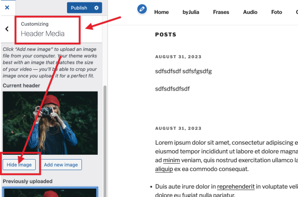
    1) Go to Appearance > Customize and remove the header image:

    Screen Shot on 2023 09 04 at 17 58 21

    2) Add the following CSS Code:

    .custom-header {
      background-image:url(https://pd.w.org/2023/08/3164f064ebcbda26.51973852-2048x1536.jpg);
      background-position: center center;
      background-size:cover
    }

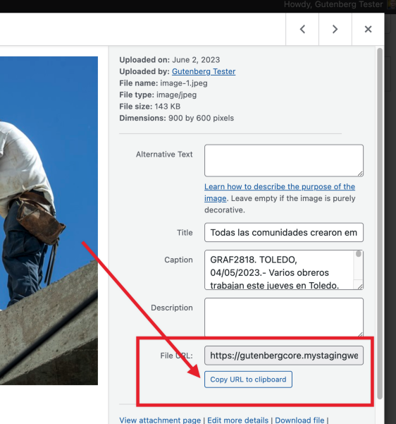
    3) Upload the header image you want to use and update the URL in the code above with the URL from your own media library. As seen below:

    Screen Shot on 2023 09 04 at 17 59 58

    4) You can also update the values of center center to adjust the position. Please check this reference for more details.

    I hope that helps!

    Thread Starter oakleaf101

    (@oakleaf101)

    Yes, thanks for your effort and ideas, that helped a bit.
    BUT there still remains the issue of the sudden jump and jag of the screen on desktop, when you’re scrolling, whenever the nav bar reaches the top of screen (if you quickly hit the pageDown key, you won’t see that, only when scrolling ). The whole screen suddenly jumps an inch or two, and then continues normally. Maybe I will have to live with that.

    But I wondered, if it’s possible to remove the parrallax functions from the function.php? But which are those functions?

    Or alternately, since 2017 has the best Nav menu ever, I wonder if its possible to remove ALL code from the theme, except the menu, and then merge that with Underscores_s
    I can easily write custom themes with Underscores_s, but I am unable to do a complex responsive, multi-tiered menu which only WP2017 really suceeds at.

    the sudden jump and jag of the screen on desktop, when you’re scrolling, whenever the nav bar reaches the top of screen

    mmm… as much as I tried, I cannot reproduce this. Could you upload a screencast to your site’s Media Library (or some other web service) and share a link?

    But I wondered, if it’s possible to remove the parrallax functions from the function.php? But which are those functions?

    I checked and it looks like this is handled on the template-parts/header-image.php file but I was not able to remove it programmatically via php.

    since 2017 has the best Nav menu ever, I wonder if its possible to remove ALL code from the theme, except the menu, and then merge that with Underscores_s

    “Extracting” the menu from one theme and using it elsewhere is going to be tricky, you would need to copy the exact markup and styles. I do like Twenty Seventeen quite a bit but I never thought too much of its menu. Can I ask why you like it so much? I am asking because it might be easier to style other menus to match it instead of trying to to copy the entire thing.

    Thread Starter oakleaf101

    (@oakleaf101)

    Thank you for the info and friendliness.

    Did you try the site?, which I linked above as: https://client1vexper.nginxweb.top/
    I just tried again with 6 browsers, including firefox, chrome, edge, even qtbrowser. The same jump happens on all when you scroll, as soon as the nav bar reaches top of screen. But it is worst on my default firefox.

    The reason I like the 2017 nav bar is because it is the only one I’ve ever found that can do a 4-level dropdown menu without bugs AND has a good mobile menu, where the different tier levels can expand and contract correctly without bugs. And I don’t want a heavy, slow theme, nor one dependent on gutenburg (some of my clients use ClassicPress, due to its faster speeds, etc). The closest menu to wp2017 is the famed GeneratePress, which I may use, but the free version does not permit styling the nav bar, nor site backgrounds.

    Hi @oakleaf101 !

    Did you try the site?, which I linked above as: https://client1vexper.nginxweb.top/

    It looks like the jump is because of some JavaScript code in the theme, which is responsible for making the navigation bar ‘sticky on scroll’. The simplest way to fix the issue is to remove the function adjustScrollClass in the file assets/js/global.js. You can see this function in the theme’s code here.

    Ideally, if you’re using this theme for multiple sites, you might want to create a child theme which removes the whole file and then loads a modified version. A plugin like ‘Child theme configurator‘ can be helpful with this.

    Thread Starter oakleaf101

    (@oakleaf101)

    @properlypurple: Thank you!, that seemed to do the trick! That .js code is the root of all evil, so I commented it out.
    And thanks to all the others for their idea. A very helpful forum.

Viewing 12 replies - 1 through 12 (of 12 total)
  • The topic ‘How completely remove all Parallax from twenty-seventeen?’ is closed to new replies.