Viewing 6 replies - 1 through 6 (of 6 total)
  • Pradnya

    (@pradnyajegstudio)

    Hi @mayeiei1

    You can try use this CSS code. Add it to Appearance > Customize > Additional CSS.

    @media only screen and (max-width: 1025px) {
    	.guten-tabs .tab-heading {
    			display: flex;
    	}
    	
    	.guten-tabs .tab-heading-mobile {
    			display: none;
    	}
    }

    Let me know if you still have questions

    Thread Starter may

    (@mayeiei1)

    At present, the left menu tabs on mobile and tablets are displayed completely, but there is a stroke showing the entire page.

    sample page

    • This reply was modified 2 years, 2 months ago by may.
    • This reply was modified 2 years, 2 months ago by may.
    Pradnya

    (@pradnyajegstudio)

    You need to adjust the height and its different for each tab heading. For example for first heading, you can use this code

    @media only screen and (max-width: 1025px) {
    	.guten-tabs.vertical .tab-heading .tab-heading-item:nth-child(1):after {
    		height: 192px;
    	}
    	
    	.guten-tabs.vertical .tab-heading .tab-heading-item:nth-child(1):before {
    		height: 2px;
    	}
    }

    After and before show the position of border. While, number in this bracket nth-child(1) indicate the order of the tab headings. Add also for other tab heading 2 and so on.

    For the precise number of your tab. You can see it on inspect element at your site frontend.

    Thread Starter may

    (@mayeiei1)

    If I want the menu tabs to show like the images attached to both mobile and tablet, where can I adjust or enter the code?

    sample ui mobile
    sample ui tablet

    Pradnya

    (@pradnyajegstudio)

    Please try use this CSS.

    @media only screen and (max-width: 1025px) {
    	.guten-tabs .tab-heading {
    			display: flex;
    	}
    	
    	.guten-tabs .tab-heading-mobile {
    			display: none;
    	}
    	
    	.guten-tabs.vertical {
    		flex-wrap: wrap-reverse;
    	}
    	
    	.guten-tabs.vertical .tab-heading {
    		width: 100%;
    	}
    }

    For the border, you can set the value to 0.

    Pradnya

    (@pradnyajegstudio)

    We haven’t heard you for a while. We will close this topic. If you still need an assist, you can create another topic.

    Thank you

Viewing 6 replies - 1 through 6 (of 6 total)
  • The topic ‘
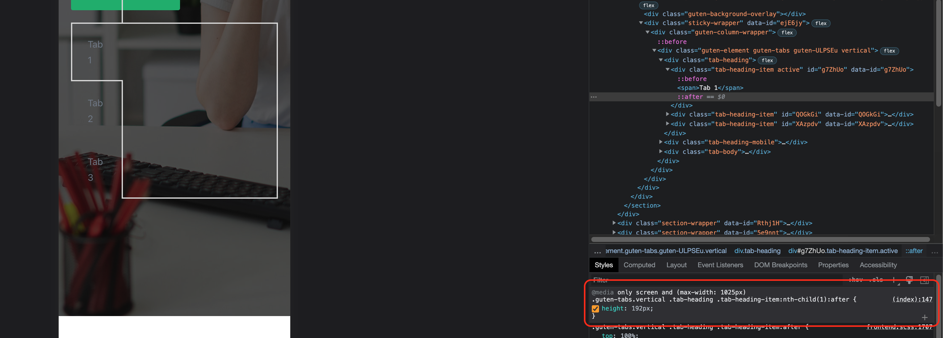
How can I make the left menu tabs show all topics on mobile and tablet?’ is closed to new replies.