• Resolved goutm

    (@goutm)


    Hej! Hope you’re doing great.

    I really enjoy what block-oriented site building jointly with FSE allows to do for non-professional users like me. We currently use WPBakery block plugin for our site but I want to switch to the Gutenberg since I believe that native is always faster and reliable in long-term perspective.

    My question is: how it is made in Gutenberg that all blocks in a row with colored background are the same height no matter of content?

    Here’s predefined patterned from 2022 theme — I’ve modified and and even inserted inside the cover block. And still the height remains the same. Here’s a screenshot.
    https://snipboard.io/nOsCM7.jpg

    And here’s a screenshot when I do the columns for myself:
    https://snipboard.io/DrdAxg.jpg

    So, what am I missing when creating colored blocks in columns by myself?

    Thank you!

Viewing 13 replies - 1 through 13 (of 13 total)
  • Moderator Kathryn Presner

    (@zoonini)

    Hi @goutm!

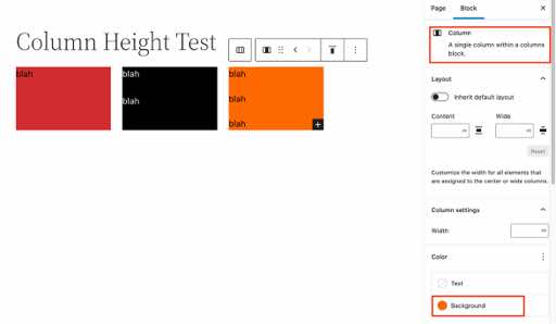
    In order to make the columns look equal in height, be sure to select the Column block itself before applying the background colour, rather than selecting the contents inside the Column block.

    Here’s a screenshot of what I mean:

    Add New Page Self hosted Test WordPress

    Let me know how it goes!

    Thread Starter goutm

    (@goutm)

    Kathryn, thanks! It works. Almost.

    I did as you said and it looks fine. But after that I decided to change the color of the column, so I removed background form the content section (because it just overlaps column color). And after that text immediately sticked to the column border.
    https://snipboard.io/pX4bxQ.jpg

    So, if I apply color background to the column — text block remain as close to the border as possible. And if I apply color background to the content block — the text moves away from the border even no padding is applied.
    https://snipboard.io/BIwoUX.jpg

    This is quite unexpected to me, could you please give more clarification about such behaviour?

    Moderator Kathryn Presner

    (@zoonini)

    Hi @goutm, if I understand correctly, you’d like to have some padding within each column.

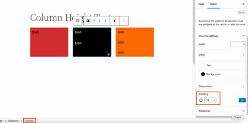
    To do that, select each column, and add a padding value in each column’s settings area in the right column. In this example, I’ve added 10px of padding all around the column:

    Edit Page Column Height Test Self hosted Test WordPress and Slack andromeda A8C

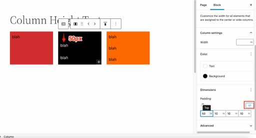
    Or if you’d like a different amount of padding on any of the four sides, click the “unlink” icon and then add a different value. In this example, I’ve added 50px of padding to the top of the middle column, while leaving the padding at 10px on the left, right, and bottom.

    Edit Page Column Height Test Self hosted Test WordPress

    Let me know if this achieves what you’re after!

    Thread Starter goutm

    (@goutm)

    @zoonini Kathryn, I would rather say I do not want padding — but it occurs beyond my will when I set color background for the content block! And in this case I can’t remove this padding, because in block settings padding is not set.

    Look at this screenshot:
    https://snipboard.io/BIwoUX.jpg
    Here I applied color background to the center (02) content block and its view has changed like there’s a padding. But no padding or anything else in the settings!

    Moderator Kathryn Presner

    (@zoonini)

    Hi @goutm. When you talk about setting a background colour on the “content block” are you referring to the paragraph block, or to the column block?

    Here I applied color background to the center (02) content block

    If you’re looking for white text on top of three coloured rectangles, with a little bit of padding around the text so that it does not butt up against the edges of the column, then the way to do that is by applying the coloured background only to the column block only, while leaving the paragraph background colour transparent. That will give you the effect I showed earlier.

    Let me know how it goes!

    Moderator Kathryn Presner

    (@zoonini)

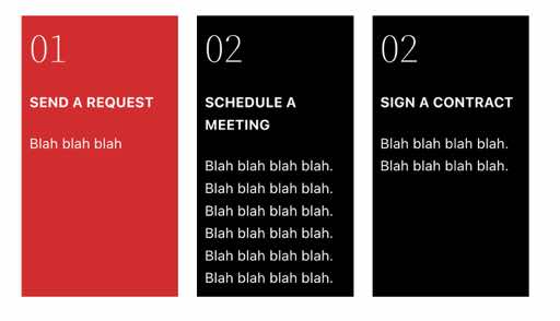
    Here’s what it looks like:

    Column Height Test Self hosted Test

    Achieved with:

    – background colour applied to each column block
    – 10px padding applied to each column block
    – heading & paragraph text: white text, NO background colour (transparent)

    Thread Starter goutm

    (@goutm)

    I have this kind of effect:
    https://file.io/TExre4ebsPle

    This is screen recording

    Moderator Kathryn Presner

    (@zoonini)

    Hi @goutm, the link above says “The transfer you requested has been deleted.” Let me know if you have another.

    Moderator Kathryn Presner

    (@zoonini)

    Also, I won’t be able to download any files for security reasons, but do feel free to use a service where the screen recording is already embedded, like Droplr – https://d.pr/

    Thread Starter goutm

    (@goutm)

    Dear @zoonini

    Since embed doesn’t work, here’s the link: https://vimeo.com/717745075

    Moderator Kathryn Presner

    (@zoonini)

    Hi there, thanks for the screencast.

    I see that the padding is being added when you add a background colour behind your paragraph blocks. I agree that this isn’t ideal, and that behaviour is being discussed in these two GitHub tickets:

    https://github.com/WordPress/gutenberg/issues/30725
    https://github.com/WordPress/gutenberg/issues/36586

    The good news is that for the effect you want, you don’t need to add a background colour on any paragraph blocks. Adding the background colour just to each column, along with some padding on each column, should give you a nice effect.

    Let me know if this is clear. Thanks!

    Thread Starter goutm

    (@goutm)

    That’s clear, @zoonini
    Thank you!

    Moderator Kathryn Presner

    (@zoonini)

    You’re very welcome!

Viewing 13 replies - 1 through 13 (of 13 total)
  • The topic ‘How can I make all blocks within a row with ONE height?’ is closed to new replies.