Hamburger Menu Too Wide!
-
Recently minimised the header of our site, and it’s much better (for mobile) but the hamburger menus are too wide on mobile – and I’d like them to kick-in sooner if possible, too!
Most grateful for any help with this.The page I need help with: [log in to see the link]
-
Hi @andynick, the problem seems to be that you’ve applied styling to the container elements that is carrying over to the mobile button. To overcome that, you could add some CSS to remove the background colour you’ve applied to the two menus, and then add it back to the more specific navigation elements.
See if this does the trick for you:
/* Menu containers - remove background colour */
header .wp-container-4,
header .wp-container-7 {
  background-color: transparent !important;
}
/* Menu elements (mobile & desktop) - add back styling */
header .wp-block-navigation__responsive-container-open,
.wp-block-navigation__responsive-container-content {
  background-color: #f0f0f091;
  border-radius: 8px;
  padding-top: 1px;
  padding-right: 6px;
  padding-bottom: 1px;
  padding-left: 6px
}
Normally we like to avoid
!importantin custom CSS, but since the background-colour CSS is being added inline through the block editor, there’s no other way to override it. Alternatively, and probably a better option, if you go ahead and just remove the styling (background colour in particular) you’ve added to those two container blocks, that would allow us to simplify the code by letting us removing the first chunk altogether.As for “I’d like them to kick-in sooner if possible, too!” do you mean that you’d like to widen the mobile breakpoint that triggers the hamburger menu? Did you have a particular breakpoint in mind? That may require rejigging quite a bit of code, but if you can confirm first that’s what you mean I can take a peek and see what’s feasible.
Thanks for your reply @zoonini
I created a staging copy today and removed the gradient background colour from the group block in question, but unfortunately it made no difference.
https://staging3.workingsheepdog.co.uk. (I will remove this staging copy after a day or two).
The hamburger menus are still full-width.Yes, I want to widen the trigger point to where the first item drops down onto a second line as you reduce the width. I don’t know how many pixels that is, (or how to find out, other then by trial and error).
Hey there!
I created a staging copy today and removed the gradient background colour from the group block in question, but unfortunately it made no difference.
I still see a grey background colour behind your two menus:

You can try removing that in the editor, then adding this part of the code I provided earlier:
/* Menu elements (mobile & desktop) - add back styling */
header .wp-block-navigation__responsive-container-open,
.wp-block-navigation__responsive-container-content {
  background-color: #f0f0f091;
  border-radius: 8px;
  padding-top: 1px;
  padding-right: 6px;
  padding-bottom: 1px;
  padding-left: 6px
}
In terms of modifying the breakpoint at which the desktop menu changes to a mobile hamburger menu… that’s a much bigger change that would require overriding a bunch of media queries set for the navigation block. If you’re comfortable with CSS (I see a bunch of custom CSS on your live site, so maybe you are?) then you can look in the browser inspector to find all the code you’ll need to override. It’s the stylesheet in
wp-includes/blocks/navigation/Thanks once more, @zoonini – but I fear I wasted your time.
I thought you were referring to the green header background (completely forgetting that I’d changed the background colour of the navigation blocks as well).
Apologies for that.
I’ve just finished updating our three websites, and am pleased to say that your CSS worked perfectly! Thank you!I looked for the code for the hamburger trigger, but I’ll look at the stylsheet you mentioned. Thanks again!
Hi @andynick – not a waste of time at all and I’m glad it worked! You’re very welcome. ??
I’m not sure what you’re seeing on your end, but I took a peek at https://workingsheepdog.co.uk/ and it looks like you still need to remove the background colour on those two navigation containers, as you see here. (You can probably also go ahead and remove the border-radius, etc. as they have no effect once the background colour is gone.)
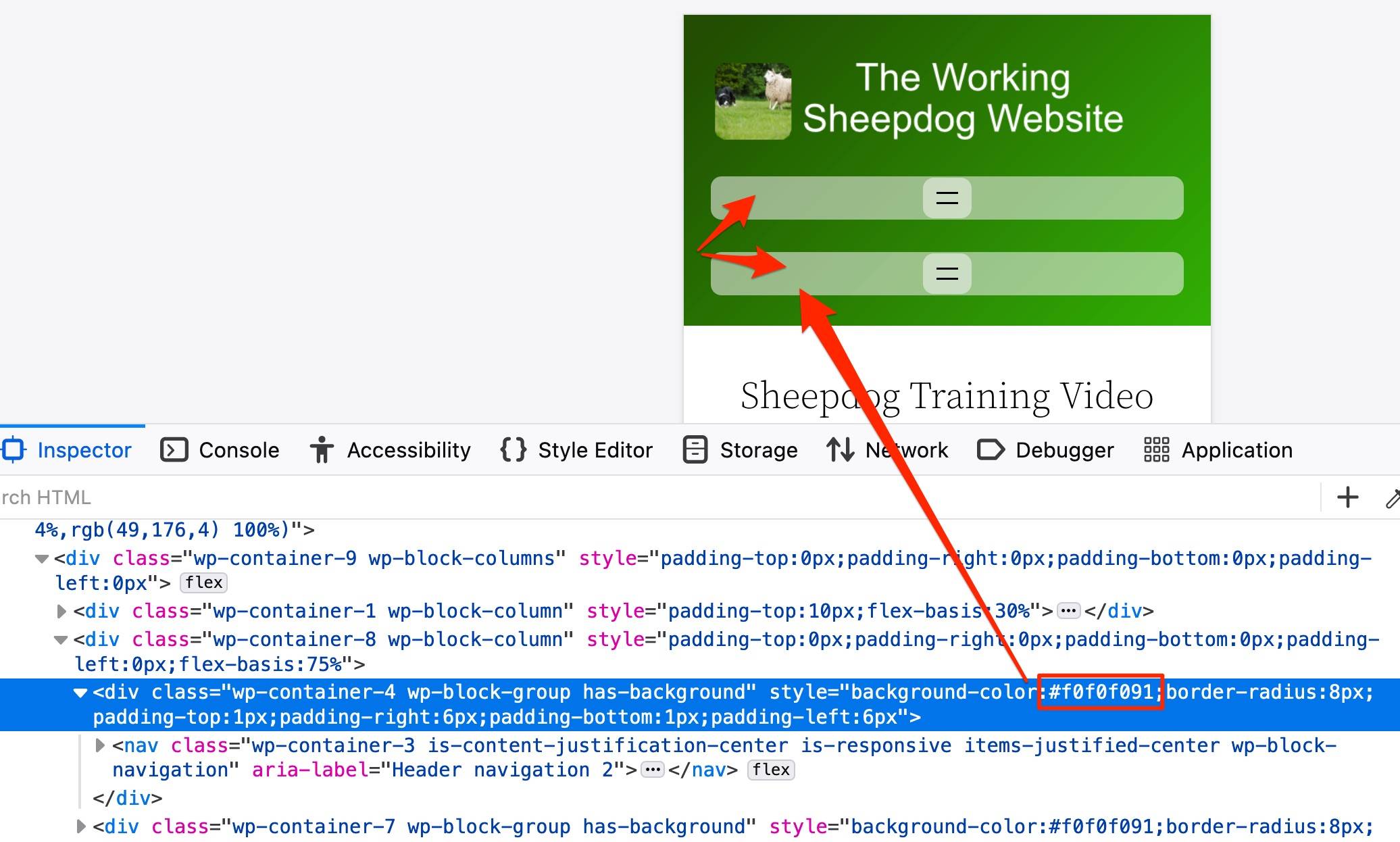
I also just noticed there were two extra characters in the hex code in your inline CSS that I’d inadvertently copied into the CSS I gave you, so you can remove two characters here, as hex codes can’t have more than 6 characters:
background-color: #f0f0f091;change to:
background-color: #f0f0f0;Let me know how it goes!
Hello Kathryn!
I did it in the staging copy and then I intended to do it on the live site, but must have got distracted!
We have members on the site in question, and I try to avoid pushing a staging copy to live in case someone has just created a new membership while I’m working on the staging copy. I haven’t yet sussed how to leave the members alone when I push a staging copy to live, so (on that site) I tend to learn how to do it on staging, and then go and do the work on the live copy!Yes, I noticed the two extra characters on the CSS but thought it must be OK. Thanks for letting me know!
Would you mind telling me what browser that inspector is on, please? It’s very clear and easy to read!
Thanks again for your help!
Would you mind telling me what browser that inspector is on, please? It’s very clear and easy to read!
It’s Firefox, my favourite browser. ??
You’re very welcome, glad to help!
- The topic ‘Hamburger Menu Too Wide!’ is closed to new replies.
