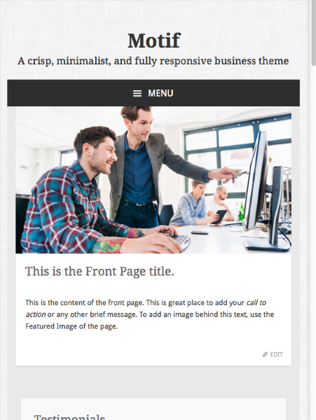
Hamburger Icon Spacing Off
-
I created a child theme for the Motif theme, but did NOT change anything with the menu’s css just yet. I noticed when the menu becomes responsive, the “hamburger” icon is a bit off in it’s bar spacing. Top bar is fine, but middle bar is close to the bottom bar, it looks odd.
I came across This Thread, but wanted to continue using Genericons method.
Is there anyway to fix this spacing with Genericons /f419?
NOTE: I cannot post a link because I am using WAMP locally.
Viewing 5 replies - 1 through 5 (of 5 total)
Viewing 5 replies - 1 through 5 (of 5 total)
- The topic ‘Hamburger Icon Spacing Off’ is closed to new replies.

