• Some of the pages on my site are made in Elementor, and some of the pages and entries are made using the WordPress editor. There are no complaints about the desktop version of the site, but on the phone there is a problem. The titles of pages created in Elementor are positioned exactly above the text on the page:

    while the titles of pages and posts created using the standard WordPress editor are offset from the text by 10px to the right:
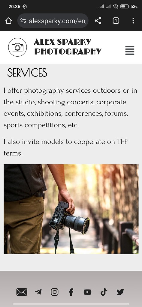
    When I add the following code into CSS, the standard page title is corrected and becomes exactly above the text:

    and the Elementor page title moves to the left of the text by 10px. That is, the distance from the edge of the screen to the title is 0px, as written in this code:
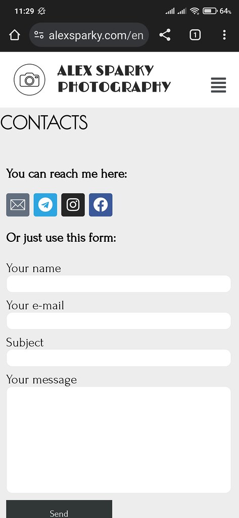
    @media (max-width: 768px) {

        .page-header .entry-title {

             padding: 0px 0 0px;    }}

    How can I make sure that all the headers on my phone are exactly above the texts?

    • This topic was modified 11 months ago by Yui. Reason: unrelated to WordPress Mobile App

    The page I need help with: [log in to see the link]

Viewing 5 replies - 1 through 5 (of 5 total)
  • Hello, please try the following CSS, which should target the page headers of pages built using standard WordPress on your website.

    @media (max-width: 575px) {
      body:not([class*=elementor-page-]) .page-header .entry-title {
        padding-inline-start: 0;
      }
    }

    The max-width of 575px is based on your website’s theme’s mobile styles which also uses padding-inline-start/-end instead of padding. Test to see if the above code works, and feel free to adapt to your requirements. Good luck!

    Thread Starter alexsparky

    (@alexsparky)

    God sent you to me, Gerry! That worked like a charm! Thanks a lot!

    • This reply was modified 11 months, 2 weeks ago by alexsparky.
    Thread Starter alexsparky

    (@alexsparky)

    Please, tell me more thing, Gerry. Everything is perfect now on amobile, but not on a tablet. On Elementor pages the page title goes to the right, but on usual WordPress pages everything is ok. Can this be fixed somehow?

    Hello, try the following CSS rules …

    @media (min-width: 576px) and (max-width: 1199px) {
      .elementor-page .page-header .entry-title {
        max-width: none;
        padding: 0 10px;
      }
    }

    The above rule should target only pages built or edited using Elementor and only the tablet (or large mobile) screen sizes. Please test as usual and adapt to your requirements.

    In the future, please post also on Elementor support forums, so the Elementor developers and community could provide more helpful replies. Thanks and good luck!

    Thread Starter alexsparky

    (@alexsparky)

    All is ok now! Thank you VERY MUCH, Gerry! You are awesome!

Viewing 5 replies - 1 through 5 (of 5 total)
  • The topic ‘Different margins for title page’ is closed to new replies.