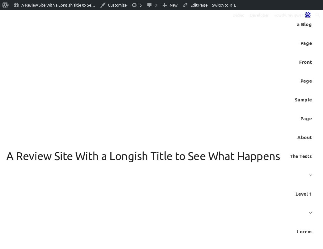
• This screenshot is my review test site using the Astra theme. It looks nothing like the theme screenshot. The way the header takes up the entire page really needs to be fixed.
    The window was 1030px wide.

Viewing 10 replies - 1 through 10 (of 10 total)
  • Hello @joyously,

    I tried reproducing this scenario. The header is using Flex layout and you seem to have hit a sweet spot with the Site title content and content Header width such that it is leaving the width for one menu width.

    Right now our idea is to allow long titles and menu to stay on the same line until their widths allow it (flex makes it simple) Once the width of the header is a bit more the menu and logo/site title will be on different rows.

    This is the same case that you have right now. If you had just one extra word in your Site title and menu would have been on separate lines.

    In such scenarios where site title/ logo has more width we usually recommend second header layout which allocates full width to site title and menu and makes them center-aligned – https://cl.ly/sU0m

    Thread Starter Joy

    (@joyously)

    So to fix it,
    are you going to set a max-width on the site title or the menu, with media queries?
    Are you going to make the default header purple with white text?
    Are you going to make sure that the header block does not take up the entire visible space?

    The theme should handle whatever width my window is.

    Hello @joyously,

    Astra Theme provides an option to hide the menu. It also provides an option to add shortcode/widget/custom HTML in place of the menu.
    There is a use case where the user can have longer text like you are using and just add button/custom markup in the header like this – https://cl.ly/sVR7

    In support tickets, we have seen and suggested ways to users to insert their custom HTML markup after logo which spans the entire space in similar use case I mentioned above.

    Adding max-width will break their existing set-up sites.

    Like I mentioned, there are several ways the theme handles this edge case when the user actually has a lot of content in the header then the actual space in the header.

    1. The width of the header can be changed to device full-width to have more space in the header. – https://cl.ly/sUEK
    2. If the content is more, It makes more sense to use the second header layout which allows setting up logo and menu on separate rows. Like I mentioned in an earlier reply – https://cl.ly/sU0m

    I would prefer allowing users to choose one of these options if they are in similar situation like this.
    Because forcing a fix, in this case, limits the other possibilities and use cases of these options.

    Also – Like I mentioned, There are users who have set up headers in a similar way that I mentioned. A fix that you have mentioned will break their existing sites.
    Thread Starter Joy

    (@joyously)

    Despite a lot of words, that is not an answer, and helps no one.
    The fact is that the defaults do not work for a long site title.
    The fact is that the defaults look nothing like the screenshot.
    The fact is that the theme has at least one situation that is not handled and I would assume there are many more, but I don’t have the time to find them.
    Therefore, I don’t trust the theme to do its job without supervision.

    Hello @joyously,

    I don’t think defaults are always good looking, especially with the title that is such unnaturally long. However, we will try to improve this in the future release.

    Thread Starter Joy

    (@joyously)

    I don’t see why anyone would make the defaults bad looking. Everyone starts there! So everyone’s first impression is that it is ugly and doesn’t match the screenshot, and you have to figure out how to make it look like that. It’s bait and switch, and not a good user experience.

    Besides, my title isn’t unnaturally long. It is sort of made up to be long because I speak English. But if I spoke German or Swedish, it would be more likely to be long without even trying.

    Hello @joyously,

    I have added this to our list to figure out a solution to this in upcoming updates of the theme.

    There are two solutions to this –
    1. Add max-width to the site content area. although as I said earlier that will not allow some of the possibilities that other theme options provide.
    2. Make the menu fall on a separate row if site title is longer.

    Thread Starter Joy

    (@joyously)

    Yeah, I see… you can change your screenshot for dummy text but not to actually better represent your theme defaults.

    I have created a PR to drop the nav menu on a separate line if site title is longer – https://github.com/brainstormforce/astra/pull/819/files

    We will how this plays along with other header options from theme and the pro addon and get this merged.

    Hello @joyously,

    In version v1.5.0 this fix was released and the navigation menu will drop on a separate row once the width of logo/site title increases.

    Earlier this was managed using flex properties to wrap nav navigation menu as content increases but as it is seen in your screenshot it can get weird when the width of site title is much longer.

Viewing 10 replies - 1 through 10 (of 10 total)
  • The topic ‘Default layout of long site title takes up entire page, looks terrible’ is closed to new replies.