Column/loop grid sizing problem in non-Safari browsers
-
The problem
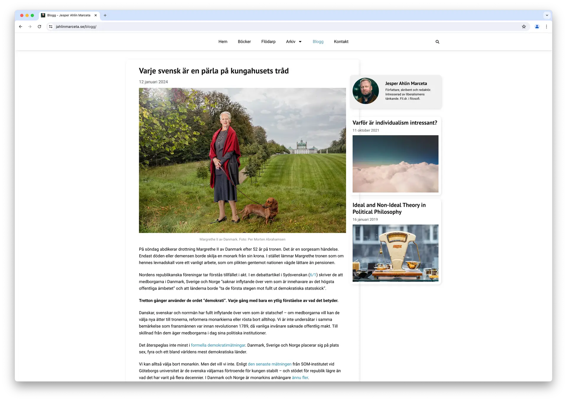
The page which displays all blog posts (let’s call it “all_posts.htm“) looks good in Safari, but not in Chrome (or other browsers). Different browsers’ interpretations of padding and width are inconsistent (despitebox-sizing: border-box;). Moreover, the content of each blog post overflows to the right and does not resize/break with the browser window. See attached images.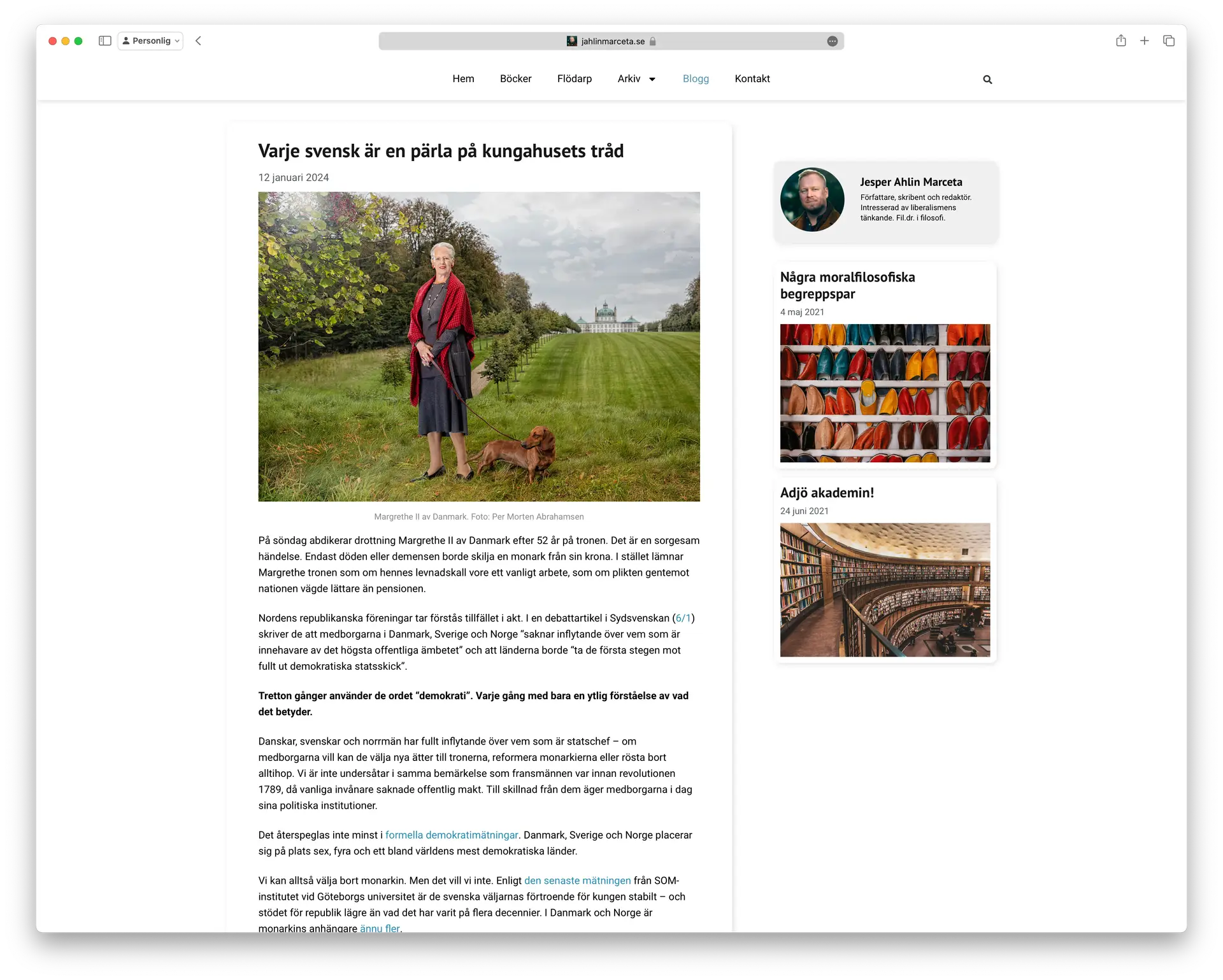


The confusion
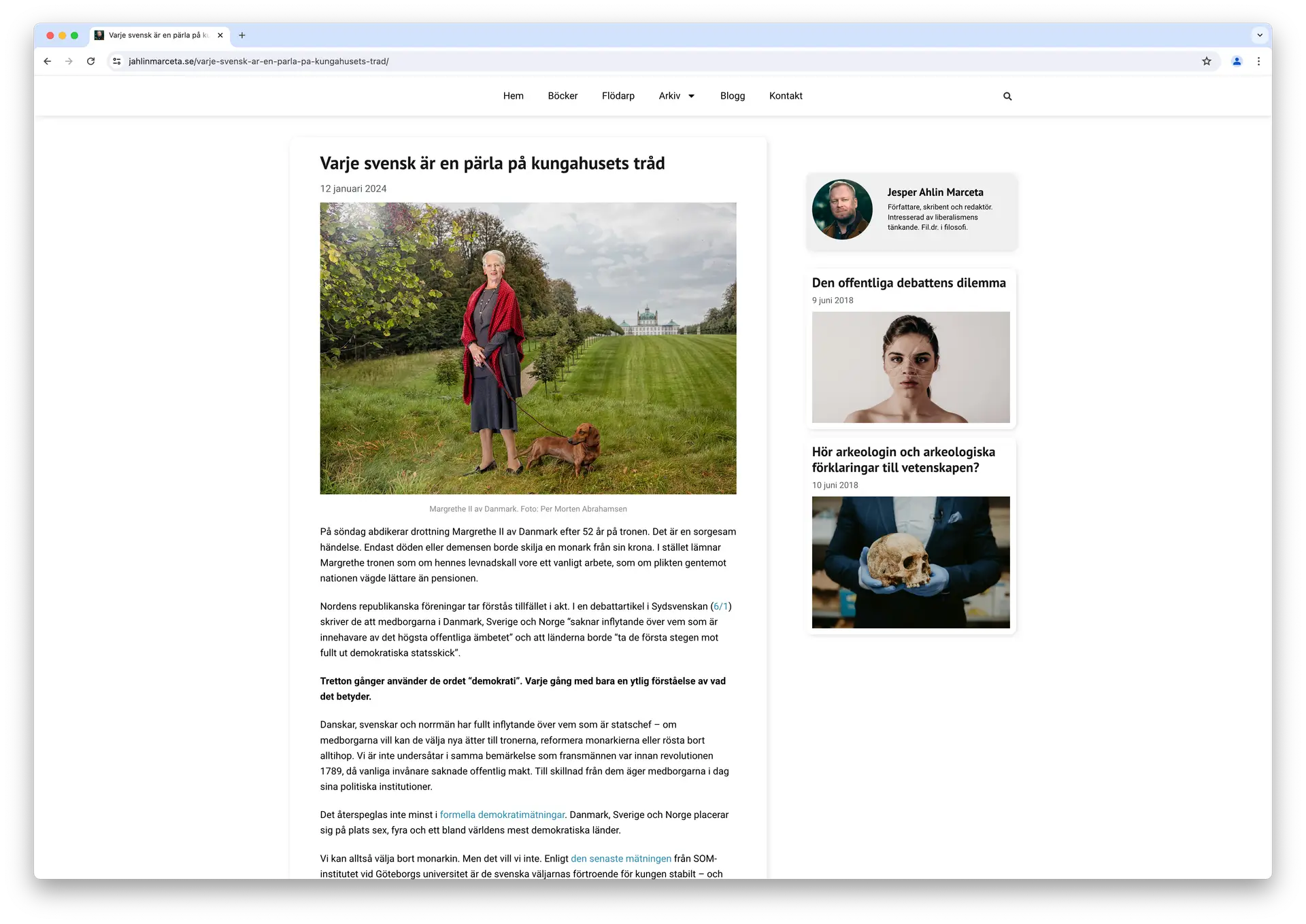
What’s weird is that the page which displays single posts (let’s call it “single_posts.htm“) works fine. See attached images.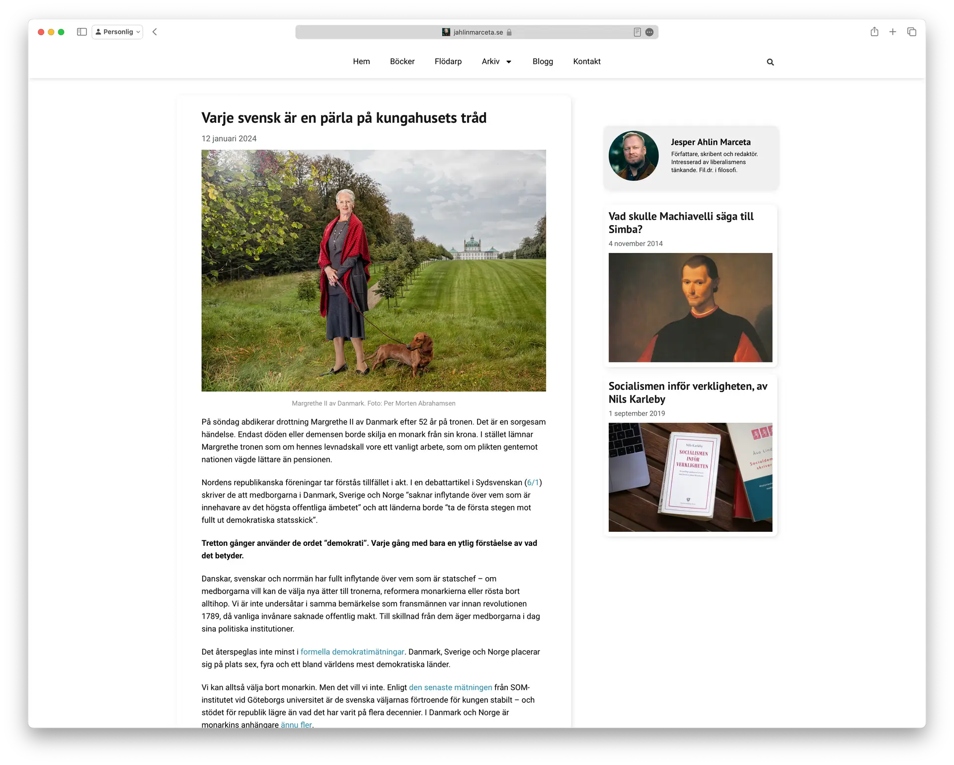
Webdesign
single_posts.htmfollows a global template that applies for most pages on the site. The template has a main column (“Is Main Column – yes”) and a sidebar (“Is Sidebar – yes”). The sidebar content is loaded from a template which randomly displays selected posts. Onsingle_posts.htm, the main column content is fetched from the post content (title, date, featured image, and post content).all_posts.htmis based on the global template design, but does not follow any template. Main column and a sidebar as in above. The main column displays all blog posts in a loop grid (“grid.loop“).grid.loophas the same design as the main column content insingle_posts.htm.Questions
What causes the issues? Should I design my pages using different methods?Technical info
Elementor 3.21.4
Elementor Pro 3.21.2
SmartMag Child 1.1
Safari 17.4.1
Chrome 124.0.6367.119
Opera 109.0.5097.68
MacOS 14.4.1 (M2 Pro)The page I need help with: [log in to see the link]
- The topic ‘Column/loop grid sizing problem in non-Safari browsers’ is closed to new replies.