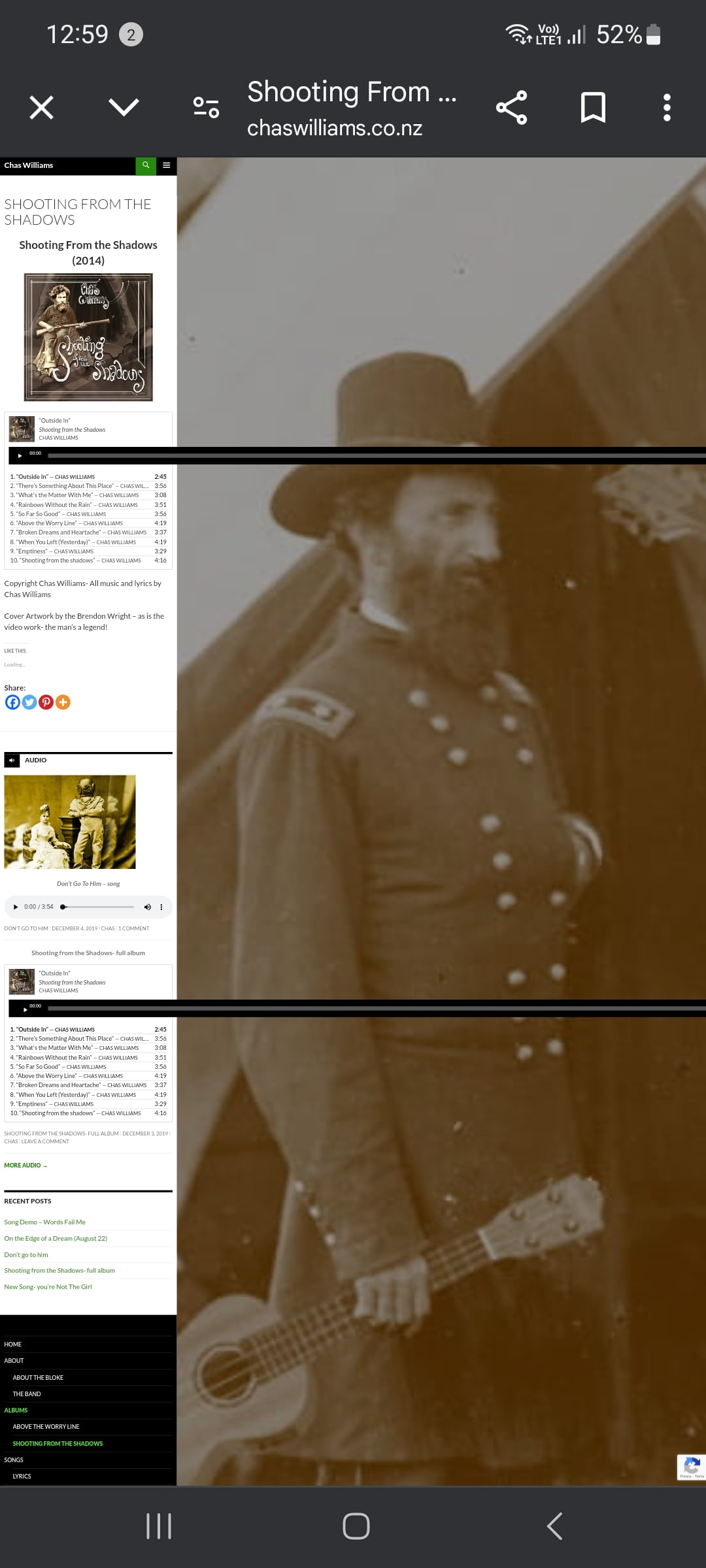
You can see that the old audio playlist widget is playing up:
It’s no longer sizing to the mobile screen but forces the whole page into a narrow band at the left.
Is there any way this can be fixed?
The same error ccurs on the homescreen, “chaswilliams.co.nz”
Apologies, the below screenshot keeps resizing to full size, even though I shrunk it down to a thumbnail when making the post.
-Best wishes,
-Brendoon
I have an issue with the Cookies popup being too wide on mobile. I am using ‘bottom’ position, but have the same issue with the ‘bottom right’ position. The buttons are stackings, but popup is still wider than my mobile screen.
My site is wordpress/elementor
Any ideas on how to fix this? I’m not sure which div/selector is pushing the popup wider than mobile screen
]]>I checked the manual and the support page and did not find any help. One thread seemed to suggest that a plugin might be to blame, so I tested every plugin that might be involved with no luck.
I do hope you can help since I looked long and hard for this theme and now have over 100 hours into its development. ]]>
When I use absolute positioning for some elements on the page it makes my page too wide and adds horizontal scroll. What could be the reason for this issue and how can I fix this?
Thanks!
]]>I am using the “FW no sidebar” option but it behaves the same as “fullwidth” too wide. Could you send me a css that I can paste so that the width with the “FW no sidebar” option is 80%?
thanks!
]]>See this screenshot:
https://prnt.sc/r6mbqj
I need to increase the width quite a bit to get it to fit.
See this screenshot:
https://prnt.sc/r6mc08
Is this normal? Am I doing something wrong? What determines how long the bar code is (your test barcode is much much shorter).
Thanks
]]>We’re using the Newsmag style & I’m seeing a problem where the plugin is writing incorrect inline css into the page, causing images in Posts to be set to 660px.
In version 0.6.2 I was seeing:
/* Inline styles */
.amp-wp-inline-72f7148af6599bc6f18d790b3f206645{max-width:660px;}  </style>
but in 1.1 we’re getting:
	/* Inline stylesheets */
:root:not(#_):not(#_):not(#_):not(#_):not(#_) .amp-wp-241f9ca{width:660px}  </style>
This is causing the error. Around images I’m seeing this:
<figure id="attachment_71569" aria-describedby="caption-attachment-71569" class="wp-caption aligncenter amp-wp-241f9ca">
I can fix the issue either by :
– removing amp-wp-241f9ca from the figure element
– removing the inline css so that this style is not defined
– changing the inline style definition so that it reads min-width instead of width
I’ve got around this by hacking the plugin (just in one place) but is there a better fix for this?
Current hack in place is:
File : amp/includes/amp-post-template-functions.php:

 * @param AMP_Post_Template $amp_template Template.
 */
function amp_post_template_add_styles( $amp_template ) {
	$stylesheets = $amp_template->get( 'post_amp_stylesheets' );
	if ( ! empty( $stylesheets ) ) {
		echo '/* Inline stylesheets */' . PHP_EOL; // phpcs:ignore WordPress.Security.EscapeOutput.OutputNotEscaped

// update next line
		echo fix_style_width_error(implode( '', $stylesheets )); // phpcs:ignore WordPress.Security.EscapeOutput.OutputNotEscaped
	}

	$styles = $amp_template->get( 'post_amp_styles' );
	if ( ! empty( $styles ) ) {
		echo '/* Inline styles */' . PHP_EOL; // phpcs:ignore WordPress.Security.EscapeOutput.OutputNotEscaped
		foreach ( $styles as $selector => $declarations ) {
			$declarations = implode( ';', $declarations ) . ';';
// update next line
			print fix_style_width_error( sprintf( '%1$s{%2$s}', $selector, $declarations ) ); // phpcs:ignore WordPress.Security.EscapeOutput.OutputNotEscaped
		}
	}
	print "\nh1.title { font-family: 'Open Sans', arial, sans-serif; font-weight:400; color:#222; word-wrap: break-word; }\n";
}

// add this function

/**
 * in v0.6 they used max-width which worked great. After that it was width, which is breaking our amp pages
 * @param $str
 */
function fix_style_width_error($str) {

    return preg_replace('/(^|[^-])(width)/', '$1max-width', $str);
}
First of all I want to thank you for this great addon!
Im using Ad Inserter on several sites and I always have problem with theme boxes. So everything work great on PC. But when I going to use my phone its not that good.
I mean that theme showing all in boxes and Adsense res ads just dont care about this boxes width. Ads starting from left side to right side of the screen. I found one solution code but then I need to write all sizes for myself and its not really handy…
When I using custom CSS in the addon and using preview wo change margins – nothing happens. On PC there is a correct margin in the boxes.
Whats is wrong?
]]>It seems to me like there is a min-width for tables somewhere but I cannot find it. I even tried using WPtouch plugin but still have the same issues with content tables.
An example of this can be seen here (try with mobile):
https://www.adsfornewbs.nz/get-ads/
Screenshots:
https://www.adsfornewbs.nz/wp-content/uploads/2019/03/mobile-tables-1.jpeg
https://www.adsfornewbs.nz/wp-content/uploads/2019/03/mobile-tables-2.jpeg
Please tell me how I can restrict tables to within the content limits.
]]>I’m testing a fresh copy of Hive theme, and there seems to be a problem with the site’s width. as you can see in the screenshot below, the body element is too wide and it exceeds the viewport, creating a scroll bar at the bottom. This appears in all browsers: Firefox, Edge, Chrome and Opera. I have not added any custom css beyond the text shadow for the title. Can you fix this?
https://ibb.co/facHO8 ]]>