Best regards.
]]>- I choose an image from the media library to use. As you can see, the image size is 450×600.
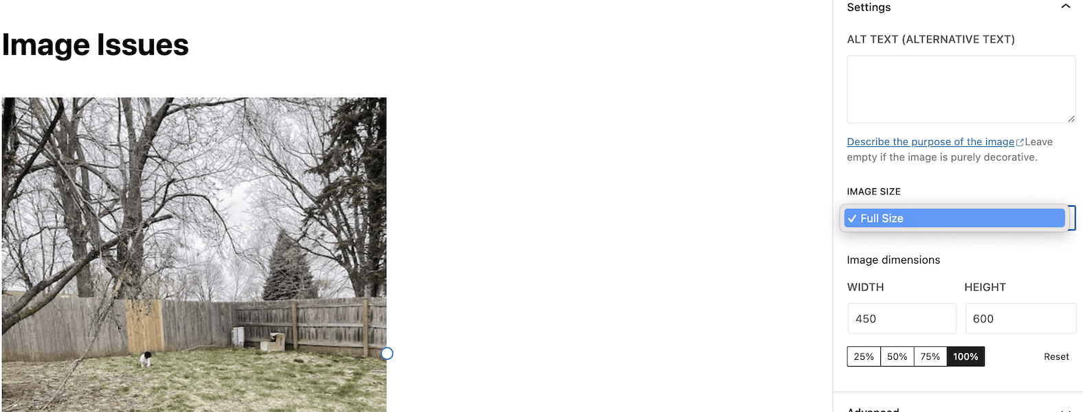
2. When it’s added to my draft, it looks fine. However, the only size option I have is Full Size.
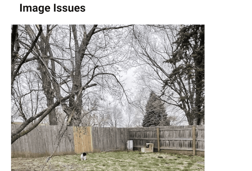
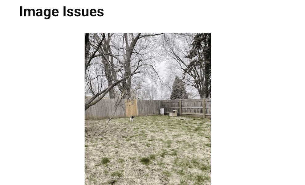
3. When I hit preview, this is what the image looks like. Somewhat larger than I’d expect, but not awful. However, it’s fuzzyish so that tells me the size has increased beyond what it should be.
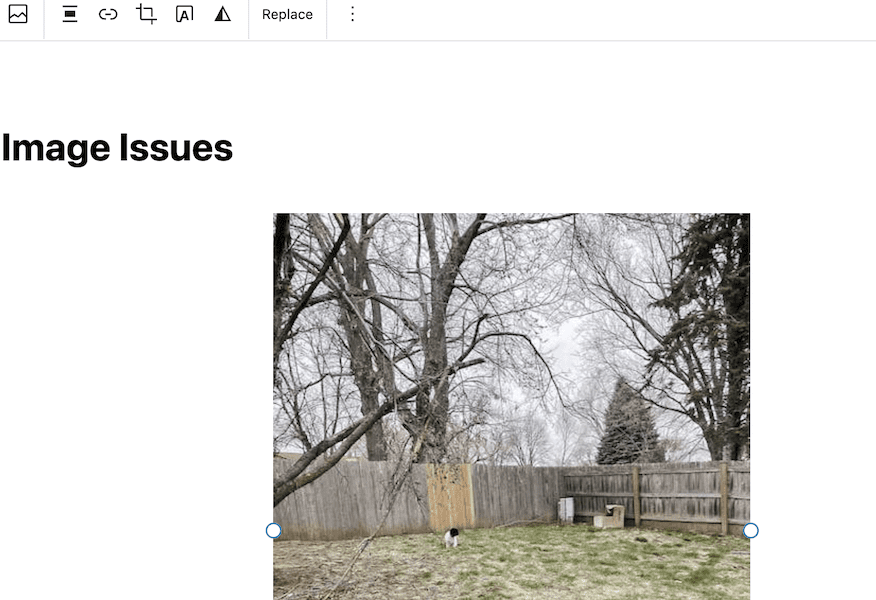
4. This is where I get confused. If I go back to the draft and change the image to be centered…
5. …The preview looks like this. The image looks to be about the same size as shown in draft form. I like the way this looks so, in every post I write, all of my images are centered.
6. Another issue: When I add 2 photos to a gallery…
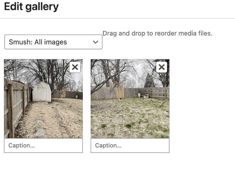
7. … they look like this in draft form.
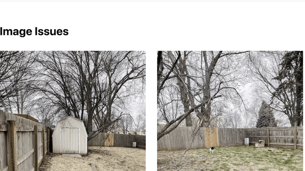
8. When I hit preview, they explode and practically take up the entire scree. They are stacked one on top of the other, completely the opposite of a gallery.
9. When I use the columns feature, this is what it looks like in preview. Looks great.
10. Things to note:
- The only sizing option I’ve ever had in the drop down menu is FULL SIZE.
- The media images in WordPress settings are all at 0. I’m sure that’s contributing to this, but I’ve played around with that a bit and it doesn’t seem to help.
- I don’t bother using image captions because they don’t stay in line with the images after the post is published.
- FYI, I did delete some CSS that made all the H2 headings not able to be centered. That was annoying, and it doesn’t appear to have broken anything. But maybe it was in there for a reason? IDK
- I have limited CSS skills so here’s what I’ve copied from the customizer:
/* Pop Up Css Slider */

.hustle-ui.module_id_3 .hustle-layout {

? ? height: 500px;

}

ui.module_id_3 .hustle-layout .hustle-layout-header {

? ? padding: 120px 20px 40px 40px ;

}

.hustle-layout-header {

? ? padding-top: 120px !important;

}

/*.hfe-submenu-icon-arrow .hfe-nav-menu .parent-has-child .sub-arrow i:before {

? ? content: "?";

}

*/

.formkit-form[data-uid="c6c2937a68"] .formkit-fields {

? ? display: -webkit-box;

? ? display: -webkit-flex;

? ? display: -ms-flexbox;

? ? display: flex;

? ? -webkit-flex-wrap: wrap;

? ? -ms-flex-wrap: wrap;

? ? flex-wrap: wrap;

? ? margin: 0 auto;

? ? flex-direction: column;

}

/*

.hustle-ui:not(.hustle-size--small).module_id_3 .hustle-layout .hustle-group-content p:not([class*="forminator-"]):last-child {

? ? padding-left: 60px;

? ? margin-bottom: 0;

}*/

.eicon-close:before {

color: white;?

}

figure.wp-block-image {

? ? margin: auto;

? ? display: block;

width:100% !important;

align-content:left !important;

text-align:left !important;

}

p {

? ? text-align: left !important;

}

dd, dl, dt, li, ol, ul {

? ? text-align: left !important;
THANK YOU AND GOOD LUCK!
]]>Way 1: Put logo in header and floating with css?
Way 2: Put logo in centent and floating with css?
Way 3: Put logo in upload-directory and insert with css?
In which ways is this possible with TT3? Hope someone can help. Thanks!
I would like to have the main menu centered and without the logo, (the logo is already in the top bar). But I have two drawbacks:
1) When I remove the logo image in the main menu, it is automatically replaced by the site name in text format. I have made it invisible:
a.site-title.site-logo-text{
visibility: hidden;
}
2) But it still takes its width…. When I choose to align the menu to the center, it is not aligned properly, it creates a double line.
How can I correct this?
Thank you!
Translated with www.DeepL.com/Translator (free version)
]]>The 4 most reason posts are displayed with a photo, title, author, date posted, excerpt, and button. I’d like the featured image to be left-aligned, that is it’s left margin always aligned with the left margin of the space in which the image sits.
Right now it is centered, and this is it’s default code:
.obfx-grid .obfx-grid-col-image img {
    display: block;
    position: absolute;
    top: 50%;
    left: 50%;
    width: 100%;
    max-width: none;
    height: auto;
    max-height: none;
    -webkit-transform: translate(-50%,-50%);
    -ms-transform: translate(-50%,-50%);
    transform: translate(-50%,-50%);
}
I have tried adjusting the left property but this just means that with certain screen sizes there is black space. The image is wide enough that if it’s left margin is aligned with the left margin of the gallery image slot, there should never been any black space with any reasonable screen size.
I didn’t have much luck changing the position property to relative or sticky either.
It should be a simple fix I think, I’m just a bit new to coding.
Thanks in advance!
]]>