Hi.
Thanks for the great plugin! Much appreciated!
Having some issue though which I’m having trouble fixing. The plugin works great on some pages, for example:
https://www.baste-sportive.com/today-bet-predictions/
but it doesn’t work here:
https://www.baste-sportive.com/competition/english-premier-league/
Both pages have tables created in Snippets, with code. They all fit somehow the opposite of “cons” mentioned in your plugin homepage.
Can you please have a quick look and let me know if there’s anything I’m missing?
Thank you!
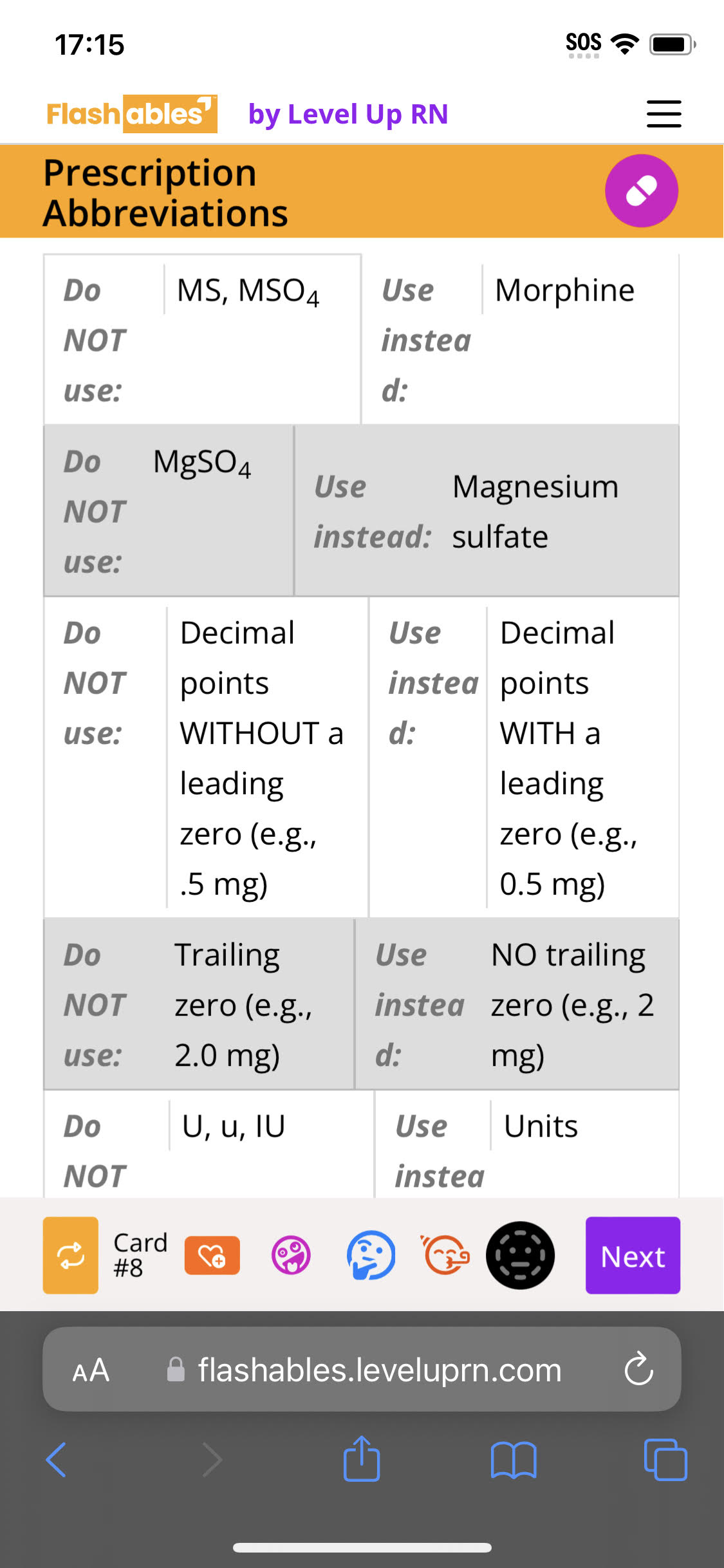
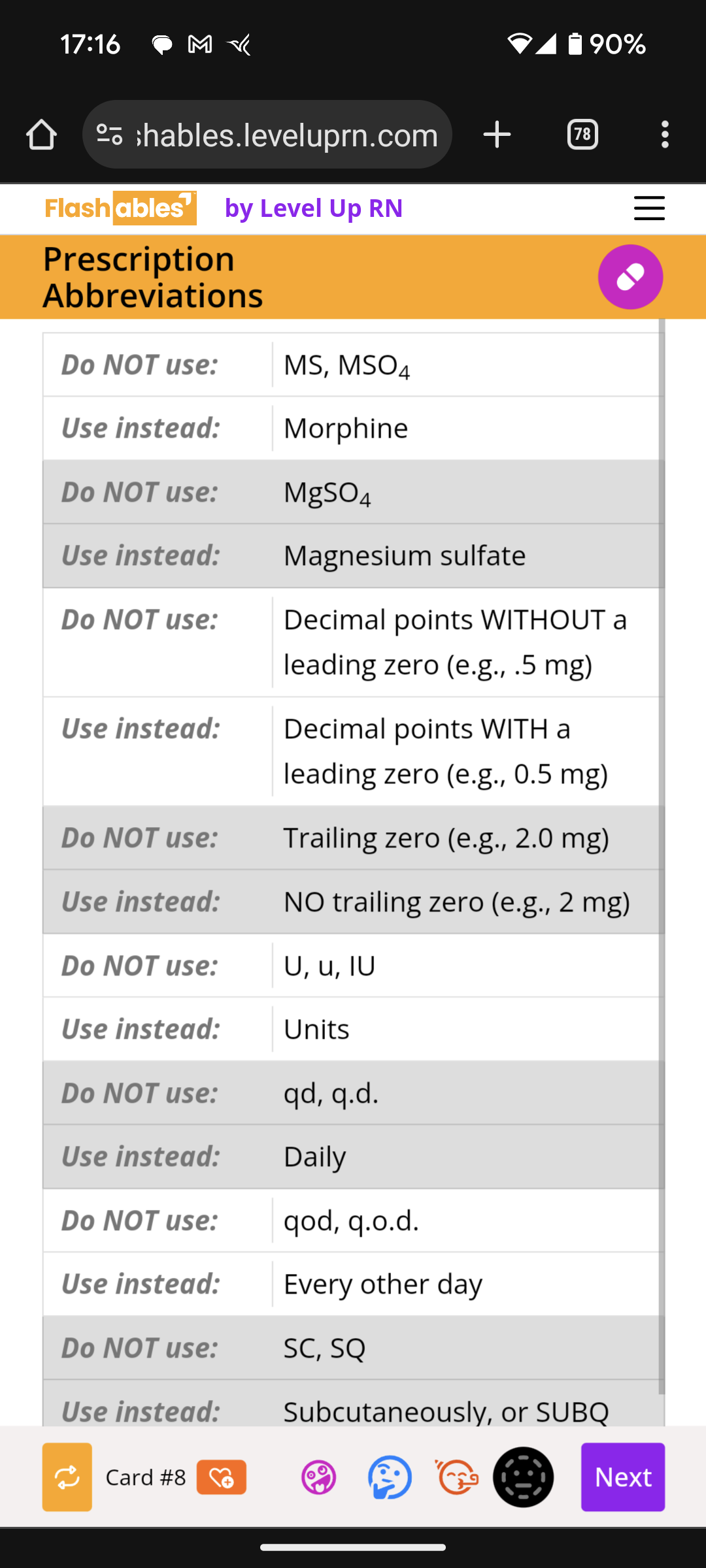
]]>Hi, I’m having a problem on all iPhones, and only iPhones, where the tables aren’t reorganizing themselves correctly. (Both Safari and Chrome). I can tell that the plugin is working because it’s correctly applying the background colors to alternating rows, but the cells within the rows are stacked oddly. See the screenshots below; the wonky one is from an iPhone 14, the correct one is from Pixel 8. This site isn’t publicly available so I can’t share a direct link, unfortunately. Do you have any idea what might cause this? thank you!


Hi,
the plugin does only work, if I deactivate the plugin autoptimize. Is it possible to use both plugins together?
Thank you!
Hi,
I wanted to know if this plugin works alongside TablePress? In one of the support threads someone had mentioned it does, but it’s not working for me. I usually have multiple columns which takes up lot of space and hence I enable horizontal scrolling on TablePress. After installing this, there is no change in how the TablePress tables look. Any help?
Update: Since I posted this question, I could get it working on one article by increasing the setting “Enable on screens smaller than” to 728px.
But it’s not working on others:
Examples:
Working on: https://techpp.com/2023/09/19/best-video-background-noise-remover-apps/
Not working on: https://techpp.com/2023/08/29/best-video-editing-apps-for-ipad/ (check the table at the end)
Result:?Entr��e �� l & # 0 3 9 ;
Bug with apostrophe ( ‘ ) character
Is there a way to make the plugin not recognize the first row as a heading row? My tables don’t have a header row.
Thanks!
]]>Hello and thank you for all the good work you are doing.
I wanted to know how can I get this (see link) when viewing tables in smartphone/tablet.
Basically in the smartphone you only see the first and second column of the table, and it puts the contents of the other columns in the window that opens when you click on “+”
thanks
Massimo<font _mstmutation=”1″></font>
Hi! This is a great plugin, it really works. And I was surprised when it handled both TablePress tables and my manual tables. But my site contains content in categories, including tables, which I would like to make adaptive. Could you add a feature to enable adaptivity in categories?
]]>Hi I am using ACF editor and am allowing customer to copy and paste tables from word but it then on mobile the widths stay as is and I am not sure how to get your plugin to work for that, it didn’t seem to change anything.
Can I please get some help.
Thanks
]]>I have added a class to the table in the editor, but I cannot get it to be excluded from responsive. I have added the class to the options and it won’t turn off.
Also if there is no title bar set for the table it will still use the first row as the one that is being repeated when becoming responsive. So the plugin cannot be used with tables without a titlebar. Would it be possible to add an option to switch off responsive when the table ahs no title bar? This would be extremely helpful.
]]>Hi Nikolay
Thanks for making this plugin! It’s really easy to use and adds crucial functionality for basic tables. Perfect if you don’t need advanced tables but just want your basic tables to be responisve.
I am using your plugin to rewamp my website. My old theme was custom made and I had responisve tables hand coded. Thanks to your plugin I have responsive tables on my new site without custome code.
I have a feature request that I think would make your plugin even better.
It is to add an option to make the content of the cells in the first column become the title for the each section in the mobile view of the table. You can see what it looks like on my old website.
https://www.yogaetmeditationparis.fr/cours-yoga/cours-de-yoga-et-meditation-a-paris/
I think it helps with readability an makes the mobile tables looks better.
Kind regards
/ Christian
]]>Hi, I cant thank you enough for this plugin but some tables doesn’t turn responsive. How can I fix it? Here is an example thank you for your help
]]>Hello,
I have added a table using Gutenberg editor; it’s not responsive, but whenever I add a table using custom HTML, it’s responsive.
If you check the link, you will find a table under the heading “How to Choose the Best Laptops for Homeschooling?” that is not responsive because I used Gutenberg editor for that table.
How to fix it? Please help.
]]>I used the following CSS to give the th (first row in table) a background colour.
table.mtr-table{
border: 1px solid #d1c9b4;
}
.mtr-table td[data-mtr-content]:before,
.mtr-table th[data-mtr-content]:before {
font-weight: 500px;
font-size:16px;
}
table.mtr-table th[data-mtr-content]{
background:#eee5de!important;
}
.mtr-table tr:nth-child(odd) .mtr-td-tag:first-child,
.mtr-table tr:nth-child(even) .mtr-td-tag:first-child {
background: #eee5de; !important;
font-weight: 500;
}`
This worked very well until it suddenly stopped working. No idea why.
In the Settings I have it set to come in at 800px ie for anything under 800px.
However it is now showing on sizes ABOVE 800px and NOT below. Not that I mind it showing on all size screens. That is great too but I need it to show for UNDER 800px as well.
It is so annoying that I actually saw it working at one stage. I must have done something to stop it working but have no idea what.
Thank you. Even without the coloured th it is a great plugin!
]]>Thank you for this fantastic plugin. I have been trying out various responsive methods since I started using Gutenberg. It was so easy to style tables the old way but I ran into trouble using Gutenberg tables.
No longer. This looks so good on mobile.
Thank you!
]]>Great plugin!!!
If I have a link in the table first-row, first-column and your plugin is active, the link is stripped and just the text is displayed.
Is there a way to allow that cell to have a link? Links appear to work in all other table cells.
Thanks for all of your hard work!
]]>Hello, how do i setup this plugin to work with WooCommerce product attribute table? i have long attributes that currently stretches out of the table causing a horizontal scroll. Am hoping this plugin can fix it
]]>Hi,
Thanks for this plugin. It will save us a lot of time with very little overhead.
In the first table I tried it with, the td tags are all left to default as left justified. However, in the responsive mode on the iphone, while the table looks great, the 2nd column, the data, is all right justified.
I tried using inline CSS (style=”text-align:left”) to force it to left justify, but that did not work.
Thanks for your help!
Darryl
]]>I want to use Make Tables responsive for my basic tables, but it also adjusts my tables made using Amalinks Pro.
How can I exclude these tables from inheriting the Make Tables Responsive settings?
Thanks
]]>I tried to use the ��Disable by class�� setting by adding a class to the table I don��t want to be in responsive mode directly from the editor, but still tries to make it responsive and adds a first column to every row on mobiles.
Any help to disable just by class and to avoid this first column would be very appreciated.
]]>Hello
I have bolded the text in the top row, and in the first column, and it appears fine in desktop view (naturally), but in mobile view the formatting is lost in the top row (which becomes the first column)
This is better explained with screenshots, see below
Desktop: https://pasteboard.co/KaHJH8w.png
Mobile: https://pasteboard.co/KaHKVTN.png
Can you let me know how to maintain formatting please?
]]>Hello
I would like to add some cell padding in mobile view but when I enter the following CSS in the wordpress customizer, it also affects desktop view, which I don’t want to change
.mtr-table td {
padding: 20px !important;
}
Can you please let me know how to do this correctly?
]]>hi,
as you can see, when you follow my link, i have table with icons and other thinks. but in vertical view on mobil device, i have just 1 column left and i cant use the table in this mode.
https://lifestylebude.at/image/table.png
left side in my screen you see page without your plugin, right side in screen with your plugin active.
any idea how to fix this?
thanks
]]>As you saw in the image, the blue box is the data I typed,
the table plugin I use is tablepress,
How to remove the red box part,
as its HTML show ::before
Hi,
First of all thanks for the plugin.
I couldn’t find out why not working on our page.
If you can guide I’ll be very happy.
Many thanks & regards.
]]>Hi
Your plugin is very useful and great
I am very happy that such a plugin has been produced
I have an idea for you
I used the ‘Kalin’s PDF Creation Station’ plugin to convert the post to pdf
Unfortunately, this plugin was no longer supported by its developer
This plugin is considered to be the most popular plugin in its time and now
Can you develop and revive it?
I have an html table that is in file that I get using Iframe.
The table gets updated every 30 minutes
Is it possible to make it responsive, I tried adding plugin and
it doesnt work so far.
Hi there, when you have more than a single shortcode in a cell of a table, Plugin seems to remove spaces between processed shortcodes without a proper way to render white-spaces correctly.
]]>the styling suddenly stopped working, and not The odd and even row colors are blue and red.
]]>Not sure why the plug-in does not work with my table on mobile. Please review and advise on what I should do.
https://new.totaldoor.com/about/hardware-and-lite-kits/
Thank you,
Lee
