Print View
-
Hello, Firstly I would like to say thank you for such a great plugin!
Now on to an issue that I have discovered. When a visitor tries to print an article that contains code (displayed via your plugin) it does not print all the code but instead only renders what can be seen on-site.
Is there a way to have it include all the code for the print only version?
To duplicate this issue, visit my site, scroll to the bottom and where the share icons are you can click on the Print button or simply select Print from your browser. Now look at the code section in the print preview.
Hope there is a solution to this other than being told to display all the code in the article as this would make for a massively unreadable article causing the reader to have to scroll past every bit of code before continuing on.
The page I need help with: [log in to see the link]
-
I made an update just now with some sensible defaults. I can help you tweak the styles though if you’d like soemthing a bit different. Just let me know.
Hi Kevin. Excellent timing on the update ??
Checking the print preview now I see I can select all of the code as opposed to it only showing what was onscreen at the time of selecting print. The only suggestion I have is that maybe it would look better (and possibly improve readability) if there was a 1px border around it and maybe an option to alternate the background of the lines between white and a very light grey.
Not sure if this is something that you could add, or if it is something I need to add to my print styles so I will include what I currently have below.
Open to any constructive feedback and/or suggestions to improve this.
/* Clean up output when printing */
@media print {
    * { background: transparent !important; color: black !important; box-shadow:none !important; text-shadow: none !important; -ms-filter: none !important; filter:none !important; }
    a, a:visited { text-decoration: underline; }
    a[href]:after { content: " (" attr(href) ")"; }
    abbr[title]:after { content: " (" attr(title) ")"; }
    .ir a:after, a[href^="javascript:"]:after, a[href^="#"]:after { content: ""; } /* Don't show links for images, or javascript/internal links */
    pre, blockquote { border: 1px solid #999; page-break-inside: avoid; }
    thead { display: table-header-group; } /* h5bp.com/t */
    tr, img { page-break-inside: avoid; }
    img { max-width: 100% !important; }
    @page { margin: 0.5cm; counter-increment: page; content: "Page " counter(page); size: A4 landscape; /* Adjust for larger screens */ }
    p, h2, h3 { orphans: 3; widows: 3; }
    h2, h3 { page-break-after: avoid; }
    .site-logo, .side-header, .main-navigation, .secondary-navigation, .widget-area, .footer-widgets, .sidebar, .social-share, .social-share-links, .entry-meta, .comment-respond, .reply, .edit-link { display: none; } /* Remove unneeded elements */
}
Many thanks
I hesitated to add anytihng more stylistic as it might only look good in 50% of themes, and someone else may have already added styles too that I could break.
It might be tricky to add alternating lines though as the lines with no text don’t actually span 100% the width. I guess you could write some CSS to get that.
For tips on how to select certain things, you can see how I added the styles today. https://github.com/KevinBatdorf/code-block-pro/blob/main/src/front/style.css#L235-L247
Some of the selectors are using CSS specificity tricks as the plugin needs to be a bit aggressive with CSS to account for themes that include code styling. Copying those might help. If you add some and get stuck I can help debug
Cool. Thanks for that and totally understand re: alternating lines.
I would imagine some would moan that it is a waste of ink… Be nice to have a toggle in the settings for this (if you can find a solution to the issue you raised) and the aforementioned border.
Addendum: I did notice when selecting print, the code block is pushed to the start of a new page as opposed to starting directly under the preceding text of the post. Is this something that can be fixed?
-
This reply was modified 7 months, 3 weeks ago by
Bri.
Ah, also just noticed the code doesn’t wrap either which is a fair old problem.
Good point. Can you try adding these styles? https://github.com/KevinBatdorf/code-block-pro/issues/312
Just tested with the new CSS you provided and it does wrap but not correctly. By this I mean it is cutting the edges of any commands that are longer than the edge but then trying to wrap other lines…
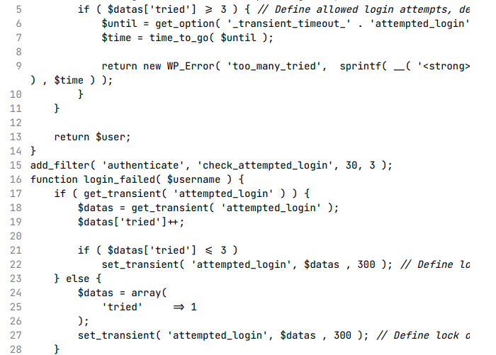
Here is an image showing what I mean:

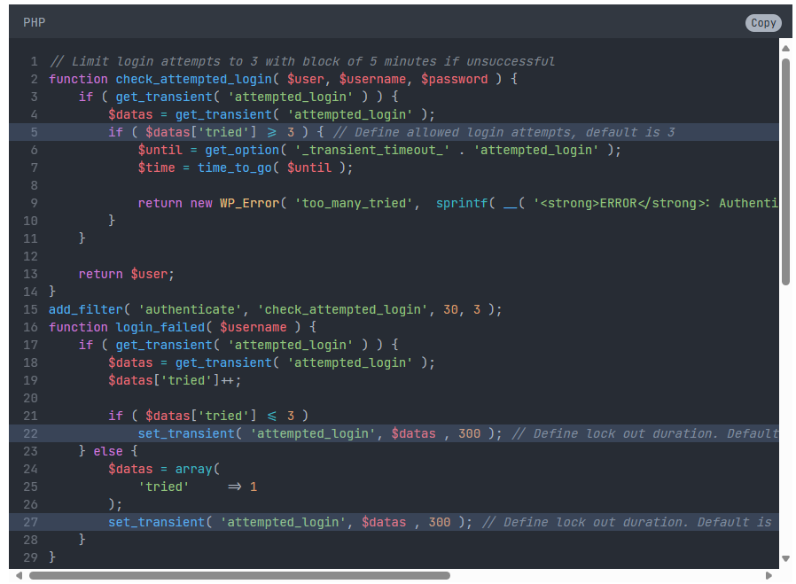
Line 5 is clipped but it shows fully in the post:

Lines 22 and 27 are longer than the container but are also clipped. Only thing that links these three lines (5,22, and 27) is that they are all highlighted.
The only Line 9 that tried to wrap was line 9 but this isn’t highlighted so there is a visible pattern to the issue.
return new WP_Error( 'too_many_tried', sprintf( __( '<strong>ERROR</strong>: Authentication limit reached, you will be able to try again in %1$s.' ) , $time ) );Hope that helped.
Can you try white-space instead? I updated that GitHub post with an example. I won’t be able to look at it more closely until next week
Still cutting lines short, and now also removing formatting.
This is what it is supposed to look like:

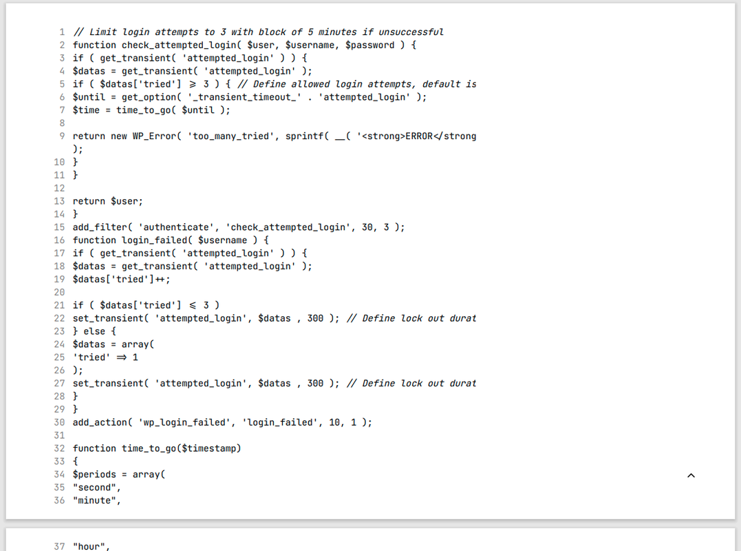
This is what I get in print preview:

Can you try
pre-wrapinstead ofnormal?Also, it might just be more readable for print and non-print to keep the max line length within your container length. That way your user doesn’t have to scroll back and forth to comprehend the code. Most are comments that could go on the line above too. Especially when printing, as the wrapping loses a bit of clarity as well.
To clarify, you’d like the CSS to be as follows in my @media print section?
.wp-block-kevinbatdorf-code-block-pro:not(#x) pre code { white-space: pre-wrap !important; } // Added for Code Block Pro Plugin

.wp-block-kevinbatdorf-code-block-pro:not(#x) .line { min-width: 0 !important; } // Added for Code Block Pro Plugin
Also, it might just be more readable for print and non-print to keep the max line length within your container length.
I do not know how to define the above. Please advise.
I think that looks right but not easy to tell by looking at it. Ar eyou comfortable with the Chrome devtools? You can look at this guide for how to enable print styles to better debug without havign to actually press the print command
https://stackoverflow.com/questions/9540990/using-chromes-element-inspector-in-print-preview-mode
For the readability, I just meant to edit your code to put the comments on the line above, so there isn’t any overflow outside the viewport. You’d just manually edit your code (so not just for print). It’s a design choice though so it’s up to you. Just it’s what i would do is all (so one guy’s opinion! ??)
Yeah I’m ok with the dev-tools. That is what I’ve been using.
Re: Comments in the code. I tend to add comments on the line before unless it is for a specific bit that needs to offer instructions and would not make sense to have either before/afterwards.
You’ll notice that some line are not comments, but are in fact large lines of code. As an example, line 9 is as follows:
return new WP_Error( 'too_many_tried', sprintf( __( '<strong>ERROR</strong>: Authentication limit reached, you will be able to try again in %1$s.' ) , $time ) );This in itself though defeats the purpose of this thread though, which is not to ask ‘everyone’ that uses this plugin to alter how they choose to format/show their code, but to try and make it work with a generic function offered by all browsers.
With the CSS you suggested applied, it looks like this:

Note that line 9 is not being correctly shown. You can also see other lines (5 in this example) also suffer the same issue.
As a side note, is there not a way in the plugin to set/restrict the width as you can with the length? Might be an idea to add this (if not there already and I have just missed it). Might also be a nice way to hook in to this function when printing to limit the width before wrapping when an @media print is called.
If you try the print preview on this page then you’ll see even the WP folks haven’t got a solution in place to print code blocks… With this in mind, it may make sense to have your plugin simply add a message before/after advising the reader that there may be issues with truncated lines and to visit the source website to obtain any code displayed.
There is no way to restrict the width currently as it breaks other features. It’s something I may do in the future but it’s low priority because I don’t think it’s a very good experience (but I’m happy to give some custom CSS to help anyone who wants it)
For the line length comment, yes that was specifically for this case, but it’s also a general web recommendation to keep lines around 80 characters. You can few that here: https://www.w3.org/WAI/WCAG21/Understanding/visual-presentation.html
When I visit your site now it looks like the line wrapping is working (via the devtools emulation), but when I press cmd + P it still is cut off. Not sure why. Do you see that difference?
-
This reply was modified 7 months, 3 weeks ago by
- The topic ‘Print View’ is closed to new replies.