• Resolved abitofmind

    (@abitofmind)


    WordPress ships with this CSS rule: figure { margin: 0 0 1em; }

    Which the the WP core containers then modify through various selectors :where(body .is-layout-* modifying various margin-* attributes resulting in images having a margin bottom of 0 usually, also if wrapped within core containers.

    Greenshift on the other hand does not opt?in to the core layout type (in this constellation at least) and hence the images inside the <figure> element have this undesired bottom gap:

    This CSS fixes it:

    .wp-block-greenshift-blocks-container .wp-block-image { margin: 0; } 
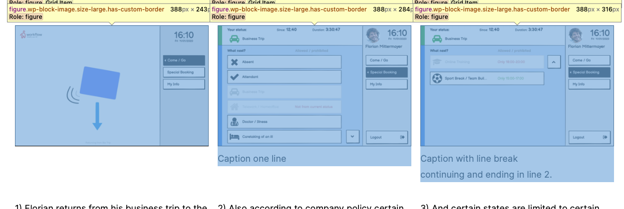
    Please include that to your plugin so that all other users who wrap core images within Greenshift containers also benefit from not having this uncontrollable bottom gap.

    • This topic was modified 1 year, 3 months ago by abitofmind.
    • This topic was modified 1 year, 3 months ago by abitofmind.
Viewing 6 replies - 1 through 6 (of 6 total)
  • Thread Starter abitofmind

    (@abitofmind)

    Offtopic: The above posting should contain 2 images. Please try to reload the page should you not see the image.

    Dropbox which has worked reliable for over a decade for me for embedding images/videos into public forums, has recently changed the Dropbox Link architecture and API, and I and other users, who got this partial rollout, have massive problems, since then!

    Plugin Author wpsoul

    (@wpsoul)

    Hi. Currently, I was not able to find any kind of hard coded margins in image block

    https://monosnap.com/file/PcSzu7t8HJtVNHltpRA67GbhET7DON

    Thread Starter abitofmind

    (@abitofmind)

    A native image block wrapped within a Greenshift container block really has figure { margin: 0 0 1em; } on it, and that 1em margin-bottom may be whatever it is in that context, for me in the screenshot above: 18px . This was confirmed by official Gutenberg developers @jasmussen and @t-hamano and is visible in my screenshots above (Greenshift 6.6.1, WordPress 6.3, Gutenberg 16.4.0).

    To remedy this:

    1. Either include a CSS fix:

    .wp-block-greenshift-blocks-container .wp-block-image { margin: 0; }

    2. Or check the possibilities to opt in to core layout if adequate.

    • This reply was modified 1 year, 3 months ago by abitofmind.
    Thread Starter abitofmind

    (@abitofmind)

    If you don’t see the screenshots, please hard reload this forum thread page. (Embedded images from Dropbox, has had issues these days).

    Plugin Author wpsoul

    (@wpsoul)

    Ok, I think I didn’t understand you correctly in first time. You have problem with core image block, but we prefer to keep core blocks untouched and without hard coded changes to them. You can use Image block of greenshift, it has no margins

    Thread Starter abitofmind

    (@abitofmind)

    Ok, when I use the core image block within a Greenshift container I will apply my custom CSS fix.

    And I may also consider using an Greenshift image block within a Greenshift container. When I use the Image Processor: WP Responsive (srcset) I get the benefits of the core image block and then can use the extra features of Greenshift.

    Another such benefit of using a dedicated Greenshift image block would be the possibility to offer extra controls when nested within a Greenshift container, as I proposed here: Greenshift Image block gets grid item UI controls when within CSS grid container.

Viewing 6 replies - 1 through 6 (of 6 total)
  • The topic ‘WP Image Block wrapped in Greenshift Container should not have bottom margin’ is closed to new replies.