Viewing 3 replies - 1 through 3 (of 3 total)
  • Moderator Kathryn Presner

    (@zoonini)

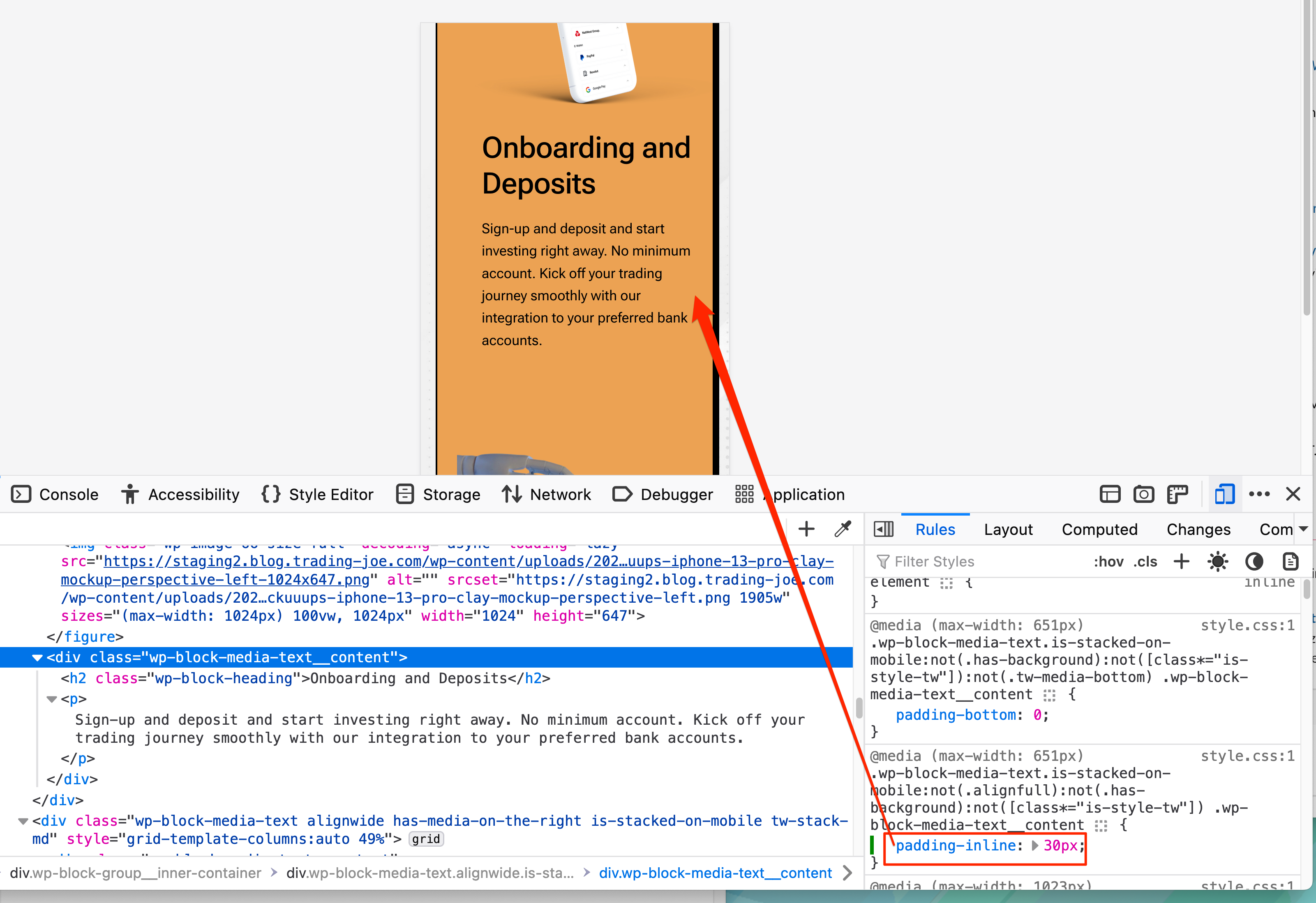
    Hi @claus90 – are you referring to the issue where the text in your column hits the right edge of the browser window on smaller screens?

    That seems to be coming from your Twentig plugin. If I manually change the value of some CSS coming from the plugin to 30px, the spacing looks better.

    Is there a spot in your plugin where you can make that change without needing to add custom CSS?

    Thread Starter claus90

    (@claus90)

    No, I can’t change it from the plugin unfortunately.

    Moderator Kathryn Presner

    (@zoonini)

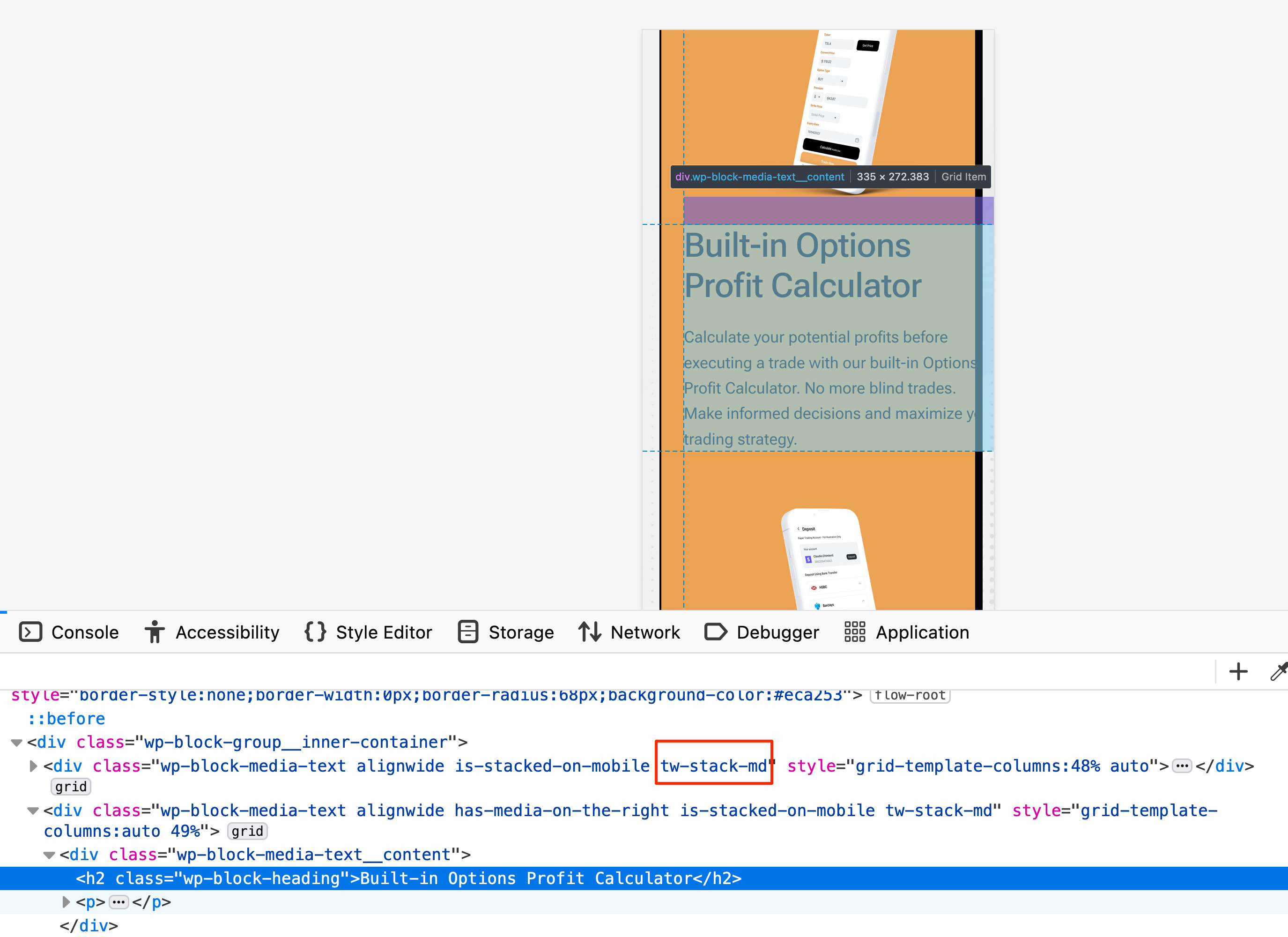
    OK, then you’ll need to report this to the Twendig folks, since this is not something in the theme. They will be able to look into this glitch and provide a fix or a workaround.

    Here’s how the Media & Text block looks with their tw-stack-md class on it:

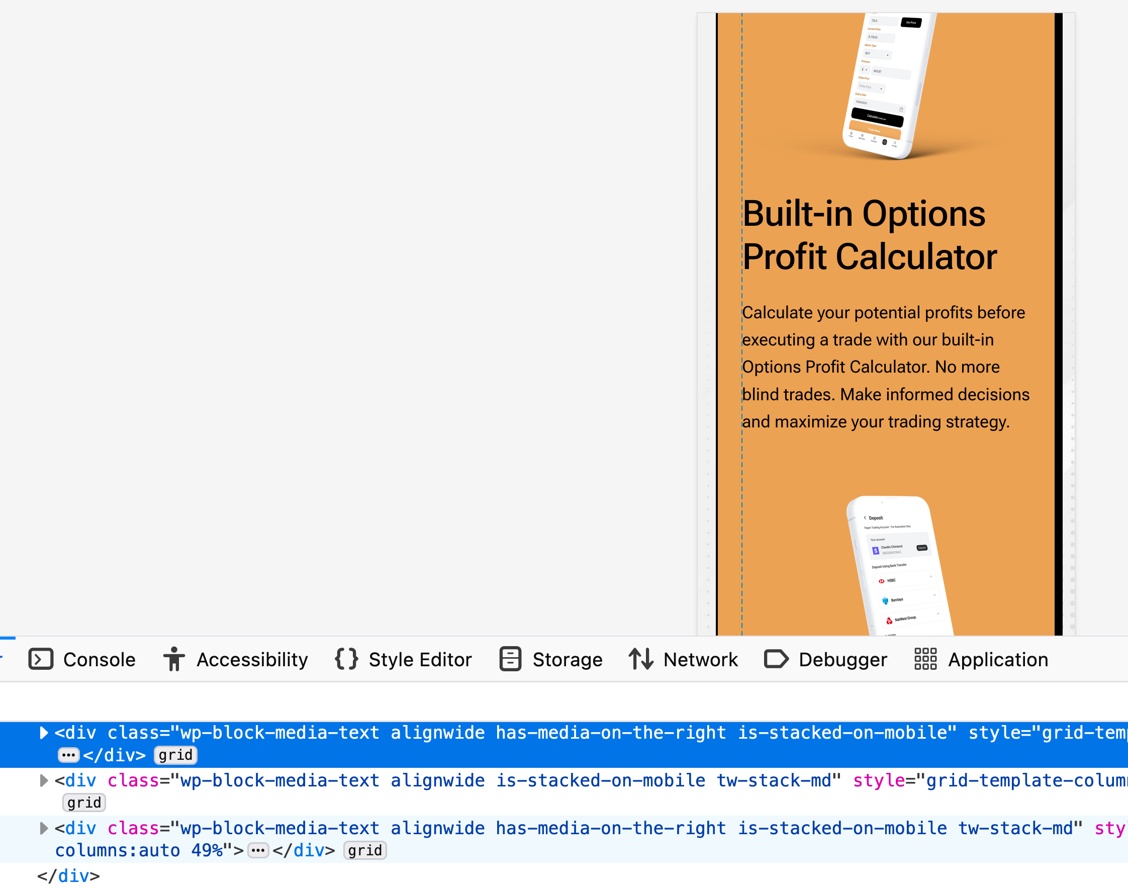
    Removing that class fixes the issue:

Viewing 3 replies - 1 through 3 (of 3 total)
  • The topic ‘Columns not responsive on mobile’ is closed to new replies.