Separate header template for mobile view
-
Is it possible to have a separate header template for mobile view? Preferably, I both want a smaller logo, no slogan, a small menu and a hamburger menu for the mobile view.
It’s quite common in classic (not-FSE) themes to have a different header for mobile view, this should be possible for FSE themes as well.
-
Hi, @audunmb – great questions!
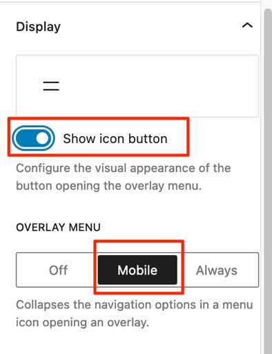
You can choose a hamburger menu for mobile in the Navigation Block settings, where it’s called an “Overlay” option. Here’s what it looks like.
As for reducing the logo size and hiding the slogan (tagline) on mobile, there aren’t currently options for that built into the Site Editor, but it could be achieved with custom CSS.
For example, something this should work to hide the tagline and reduce the logo size on smaller screens. You can change that 782px breakpoint as you prefer.
@media screen and ( max-width: 782px ) {
  /* Tagline - hide on smaller screens */
  .wp-block-site-tagline {
    display: none;
  }
  /* Logo - reduce size on smaller screens */
  .custom-logo {
    max-width: 70px;
  }
}
If the link to your Customizer is hidden, you can still access it by adding
/wp-admin/customize.phpafter your URL.I think that it’s in the plans to add more mobile-specific options to various blocks the editor itself in the future as Full-Site Editing matures, but for now, CSS is a workaround that’s still available.
Thanks for your answer. I was a aware that hamburger menu was an option, but I don’t want a hamburger menu only (it’s bad for UX), I want a short menu and an extended menu (where the hamburger is good).
CSS hacks is also possible solution, but doesn’t fix the menu issue. It can fix size of the logo image, but often you have different versions of a logo for different sizes and uses. A separate header for mobile view would be a much better solution.
Do you (or anyone else) know if there’s anything on the roadmap for separate mobile view templates?
Currently, for instance the popular Neve theme (not FSE) has a header builder which allows for different headers in mobile view.
I think something similar should be a rather obvious thing to do.
And maybe not only for headers and footers, but for all templates. The UX on mobile is different, so you need different templates.
Some things you may want to hide or move (CTA buttons, graphical elements, banners, etc), some things you may want to make smaller or tighter to get a better view on mobile. Many custom blocks already have options for mobile view, adding that to the whole editing interface should be obvious.
Thanks for all the feedback!
Do you (or anyone else) know if there’s anything on the roadmap for separate mobile view templates?
It looks like there are indeed some good discussions going on over in the Gutenberg GitHub repository about the best way to improve responsiveness and device-specific editing going forward. Here are two issues you might like to keep an eye on:
https://github.com/WordPress/gutenberg/issues/19909
https://github.com/WordPress/gutenberg/issues/34641
If you create a GitHub account, you can click the “Subscribe” button on the right to follow any issues you’re interested in.
Hi @audunmb,
I ended up here while looking for the ability of having a different header logo for mobile (vs desktop) in the 2022 WP theme. My solution for now is adding a second image (for mobile) to my header. Both logo images are inside a vertical stack that’s inside a cover image. I added a class for each image and for the cover image in advanced, then used CSS to toggle the logos on/off, and to control the way the cover background image reacts. Here’s my CSS. It works perfectly. But… (see below)
.header-cover{
	background-size: contain !important;
	min-height: auto;
}

.logo-mobile {
	display: none;
}

@media screen and (max-width: 782px) {
	.header-cover {
	background-size: cover !important;
	}
		.logo-mobile {
			display: unset;
	}
		.logo-wide {
			display: none;
	}
}
But… it would make more sense to have a mobile/non-mobile/all display option for templates as you asked about.
Related to this, FSE’s preview should respect that setting, as well as any custom CSS (which it ignores currently) as it does in the customizer preview. As it is now, I get to look at 2 logo images stacked in my header in the FSE editor.
@hyssop – thanks for sharing your CSS workaround. It would be ideal to have these settings in the editor itself, and hopefully that’s something that will be available in the future as FSE becomes more mature.
@zoonini I agree. I think the simplest way would be template (and template part) controls that would allow for mobile and non-mobile visibility (toggle for one, the other, or both).
@hyssop Yes, it will definitely be interesting to see how future mobile templates and settings will be developed in FSE. Do feel free to share your thoughts on the relevant GitHub issues.
I’ll mark this thread as resolved for now but if there are other questions about mobile options in Twenty Twenty-Two, folks are welcome to start a new thread!
I’m attempting to place an above-header advertisement that will appear on mobile only.
My site uses the JNews theme, so I attempted using the Customizer under JNews: Advertisement Option > Header Ads > Above Header Advertisement. However, this resulted in the ad appearing above the header on desktop as well as mobile.
Is there another way, via header.php or CSS, to allow an above-header ad on mobile only?
@larryborowsky This thread is about Twenty Twenty-Two, and is already resolved. I’m not seeing your theme in the www.remarpro.com theme repo, so there wouldn’t be a support forum here. I suggest you try their support portal:
- The topic ‘Separate header template for mobile view’ is closed to new replies.

