Word wrap/text size on customize phone preview
-
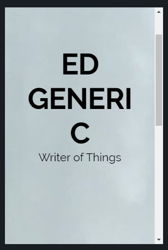
Created a website using your theme with the name “Ed Generic”. In customize, previewed the site at phone size. The above URL is a screenshot of the result. Fortunately, this is not an accurate simulation of how it appears on a phone screen, because the latter looks fine. Unfortunately, it’s not an accurate simulation of how it appears on a phone screen, because it is supposed to be accurate. I suspect it’s resizing the text based on the width of the window including scrollbar?
The page I need help with: [log in to see the link]
- The topic ‘Word wrap/text size on customize phone preview’ is closed to new replies.
