Use the Archive Title block to display the name of the Category, Tag, or custom Taxonomy, on the archive pages.
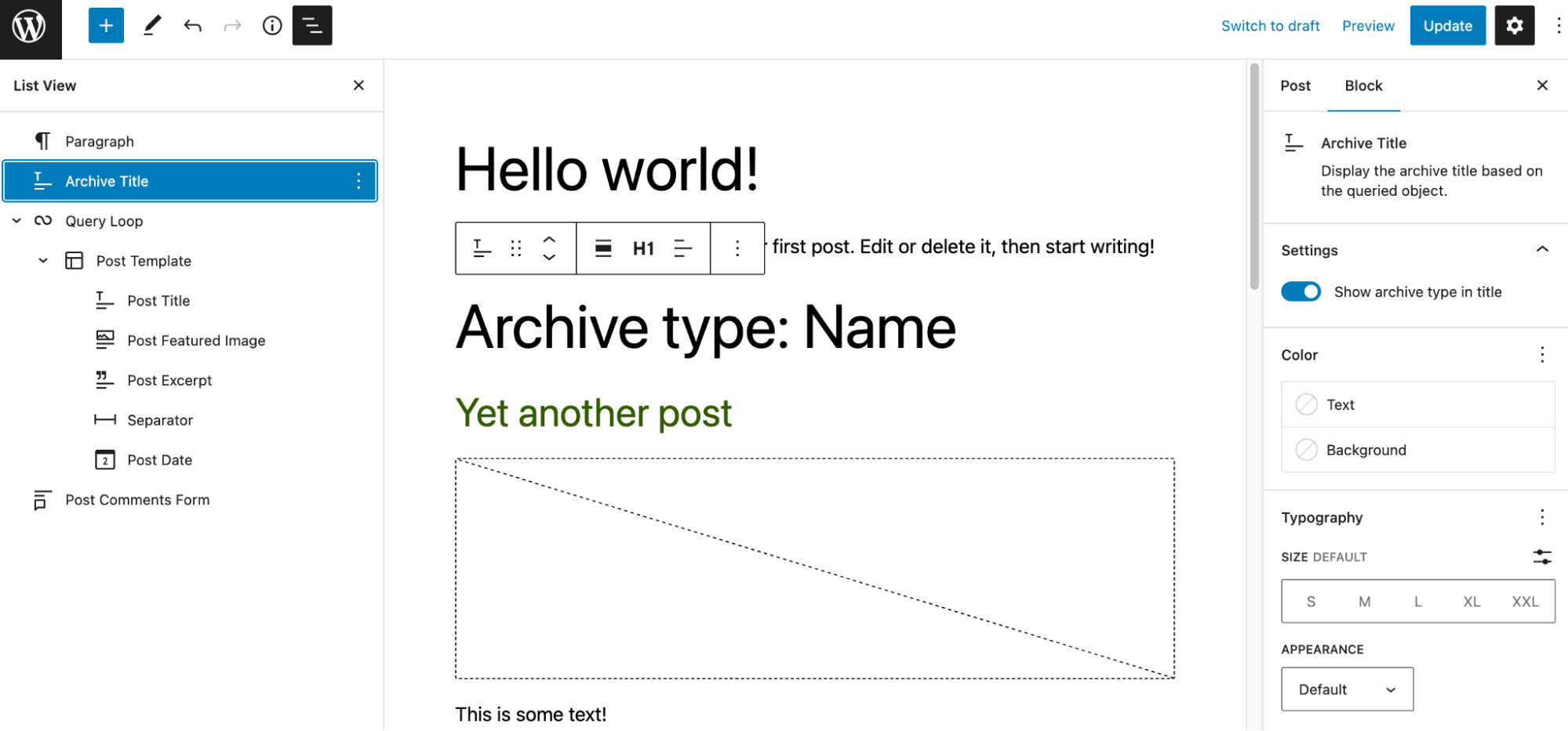
Note: This block works only in the archive pages and will not be visible on other pages of the website. This block should be used only in the Site Editor to edit the archive page templates.
To add an Archive Title block, click the Block Inserter icon when editing the archive page template. Search for the Archive Title block. Click on it to add the block to your page template.
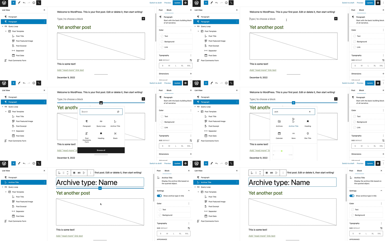
You can also use the keyboard shortcut /archive-title to quickly insert an Archive Title block.
Detailed instructions on adding blocks
Block toolbar
To view the block toolbar, click on the block, and the toolbar will be displayed.

Every block comes with unique toolbar icons and blocks specific user controls that allow you to manipulate the block right in the editor.
The Archive Title block shows seven buttons in the block toolbar:
- Transform to
- Drag icon
- Move arrows
- Change alignment
- Change heading level
- Change text alignment
- More options
Transform to
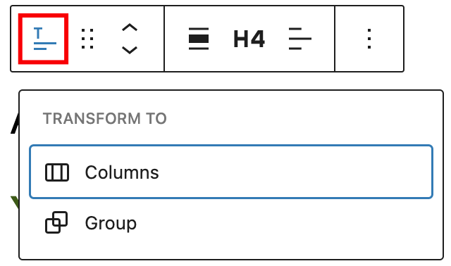
Click on the Transform button to convert the Archive Title block into a Group block or Columns block.
Drag icon

To drag and drop the block to a new location on the page template, click and hold the rectangle of dots, then drag it to the new location. The blue separator line indicates where the block will be placed. Release the left mouse button when you find the new location to place the block.
Move arrows

The up and down arrow icons can be used to move the block up and down on the page.
Get more information about moving a block within the editor.
Change alignment
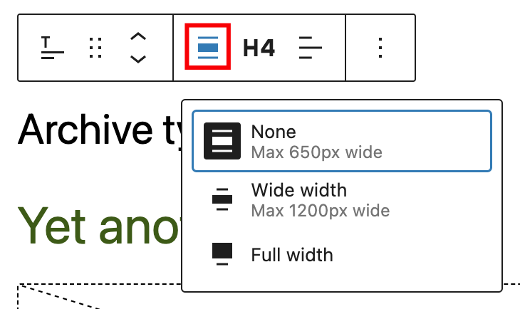
Use the change alignment tool to align the Archive Title block. Choose one of the following options:
- None – Leaves the block the current size.
- Wide width – Increase the width of the block beyond the content size.
- Full width – Extend the block to cover the full width of the screen.
Change heading level

You can choose the heading level for the archive title from H1-H6.
Change text alignment
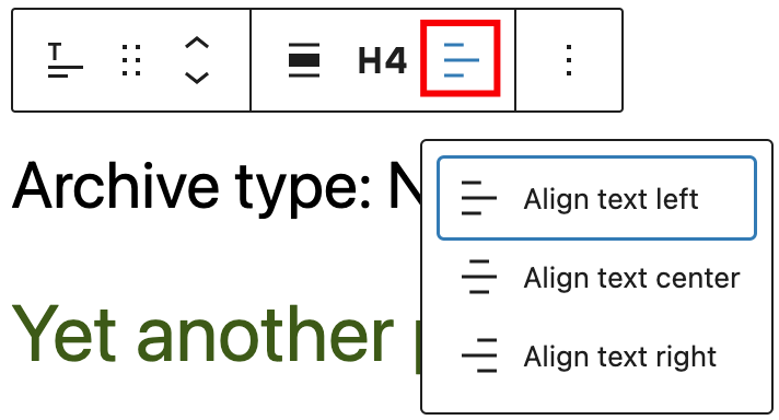
Click the Change alignment button in the block toolbar to display the alignment drop-down. You can align the block text to the left, make it center-aligned or align it to the right.
Options
The Options button on a block toolbar gives you more features to customize the block.
Read about these and other settings.
Block settings
The block settings panel contains customization options specific to the block. To open it, select the block and click the Settings icon next to the Publish button.

Here are the options for the Archive Title block:
Settings
It’s possible to toggle between an option to either show the archive type in the title or not.

An example with this setting enabled:

An example with this setting disabled:

Color
The Archive Title block provides color settings options to change the text and background colors.
See this guide for more information about changing colors.
Typography
The Archive Title block provides typography settings to change the font family, size, appearance, line height, letter case, letter spacing, and decoration.
Get more details about changing typography settings.
Dimensions
The Archive Title block provides dimensions settings options to change padding and margin size.
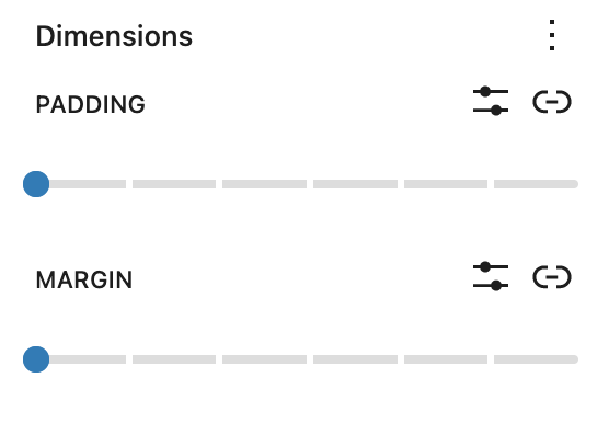
Learn more about dimension controls.
Advanced settings
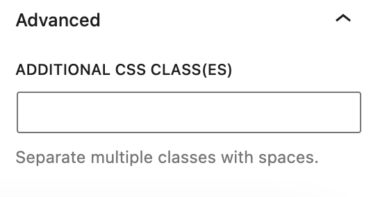
The Advanced tab lets you add CSS class(es) to your block. This will allow you to write custom CSS and styles to the block.
Changelog
- Updated 2023-02-07
- Updated screenshots
- Fixed some formatting
- Created 2022-03-10
Use the Avatar block to display the user’s profile picture on any post, page, or template. Although the block can be added anywhere, the most common use is in the single post template to display the author. Another use case is in the Query Loop block to include the post author’s avatar in the query.

To add the Avatar block, click the Add block button to open the block inserter pop-up window and choose the Avatar block.
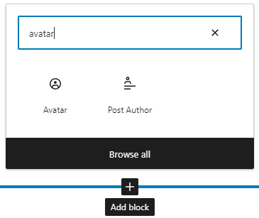
If you want to add one in the Query Loop block, be sure to add it inside the Post Template block.
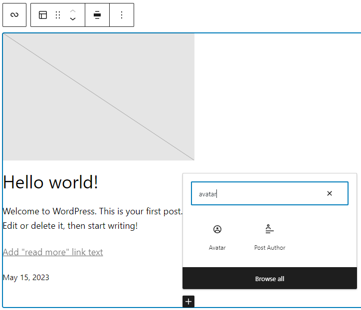
You can also use the keyboard shortcut /avatar to quickly insert an Avatar block.
Detailed instructions on adding blocks
Block toolbar
Every block comes with unique toolbar icons and blocks specific user controls that allow you to manipulate the block right in the editor. To view the block toolbar, click on the Avatar block, and the toolbar will be displayed.

There are six buttons on the Avatar block toolbar:
- Transform to
- Drag icon
- Move arrows
- Align
- Duotone filter
- Options
Transform to

Click on the “Transform” button to convert the Avatar block into a “Group” or “Columns” block.
Drag icon

To drag and drop the block to a new location on the page template, click and hold the rectangle of dots, then drag it to the new location. The blue separator line indicates where the block will be placed. Release the left mouse button when you find the new location to place the block.
Move arrows

The up and down arrow icons can be used to move the block up and down on the page.
Get more information about moving a block within the editor
Align
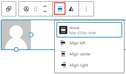
Use the change alignment tool to align the Avatar block. The following is a list of the block align options:
- None
- Align left – make the block left-aligned.
- Align center – make the block alignment centered.
- Align right – make the block right aligned.
Note that the align option is only available if the Avatar block is inside a container block.
Duotone filter

The duotone filter lets you create a two-tone color effect without losing your original image.

Options
The Options button on a block toolbar gives you more features to customize a specific button.
Read about these and other settings.
Block settings
The block settings panel contains customization options specific to the block. To open it, select the block and click the Settings button next to the Publish button.

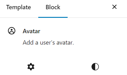
The block settings panel consists of two tabs – Settings and Styles
Settings
You can adjust various settings and add additional CSS classes for the Avatar block. The panel is divided into Settings and Advanced sections.
Settings
Here are the options available in the Settings section:

- Image size – lets you adjust the avatar image size in pixels. There are two ways to do this: the first is by using the slider to fine-tune the size, and the other is by using the pixel field to specify the image size in pixels.
- Link to user profile – enable this toggle option if you want to link the avatar image to the user profile page.
- Open in new tab – enable this toggle option if you want to open the user profile page in a new tab. This option is only available if you enable the Link to user profile option.
- User – select a specific user to be displayed on the Avatar block. If left empty, the block will use the post or page author.
Advanced
In the Advanced section, you will see a field to add additional CSS classes to customize the appearance of the Avatar block. There’s also the Apply globally button if you want to apply the selected block’s settings to all Avatar blocks on your website.

Styles
The Avatar block has two styles settings – dimensions and border.
Dimensions
The Avatar block provides dimension settings options to change padding and margin size.
Learn more about dimension controls.
Border
Border settings provide options to control the width and radius on each side of the button.
Learn more about border settings.
Changelog
- Created 2023-06-27
Use the Categories block to display the posts’ categories. This block is primarily nested inside a query loop block and helps to customize the appearance of the query loop.
To add a Categories block, click the Block Inserter icon when editing the page template. Search for the Categories block. Click on it to add the block to your page template.
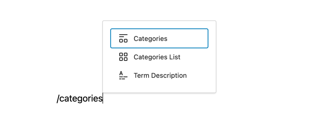
You can also type /categories and hit enter in a new paragraph block to add the Categories block quickly.
Detailed instructions on adding blocks
Block toolbar
To view the block toolbar, click on the block and the toolbar will be displayed.
Every block comes with unique toolbar icons. These block-specific controls allow you to manipulate the block right in the editor.
The Categories block shows five buttons in the block toolbar:
- Transform to
- Drag icon
- Move arrows
- Change text alignment
- More options
Transform to:
Click on the “Transform” button to convert the Categories block into a “Group” block or “Columns” block.
Drag icon:
To drag and drop the block to a new location on the page template, click and hold the rectangle of dots, then drag to the new location. The blue separator line indicates where the block will be placed. Release the left mouse button when you find the new location to place the block.
Move arrows:
The up and down arrow icons can be used to move the block up and down on the page.
Get more information about moving a block within the editor.
Change text alignment:
Click the “Change alignment” button in the Block toolbar to display the alignment drop-down. You can align the block text to the left, make it center-aligned or align it to the right.
More options
These controls give you the option to copy, duplicate, and edit your block as HTML.
Read about these and other settings.
Block settings
In addition to the block toolbar, every block has specific options in the editor sidebar.
If you do not see the sidebar, click the icon next to the Publish button.
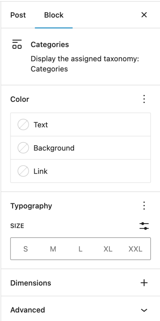
Color
You can customize the text color, background color, and link color for the Categories block. The color options available will vary based on the theme.
See this guide for more information about changing colors.
Typography
On this tab, you can adjust properties such as the Font size, Font family, Appearance, Line height, Letter spacing, Decoration and Letter case.
To access all the typography options click on the + button in the right corner of the Typography tab.
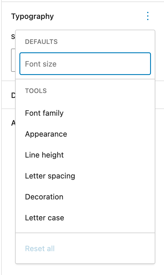
Get more details about changing typography settings.
Advanced settings:
The “Advanced” tab lets you enter character(s) that can be used to separate the category terms. The default setting is a comma.
You can also add CSS class(es) to your block. This will allow you to write custom CSS and styles to the block.
Changelog
- Updated on 2023-06-27
- Renamed ‘Post Categories Block’ with ‘Categories Block’
- Updated screenshots/video to 6.2.2
- Created 2022-03-21
The Comment Author Name block displays the username of the comment’s author. This block is nested inside a Comment Query Loop block and lets you customize the appearance of the comment author’s name.
You can only insert the Comment Author Name Block inside a Comment Template block within the Comment Query Loop block.
Click the (+) icon inside the Comment Template block to open the block inserter pop-up window and search for the Comment Author Name block.
You can also use the keyboard shortcut /comment-name to quickly insert a Comment Author Name block inside a Comment Template block.
Detailed instructions on adding blocks
Block toolbar
The block toolbar contains the tools to customize each block. The Comment Author Name block’s toolbar is relatively simple with the following tools:
Transform to
You can transform a Comment Author Name block into a Columns, or a Group block.

Block-moving tools
Use the block-moving tools to move the block up and down the editor. Use the six dots icon to drag and drop the Comment Author Name block and reposition it anywhere on the editor. Alternatively, click on the up and down arrows to move the block up or down the editor.
Get more information about moving a block within the editor.
Change text alignment
Text alignment options lets you choose to align the author’s name left, center, or right.
More options
Read about these and other settings.
Block settings
The block settings panel contains customization options specific to the block. To open it, select the block and click the cog icon next to the Publish button.
Here are the options for the Comment Author Name block:
Link
In the Link Settings section, you can enable the Link to authors URL option to link the author’s name to their profile page. When you enable it, the Open in new tab option will appear. Enable it if you want the author’s profile page opened in a new tab.
Color
Text and background colors can be set on a per-block basis, allowing you to call attention to important content. Pick a color from the suggestions, or add a custom color using the color picker or by adding a color code.
See this guide for more information about changing colors.
Typography
Typography settings allow you to change a block’s font size, appearance, line height, letter casing, and spacing.
Get more details about changing typography settings.
Dimension
Dimension controls are used to control how groups of blocks are placed alongside one another, by changing the values for padding, margin, and other dimensions
Learn more about dimension controls.
Advanced
The “Advanced” tab lets you add CSS class(es) to your block. This will allow you to write custom CSS and styles to the block.
Changelog
- Created 2022-07-25
The Comment Content block displays the content of a comment. This block is located inside a Comment Query Loop block and lets you customize the appearance of the comment’s content.
You can only insert the Comment Content block inside a Comment Template block within the Comment Query Loop block.
Click the (+) icon inside the comment template block to open the block inserter pop-up window and search for the Comment Content block.
You can also use the keyboard shortcut /comment-content to quickly insert a Comment Content block inside a Comment Template block.
Detailed instructions on adding blocks
Block toolbar
The block toolbar contains the tools to customize each block. The Comment Content block’s toolbar consists of the following tools:
Transform to
You can transform a Comment Content block into a Columns, or a Group block.

Block-moving tools
Use the block-moving tools to move the block up and down inside the editor. Use the six dots icon to drag and drop the Comment Content block and reposition it anywhere on the editor. Alternatively, click on the up and down arrows to move the block up or down the editor.
Get more information about moving a block within the editor.
Change text alignment
Text alignment options let you align the content of a comment towards the left, center, or right.
More options
The More Options menu represented by three vertical dots on the far right of the toolbar gives you more features such as the ability to duplicate, remove, or edit your block as HTML.
Read about these and other settings.
Block settings
Every block has specific options in the editor sidebar in addition to the options found in the block toolbar. If you do not see the sidebar, simply click the ‘cog’ icon.

Here are the options for the Comment Content block:
Color
The comment content block lets you customize the text, and background colors.
Click on any of the options to change the color. Choose from the default color or click the upper rectangle area to pick a custom color using the color picker.
See this guide for more information about changing colors.
Typography
Typography settings allow you to change a block’s font size, appearance, line height, letter casing, and spacing.
Get more details about changing typography settings.
Dimensions
Dimension controls are used to control how groups of blocks are placed alongside one another, by changing the values for padding, margin, and other dimensions

Learn more about dimension controls.
Advanced
The “Advanced” tab lets you add CSS class(es) to your block. This will allow you to write custom CSS and styles to the block.
Changelog
- Created 2022-08-02
The Comment Date Block displays the date on which a comment was posted. This block is located inside a Comment Query Loop block and allows users to edit the appearance of the comment date.
You can only insert the Comment Date Block inside a Comment Template block within the Comment Query Loop block.
Click the (+) icon inside the Comment Template block to open the block inserter pop-up window and search for the Comment Date Block.
You can also use the keyboard shortcut /comment-date to quickly insert a Comment Date block inside a Comment Template block.
Detailed instructions on adding blocks
Block toolbar
The block toolbar contains the tools to customize each block. The Comment Date Block’s toolbar consists of the following tools:
Transform to
You can transform a Comment Date block into a Columns, or a Group block.

Block-moving tools
Use the block-moving tools to move the block up and down inside the editor. Use the six dots icon to drag and drop the Comment Date Block and reposition it anywhere on the editor. Alternatively, click on the up and down arrows to move the block up or down the editor.
Get more information about moving a block within the editor.
More options
The More Options menu represented by three vertical dots on the far right of the toolbar gives you more features such as the ability to duplicate, remove, or edit your block as HTML.
Read about these and other settings.
Block settings
The block settings panel contains customization options specific to the block. To open it, select the block and click the cog icon next to the Publish button.
Here are the options for the Comment Date Block:
Settings
In the Settings tab, you can select the Date format. By turning on the Default format option, you can choose to use the default date format. When this setting is turned off, you can select the preferred date format from the drop-down list or enter a custom date or time format.

You can also turn on/off the ‘Link to comment’ switch. Turning on this button will link the date field to the specific comment.
Color
The Comment Date Block lets you customize the text, background, and link color. Click on any of the options to change the color. Choose from the default color or click the upper rectangle area to pick a custom color using the color picker.

See this guide for more information about changing colors.
Typography
To access all the typography options click on the 3-dot button in the right corner of the Typography tab. You also have the option to Reset all the typography changes you made by clicking on the Reset all option in the dropdown.

Get more details about changing typography settings.
Advanced
The “Advanced” tab lets you add CSS class(es) to your block. This will allow you to write custom CSS and styles to the block.
Changelog
- Created 2022-07-25
The Comment Edit Link block displays a link to edit the comment in the WordPress Dashboard. This block is located inside a Comment Query Loop block and lets you customize the appearance of the Edit link. The Edit link is only visible to users who have permission to edit the comments.
You can only insert the Comment Edit Link block inside a Comment Template block within the Comment Query Loop block.
Click the (+) icon inside the comment template block to open the block inserter pop-up window and search for the Comment Edit Link block.
You can also use the keyboard shortcut /comment-edit-link to quickly insert a Comment Edit Link block inside a Comment Template block.
Detailed instructions on adding blocks
Block toolbar
The block toolbar contains the tools to customize each block. The Comment Edit Link block’s toolbar consists of the following tools:
Transform to
You can transform a Comment Edit Link block into a Columns block, or a Group block.
Block-moving tools
Get more information about moving a block within the editor.
Use the block-moving tools to move the block up and down inside the editor. Use the six dots icon to drag and drop the Comment Edit Link block and reposition it anywhere on the editor. Alternatively, click on the up and down arrows to move the block up or down the editor.
Change text alignment
Text alignment options let you align the Edit button towards the left, center, or right.
More options
The More Options menu represented by three vertical dots on the far right of the toolbar gives you more features such as the ability to duplicate, remove, or edit your block as HTML.
Read about these and other settings.
Block settings
The block settings panel contains customization options specific to the block. To open it, select the block and click the cog icon next to the Publish button.
Here are the options for the Comment Edit Link block:
Link
In the Link Settings section, you can enable the open in new tab option, and if enabled, will open the link editing page in a new tab.
Color
The Comment Edit Link block lets you customize the background and link color.
Click on any of the options to change the color. Choose from the default color or click the upper rectangle area to pick a custom color using the color picker.
See this guide for more information about changing colors.
Typography
Typography settings allow you to change a block’s font size, appearance, line height, letter casing, and spacing.
Get more details about changing typography settings.
Advanced settings
The “Advanced” tab lets you add CSS class(es) to your block. This will allow you to write custom CSS and styles to the block.
Changelog
- Created 2022-08-17
The Comment Reply Link block displays a link to reply to a comment. This block is located inside a Comment Query Loop block and lets you customize the appearance of the Reply link.
You can only insert the Comment Reply Link block inside a Comment Template block within the Comment Query Loop block.
Click the (+) icon inside the comment template block to open the block inserter pop-up window and search for the Comment Reply Link block.
You can also use the keyboard shortcut /comment-reply-link to quickly insert a Comment Reply Link block inside a Comment Template block.
Detailed instructions on adding blocks
Block toolbar
The block toolbar contains the tools to customize each block. The Comment Reply Link block’s toolbar consists of the following tools:
Transform to
You can transform a Comment Reply Link block into a Columns block or a Group block.
Block-moving tools
Use the block-moving tools to move the block up and down inside the editor. Use the six dots icon to drag and drop the Comment Reply Link block and reposition it anywhere on the editor. Alternatively, click on the up and down arrows to move the block up or down the editor.
Change text alignment
Text alignment options let you align the Reply button towards the left, center, or right.
More options
The More Options menu represented by three vertical dots on the far right of the toolbar gives you more features such as the ability to duplicate, remove, or edit your block as HTML.?
Read about these and other settings.
Block settings
The block settings panel contains customization options specific to the block. To open it, select the block and click the cog icon next to the Publish button.
Here are the options for the Comment Reply Link block:
Color
The Comment Reply Link block lets you customize the background and link color.
Click on any of the options to change the color. Choose from the default color or click the upper rectangle area to pick a custom color using the color picker.
See this guide for more information about changing colors.
Typography
Get more details about changing typography settings.
Advanced
The “Advanced” tab lets you add CSS class(es) to your block. This will allow you to write custom CSS and styles to the block.
Changelog
- Created 2022-08-17
The Comment Template block is a part of the Comments block. It contains block elements to display comments, such as the comment author, avatar, and comment content.
How to use the Comment Template Block
When you add a Comments block, the Comment Template block is included by default. Also, you can only insert a Comment Template block inside a Comments block. Since the Comment Template is a part of the Comments block, the content will change on the front-end depending on the query.
To add a Comment Template block, click the block inserter icon (+) inside the Comments block to open the block inserter pop-up window and search for the Comment Template block.
You can also use the keyboard shortcut /comment-template to insert a Comment Template block quickly.
Check the detailed instructions on how to add a block here.
When the Comments block is added in the post editor, the Comment Template block will display the actual comments on the post and use a “No results found” placeholder when there’s no comment on the post yet.

Block toolbar
To view the block toolbar, click on the block, and the toolbar will be displayed.
Every block has unique toolbar icons and blocks specific user controls that allow you to manipulate the block right in the editor.
The Comment Template block shows the following buttons:

- Select Comments block
- Transform to
- Drag icon
- Move arrows
- Align
- More options
Select Comments block
This button will select the Comments block, as it’s the parent block of the Comment Template block.
Transform to
When you click the Transform button, you can convert the Comment Template block into another block type using the existing content.
Block-moving tools
Use the block-moving tools to move the block up and down inside the editor. Use the six dots icon to drag and drop the Comment Template block and reposition it anywhere on the Comments block. Alternatively, click on the up and down arrows to move the block up or down the editor.
Get more information about moving a block within the editor.
Change alignment
The change alignment tool is used for the Comment Template block’s position inside the Comments Query Loop block. Choose one of the following block alignment options:
- None
- Align left
- Align center
- Align right
Options
The Options button on a block toolbar gives you more features to customize the block.
Read about these and other settings.
Block settings
The block settings panel contains customization options specific to the block. To open it, select the block and click the Settings button next to the Publish button.

Typography
Typography settings allow you to change a block’s font size, appearance, line height, letter casing, and spacing.
Get more details about changing typography settings.
Dimensions
The Comment Template block provides dimension settings options to change padding and margin size.
For details, refer to this support article: Dimensions Settings Overview.
Advanced
The Comment Template block only has Advanced settings in the block settings panel. The “Advanced” settings tab lets you add CSS class(es) to your block. This will allow you to write custom CSS and styles to the block.
Changelog
- Updated 2023-04-11
- Added “no results found” placeholder
- Updated 2023-04-05
- Updated images for 6.2
- Added dimensions support
- Created 2022-08-19
The Comments block is an advanced block that displays post comments with various visual configurations. It contains multiple blocks to show comments, such as Comments Title, Comment Template, Comment Pagination, and Post Comments Form. With the Comments block, adding a comment section to your posts becomes effortless.
To add the Comments block, open the block inserter by clicking the (+) icon on the upper left corner of the editor. After that, look for Comments using the search bar and click it to insert the block into the editor.
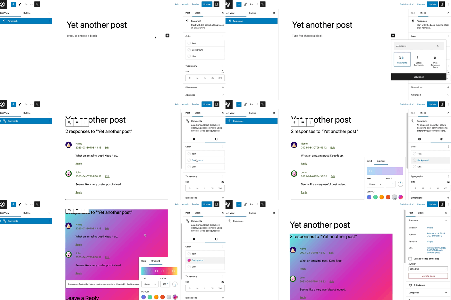
Alternatively, you can type /comments on the editor to insert the Comments block manually.
Detailed instructions on adding blocks can be found here.
Block toolbar
Most blocks have their own block-specific controls that allow you to manipulate the block right in the editor.
The Comments Block shows the following buttons:
- Transform to
- Moving handles
- Change alignment
- More options
Transform to

The Transform to button lets you change the Comments block into a Columns or a Group block.?
Moving handles

The dotted icons can be used to drag and drop a block to the place of your choosing. The up and down arrow icons can be used to shift a block up and down in your document.
Get more information about moving a block within the editor.
Change alignment
You can modify the alignment of the Comments block using this tool. Click on the icon and select one of the following alignment options:
- None
- Wide width – Increase the width of the block beyond the content size.
- Full width – Extend the block to cover the full width of the screen.

When you transform the Comments block into a Columns block, the toolbar will show an additional tool called Change vertical alignment with three options:
- Align top – makes the block top-aligned.
- Align middle – lets you align the block to the center.
- Align bottom – makes the block right-aligned.

Options
The Options button on a block toolbar gives you more features to customize the block.?
Read about these and other settings.
Block settings
The block settings panel contains customization options specific to the block. To open it, select the block and click the Settings button next to the Publish button.

It’s possible to change the Color, Typography, and Dimensions settings. To access them, open the Styles section:

Color
The Comments block provides color settings options to change the text and background colors.
For details, refer to this support article: Color settings overview
Typography
The Comments block provides typography settings to change the font family, appearance, line height, letter spacing, decoration, letter case, and font size.
For details, refer to this support article: Typography settings overview
Dimensions
The Comments block provides dimension settings options to add padding and margin.
For details, refer to this support article: Dimension settings overview
Advanced

Additional CSS Class(es)
The Comments block provides advanced settings for adding CSS class(es), allowing you to style the block using custom CSS code.
HTML Element
Use this feature to select an HTML element in the Comments block.
Changelog
- Updated 2023-05-09
- Updated for WordPress 6.2 update
- Updated 2023-03-07
- Fixed the link to Comment Pagination block page
- Updated 2023-01-10
- Added dimension settings
- Created 2023-01-04