The classic block looks just like the classic editor, but it’s in block form. Custom TinyMCE buttons are found in this block.
In order to add a classic block, click on the Block Inserter icon.
You can also type /classic and hit enter in a new paragraph block to add one quickly.
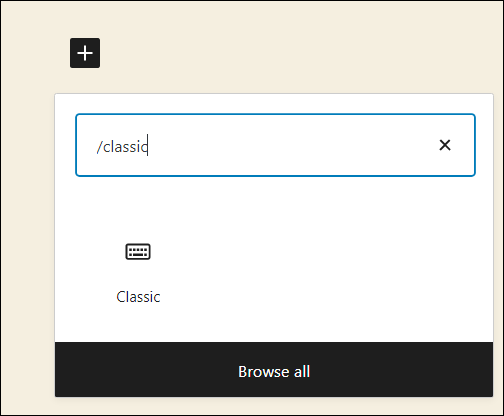
Detailed instructions on adding blocks can be found here.
Block Toolbar
Each block has its own block-specific controls that allow you to manipulate the block right in the editor.

Convert to blocks
Selecting this option will convert the content to blocks.
More Options
These controls give you the option to copy, duplicate, and edit your block as HTML.
Read about these and other settings.
Classic editor toolbar
Once you add the block, you can edit the text you add as you would in the classic visual editor, using the tools provided.
Block Settings
While most blocks have specific options in the editor sidebar in addition to the options found in the block toolbar, the classic block does not have any additional options.
Changelog
- Updated 2023-06-08
- Minor design changes for accessibility and addition of ‘back to list of blocks’ link at top.
- Updated 2023-03-31
- Updated screenshot of the block
- Added a link to the More Options overview.
- Updated 2020-12-1
- Added Changelog
- Updated: 2020-11-27
- screenshot of toolbar
- Updated 2019-11-27
- added video
- Created 2019-03-07
Code block lets you add and display code snippets for others to view.
Code block example:
if ( condition ) {
    action1();
    action2();
} elseif ( condition2 && condition3 ) {
    action3();
    action4();
} else {
    defaultaction();
}
To add the Code block, open the block inserter by clicking the (+) icon on the upper left corner of the editor. After that, look for Code using the search bar and click it to insert the block into the editor.
Alternatively, you can type /code on the editor to insert the Code block manually.

Detailed instructions on adding blocks
Block toolbar
Most blocks have their own block-specific controls that allow you to manipulate the block right in the editor.
The Code Block shows the following buttons:
- Transform to
- Moving handles
- Bold
- Italic
- Link
- More Rich Text controls
- More options

Transform to
The Transform to button lets you change the Code block into a Paragraph, Columns, Group, Custom HTML or Preformatted blocks.

Transforming the Code block into Group will give you the ability to change the background color around the code.

Moving handles
The dotted icons can be used to drag and drop a block to the place of your choosing. The up and down arrow icons can be used to shift a block up and down in your document.

Get more information about moving a block within the editor.
Change alignment

The change alignment tool lets you align the Code block within the content. You can choose one of the following alignment options:
None: Leaves the block alignment as is.
Wide width: Increase the block’s width beyond the content size.
Bold

You can select the text in the Code block and use the Bold option or Ctrl+B / Cmd+B on your keyboard to bold it, which is usually heavier than the surrounding text.
Italic

You can select the text in the Code block and use the Italic option or Ctrl+I / Cmd+I on your keyboard to italicize it, which usually appears slanted to the right.
Link

Use the link icon to hyperlink the highlighted text inside the Code block.
Read about more link editing options.
More rich text options
The drop-down menu to the left of the More options menu contains a range of additional rich text editing options such as highlighting, inline code, strikethrough, and more.
Read about more rich text editing options.
More options
The Options menu represented by three vertical dots on the far right of the toolbar gives you more features such as the ability to duplicate or remove the block.
Read about these and other settings.
Block settings
The block settings panel contains customization options specific to the block. To open it, select the block and click the Settings button next to the Publish button.

Color
The Code block provides color settings options to change the text and background colors.
For details, refer to this support article: Color settings overview
Typography
The Code block provides typography settings to change the font family, appearance, line height, letter spacing, decoration, letter case, and font size.
For details, refer to this support article: Typography settings overview
Dimensions
The Code block provides dimension settings options to add padding and margin.
For details, refer to this support article: Dimension settings overview
Border
The Code block provides border settings options to add border color, width, and radius.
For details, refer to this support article: Border settings overview
Advanced
The Advanced tab lets you add HTML anchor and CSS class(es) to your block.

HTML anchor allows you to make a unique web address for a particular Code Block. Then, you’ll be able to link directly to a Code Block of your page.
The Additional CSS class(es) lets you add CSS class(es) to your block, allowing you to write custom CSS and style the block as you see fit.
Changelog
- Updated 2024-03-26
- Add wide align support
- Update videos and screenshots for 6.3
- Updated 2023-08-09
- Replaced the link section with short summary linking to new dedicated page.
- Updated 2023-06-08
- Replaced “More rich text options” section with short summary linking to new dedicated page for rich text editing options.
- Updated 2023-06-02
- Screenshots for 6.2
- Revised formatting
- Added transform to paragraph support
- Updated 2021-02-27
- Added Typography option
- Updated 2020-09-13
- Screenshots and video as per WordPress 5.5
- Added feature changes in Block Toolbar
- Added feature changes in Block Settings
- Created 2019-03-07
The Details block displays a text summary and an arrow button: When you click on the text or the button, the block opens and reveals additional content on the page.
This block provides a way to show or hide content on your site. This can be useful on faq pages, showing /hiding detailed event information etc.
The Summary is customizable by selecting the “Write summary…” placeholder text and adding your own text.
The additional content are blocks that you place inside the Details block that are hidden until you click on the summary text or the button. Because the content is hidden until you open the block, it is referred to as “hidden content”.
Closed state:
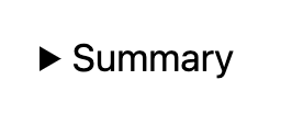
Open state:

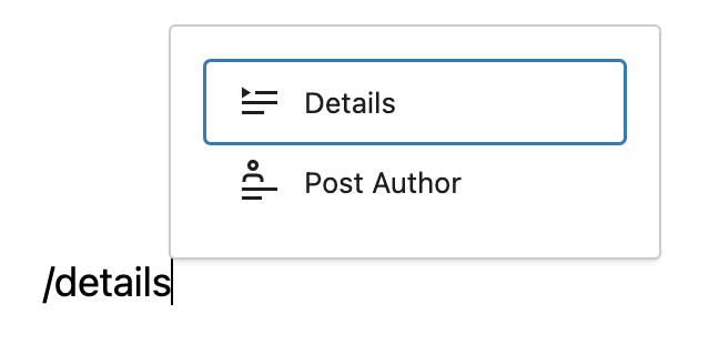
To add a Details block, click on the Block Inserter (+) and select the Details block.
You can also type /details and hit enter in a new paragraph block to add one quickly.
Block toolbar
Every block comes with unique toolbar icons and block-specific user controls that allow you to manipulate the block right in the editor.
The Details block shows five buttons in the block toolbar:
- Transform to
- Drag icon
- Move arrows
- Change alignment
- Options

Transform to
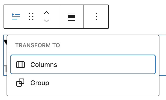
Click on the transform button to place the block inside a group or columns block.
Drag

To drag and drop the block to a new location on the page template, click and hold the rectangle of dots, then drag to the new location. The blue separator line indicates where the block will be placed. Release the left mouse button when you find the new location to place the block.
Move

The up and down arrow icons can be used to move the block up and down on the page.
Detailed instructions on moving a block within the editor can be found here.
Change alignment

Change the alignment of the block to none, wide, or full width.
Options
The Options menu represented by three vertical dots on the far right of the toolbar gives you more features such as the ability to duplicate or remove the block.
Details about More options can be found in this support article.
Settings
The block settings panel contains customization options specific to the block. To open it, select the block and click the Settings button next to the Publish button.

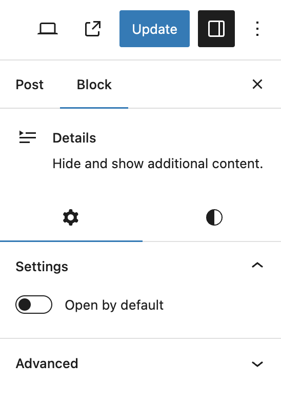
Open by default
Enabling this option keeps the block open and the hidden content will be disaplay until closed.
Advanced
The Advanced tab lets you add CSS class(es) to your block. This will allow you to write custom CSS and styles for the block.

Styles
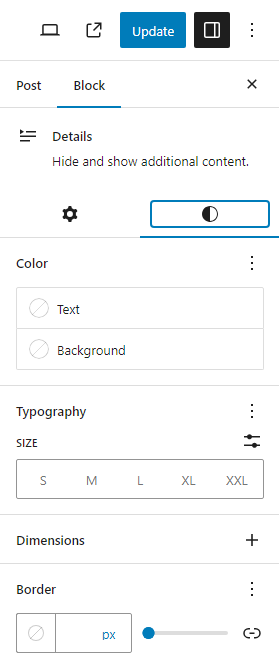
Color
The block provides dimension settings options to add text, background, and link color.
For details refer to this support article: Color settings overview
Typography
The block provides typography settings to change the font family, appearance, line height, letter spacing, decoration, letter case, and font size.
For details refer to this support article: Typography settings overview
Dimensions
The block provides dimension settings options to add padding and margin.
For details refer to this support article: Dimension settings overview
Border
The block provides border settings options to add border color, style, width, and radius.
For details refer to this support article: Border settings overview
Changelog
- 2024-06-13 Updated video to 6.5 version
- 2023-12-05 Headings case resolved
- Created 2023-08-08
Adding the Footnotes Block
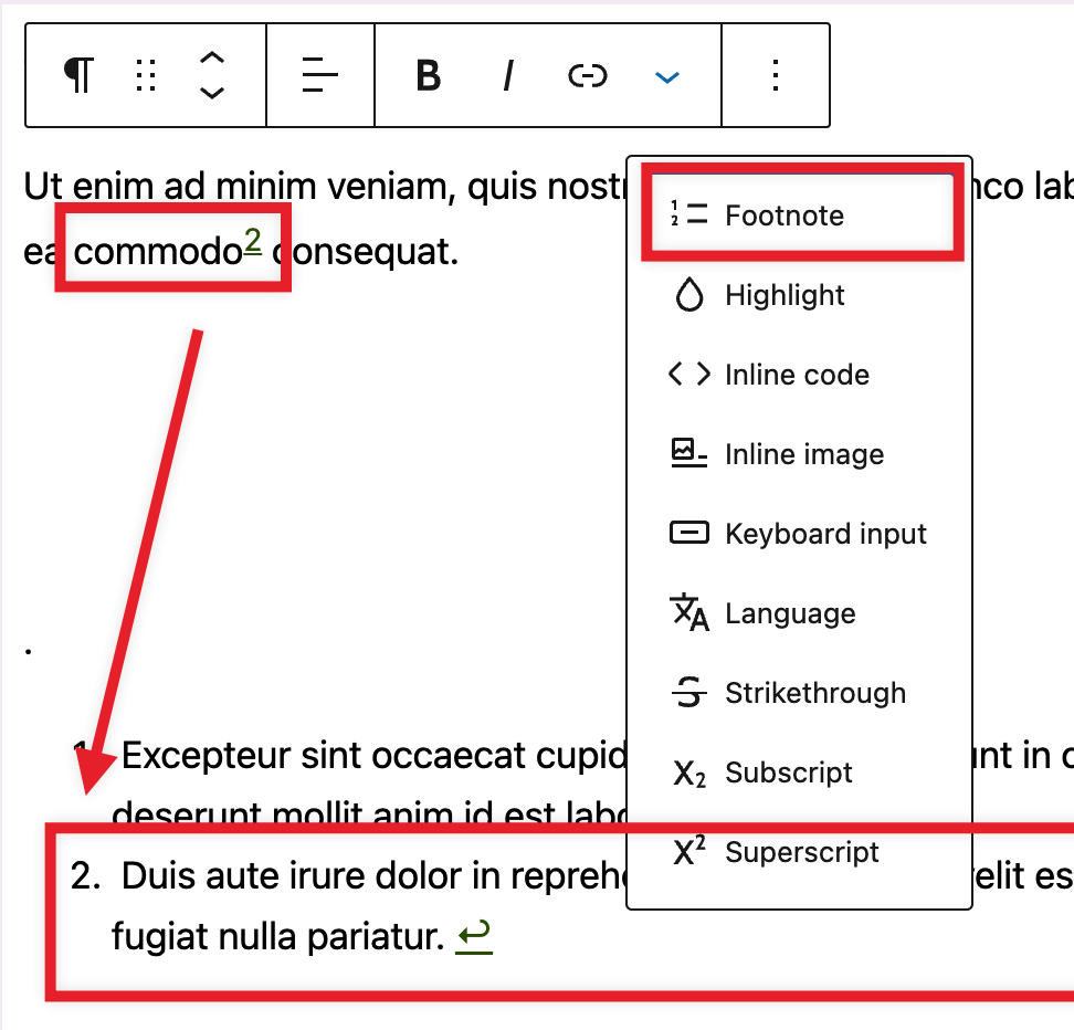
The Footnotes block will be added to your page or post as soon as you insert your first note using the Rich Text option. This new block works like other blocks and it can be moved around and removed.
From 6.4, the Footnotes block can be removed, a provision has been made to make re-insertion easier. Additionally, the footnotes block is now displayed in the inserter for improved discoverability. It will show even if anchors are not yet inserted into the content. This modification strеamlinеs and improvеs thе discovеrability of thе Footnotеs block, with thе wider goal of crеating a morе usеr-friеndly еxpеriеncе.
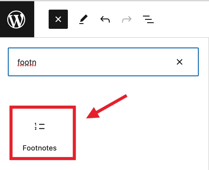
The text in the placeholder is a starting point, future refinements may include instructions on how to insert anchors.
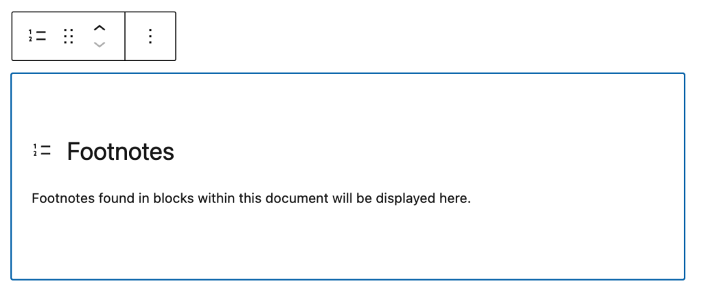
The user experience was enhanced in the most recent update by giving placeholder instructions for scenarios where the Footnotes block is not available for custom post types. This enhancement seeks to provide users with clearer guidance by providing instructions when the Footnotes block is missing in specified instances.

Adding Footnote blocks to templates is also not possible at the moment but it is being explored.
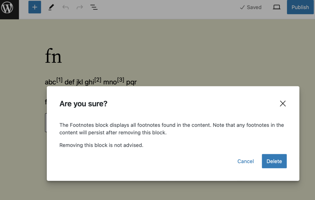
Attempting to remove a Footnotes block triggers a warning regarding its removal and its impact. It advises that footnote references in the content area will continue to show if the block is removed. The user is required to confirm the deletion request before the block is deleted.
Adding individual notes
To add new notes, highlight some text and open the “Rich Text” menu. Then select the “Footnotes” option.
Notes are automatically linked to the original text and include a “go back” link for convenience.
If you move your blocks around after having added notes, the numbers and order of the notes will be automatically updated to match the changes you made.
Customize the Footnotes Block
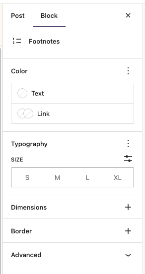
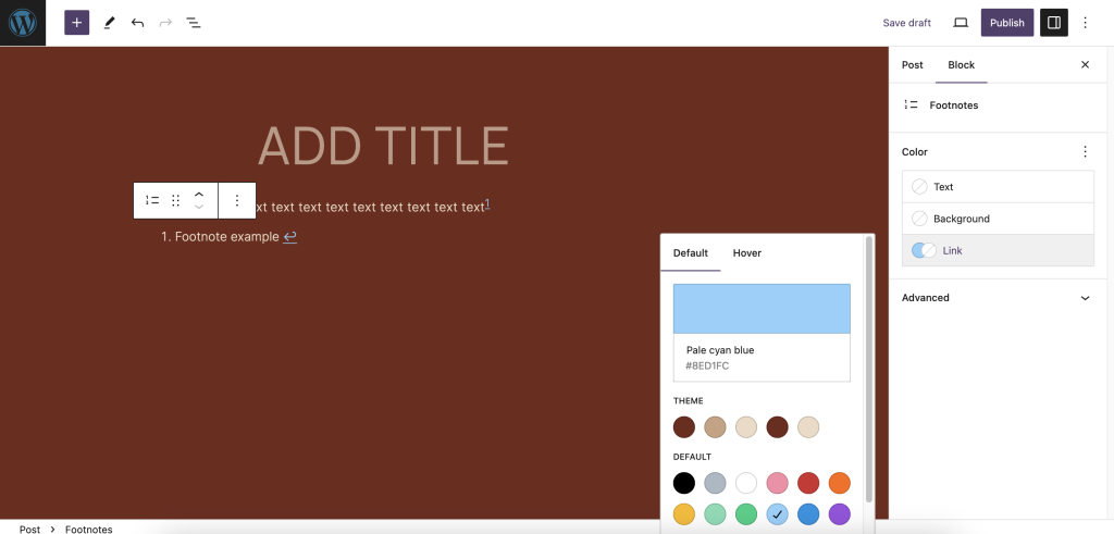
The Footnotes block has been improved with more design flexibility in this release. The block now has settings for typography, dimensions, and border control. Color support has been adjusted, with link and text now being the default, rather than background and text. These modifications attempt to give users more flexibility when it comes to modifying the Footnotes block.
Changelog
- Updated 2023-12-12
- Updating content for WordPress 6.4
- Created 2023-08-08
Headings help to introduce new sections and organize the content on the page. They make your website more readable by humans and search engines.
To add a heading, click on the Block Inserter (+). Alternatively, you can type /heading in a new paragraph block and press enter.
You can also add a Heading block with H1 heading level by typing /h1 in a new paragraph block followed by enter. Subsequent heading blocks can be added by typing /h2, /h3, /h4, /h5, /h6 followed by enter.
The Block editor by default considers the page title as the <h1> tag, so subsequent Heading blocks are added as H2, H3, and so on.
You can also choose your heading level according to your style from the Block Toolbar.

Another shortcut method to add a heading is to type ##space to add H2 heading, ###space to add H3 heading, etc.
Detailed instructions on adding blocks
Block toolbar
Each block has its own block-specific controls that allow you to customize the block right in the editor. The Heading block offers the following options in its toolbar:
- Transform to
- Drag icon
- Move handles
- Change alignment
- Change heading level
- Change text alignment
- Bold
- Italic
- Link
- More rich text controls
- More options

Transform to
When you click on the Transform button you can convert the Heading block into a Paragraph, List, Quote, Columns, Pullquote, or Group block.

Drag icon

To drag and drop the block to a new location on the page template, click and hold the rectangle of dots, then drag to the new location. The blue separator line indicates where the block will be placed. Release the left mouse button when you find the new location to place the block.
Move handles

The up and down arrow icons can be used to move a block up and down on the page.
Get more information about moving a block within the editor.
Change alignment
Using the alignment drop-down from the toolbar, you can make the Heading block wide width or full width. The wide-width and the full-width align options are only available if your theme supports them.

Change heading level
You can change the heading levels from H1 through H6 from the block toolbar.

Change text alignment

Using the alignment drop-down from the toolbar, you are able to align the whole heading text to the left, make it center-aligned or orient it to the right.
Bold
Use the Bold option or Ctrl+B / Cmd+B on your keyboard to bold it, which is usually heavier than the surrounding text.
Italic
Use the Italic option or Ctrl+I / Cmd+I on your keyboard to italicize it, which usually appears slanted to the right.
Link
Use the link icon to insert a hyperlink to the highlighted heading text.
Read about more link editing options.
More rich text options
The drop-down menu to the left of the More options menu contains a range of additional rich text editing options such as highlighting, inline code, strikethrough, and more.
Read about more rich text editing options.
More options
These controls give you the option to copy, duplicate, and edit your block as HTML.
Read about these and other settings.
Block Settings
Every block has specific options in the editor sidebar in addition to the options found in the block toolbar. If you do not see the sidebar, click the cog icon next to the Publish or Update button.

Color
You can customize the text color, and background color, for the Heading block. The color options available will vary based on the theme.

See this guide for more information about changing colors.
Typography
Typography settings allow you to adjust the Font size, Appearance, Letter case, Line height, and Letter spacing.

Get more details about changing typography settings.
Dimensions
Dimension controls are used to control how groups of blocks are placed alongside one another, by changing the values for padding, margin, and other dimensions
Learn more about dimension controls.
Advanced
In the advanced panel of the block options, you’ll see options for HTML Anchor and Additional CSS Class.

“HTML anchor” allows you to make a unique web address for a particular Heading block. Then, you’ll be able to link directly to the Heading block of your page.
The “Additional CSS class(es)” lets you add CSS class(es) to your block, allowing you to write custom CSS and style the block as you see fit.
Changelog
- Updated 2023-03-07
- Added missing ALT tag for text alignment image
- Updated 2023-08-09
- Replaced the link section with short summary linking to new dedicated page.
- Updated 2023-06-08
- Replaced “More rich text options” section with short summary linking to new dedicated page for rich text editing options.
- Updated 2022-06-22
- Updated content and screenshots for 6.0
- Added ALT tags for the images
- Updated 2022-02-04
- Added further update for WP 5.9
- Updated 2021-02-28
- Added images and updated for WP 5.7
- Updated 2020-08-27
- Added images for WP 5.5
- Updated 2020-06-18
- Added ‘Link back to blocks’ to the top of the page
- Added the ‘Changelog’
- Created 2019-03-07
Organizing content into lists has just gotten easier. You can use the List Block to create a bulleted or numbered list.
In order to add a List Block, click on the add block button and select the List Block.
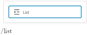
You can also type /list and hit enter in a new paragraph block to add one quickly.
Detailed instructions on adding blocks can be found here.
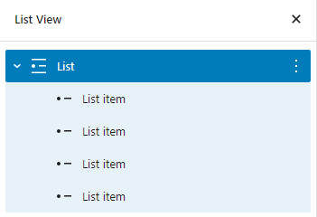
Each List Item inside the List block is a block that can be edited and moved. List Items can also be selected in the List View.
Block toolbar
Every block comes with unique toolbar icons and block-specific user controls that allow you to manipulate the block right in the editor.
The List Block shows these standard buttons:
- Transform to
- Block moving tools
- Unordered list
- Ordered list
- Indent
- More options

The List Item shows the following buttons:
- Block moving tools
- Outdent list item
- Indent list item
- Bold
- Italic
- Hyperlink
- More rich text controls
- More options

Transform to
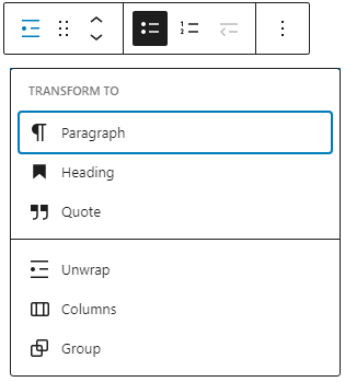
You can transform the List Block into the Paragraph Block, Heading Block, Quote Block, Columns or Group. You can unwrap list items and replace the list with the individual blocks using the Unwrap option.
Block moving tools

The up and down arrow icons can be used to shift a block up and down in your document.
Detailed instructions on moving a block within the editor can be found here.
Unordered list

An unordered list typically is a bulleted list of items. You can use unordered list where you do not need to display items in any particular order.

Ordered list

An ordered list typically is a numbered list of items. You can use ordered list where you need to display items in a particular order.

Outdent list item

Select the List Item. You can use the Outdent list item option or Backspace key on your keyboard to decrease the indentation level of a list item.
Indent list item

Select the List Item. You can use the Indent list item option or Space key on your keyboard to increase the indentation level of a list item.
Bold

You can select the text of a list item and use the Bold option or Ctrl+B / Cmd+B on your keyboard to bold it, which is usually heavier than the surrounding text.
Italic

You can select the text of a list item and use the Italic option or Ctrl+I / Cmd+I on your keyboard to italicize it, which usually appears slanted to the right.
Hyperlink
You can select the text of a list item and use the Hyperlink option or Ctrl+K / Cmd+K on your keyboard to add a link to it.
Read about more link editing options.
More rich text options
The drop-down menu to the left of the More options menu contains a range of additional rich text editing options such as highlighting, inline code, strikethrough, and more.
Read about more rich text editing options.
More Options
The Options menu represented by three vertical dots on the far right of the toolbar gives you more features such as the ability to duplicate or remove the block.
Read about these and other settings.
Block settings
Every block has specific options in the editor sidebar in addition to the options found in the block toolbar. If you do not see the sidebar, click the cog icon next to the Publish or Update button.

Ordered list settings

If you choose a numbered list, you can select the number your list starts at. This is useful if you want your list to start at a number other than 1.

You can also reverse the numbers of the list to start at the highest number first.

Color
The List Block provides Color settings options to change the text, background, and link colors.
For details refer to this support article: Color settings overview
Typography
The List Block provides typography settings to change the font family, appearance, line height, letter spacing, decoration, letter case, and font size.
For details refer to this support article: Typography settings overview
Dimensions
The List Block provides dimension settings options to add padding and margin.
For details refer to this support article: Dimension settings overview
Advanced
The Advanced tab in the List Block and List Items lets you add HTML anchor and CSS class(es) to your block.

HTML anchor allows you to make a unique web address for a particular List Block. Then, you’ll be able to link directly to a List Block of your page.
The Additional CSS class(es) lets you add CSS class(es) to your block, allowing you to write custom CSS and style the block as you see fit.
Changelog
- Updated 2023-08-09
- Replaced the link section with short summary linking to new dedicated page.
- Updated 2023-06-08
- Replaced “More rich text options” section with short summary linking to new dedicated page for rich text editing options.
- Updated 2022-11-29
- Updated sidebar screenshots
- Linked to Color, Dimension, and Typography overview pages and removed content from here
- Linked to More options page and removed content from here
- Updated the More rich text controls screenshot and content.
- Updated 2022-11-01
- Added information about the list item block.
- Screenshots and updates as per WordPress 6.1.
- Updated 2021-02-27
- Added Typography option
- Updated 2020-12-06
- Added Color settings in Block Settings
- Updated 2020-09-24
- Screenshots and video as per WordPress 5.5
- Added feature changes in Block Toolbar
- Added feature changes in Block Settings
- Updated 2020-06-18
- Added “Go back to the list of Blocks” to the top of the page
- Created 2019-03-07
The Paragraph block is a basic building block that allows you to add text content to a post or page. It is the default block that appears when you create a new post or page.
Besides adding text, the Paragraph block offers various formatting options to customize text content. It lets you make the text bold, italics, and strikethrough. Additionally, you can add links, inline images, and highlights to the text content.
The Paragraph block also supports keyboard shortcuts for text formatting, making creating and customizing content easier. For example, you can convert texts into headings using keyboard shortcuts: Alt + Shift + Number 1-6. The numerical keyboard shortcuts represent Heading 1 to Heading 6. If you want to change them back to texts, press Alt + Shift + 0.
Learn more about the text formatting keyboard shortcuts.
To add a Paragraph block, create a new post or page and open the Block Inserter tool. Look for the Paragraph block using the search bar and click on the icon to insert the block into the editor.
You can also choose the Paragraph block from the “Block Inserter” (+) pop-up window when you click on the (+) sign.
Get detailed instructions on adding blocks.
Block toolbar

Each block has its own block-specific controls that allow you to manipulate the block right in the editor. If you hover over the buttons, tooltips will tell you what is behind the buttons, and also show you keyboard shortcuts when available.
The block toolbar for the paragraph block shows these buttons:
- Transform to
- Block-moving tools
- Change text alignment
- Bold and Italics
- Insert links
- More rich text controls
- Options
Transform to

The Transform to button lets you convert the Paragraph block into Heading, List, and Quote blocks. Additionally, you can transform the text content into Columns, Pullquote, Code, Group, Preformatted, and Verse blocks. Using one of these tools also changes the text’s appearance or style.
Block-moving tools

Use the block-moving tools to move the Paragraph block.
The drag or six dots icon allows you to freely reposition the block anywhere within the editor by holding the icon and dragging it to the new location.
You can also use the arrow icons to move the block up or down within the group of nested blocks or when there are multiple blocks.
Get more information about moving a block within the editor.
Change text alignment
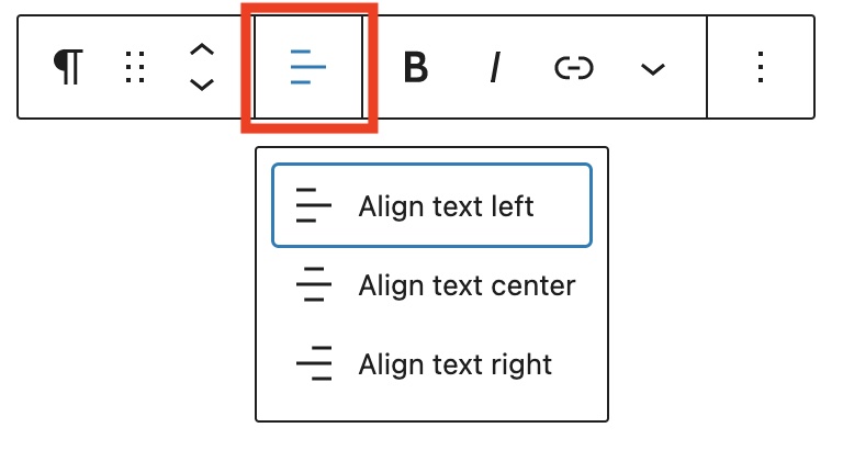
Use the Change text alignment tool to modify the alignment of the Paragraph block. Select the icon to display the alignment dropdown menu. You can align the text to the left, make it center-aligned, or orient it to the right.
Bold and italics

The Bold and Italics formatting options are used to customize the text in the Paragraph block. You can also use keyboard shortcuts to enable these text formatting:
- Ctrl + B or Command + B to bold the text.
- Ctrl + I or Command + I to italicize the text.
Insert links
The Insert links tool lets you add a hyperlink to the selected text.
Read about more link editing options.
More rich text options

The drop-down menu to the left of the More options menu contains a range of additional rich text editing options such as highlighting, inline code, strikethrough, and more.
Read about more rich text editing options.
More options
The More Options menu represented by three vertical dots on the far right of the toolbar gives you more features such as the ability to duplicate, remove, or edit your block as HTML.

Read about these and other settings.
Block settings

WordPress blocks have specific configuration options in the block settings panel. To access the Paragraph block settings panel, click the Settings button at the top-right corner of the editor. Here is a list of the Paragraph block settings options:
Color
Text and background colors can be set on a per-block basis, allowing you to call attention to important content. Using the Color settings, you can customize the block by adding text, background, and link colors.
See this guide for more information about changing colors.
Typography
The Typography settings enable you to customize the font and text appearance of the content within the Paragraph block. The settings have various options, such as font size, font style, font family, and letter spacing.
Get more details about changing typography settings.
Dimensions
The paragraph block provides various options to adjust its dimensions, such as width and height, allowing you to customize the text layout to ensure visual consistency.
For details refer to this support article: Dimension settings overview
Advanced
The Advanced tab lets you add HTML anchor and CSS class(es) to your block.

The Advanced settings let you add an HTML anchor and CSS class(es) to the Group block.
The HTML anchor settings let you make a unique anchor text for the Group block and link it to another web page. For more detail, refer to Page Jumps.
The Additional CSS class(es) enables you to write custom CSS class(es) to the Group block, so you can style the block as you see fit.
Changelog
- Updated 2024-05-14
- Replaced the long GIF with a video to provide better usability. This allows readers to rewatch missed parts, skip sections, etc.
- Fixed: The first image in “Lock Settings” was outdated.
- Corrected: Changed “links, inline images, and highlight” to “links, inline images, and highlights” to match plural form.
- Corrected: “The paragraph block provides options for dimension settings”.
- Corrected: Clarified whether the paragraph block ensures consistency.
- Corrected: The “Advanced” guide allowed adding HTML anchors. Inconsistency in the use of quotes around “Advanced” in this menu was fixed.
- Updated 2023-08-09
- Replaced the link section with short summary linking to new dedicated page.
- Updated 2023-06-08
- Replaced “More rich text options” section with short summary linking to new dedicated page for rich text editing options.
- Updated 2023-05-16
- Content and screenshots updated for 6.2
- Updated 2022-09-26
- Updated wording of “Block Toolbar” section
- Added Alt Text to images
- Updated 2022-05-24
- All screenshots & videos have been changed for WordPress 6.0.
- Added Keyboard Input inline format.
- Updated 2020-08-23
- Added subscript and superscript options
- Updated content to WP 5.5
- Updated images to WP 5.5
- Convert existing blocks to media & text blocks
- Updated 2020-04-20
- Added updated color settings screen
- Added video on how to change color in the Custom Color window.
- changed date in Changelog from mm/dd/yyyy to yyyy-mm-dd
- Added new Category: Common Blocks
- Category Hierarchy:
Block Editor > Core Blocks > Common Blocks
- Updated 2020-04-18
- Added “More Options” 3-dot menu section and explanations of the options.
- Added explanations and illustrations to the various toolbar rich content options.
- Added screenshots of toolbar drop downs
- Replaced previous block tool bar images with WordPress 5.4 views
- Added video for tool tips on paragraph toolbar
- converted reusable block to Regular block
- Added the Changelog
- Created 2019-03-07
If you wish to add text to a post or page that is displayed exactly as you type it, the Preformatted Block is for you. You can create one by clicking the Block Inserter icon.
You can also type “/preformatted” and hit the enter key in an empty paragraph block to quickly create one.

Detailed instructions on adding blocks
The Preformatted Block shares a lot of similarities with the Paragraph Block and the Code Block. Think of it as a hybrid of the two.
Like Paragraph Block, the Preformatted Block is intended primarily to display text. Unlike the Paragraph Block, though, the Preformatted Block keeps any spacing or line breaks exactly as they are entered.
Similar to the Code Block, the Preformatted Block is displayed in a monospace font, making it easy to keep text perfectly aligned. However, the Preformatted Block also includes styling and the ability to add hyperlinks (described below) that a Code Block doesn’t have.
Block Toolbar
Every block comes with unique toolbar icons and block specific user controls that allow you to manipulate the block right in the editor.
The Preformatted Block shows the standard eight buttons:
- Change block type or style
- Drag
- Moving handles
- Bold
- Italic
- Hyperlink
- More rich text controls
- More options

Change block type or style

You can transform the Preformatted Block into Paragraph Block, Columns Block, Code Block, or Group. The Group would give you the ability to change the background color around the Preformatted Block.

Moving handles

The up and down arrow icons can be used to shift a block up and down in your document.
Detailed instructions on moving a block within the editor can be found here.
Bold

You can select the text of the block and use the Bold option or Ctrl+B / Cmd+B on your keyboard to bold it, which is usually heavier than the surrounding text.
Italic

You can select the text of the block and use the Italic option or Ctrl+I / Cmd+I on your keyboard to italicize it, which usually appears slanted to the right.
Hyperlink
You can select the text of the block and use the Hyperlink option.
Read about more link editing options.
More rich text options
The drop-down menu to the left of the More options menu contains a range of additional rich text editing options such as highlighting, inline code, strikethrough, and more.
Read about more rich text editing options.
More options
The Options menu represented by three vertical dots on the far right of the toolbar gives you more features such as the ability to duplicate or remove the block.
Read about these and other settings.
Block Settings
Every block has specific options in the editor sidebar in addition to the options found in the block toolbar. If you do not see the sidebar, click the ‘cog’ icon next to the Publish button.

Color
You can customize the text color, and background color, for the Heading block. The color options available will vary based on the theme.

You can pick a color from the suggestions, or add a custom color using the color picker, or by adding a color code.
See this guide for more information about changing colors.
Typography
Typography settings allow you to adjust the Font size, Appearance, Letter case, Line height, and Letter spacing.
To access all the typography options click on the 3 dot button in the right corner of the Typography tab.

Get more details about changing typography settings.
Advanced
The Advanced tab lets you add HTML anchor and CSS class(es) to your block.

HTML anchor allows you to make a unique web address for a particular Preformatted Block. Then, you’ll be able to link directly to a Preformatted Block of your page.
The Additional CSS class(es) lets you add CSS class(es) to your block, allowing you to write custom CSS and style the block as you see fit.
Changelog
- Updated 2023-08-09
- Replaced the link section with short summary linking to new dedicated page.
- Updated 2023-06-08
- Replaced “More rich text options” section with short summary linking to new dedicated page for rich text editing options.
- Updated 2022-02-04
- Screenshots and video as per WordPress 5.9
- Updated 2020-10-25
- Screenshots and video as per WordPress 5.5
- Added feature changes in Block Toolbar
- Added feature changes in Block Settings
- Added “Go back to the list of Blocks” to the top of the page
- Created 2019-03-07
If you want to add emphasis to a piece of text in your post or page, the pullquote block can quickly and easily make short snippets look beautiful.
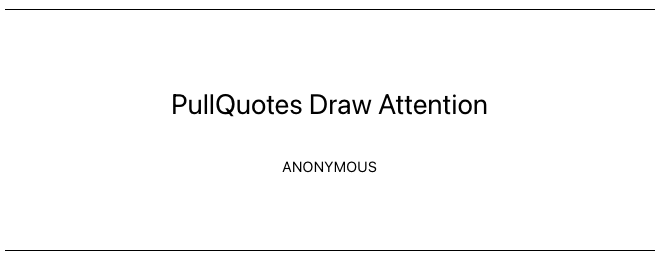
To add one, click the Block Inserter icon when editing your post or page.
You can also quickly add one by typing /pullquote in a blank paragraph block and then hitting the enter key.

Detailed instructions on adding blocks can be found here.
In this video, you can see how you can use the pullquote block and the different settings to modify how your pullquote will appear.
Block Toolbar
In order to reveal the block toolbar, you can click on the block and the toolbar will display.
Every block comes with unique toolbar icons and blocks specific user controls that allow you to manipulate the block right in the editor.
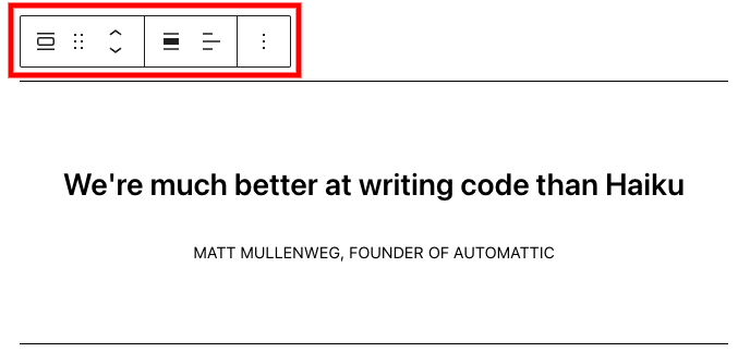
The pullquote block shows five standard buttons:
- Transform to
- Moving handles
- Change alignment
- Text Editing options (bold, italics, add a link, and drop-down for more text editing options)
- More options
Transform to
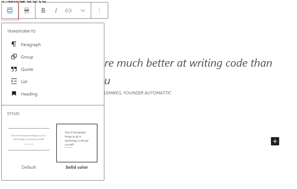
When you click on the “Transform” button you can convert the pullquote block into another block type, using the existing content.
You can transform the pullquote block into a “Paragraph” block, “Group” block, “Quote” block, “List” block, or “Heading” block. The “Group” would give you the ability to change the background color around the Quote.
You can also transform the style of your pullquote block
The pullquote block includes two styles, ‘Default’ and ‘Solid’ color.
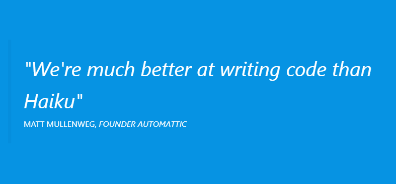
The ‘Default’ pullquote is a simple style that looks like this:

The ‘solid color’ pullquote is a little different, and looks like this:
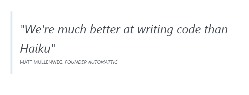
While it looks like a variation on the ‘Default color’ pullquote, the ‘solid color’ pullquote really shines when you use the block’s color settings to select colors.
Block-moving tools
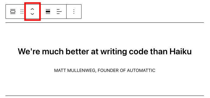
The up and down arrow icons can be used to move a block up and down in your document.
Detailed instructions on moving a block within the editor can be found here
Change alignment
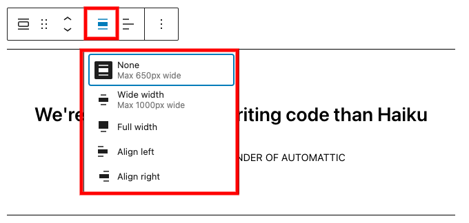
You can align the pullquote block itself to the left, right, and none (= center) from the toolbar. When using the left or right alignment, you can put another block beside the pullquote block.
The pullquote block also has a Wide and Full width alignment that is useful for creating unique headers and widescreen effects. These two options are only available if your Theme supports these alignments.
Text editing options
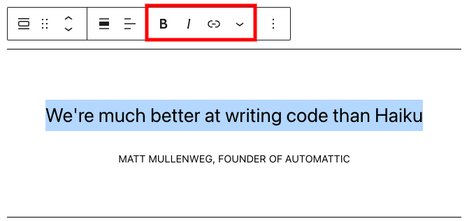
Bold and Italics
Used quite frequently, Bold and Italics formatting have their own buttons on the Toolbar. The shortcuts are CTRL+b (or Command+B) for bold and CTRL+i (or Command+i) for italics.
Insert Hyperlinks
Use the chain link icon to insert a hyperlink to your highlighted text.
Read about more link editing options.
More rich text options
The drop-down menu to the left of the More options menu contains a range of additional rich text editing options such as highlighting, inline code, strikethrough, and more.
Read about more rich text editing options.
More options
The Options menu represented by three vertical dots on the far right of the toolbar gives you more features such as the ability to duplicate or remove the block.
Read about these and other settings.
Block Settings
Every block has specific options in the editor sidebar in addition to the options found in the block toolbar. If you do not see the sidebar, simply click the ‘cog’ icon next to the Publish button.

The block styles can also be found in the sidebar settings along with the color settings and advanced options.
Color
Like the paragraph block, the pullquote block has color selection settings in the block’s sidebar settings.
The main color option allows you to set the color of the accent lines on the top and bottom of the ‘regular’ style and changes the background color of the ‘solid color’ style.
The text color option allows you to set the color of the pullquote’s text in both styles.
For details refer to this support article: Color settings overview
Typography
The pullqoute provides typography settings to change the font family, appearance, line height, letter spacing, decoration, letter case, and font size.
For details refer to this support article: Typography settings overview
Border
The pullqoute block provides border settings options to add border color, width, and radius.
For details refer to this support article: Border settings overview
Advanced
The “Advanced” tab lets you add HTML anchor and CSS class(es) to your block.
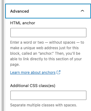
“HTML anchor” allows you to make a unique web address for a particular “Video” block. Then, you’ll be able to link directly to a “Quote” block of your page.
The “Additional CSS class(es)” lets you add CSS class(es) to your block, allowing you to write custom CSS and style the block as you see fit.
Changelog
- Updated 2023-08-09
- Replaced the link section with short summary linking to new dedicated page.
- Updated 2023-06-08
- Replaced “More rich text options” section with short summary linking to new dedicated page for rich text editing options.
- Updated 2023-05-16
- Content and screenshots updated for 6.2
- Updated 2022-02-04
- All screenshots have been changed for WordPress v5.9
- New video tutorial
- Modifying the block name in the post to respect a single spelling: “pullquote”
- Updated 2020-09-28
- Updated the block toolbar
- Updated the block settings
- Updated 5.5 screenshots
- Added the changelog
- Created 2019-03-07
Use the Quote block to easily add a quote to any post or page. Adding quotes can help you highlight great reviews from your audience or phrases that inspire you.
To add the Quote block to a page, click the block inserter (+) to open the block inserter pop-up window and choose the Quote block.
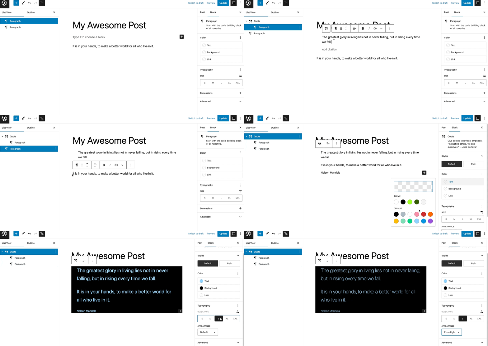
Alternatively, you can use the slash command, /quote in a new paragraph block then press enter to add one quickly.

Detailed instructions on adding blocks
Block toolbar
Each block comes with unique toolbar icons and blocks specific user controls that allow you to manipulate the block right in the editor.
To view the block toolbar, click on the block, and the toolbar will be displayed.

The Quote block shows the following buttons:
- Transform to
- Drag icon
- Move handles
- Change text alignment
- Bold
- Italic
- Link
- More text editing options
- Options
Transform to
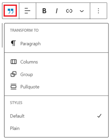
Click on the Transform button to convert the Quote block into another block type using the existing content.
You can transform the Quote block into a Paragraph, Columns, Group, or Pullquote block. You can also change the style of the Quote block from Default to Plain.
Drag icon

To drag and drop the block to a new location on the page template, click and hold the rectangle of dots, then drag it to the new location. The blue separator line indicates where the block will be placed. Release the left mouse button when you find the new location to place the block.
Move handles

The up and down arrow icons can be used to move the block up and down on the page.
Get more information about moving a block within the editor.
Change text alignment
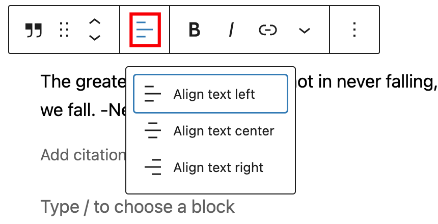
Using the alignment drop-down from the toolbar, you are able to align the Quote block to the left, make it center-aligned, or align it to the right.
Bold

You can select the text in the Quote block and use the Bold option or Ctrl+B or Cmd+B on your keyboard to bold it, which is usually heavier than the surrounding text.
Italic

You can select any text inside the Quote block and use the Italic option or Ctrl+I or Cmd+I on your keyboard to italicize it, which usually appears slanted to the right.
Link
Use the link icon to insert a hyperlink to the highlighted text inside the Quote block.
Read about more link editing options.
More rich text options
The drop-down menu to the left of the More options menu contains a range of additional rich text editing options such as highlighting, inline code, strikethrough, and more.
Read about more rich text editing options.
More options
The Options menu represented by three vertical dots on the far right of the toolbar gives you more features such as the ability to duplicate or remove the block.
Read about these and other settings.
Block settings
The block settings panel contains customization options specific to the block. To open it, select the block and click the Settings button next to the Publish/Update button.

Styles
You can modify the Quote block styles by choosing the Default or Plain buttons in the Styles settings panel. Hover over the Default or Plain buttons to get a preview of the styles.
The style options may vary based on your theme.

Based on which style you choose for the Quote block, WordPress automatically adds a CSS class to the Quote block. You can find the class in the Advanced settings panel under the Additional CSS class(es) section.
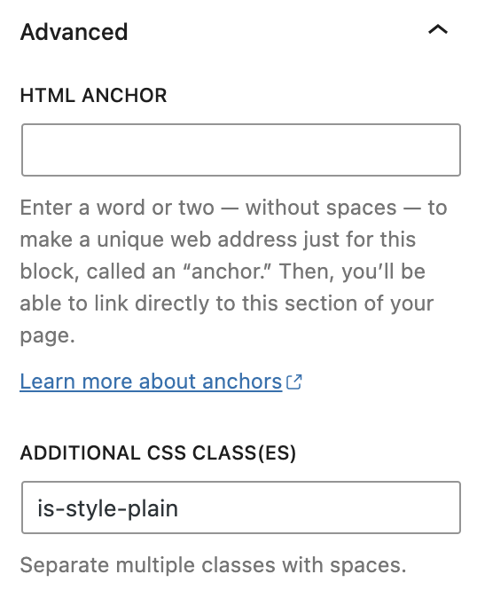
Color
The Quote block provides Color settings options to change the text and background colors.
See this guide for more information about changing colors.
Typography
The Quote block provides typography settings to change the font family, size, appearance, line height, letter case, letter spacing, and decoration.
Get more details about changing typography settings.
Dimensions
The Quote block provides dimension settings options to change padding and margin size.
For details refer to this support article: Dimension settings overview
Advanced
The Advanced tab lets you add HTML anchor and CSS class(es) to your block.
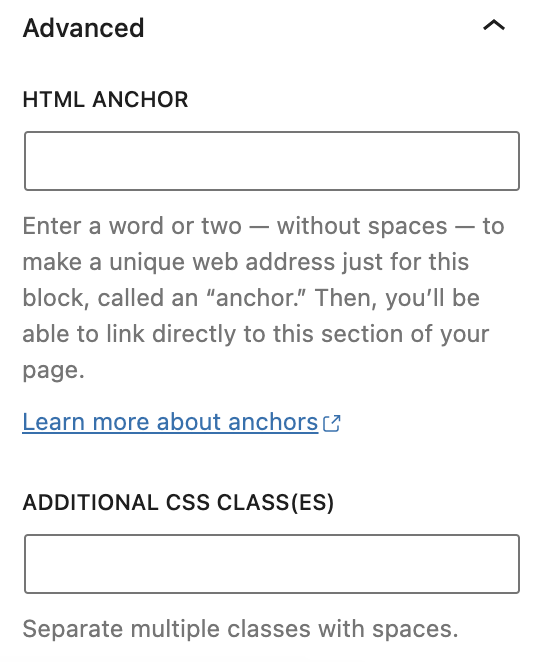
HTML anchor allows you to make a unique web address for a particular Quote block. Then, you’ll be able to link directly to a Quote block of your page.The Additional CSS class(es) lets you add CSS class(es) to your block, allowing you to write custom CSS and style the block as you see fit.
Changelog
- Updated 2023-10-26
- Updated content
- Updated 2023-08-09
- Replaced the link section with short summary linking to new dedicated page.
- Updated 2023-06-08
- Replaced “More rich text options” section with short summary linking to new dedicated page for rich text editing options.
- Updated 2023-03-26
- Updated content, images, and video for 6.2
- Updated 2022-10-18
- Updated images, video for 6.1
- Updated 2022-06-24
- Updated content, images, videos for 6.0
- Added ALT tags for images
- Updated 2020-09-21
- Updated 5.5 video
- Updated 2020-09-14
- Updated 5.5 screenshots
- Updated block toolbar new features
- Updated block settings new features
- Updated 2020-06-18
- Added ‘Link back to blocks’ to the top of the page
- Converted the ‘Advanced’ reusable block to a regular block
- Add the ‘Changelog’
- Created 2019-03-07