Creating an audio block will allow you to embed a piece of music, podcast, or other sound file right into your page or post.
In order to add an audio block, click on the inserter icon.
You can also type /audio and hit enter in a new paragraph block to add one quickly.

Detailed instructions on adding blocks
Block Interface
Every block comes with unique toolbar icons and block-specific user controls that allow you to manipulate the block right in the editor.

Adding Files
When you add an audio block, you get three options: Upload, Media Library, and Insert from URL.
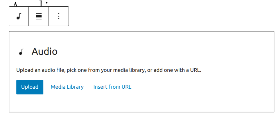
Upload will allow you to upload a new audio file from your computer. Media Library lets you select a file that’s already uploaded to your site’s Media Library. Insert from URL lets you input a URL where the file has already been uploaded, on WordPress.com or elsewhere on the web.
Once you’ve selected your audio file you can start configuring your audio block!
Alignment
When you select your audio block, a toolbar will appear where you can change block’s alignment. Choosing right or left will allow you to place another block alongside the audio block.

- None – Default alignment option.
- Wide width – Increase the width of the post beyond the content size.
- Full width – Extend the block to cover the full width of the screen.
- Align left – Make the block left-aligned.
- Align center – Make the block alignment centered.
- Align right – Make the block right aligned.
Replace Audio
This is another option in the audio block’s toolbar. Choosing this will allow you to select a new audio file for your block. Use this if you need to replace the audio file in your audio block.

Caption
If your audio file has a caption in the Media Library, it is shown below the audio player:

If your file does not have a caption in the Media library, you can add a custom caption by selecting the Add caption option in the toolbar:

Both the Media Library caption and the placeholder text are editable. Select the caption to edit the text. You can use the caption toolbar to make the text bold or italic, or add a link. Select the arrow icon in the toolbar to access more options:

You can remove a caption by selecting the Remove caption button in the toolbar:

More Options
These controls give you the option to copy, duplicate, and edit your block as HTML.
Read about these and other settings.
Block Settings
Every block has specific options in the editor sidebar in addition to the options found in the block toolbar. If you do not see the sidebar, simply click the ‘settings’ icon next to the Publish button.

Settings tab

Autoplay & Loop
These options let you set your audio file to autoplay when someone visits the page or post. Looping lets you choose if the audio file repeats after it’s finished.
Preload
This option allows you to select how much of the audio file is downloaded when the page or post is loaded. While it may be tempting to go ahead and have the whole file download automatically, keep in mind that this can slow your page’s load speed down.
There are four settings:
Browser default – Use settings from site visitor’s browser.
Auto – The entire audio file is downloaded, regardless of whether the visitor clicks the Play button or not. This makes the biggest impact on your page or post’s load speed, especially with larger audio files.
Metadata – Only basic info about the file will be downloaded automatically. Like the None option, the download of the audio file only begins when someone clicks Play. This setting is also very fast, as the only thing downloaded is text. On a fundamental level, there’s not a big difference between None and Metadata.
None – Nothing about the audio file is downloaded automatically. The download of the audio file only begins when your visitor clicks the Play button. This is the fastest setting.
Advanced
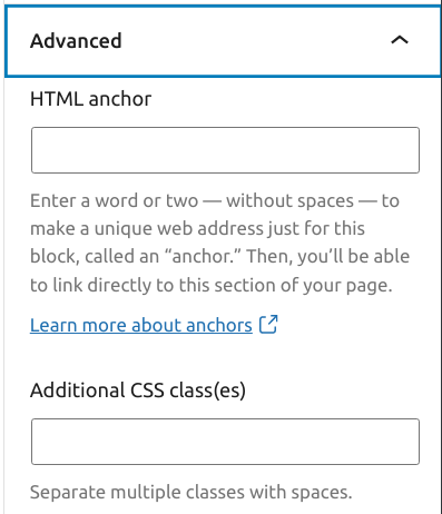
The advanced tab lets you add a CSS class to your block, allowing you to write custom CSS and style the block as you see fit.
Styles tab

Dimensions
The Audio block provides dimension settings options to add padding and margin.
For details refer to this support article: Dimension settings overview
Troubleshooting
If you try to upload a file type that is not supported, the editor will display a notice with an error message:

Changelog
- Updated 2023-03-29
- Updated information about the caption option
- Updated images
- Updated 2022-11-25
- Added Alt text to a few images
- Replaces redundant content
- Updated 2022-03-15
- Update screenshots for 5.9
- Update alignment and replace sections content
- Add More options section
- Updated 2022-03-03
- Update screenshots for 5.9
- Updated 2020-06-18
- Added ‘Link back to blocks’ to the top of the page
- Replace the ‘Advanced’ section with the ‘Advanced settings’ reusable block
- Created 2019-03-07
The Cover block lets you add an image or video with a text overlay.
To add the Cover block, click the (+) icon to open the block inserter pop-up window. Look for the Cover block using the search bar and click the block icon to add it to the editor.
Alternatively, you can quickly add the Cover block by typing /cover and pressing Enter.

Detailed instructions on adding blocks
Once you add the Cover block, you have a few options which are
- You can add an image or video from your device or from the Openverse.
- Choose Select Media to choose from an existing image or video on your site.
- You can now select the Use featured image option to set the cover as the featured image of your page or post.
- You can click on the colored circles to use the respective background color for your cover. You can later change it to any other color in the block settings.
- Resize the Cover block by dragging the bottom border and moving it up and down.
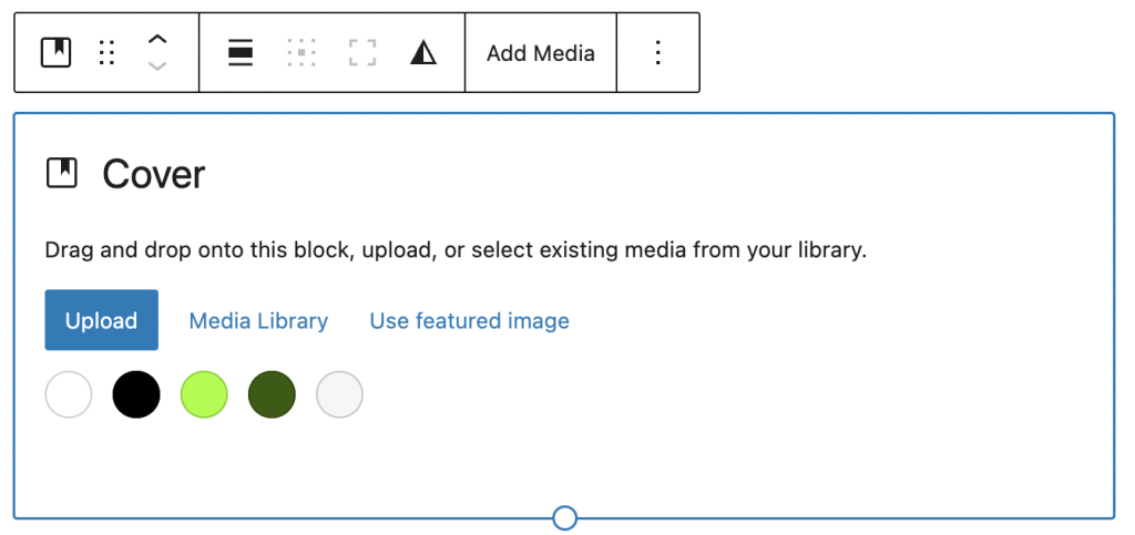
Here’s how to use the Featured Image on the Cover block
Resize option for the Cover block
The Cover block comes with a resize tooltip which appears below the Cover block when dragging. You can resize the block by moving the tooltip up and down.
Block toolbar
Each block toolbar comes with different options. These block toolbars let you customize or modify the block in the editor. To view the Cover block toolbar, select the block, and it will show a list of toolbar options.
The Cover block has the following tools:
- Transform to
- Moving handles
- Change alignment
- Change content position
- Toggle full height
- Replace
- More options

Transform to
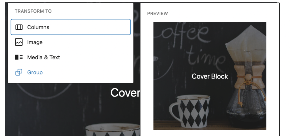
The Transform to tool allows you to convert the Cover block into the following blocks:
- Columns
- Group
- Media & Text
- Image

Moving handles

The up and down arrow icons can be used to shift a block up and down in your document.

Or you can drag the six dots icon allows you to freely reposition the Cover block anywhere within the editor by holding the icon and dragging the block to the new location.
Detailed instructions on moving a block within the editor can be found here.
Change alignment
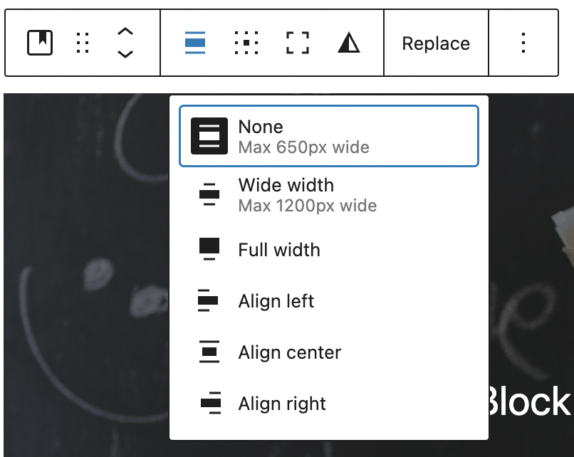
Use the Change alignment tool to modify the alignment of the Cover block. Select the tool and pick one of the following alignment options:
- None – Leaves the block the current size.
- Wide width – Increase the width of the post beyond the content size.
- Full width – Extend the block to cover the full width of the screen.
- Align left – Make the block left-aligned.
- Align center – Make the block alignment centered.
- Align right – Make the block right aligned.
Change content position

The Change content position lets you modify the position of the Paragraph block within the Cover block. You can position the Paragraph block on the top left to the bottom right of the Cover block.
Toggle full height

This option allows the Cover block to take up the height of the reader’s screen to create an immersive experience.
Replace

This is another option in the Cover block’s toolbar. Choosing this will allow you to select a new image file for your block. Use this if you need to replace the image file in your Cover block.
More options
These controls give you the option to copy, duplicate, and edit your block as HTML.
Read about these and other settings.
Block settings
WordPress blocks have specific configuration options in the block settings panel. To access the Cover block settings panel, click the Settings button at the top-right corner of the editor screen.
The Cover block settings panel is divided into two tabs – Settings and Styles. It contains the following sections:
Layout
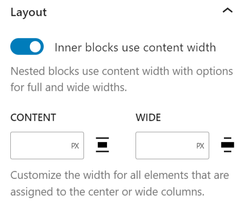
In the Layout section, you will see the following customization options:
- The Inner blocks use the content width toggle button, allowing nested blocks to use content width with options for full and wide widths.
- The Content width tool lets you customize the width for all elements assigned to the center or wide columns.
Media settings
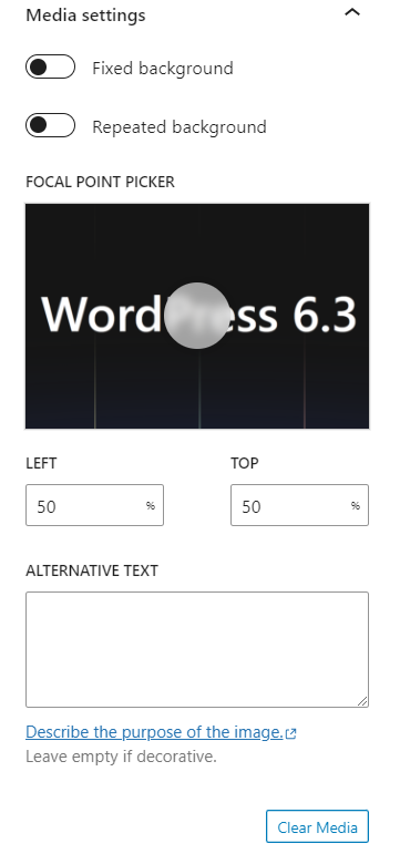
Fixed background

In the block settings on the sidebar, you have some other options, the first of which is a toggle for a fixed background. A fixed background means the cover image scrolls along with your page. Turning this option off embeds the image in place, so the image doesn’t scroll.
Repeated background

The Repeated background option lets you repeat the same image to form a pattern in the Cover block. For example, if you have a small image and you want it to repeat multiple times in the Cover block, you can enable this option.
You can use the Repeated background toggle in combination with Fixed background, but Fixed background does not necessarily have to be turned on. Feel free to play around with these options to find what suits your needs.
Focal point picker
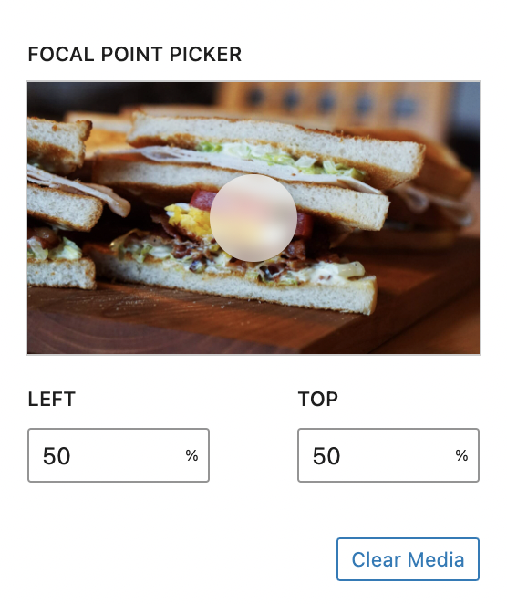
If the fixed background option is turned off, you will see the focal point picker. This tool lets you identify the main point of interest in the photo and highlight. Click on the picker to drag it to the spot you want, or use the left and top position percentages below to set it manually.
The clear media button removes the media and any changes you have to it.
Alternative text
The alternative text field allows you to add an alternative text for the cover image.
Color
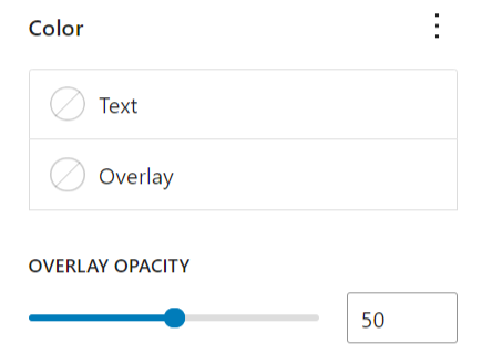
With the Color settings, you can customize the Cover block by adding text, background, and link colors. The color selections vary depending on your active theme.
You can also add a gradient color to the Cover block. To do that, transform the block into the Media & Text block. Click the Background option and select the Gradient tab. Choose a color from the list. Convert the Media & Text block back into the Cover block.
Learn more about the Color settings.
Filter options
The Filters section contains the Apply duotone filter option. So, you can enable the duotone filter from the block settings panel
Read more about the filter options.
Dimensions
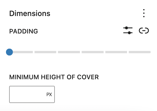
The Cover block provides dimension settings options to add padding and margin.
For details refer to this support article: Dimension settings overview
Typography
The Typography settings enable you to customize the font and text appearance of the content within the Cover block. The settings have various options, such as font size, font style, font family, and letter spacing.
For details refer to this support article: Typography settings overview
Advanced
The Advanced tab lets you add HTML anchor and CSS class(es) to your block.
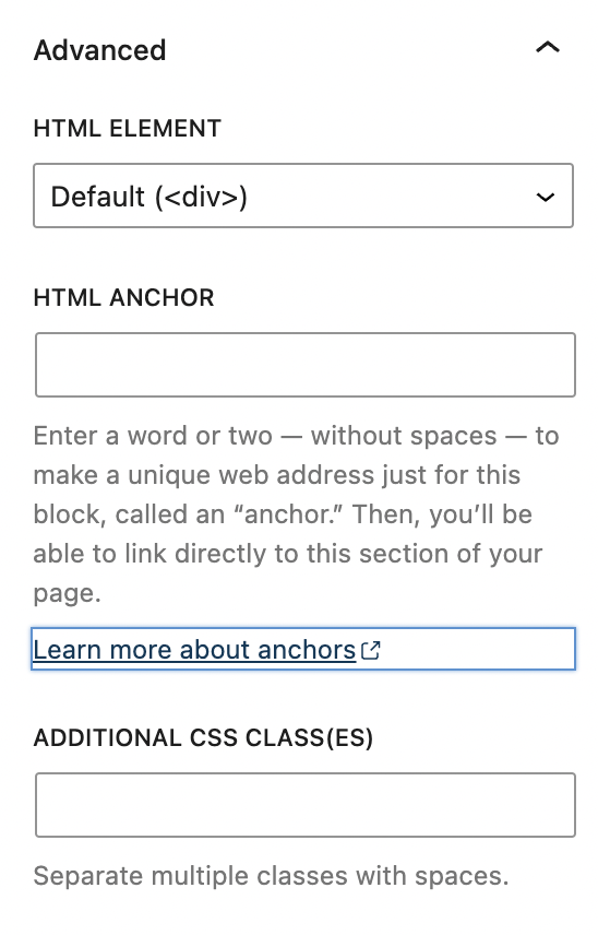
HTML element lets you choose between these HTML elements: Div, header, footer, main, section, article, and aside. It will default to div if another option isn’t selected. While more advanced, this option allows you to add semantic elements that can be used to define different parts of a web page. For example, if you’re using the Cover block as part of your Header, it would make sense to define it as such.
HTML anchor allows you to make a unique web address for a particular Cover block. Then, you’ll be able to link directly to a Cover block of your page.
The Additional CSS class(es) lets you add CSS class(es) to your block, allowing you to write custom CSS and style the block as you see fit.
Changelog
- Updated 2023-11-21
- consistency changes for Cover block mentions in text
- Updated 2023-11-11
- Updated all headings to sentence case
- Updated 2023-10-04
- Updated for 6.3
- Updated 2023-03-27
- Updated video on using a featured image in a Cover block.
- Updated information about the HTML element section.
- Updated 2023-03-02
- Changed the screenshot to reflect the new changes
- Added the Duotone filter
- Information/video about how to resize the cover block
- HTML element
- Updated 2022-12-12
- Added typography and dimension settings
- Updated 2022-11-26
- Made images more mobile responsive
- Added captions to images
- replaces redundant content
- Updated 2022-02-04
- Screenshots for WordPress 5.9
- Updated 2021-02-23
- Screenshots per WordPress 5.7
- Added feature change to Block Toolbar: Full Height Alignment
- Updated 2020-12-14
- Added Repeated background in Block Settings
- Updated 2020-08-24
- Screenshots and videos as per WordPress 5.5
- Added feature changes in Block Toolbar
- Added feature changes in Block Settings
- Updated 2020-06-18
- Added “Go back to the list of Blocks” to the top of the page
- Updated 2020-04-28
- Changed Category to “Common Blocks”
- Updated 2019-11-27
- Updated animated GIF to video
- Created 2020-03-07
The File Block allows you to add a link to the downloadable files on your website.
In this video, you can see how to use the file block and the different settings to customize it.
How to add a File block to your post or page:
- To add a File block, use the Block Inserter (+), or you can type
/filein a new paragraph block and press enter.

Detailed instructions on adding blocks
- To add a file, you can use the upload button to upload your files directly from your computer, or you can click Media Library to add files from your media library.

After you add a file, you can edit the file name by typing inside the rectangle. You can click Replace to replace the file and upload another one. You can click Copy URL to copy the URL of the file.

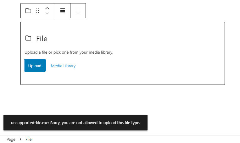
If you try to upload an unsupported file, you will see an error notification at the bottom-left corner of the screen.
Block toolbar
Every block comes with unique toolbar icons and block-specific user controls that allow you to manipulate the block right in the editor.
The File block has seven buttons:
- Transform to
- Drag icon
- Move handles
- Change alignment
- Replace
- Copy URL
- More options

Transform to:
When you click on the Transform button you can convert the File block into a Group, Columns, or Image block.

The Group gives you the ability to change the background color around the File block.

Drag icon

To drag and drop the block to a new location on the page template, click and hold the rectangle of dots, then drag to the new location. The blue separator line indicates where the block will be placed. Release the left mouse button when you find the new location to place the block.
Move handles

The up and down arrow icons can be used to move a block up and down on the page.
Get more information about moving a block within the editor.
Change Alignment

Using the alignment drop-down from the toolbar, you can align the file block to the left, make it center-aligned, or align it to the right. You can also make the file block wide width and full width.
Replace
Using the Replace button, you can replace your file by uploading a new one from your device or adding another one from your media library.

Copy URL
Click Copy URL to copy the URL of the file to your clipboard. You will see a message on the bottom left corner of your browser saying the URL has been copied.

More rich text controls
Clicking on the file name in the File block will display three more buttons in the Block Toolbar – Bold, Italic, and More Rich Text controls.

Use the “Bold” option or “Ctrl+B” / “Cmd+B” on your keyboard to bold it, which is usually heavier than the surrounding text.

Use the “Italic” option or “Ctrl+I” / “Cmd+I” on your keyboard to italicize it, which usually appears slanted to the right.

More rich text controls
Highlight
Use the Highlight option to change the color of the selected text and its background.

Inline code
Use the Inline code feature to format code snippets within your text differently. Not only that, but Inline code formatting also prevents the code to be executed instead of displayed.
Inline image
The Inline image feature allows you to add an image to your block. It has one option: enter the desired pixel width for your image.
Keyboard Input
The Keyboard Input option allows you to add the <kbd> tag to selected text.
Strikethrough
Use the Strikethrough option to place a horizontal line through the middle of the selected text.
Example: File Block
Subscript
Use the Subscript option to set the selected text slightly below the normal line of type.
Example: File Block
Superscript
Use the Superscript option to set the selected text slightly above the normal line of type.
Example: File Block
More options
The More Options menu represented by three vertical dots on the far right of the toolbar gives you more features such as the ability to duplicate, remove, or edit your block as HTML.
Read about these and other settings.
Block settings
Every block has specific options in the editor sidebar in addition to the options found in the block toolbar. If you do not see the sidebar, simply click the cog icon next to the Publish or Update button.

The File block offers the following settings
Settings
You can choose whether to link to the media file directly or a separate attachment page by using the drop-down menu. If you want the media file/attachment page to open in a new tab, enable the Open in a new tab button.
The File block comes with a Download button that can be toggled on and off using the Show download button.
By toggling it off, the file name will appear as a link.

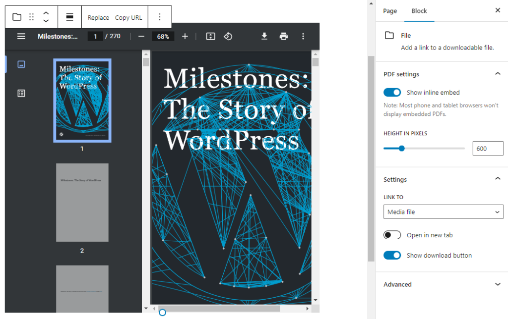
If you upload a PDF file, you’ll see a PDF settings section on the block settings.

You can embed PDF on your page or post by enabling the Show inline embed option. When it’s enabled, you’ll see the height in pixels setting that lets you adjust the PDF display by using the slider or entering a value in pixels.
Advanced
The Advanced tab lets you add HTML anchor and CSS class(es) to your block.

HTML anchor allows you to make a unique web address for the File block. Then, you’ll be able to link directly to the File block on your page.
The Additional CSS class(es) lets you add CSS class(es) to your block, allowing you to write custom CSS and style the block as you see fit.
Changelog
- Updated 2023-08-13
- Updated More Options
- Updated 2022-11-16
- Updating screenshots, video and content for 6.1, added info for PDF settings
- Updated 2022-06-21
- Updated content and screenshots for 6.0
- Added ALT Tags for images
- Updated 2022-06-07
- Add video for 6.0
- Updated 2020-09-19
- Updated new block toolbar features
- Updated new block settings features
- Updated 5.5 screenshots
- Updated 2020-06-18
- Added ‘Link back to blocks’ to the top of the page
- Converted the ‘Advance’ reusable block to a regular block
- Added the ‘Changelog’
- Created 2019-03-07
The Gallery block allows you to easily add multiple photos and automatically arrange them in a gallery. You can control the number of columns and the size of the images in the gallery.
The Gallery block can be added to a page by clicking on the?Block Inserter?(+) icon and selecting the?Gallery block.

Alternatively, you can type /gallery and press Enter.

Detailed instructions on adding blocks
Block toolbar
Each block has its own block-specific controls that allow you to manipulate the block right in the editor.
The?Gallery block?has a toolbar for the individual images as well as a toolbar for the entire Gallery block.?

For the Gallery block
The main options in the Gallery block toolbar are:
- Transform to
- Block moving handles
- Drag and drop
- Move up and down
- Change alignment
- Caption
- Add button
- More options
Transform to

You can transform or change the block to another block including the Group, Image, and Column blocks.
When you change the block type to the Image block, every image in your gallery will be converted into a single image block.
Block moving handles

The block-moving handles allow you to move the block up and down the editor. Use the six dots icon to drag and drop the?Gallery?block and place it anywhere on the page. Alternatively, click on the up and down arrows to move the block up or down.
Get more information about moving a block within the editor.
Change alignment

- Align left – Make the block align-center
- Align center – Make the block alignment centered
- Align right – Make the block align-right
- Wide width – Increase the width of the block beyond the content size
- Full width – Extend the block to cover the full width of the screen.
Wide width and Full width alignment options are only available if they are enabled in your theme.
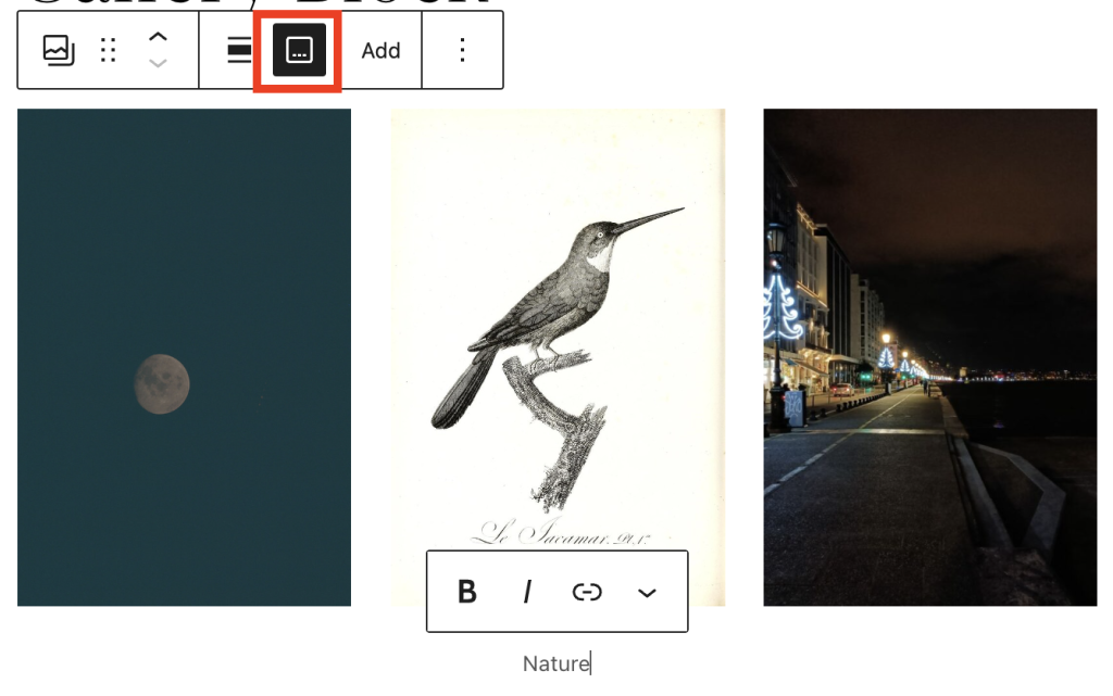
Caption
You can add this by clicking on the caption icon on the settings toolbar.
Adding images
The Add button in the Gallery block lets you add images to the gallery. You have two options to add images to the Gallery block:?Open Media Library and Upload.

The Upload option allows you to upload a new image or multiple images to the?Gallery block?and to your media library. The Media Library option lets you select from previously uploaded images in your Media Library.
You can also drag and drop multiple images at the same time from your explorer or finder window into the Gallery block.
Alternatively, you can open the main inserter panel on the editor and open the media tab. Then, you can drag and drop images from the media library and Openverse into the Gallery block.
Options
These controls give you the option to copy, duplicate, and edit your block as HTML.
Read about these and other settings.
Toolbar for images in the gallery
Move images
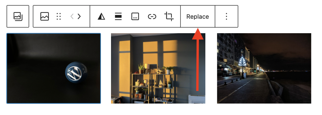
After you add images to the Gallery block, you can change the order of images in the gallery. Click on an image and in the block toolbar use the move left and move right arrow handles to arrange the images as you like.

Add a link to an image
To add a link to an image, click the link icon in the block toolbar for the selected image. You can paste a URL for the link, type in the text field to search for a page. You can also link to the Media file of the image or the Attachment Page for the image.
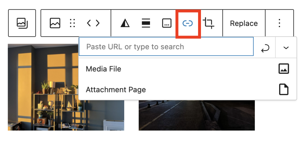
You can change the link settings by clicking the down arrow in the top right corner. You can choose to open the link in a new tab, add CSS class for the link and link rel attribute, if needed.

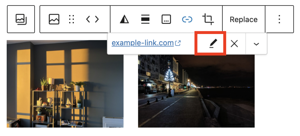
After you add a link to the image, you can click the link icon in the block toolbar and choose the pen icon to edit the link or the X icon to delete the link.
Crop an image
Here’s a video showing how you can crop an image in the gallery, zoom in, rotate and crop by keeping the aspect ratio of the selected image.
Replace an image
You can replace images in your gallery with the Replace button in the block toolbar of the selected image. This will allow you to upload a new image to the media library or select another image from your library.
Remove an image
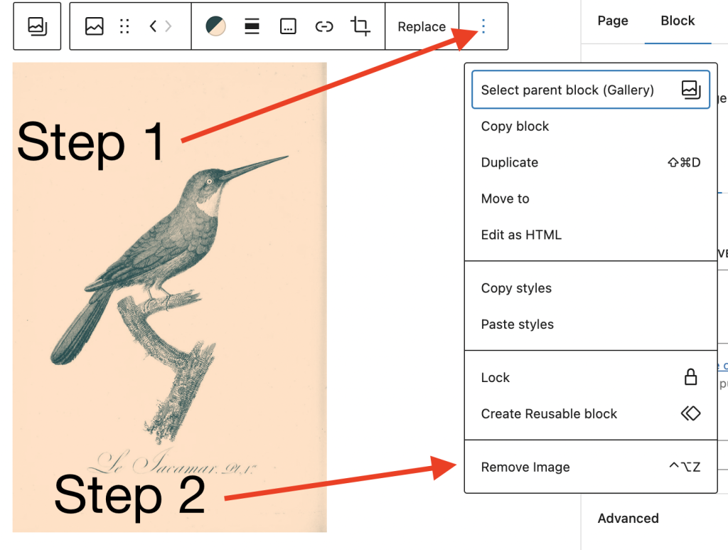
To remove an image from your gallery, select the image in the gallery and either click delete on your keyboard or select the three-dot menu on the block toolbar of the selected image and select Remove Image.
Adding captions
Caption for images
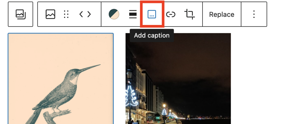
You can caption your images individually by editing the “Add caption” text with the image.
Caption for the gallery
You can add this by clicking on the caption icon on the block settings toolbar.

Block settings
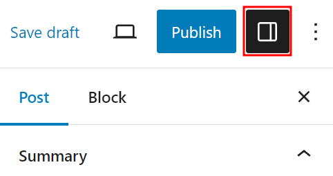
Every block has specific options in the editor sidebar in addition to the options found in the block toolbar. If you do not see the sidebar, simply click the ‘sidebar’ icon.
For the Gallery block
Columns
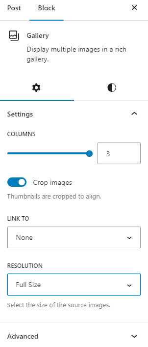
You can choose how many columns your Gallery block can have.
Select between 1 column and 8 columns. Keep in mind that you can only select as many columns as you have images.
This means that if you add 4 images, you’ll be given the option for a maximum of 4 columns. This number will increase as you add more images until you reach the maximum of 8. Even if you add more images to the Gallery, you will not be able to add more than 8 columns.
Your images will automatically arrange themselves to look good no matter how many columns you select. Try changing the setting and see what you like best.
To change the setting you can either manually enter the number of columns you want or visually change the number by using the slider to drag the number up and down.
Crop images
You can select whether or not you’d like all of your images to be cropped in your Gallery block.
This option is useful if you have images of varying sizes and shapes. Cropping them will make the images in each row of the gallery the same size. You can toggle this option on and off to see which way you prefer.
Link to
You have 3 options for linking the images in your gallery: Attachment Page, Media File, and None. This determines what happens when your visitors click on the images in your gallery. You can also add custom links for each image from the block toolbar of the selected image.
- Attachment page: Selecting this option will link the image to its WordPress media attachment page. This is an informational page about your image, which includes the image, the caption, the image description, and a comment field.
- Media file: Selecting this option will link the image to the image file in the original size in a new browser window.
- None: Selecting this option will not link the image to anything.
Image sizes
The Image Size setting allows you to set all the images to the size you choose.
- Thumbnail: Displays a small thumbnail-sized version of your image on the page/post. Note, by default the Thumbnail size is a square, so some cropping of your original image may occur.
- Medium: Displays a medium-sized version of your image on the page/post. This is a good size to use with Left/Right alignments, as it leaves sufficient space for legible text to either side.
- Large: Displays a large-sized version of your image on the page/post. Note: WordPress will determine the width of the content column of your theme, and display the largest possible image for that space.
- Full Size: Displays a full-sized version of your image on the page/post. Note: WordPress will determine the width of the content column of your theme, and display the largest possible image for that space. If your original image is larger than this column width, the full size of the image may not be displayed.
Note: For these images sizes to work, your theme needs to support them.
Style Settings
You can access the Style settings for the Gallery and Image block by clicking on the Styles tab.
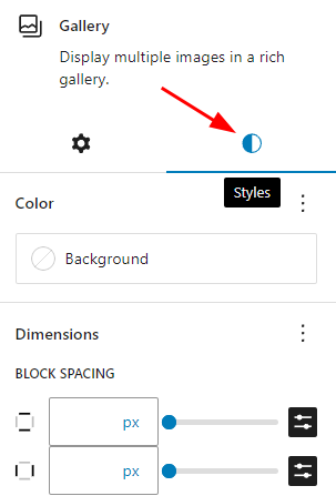
Color
The Gallery block provides color settings options to change the text, background, and link colors for the block
For details, refer to this support article: Color settings overview
Dimensions
The Gallery block provides dimension settings options to add padding and margin.
For details refer to this support article: Dimension settings overview
Advanced settings
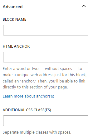
Block Name field lets you add a name for the gallery, which will appear on the editor’s list view. That will help you to navigate the list view and find the right block easier.
HTML anchor allows you to do “page jumping” to the gallery. Page jumping, also sometimes referred to as anchor links, is where you click a link and instantly get moved somewhere further up or down a long page.
To enable this, you put an HTML anchor in the Advanced settings in the Gallery block. You can then create a link to this anchor anywhere on the page and it scrolls to the Gallery block.
The advanced tab also lets you add a CSS class to your block, allowing you to write custom CSS and style the block as you see fit.
For images in the gallery
Image settings
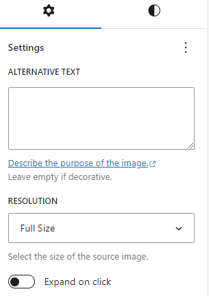
For each image in the gallery, add alternative text to help with accessibility. ALT text can describe the purpose of the image. Leave the ALT text field empty if the image is purely decorative.
Resolution
The?Resolution?setting allows you to set the image size for individual images in the gallery. You can choose between Thumbnail, Medium, Large and Full size.
There’s also the Expand on click toggle to enable the lightbox feature. This will let visitors to enlarge the image into its full size by clicking on the image.
Note: For these image sizes to work, your theme needs to support them.
Styles
You can vary the styles of the images in the Gallery block by choosing the Styles settings. You have two different style options in the block sidebar, when you select an image.
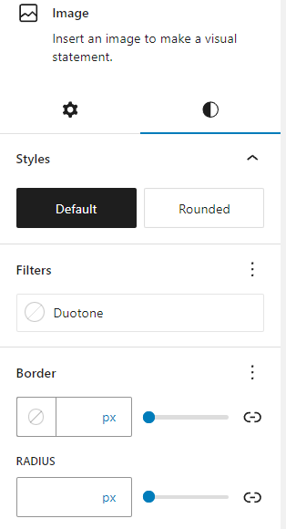
Filter options
You can create a filter effect on images without actually changing the original image.
The filter option allows you to add this filter color to your block content from the block toolbar.
Read more about the filter options.
Border
The Gallery block provides border settings options to add border color, width, and radius.
For details refer to this support article: Border settings overview

Advanced settings

The advanced settings for each image have a Title attribute, HTML anchor, and CSS class fields.
The Title attribute field is designed to describe the role of the image on your page. Many devices and browsers don’t display this text.
HTML anchor allows you to do “page jumping” to that specific image. Page jumping, also sometimes referred to as anchor links, is where you click a link and instantly get moved somewhere further up or down a long page.
To enable this, you put an HTML Anchor in your photo and create a link that jumps to the anchor.
The advanced tab also lets you add a CSS class to your block, allowing you to write custom CSS and style the image as you choose.
Note: Based on which style you choose for the image block in the Styles settings, WordPress automatically adds a CSS class to the image block under Additional CSS class(es). You can add additional classes with spaces.
Changelog
- Updated 2024-01-16
- Updated screenshots and content for 6.3
- Fixed text formatting consistecy
- Added missing alt text to screenshots
- Updated 2023-03-29
- Added the option to clear duotone
- Added information about the style settings tab
- Added caption button for Gallery
- Updated screenshot and Videos for 6.2
- Added Alt text
- Updated 2022-12-12
- Added color settings
- Updated 2022-11-20
- Adjusted images for mobile view
- Added caption for images
- Removed redundant content
- Updated 2022-08-21
- Added 6.0 screenshots and videos.Updated block toolbar with Add button and replace the info with the updated process for adding images to the gallery.Reordered the info to separate for the block toolbar and block sidebar. Adding Dimensions to the block settings with video.Updating the blosk settings for images.
- Adding details for image customizations with content, screenshots and video.
- Added ALT tags for images.
- Updated 2021-12-21
- Updated all screenshots for 5.9 with higher resolution.
- Added in a context related to the refactoring.
- Updated 2021-02-02
- Updated the 5.5 video with 5.6 gifs
- Updated all screenshots with 5.6
- Added details to Advanced block settings options
- Updated out-of-date contents
- Updated 2020-10-05
- Updated the video
- Updated 2020-09-14
- Updated 5.5 screenshots
- Updated Block toolbar new features
- Updated Block settings new features
- Updated 2020-06-18
- Added ‘Link back to blocks’ to the top of the page
- Updated 2020-04-24
- Added Drag & Drop multiple images to the Gallery block
- Added video to change the background color as group block
- Added updated UI displays for WordPress 5.4
- Added “More Options” to the Block Toolbar section and updated the existing once to fit other block descriptions.
- Reorganized the post into 3 sections: How to add gallery and images, Block Toolbar and Block Settings.
- Converted all reusable blocks to regular blocks.
- Created 2019-03-07
The image block can be added to a page by clicking on the Add Block button.
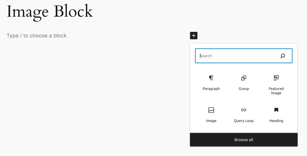
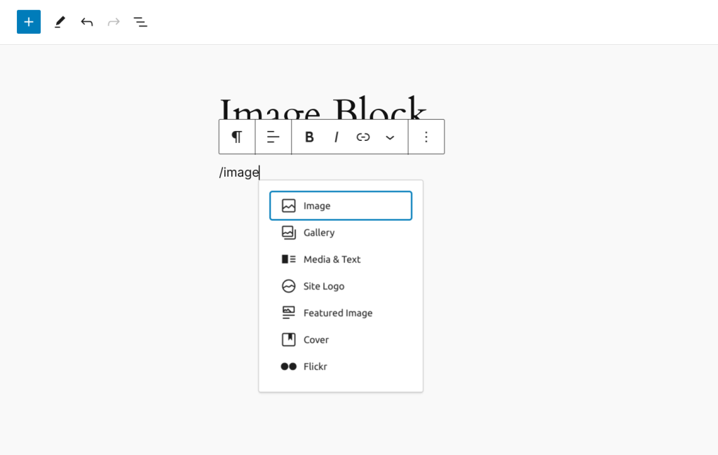
Alternatively, you can type /image and press enter.
Detailed instructions on adding blocks
Block toolbar
Each block has its own block-specific controls that allow you to manipulate the block right in the editor.
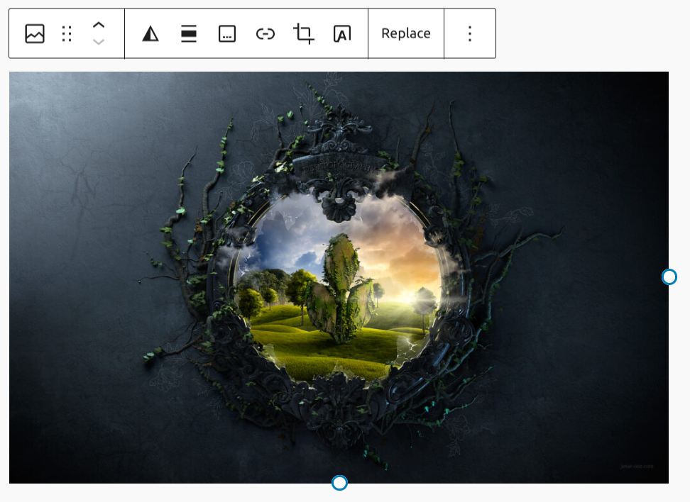
- Change block type
- Drag
- Move arrows
- Add duotone filter
- Align
- Add caption
- Link
- Crop
- Add text over image
- Replace
- More Options
Adding an image
The media options panel will load with three options, Upload, Media Library, and Insert from URL.
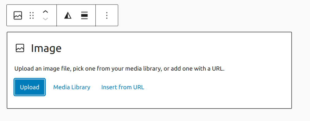
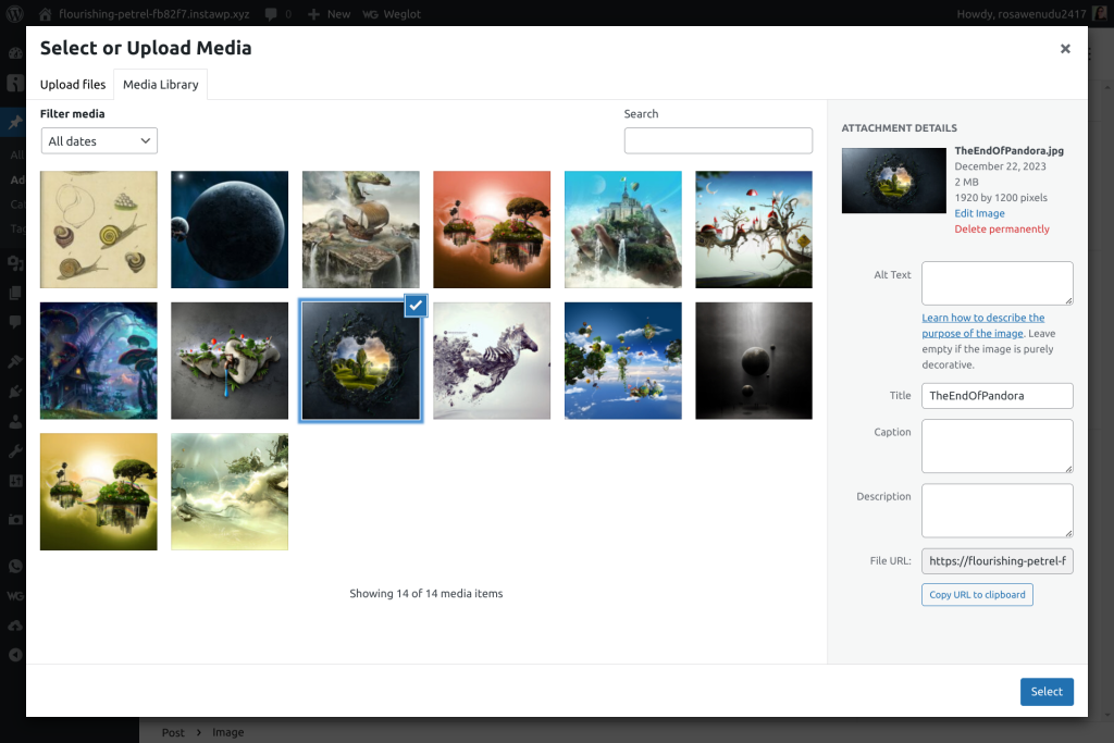
Upload and Media Library will let you add or choose media from your library and embed it in your page.
Simply add the image from the Upload Files tab, then select it in the Media Library tab. Customizing the image attachment details, such as the Title, Caption, Alt Text, and Description, in the Media Library window can also be helpful for SEO and future navigation of your media library.
It is, also, possible to drop image into empty paragraph.
As well as choosing an image from Openverse, which will be uploaded to your site’s Media.
Images can also be dragged from inserter to existing image block.
Importing external images
If you selected the “Insert from URL option” to add your image, you will see a button with an upward facing arrow. If you click on it, the image will be imported into your site’s local Media Library and the URL on the image block will be automatically updated to point at the new file.
If the imported image has a caption, it will be added automatically as well.
Please note that the “Upload External Image” feature might not work on all websites, as some of them restrict how their images are handled.
Resizing images
Once the image is added to the editor, you can resize and align the images to better fit the surrounding content.
To resize an image,
- Click on the image to reveal the draggable resize handles.
- Click on the resize handles and drag the image to your desired size.
Alternatively, on the right-hand side in the Block Settings, the image size can be fine-tuned by adjusting width and height dimensions. There are also some convenient options in the block settings for setting the image to 100, 75, 50, and 25% of its original size.
Aligning images
If you wish to align an image within a paragraph you will first need to insert the image just above the target paragraph block.
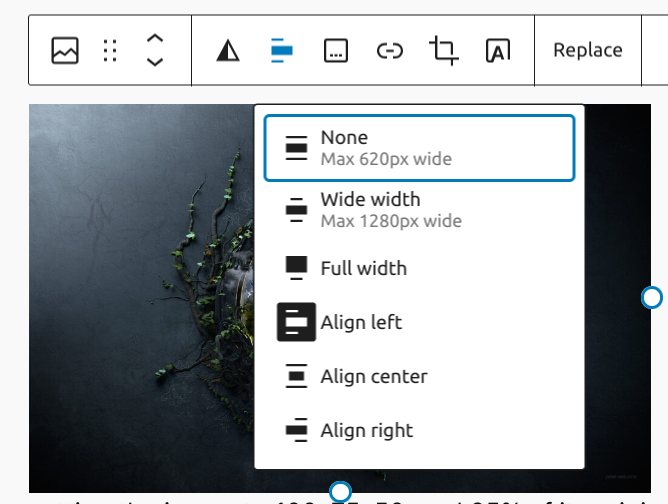
From there, click on the image and select left or right alignment, this will merge the image into the paragraph block.
Finally, resize the image to your desired width and height.
Wide and Full width images
As support for the new editor is added to our themes, you will begin seeing icons for Wide and Full Width images. These two image sizes will allow you to expand the image beyond the theme’s usual content width.
Captions
If you wish to add a caption to a singular instance of an image, simply type it in the caption space below the image in the editor.
Link settings
The link settings allow you to hyperlink your images. You may choose for clicking on the image to open an attachment page, the original media file, or a custom URL of your choice.
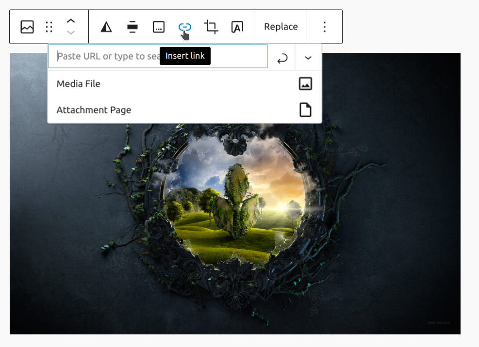
Image editing
A new feature allows you to make quick crops without leaving the editor. Just hit the Crop button in the toolbar.
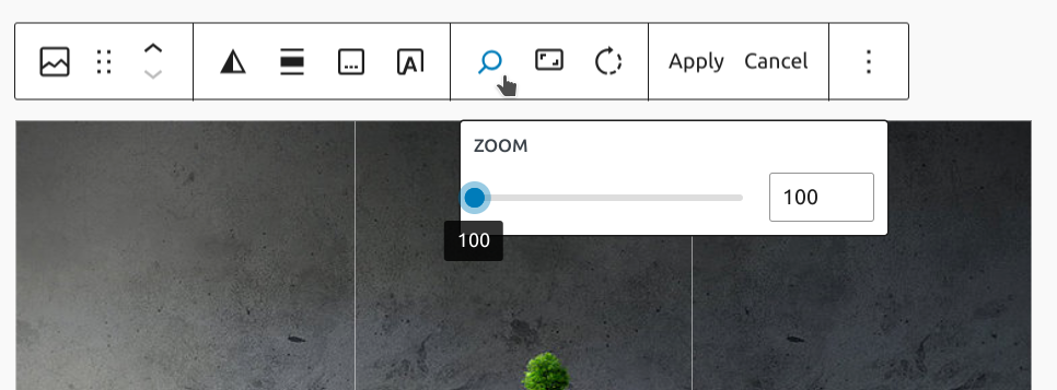
An expanded toolbar will appear. This will allow you to zoom an image.
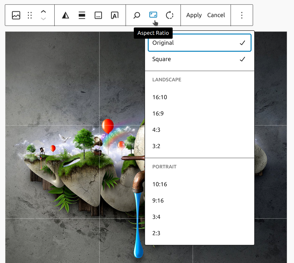
There are also options to set the aspect ratio, such as to crop the image into a square.
You can also rotate the image if it comes in sideways.
After you make any changes, click Apply.
Adding text overlay
A new feature allows you to convert image block to cover block so that you can add overlay text on the image.
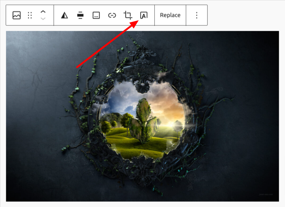
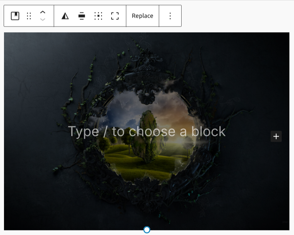
Upon clicking the Add text over image button the block transforms immediately to a cover block with its placeholder paragraph.
Sometimes you use a tool like Google Docs to write or collaborate on posts. When you’re ready to put the content on your site, you may copy and paste them into the editor.
One problem is that those images are likely hosted somewhere else like Google and could easily become broken if a change is made.
So, If you copy and paste an image from a resource like Google Docs, a button will appear on the toolbar to upload it to the media library. Click that, and it will stay in the post, but also upload to your media library.
More options
These controls give you the option to copy, duplicate, and edit your block as HTML.
Read about these and other settings.
Block settings
Every block has specific options in the editor sidebar in addition to the options found in the block toolbar. If you do not see the sidebar, click the ‘cog’ icon next to the Publish button.

Styles
Depending on your theme, you may have several styles for your image. In Twenty Twenty-One, you can choose to make the image rounded, with borders or a frame.

Image settings
The image settings offer a text field to add an Alternative Text description, which is important for accessibility and SEO.
You can choose the Image size between thumbnail, medium, large and full size. You can also change the Image dimensions – width and height dimensions of an image in 25% increments, or in exact pixel dimensions.


Filter options
You can create a filter effect on images without actually changing the original image.
The filter option allows you to add this filter color to your block content from the block toolbar.
Read more about the filter options.
Border
The Image block provides border settings options to add border color, width, and radius. If there are custom border settings, custom border will be visible on image placeholder.
For details refer to this support article: Border settings overview
Advanced
The Title attribute field is designed to describe the role of the image on your page. Many devices and browsers don’t display this text.
HTML anchor allows you to do “page jumping” to that specific image. Page jumping, also sometimes referred to as anchor links, is where you click a link and instantly get moved somewhere further up or down a long page.
To enable this, you put an HTML Anchor in your photo, and create a link that jumps to the anchor.
The advanced tab also lets you add a CSS class to your block, allowing you to write custom CSS and style the block as you see fit.
Changelog
- Update 2024-01-25
- Updates for 6.2 completed
- Allow dropping an image on an empty paragraph block to create an image block
- Updates for 6.3 completed
- Display custom borders on image placeholder
- Upload Openverse images when inserted
- Allow dragging-and-dropping images from the inserter to image blocks
- Updates for 6.4 completed
- Update 2024-01-16
- Updates for 6.1 completed
- Re-upload missing images
- Update 2023-12-25
- Update screenshots and videos for 6.4
- Update 2022-12-12
- Added Border settings
- Updates 2022-11-28
- Added missing image caption
- Replaced content on more options
- Updated 2022-03-15
- Added notes about converting cover block from toolbar.
- Updated 2022-01-25
- Updated a few screenshots to align with expanded toolbar.
- Added notes about using duotone.
- Updated 2021-01-04
- Updated all screenshots to WordPress 5.6
- Added section on image title attribute (Gutenberg 6.9/WP 5.4)
- Added section about easy upload for external images (Gutenberg 8.5/WP 5.5)
- Added section about block editor image editing (Gutenberg 8.4/WP 5.5)
- Added details on HTML Anchor and Image Styles to Advanced
- Removed pencil (edit) icon and added more option menu
- Removed some out-of-date content
- Re-ordered to match the current block toolbar layout
- Updated 2020-06-18
- Added ‘Link back to blocks’ to the top of the page
- Added the ‘Changelog’
- Created 2019-03-07
The media & text block allows you to place an image or video side-by-side with text.
To create this layout, click on the block inserter icon to open the block library and select the media & text block.
You can also type /media and hit enter in a new paragraph block to add one quickly:

Detailed instructions on adding blocks
Adding content
To add your image or video to the block, you can use the options provided to upload a file from your computer or select from your existing Media library.

To add your text, simply start typing in the text box. You will be given the same text editing options as a regular paragraph block. You can also use the block inserter and add other blocks to the content area.
Block toolbar
In order to reveal the block toolbar, you can click on the block and the toolbar will display. Each block has its own block-specific controls that allow you to manipulate the block right in the editor. The media & text block offers the following options in its toolbar:

With these options, you can:
Transform the block to a column, group, image (or video if you have a video media file instead of an image ), or cover block.

Toggle the block between a none, wide-width display and a full-width display (if supported by your site’s theme).

You can align your content vertically to either the top, middle, or bottom, using the “Change vertical alignment” option.

You can use the following options to show the media content on either the left or right.


If you attempt to upload a file that is not supported you will receive an error message at the bottom left corner of your browser.

You can insert a link to the image in the block using the link icon in the Block toolbar. The image can be linked to an external URL or to a page on your site. You can also link the image to its own Media file or Attachment Page.

Use the Replace button in the Block toolbar to replace the media file you have already inserted.
More options
These controls give you the option to copy, duplicate, and edit your block as HTML.
Read about these and other settings.
Block settings
Every block has specific options in the editor sidebar in addition to the options found in the block toolbar. If you do not see the sidebar, simply click the ‘setting’ icon next to the Publish or Update button.

Settings tab

Stack on Mobile
You will be given the option to stack the media and text on top of each other for mobile phones. This is useful for people viewing your website on smaller screens.
If the media and text in your block were to stay side-by-side on mobile, they may be too small to view on mobile devices. By enabling stack on mobile, the content on the left will show on top of the content on the right. This provides a better experience for mobile visitors.
Crop image to fill entire column
If your image does not fit the entire column width, you can turn on this option to automatically crop the image so that it fills the entire column. Additionally, you are given a circular focal point to help center the most relevant section of your photo as it is possible that some cropping may occur.
Alt text ( alternative text)
You can add alt text to the image to describe what the image is about. It is useful for accessibility (screen readers, for example) and for search engine optimization.
Image size
You can choose a full, large, medium, or thumbnail image to display by selecting the size desired from the drop-down menu.
Media width
You can adjust the proportion that the media takes up in the overall percentage of the Media & Text block by adjusting the sliders or typing in the desired proportion. The range is between 15% and 85 %.

Focal point picker
If you crop the image, you will see the focal point picker. This tool lets you identify the main point of interest in the image and highlight it. Click on the picker to drag it to the spot you want, or use the left and top position percentages below the image to set it manually.
Styles tab
Color
The media & text block provides color settings options to change the text, background, and link colors. Pick a color from the suggestions, or add a custom color using the color picker or by adding a color code.
See this guide for more information about changing colors.
Typography
The media & text block provides typography settings to change the font family, appearance, line height, letter spacing, decoration, letter case, and font size.
Get more details about changing typography settings.
Dimensions
The media & text block provides dimension settings options to add padding and margin.
Learn more about dimension controls.
Advanced
The advanced tab gives you two options. You can add anchor text to be able to link directly to this section of your page. You are also able to add a CSS class to your block, allowing you to write custom CSS and style the block as you see fit.

Changelog
- Updated 2023-04-03
- Added information about the focal point picker for cropped images
- Updated 2022-11-22
- Aligned images for mobile view
- replaced redundant content
- Updated 2022-11-10
- Removed Color settings and added link to Color overview page
- Added Dimension and Typography settings and linked to their overview pages
- Updated a few more screenshots for 6.1.
- Added info about Insert link in the Block toolbar
- Updated 2022-11-01
- Updated video for WP 6.1
- Updated images to WP 6.1
- Added image of content locking for Media & Text Block
- Updated Alt text
- Added transform option to “Cover”
- Added error message example
- Updated 2022-06-02
- Updated images to WP 6.0Changes to Block Tool Bar
- Added “None” to alignmentRemoved term “vertically” from alignmentAdded “columns” to transform
- Added “Move to”Added “Lock”Added “Hide”
- Changes to Text & Media block settings
- Updated color text and background options to include gradients
- Added “anchor text”
- Added “cropping images”
- Added “alt text”
- Added “image size”
- Added “media width”
- Updated images to WP 6.0Changes to Block Tool Bar
- Updated 2020-08-23
- Updated images to WP 5.5
- Updated 2020-06-04
- Converted 2 reusable blocks to regular blocks
- Changes to Headings
- Changes to Block Toolbar
- Added Vertical Alignment options
- Added new images
- Added “More Options” Block
Use the Video block to upload and embed video into your post or page.
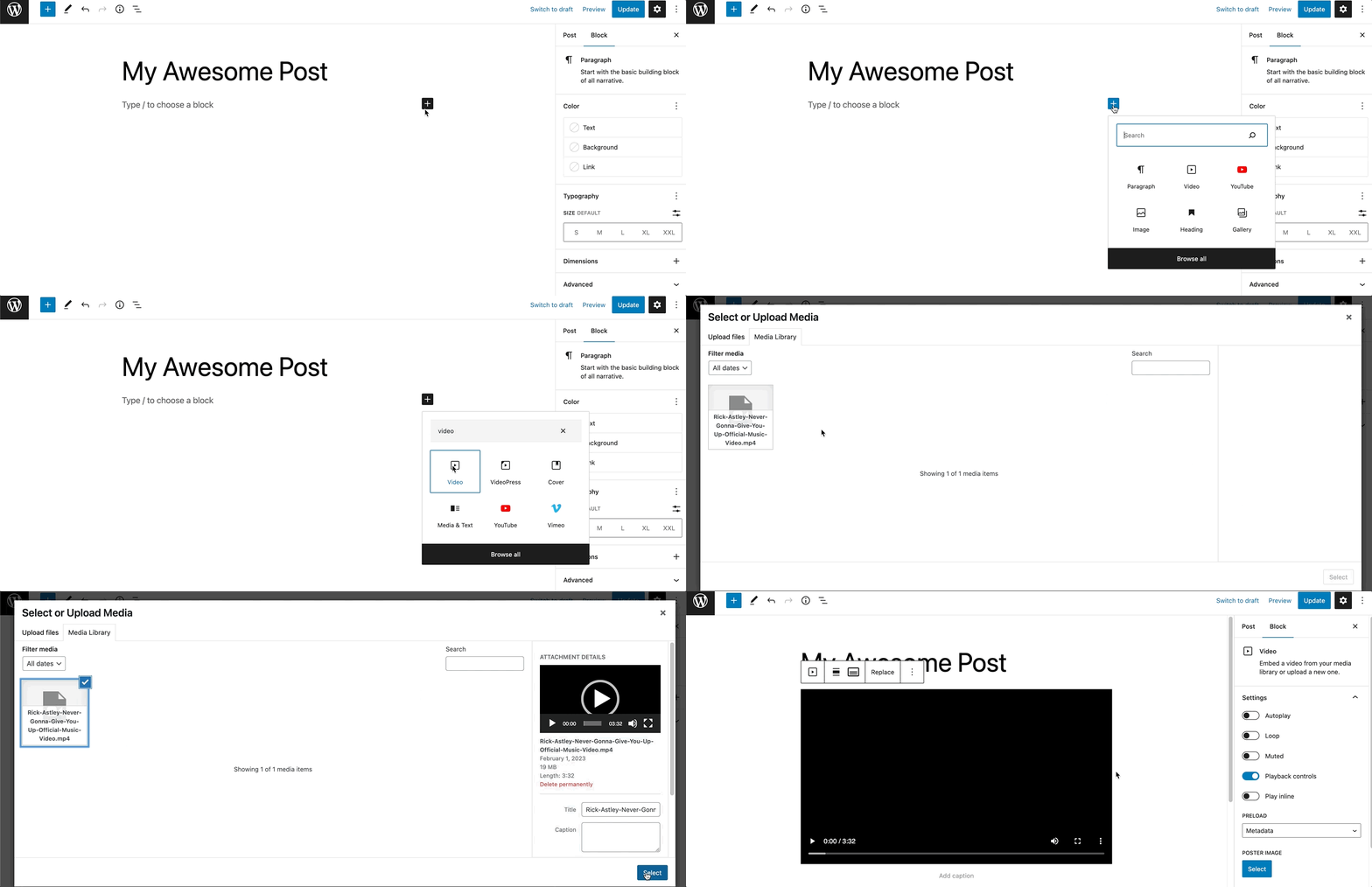
To add the Video block to a page, click the (+) icon to open the block inserter pop-up window and choose the Video block.
You can also use the keyboard shortcut /video to quickly insert a Video block.
Detailed instructions on adding blocks can be found here.
When you add a Video block, you will be prompted with three options to add your content, Upload, Media Library, and Insert from URL.
The Upload will allow you to upload a new video file from your computer. Media Library lets you select a file that’s already uploaded to your site’s media library.
If you insert a URL from a supported block type, such as YouTube, the Video block will automatically transform into a YouTube block.

Once the video is embedded in the page, you can add an optional caption.
Block toolbar
To view the block toolbar, click on the block, and the toolbar will be displayed.
Every block comes with unique toolbar icons and blocks specific user controls that allow you to manipulate the block right in the editor.
The Video block toolbar comes with six buttons:

- Transform to
- Drag icon
- Move arrows
- Align
- Text tracks
- Replace
- More options
Transform to
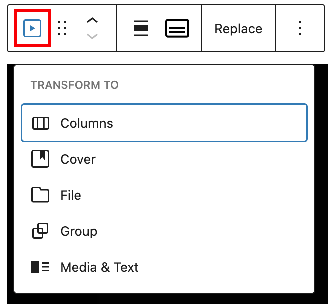
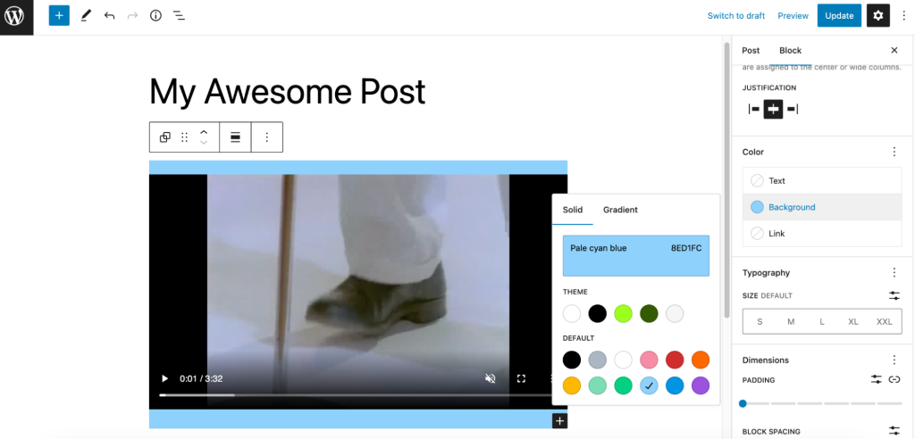
Click on the “Transform” button to convert the Video block into a Columns, Cover, File, Media & Text, or Group block. If you choose to transform it to a Group block, you will be able to change the background color around the video:
Drag icon

To drag and drop the block to a new location on the page template, click and hold the rectangle of dots, then drag it to the new location. The blue separator line indicates where the block will be placed. Release the left mouse button when you find the new location to place the block.
Move arrows

The up and down arrow icons can be used to move the block up and down on the page.
Detailed instructions on moving a block within the editor can be found here.
Change alignment
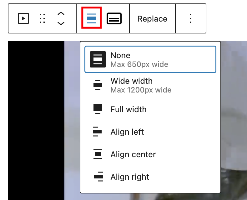
Use the change alignment tool to align the Video block. Choose one of the following options:
- None – leaves the block the current size.
- Wide width – increase the width of the block beyond the content size.
- Full width – extend the block to cover the full width of the screen.
- Align left – makes the block left-aligned.
- Align center – makes the block center-aligned.
- Align right – makes the block right-aligned.
The “Wide width” and “Full width” alignment settings must be enabled by your WordPress theme.
Text tracks

The Text tracks option will allow you to display timed text tracks (such as subtitles or captions) when the media is playing.
The tracks are formatted in WebVTT format (.vtt files) — Web Video Text Tracks.
Once you upload the track, you will find the edit track option.
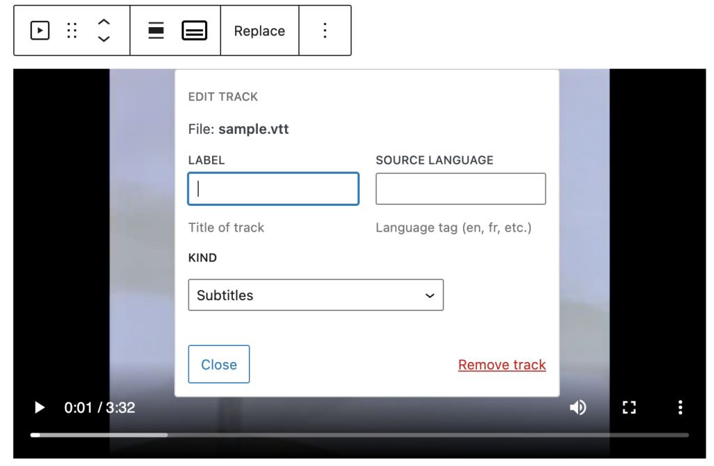
Label. A user-readable title of the text track which is used by the browser when listing available text tracks.
Source language. Language of the track text data. It must be a valid BCP 47 language tag. If the Kind attribute is set to Subtitles, then the Source language must be defined.
Kind. How the text track is meant to be used. If omitted, the default kind is Subtitles. If the attribute contains an invalid value, it will use Metadata.
- Subtitles: Translations of the dialogue in the video for when audio is available but not understood. Subtitles are shown over the video.
- Captions: Transcription of the dialogue, sound effects, musical cues, and other audio information for when the viewer is deaf/hard of hearing or the video is muted. Captions are also shown in the video.
- Descriptions: Text descriptions of what’s happening in the video for when the video portion isn’t available because the viewer is using assistive technology. Descriptions are read by a screen reader or turned into a separate audio track.
- Chapters: Chapter titles that are used to create navigation within the video. Typically they’re in the form of a list of chapters that the viewer can click on to go to a specific chapter.
- Metadata: Tracks with data meant for javascript to parse and do something with. These aren’t shown to the user.
Replace

The Replace option will allow you to select a new video file for your block. Use this if you need to replace the video file in your Video block. You’ll have the option to select Open Media Library, Upload, or Current media URL.
Options
The Options button on a block toolbar gives you more features to customize the block.
Read about these and other settings.
Block settings
The block settings panel contains customization options specific to the block. To open it, select the block and click the cog icon next to the Publish button.

Settings
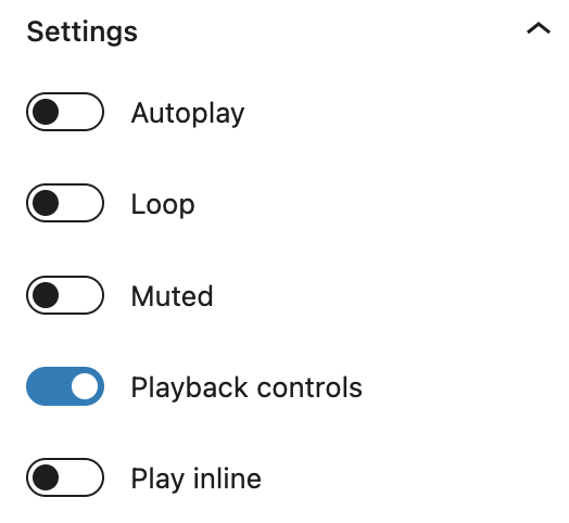
- Autoplay, Loop, Muted. These options let you set your video file to autoplay when someone visits the page or post. Looping lets you choose if the video file repeats after it is finished. You can also choose to mute the video if your circumstance requires it.
- Play inline. This option lets you set your video to be played inline, that is within the element’s playback area. Keep in mind that turning this option off does not imply that the video will always be played in fullscreen.
Playback controls
Toggle this option to show or hide the playback control overlay on the video. For example, a video with playback controls:
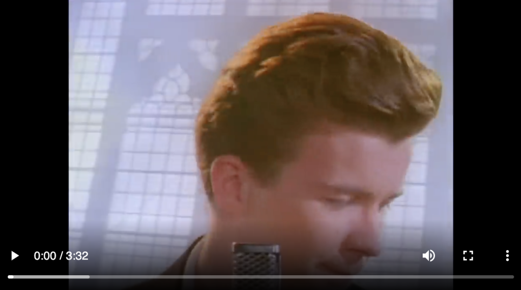
Without playback controls:

Preload

This option allows you to select how much of the video file is downloaded when the page or post is loaded. While it may be tempting to go ahead and have the whole file download automatically, keep in mind that this can slow your page’s load speed down.
There are three settings:
- Auto – The entire video file is downloaded, regardless of whether the visitor clicks the Play button or not. This makes the biggest impact on your page or post’s load speed, especially with larger video files.
- Metadata – Only basic info about the file will be downloaded automatically. Like the None option, the download of the video file only begins when someone clicks Play. This setting is also very fast, as the only thing downloaded is text. On a fundamental level, there’s not a big difference between None and Metadata.
- None – Nothing about the video file is downloaded automatically. The download of the video file only begins when your visitor clicks the Play button. This is the fastest setting.
Poster image
You can choose a poster image that will be displayed before a video is set to play. This can be useful if the first frame of the video isn’t necessarily appealing or indicative of the video content. An eye-catching poster image can really draw attention to your video.
Dimensions
The Video block provides dimension settings options to change padding and margin size.
For details, refer to this support article: Dimensions Settings Overview
Advanced

HTML Element allows you to make a unique web address for a particular Video block. Then, you’ll be able to link directly to a Video block of your page.
The Additional CSS class(es) lets you add CSS class(es) to your block, allowing you to write custom CSS and style the block as you see fit.
Changelog
- Updated 2023-02-17
- Revised formatting for the whole article
- Updated all the screenshots for 6.1
- Updated 2022-11-25
- Change screenshot alignment for mobile view
- Remove redundant text
- Added caption to images
- Updated 2022-02-04
- Changed screenshots
- Updated 2020-12-07
- Added Text tracks in Block Toolbar
- Changed screenshots in Block Toolbar
- Updated 2020-08-25
- Screenshots as per WordPress 5.5
- Added feature changes in Block Toolbar
- Added feature changes in Block Settings
- Updated 2020-06-18
- Added “Go back to the list of Blocks” to the top of the page
- Added the Changelog
- Created 2019-03-07