The button block has been deprecated since WordPress 5.4. Please use the buttons block instead.
]]>Use the Buttons block to add one or more buttons to your page or post. This block has been available since WordPress 5.4, when the button block was deprecated.
To add the Buttons block to a page, click the Add block button to open the block inserter pop-up window and choose the Buttons block.
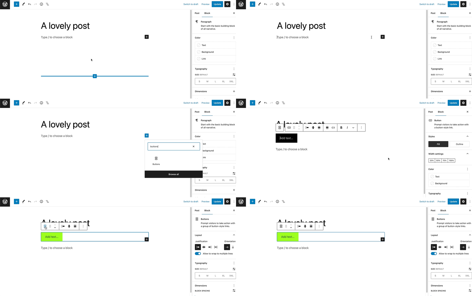
You can also use the keyboard shortcut /buttons to quickly insert a Buttons block.
Detailed instructions on adding blocks
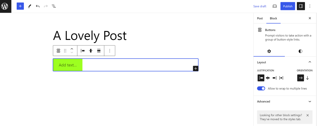
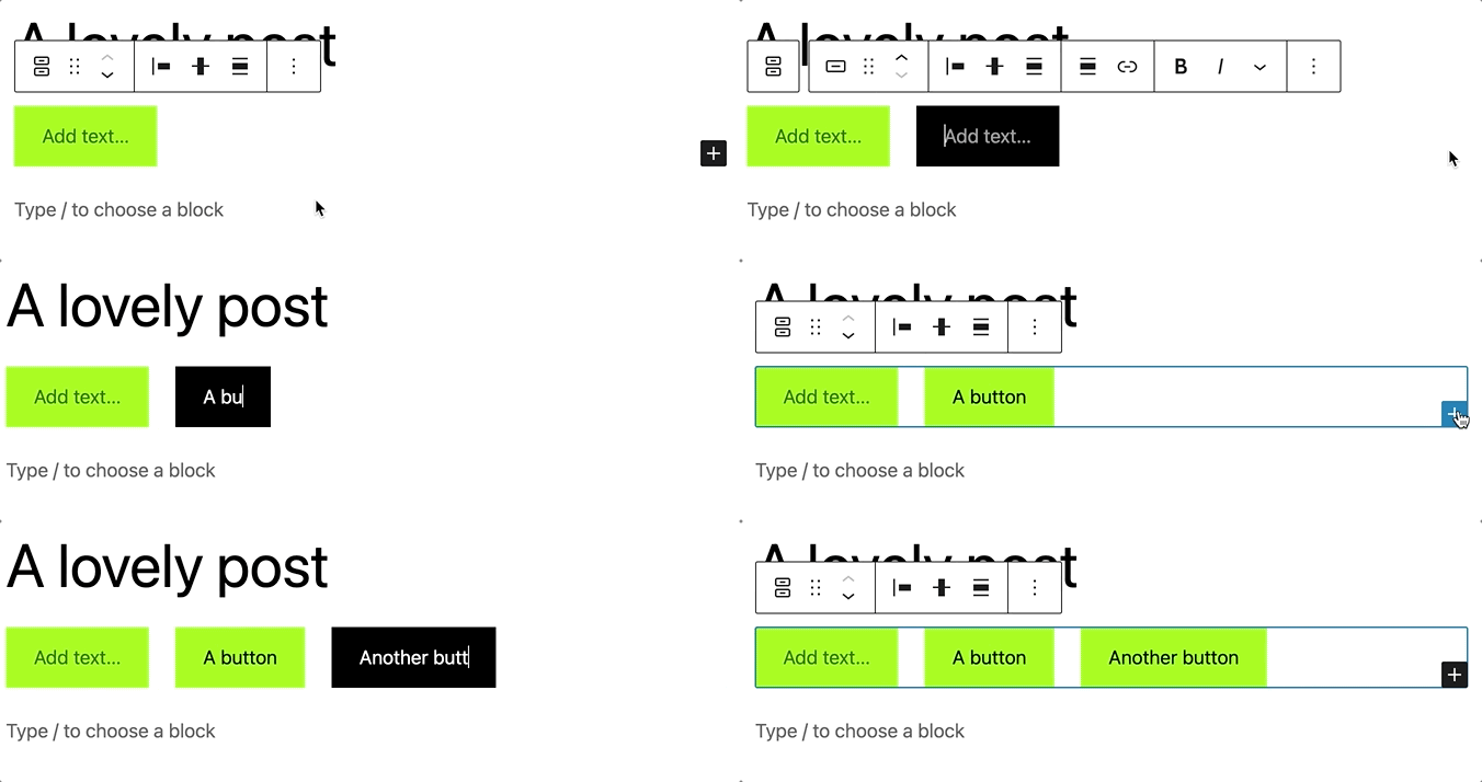
The Buttons block comes with one individual button block by default. You can customize the text, link, and style for this button. To add more buttons, click the plus Add block button in the bottom right corner within the Buttons block, and a new button will appear. Note that the new button will follow the same style as the existing button.
Block toolbar
To view the block toolbar, click on the block, and the toolbar will be displayed.
Every block comes with unique toolbar icons and blocks specific user controls that allow you to manipulate the block right in the editor.The Buttons block has a toolbar for the individual button and a toolbar for the entire block.
For the entire block

The main toolbar for the entire block has the following buttons:
- Transform to
- Drag icon
- Move arrows
- Change items justification
- Change vertical alignment
- Align
- Options
Transform to
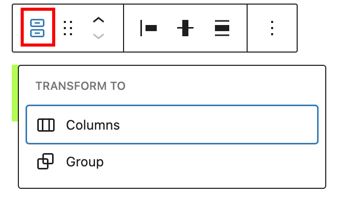
Click on the “Transform” button to convert the Buttons block into a “Group” or “Columns” block.
Drag icon

To drag and drop the block to a new location on the page template, click and hold the rectangle of dots, then drag it to the new location. The blue separator line indicates where the block will be placed. Release the left mouse button when you find the new location to place the block.
Move arrows

The up and down arrow icons can be used to move the block up and down on the page.
Get more information about moving a block within the editor.
Change items justification
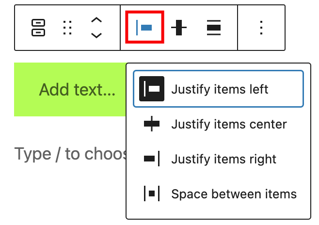
The items justification setting allows justifying the buttons to the left, center, or right. There is also an option to “Space between items”. If it is selected, the Buttons block will be centered with equal spacing between the buttons.

Change vertical alignment
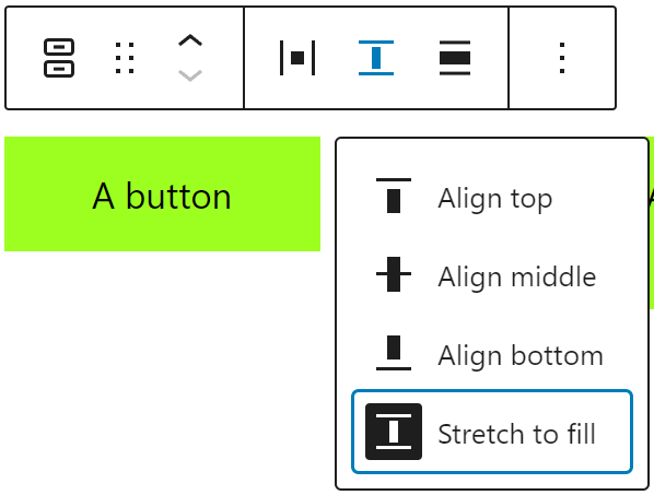
Use the change vertical alignment option to align buttons vertically with four possible options:
- Align top
- Align middle
- Align bottom
- Stretch to fill
Align
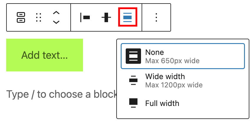
Use the change alignment tool to align the Buttons block. Choose one of the following options:
- None – leaves the block the current size.
- Wide width – increase the width of the block beyond the content size.
- Full width – extend the block to cover the full width of the screen.
The “Wide width” and “Full width” alignment settings must be enabled by your WordPress theme.
Options
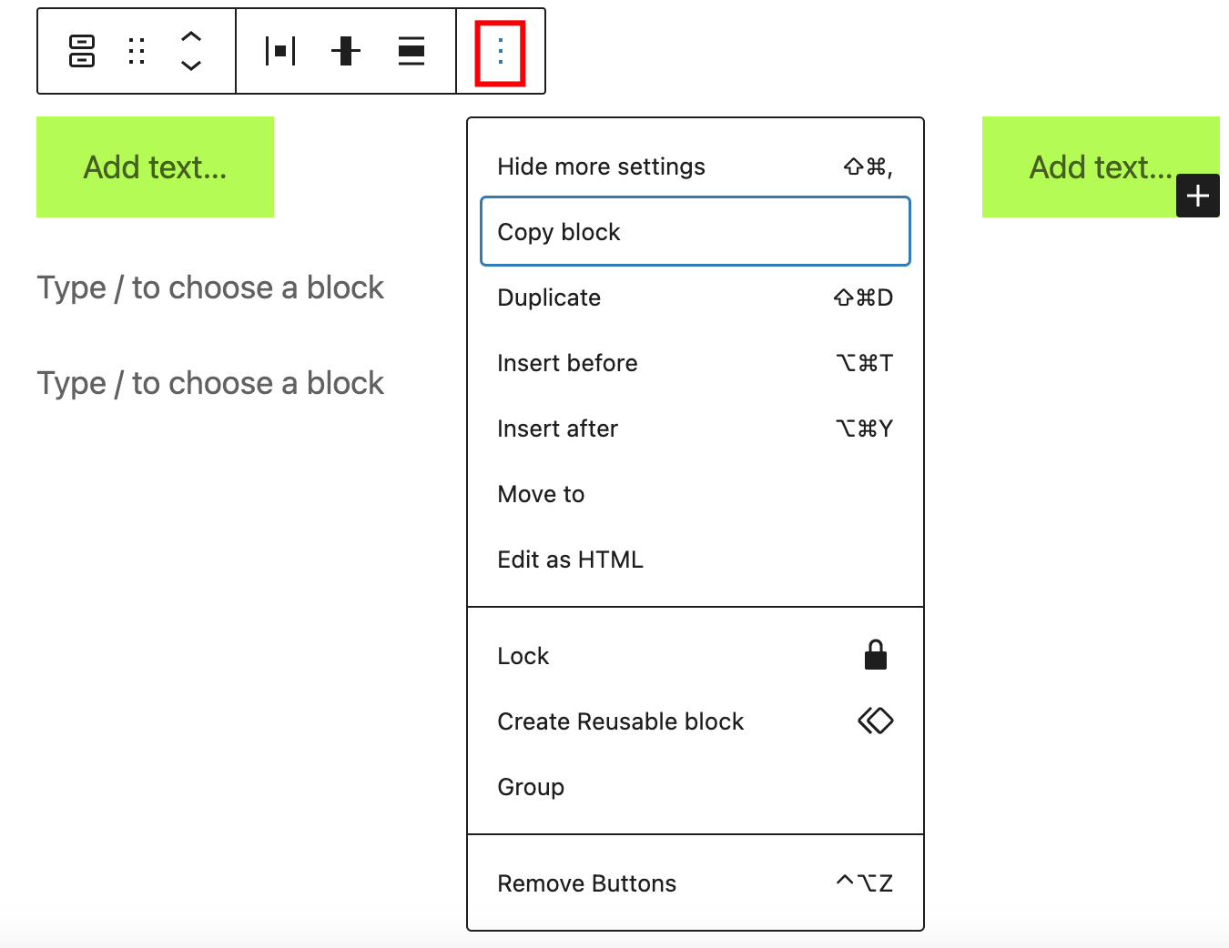
The Options button on a block toolbar gives you more features to customize the block.
Get more information about other settings
For individual button

If you select a specific button, a new toolbar will appear with these new options:
- Change block style
- Link
- Bold
- Italic
- More Rich Text controls
- Options
Change block style
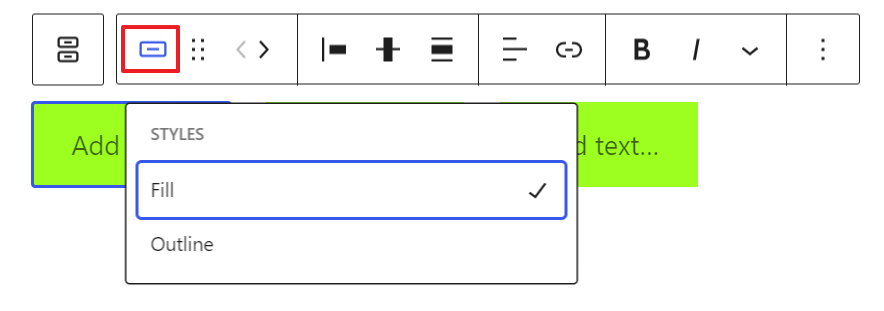
Use the change block style option to change the style of a particular button.
Link

Use the link option to add a link to the button. It’s also possible to set it to open the link in a new tab
Bold

You can select the text in the Buttons block and use the “Bold” option or “Ctrl+B” / “Cmd+B” on your keyboard to bold it, which is usually heavier than the surrounding text.
Italic

You can select the text in the Buttons block and use the “Italic” option or “Ctrl+I” / “Cmd+I” on your keyboard to italicize it, which usually appears slanted to the right.
More rich text options
The drop-down menu to the left of the More options menu contains a range of additional rich text editing options such as highlighting, inline code, strikethrough, and more.
Read about more rich text editing options.
Options
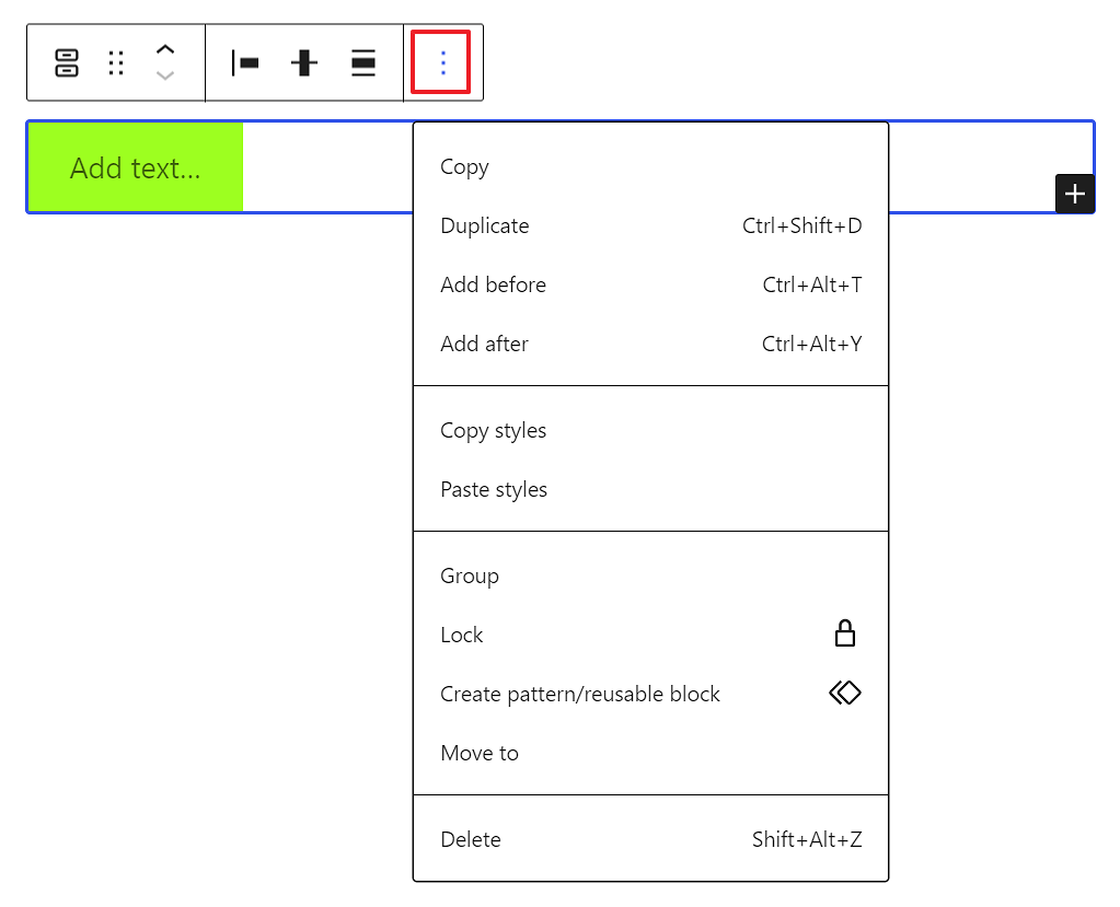
The Options button on a block toolbar gives you more features to customize a specific button.
Read about these and other settings.
Block settings
The block settings panel contains customization options specific to the block. To open it, select the block and click the Settings button next to the Publish button.

When the entire Buttons block is selected, you have the Layout, Typography, Dimensions, and Advanced customization settings.
For the entire block
When the entire buttons block is selected, you have the Layout, Dimensions, and Advanced settings for customization.
Layout
The Buttons block provides layout settings to change item justification and orientation.
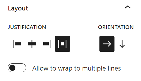
When a specific button from the Buttons block is selected, you have the Styles, Width, Color, Typography, Dimensions, Border, and Advanced customization settings.
This article provides details about layout settings.
Color
The Buttons block provides Color settings options to change the text and background colors
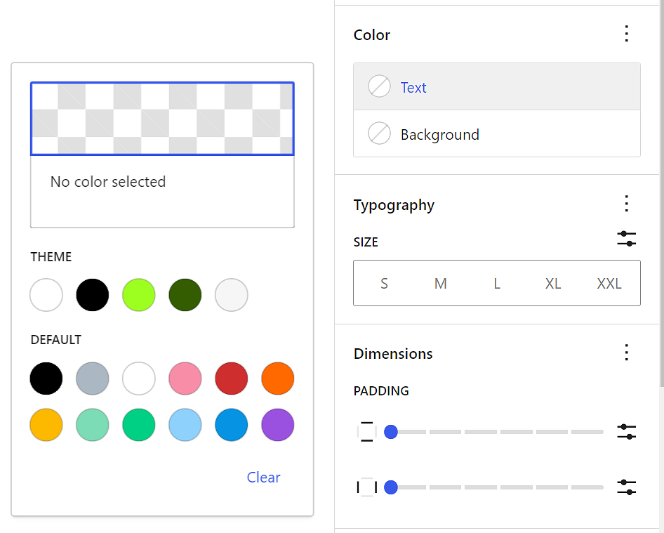
See this guide for more information about changing colors.
Typography
The Buttons block provides typography settings to change the font family, size, appearance, line height, letter case, letter spacing, and decoration.
Get more details about changing typography settings.
Dimensions
The Buttons block provides dimensions settings options to change padding and margin size.
Learn more about dimension controls.
Border
Border settings provide options to control the width and radius on each side of the button.
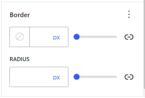
Learn more about border settings.
For individual button
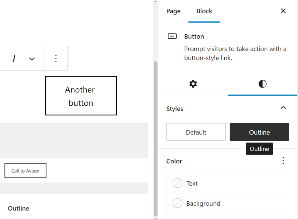
Styles settings
It’s possible to change the individual button style. Hover over a particular style to see how it looks.
Width settings

Each button can have its own width setting inside the buttons block based on a % value.
Advanced settings

You can add a Link rel attribute to each button in the block. This is a more advanced feature that enables to control the button link’s rel attribute, The rel attribute defines the relationship between a linked resource and the button. Eg: for rel attributes are nofollow, external, stylesheet, pingback, preload, prefetch, prev etc
You can also add HTML anchor and CSS class(es) to each button in the block.
HTML anchor allows you to make a unique web address for an individual button. Then, you’ll be able to link directly to that button on your page.
The Additional CSS class(es) lets you add CSS class(es) to your button, allowing you to write custom CSS and style the button as you see fit.
Based on which style you choose for the button block, WordPress automatically adds a CSS class to that button block. You can find the class in the Advanced settings panel under Additional CSS class(es). You can also add additional classes with spaces.
Changelog
- Updated 2023-11-21
- Updated screenshots for 6.4
- Updated 2023-11-11
- Updated title in sentence case
- Updated 2023-06-09
- Replaced “More rich text options” section with short summary linking to new dedicated page for rich text editing options.
- Updated 2023-03-07
- Revised formatting for the whole article
- Updated content and all screenshots for 6.2
- Updated 2022-11-22
- Change alignment for images
- Replaced redundant content
- Updated 2022-08-18
- Updated content, screenshots, and videos for 6.0.
- Added explanation for adding individual buttons and style preservation.
- Added new block toolbar options.
- Added images and info for space between items and change vertical alignment.
- Added details for the block settings sidebar info.
- Updated info for the More options for the individual button block.
- Removed Text Color from the block toolbar for the individual button block.
- Added ALT tags for the images.
- Updated 2022-02-15
- Updated screenshots to 5.9
- Updated video to 5.9
- Added new settings for previous versions
- Added Live example
The Columns Block allows you to insert text, media, and other types of content into columns – limit 6. When used one after another, the columns can create a grid effect.?
You can type /columns and hit enter in a new paragraph block to add one quickly.

Detailed instructions on adding blocks
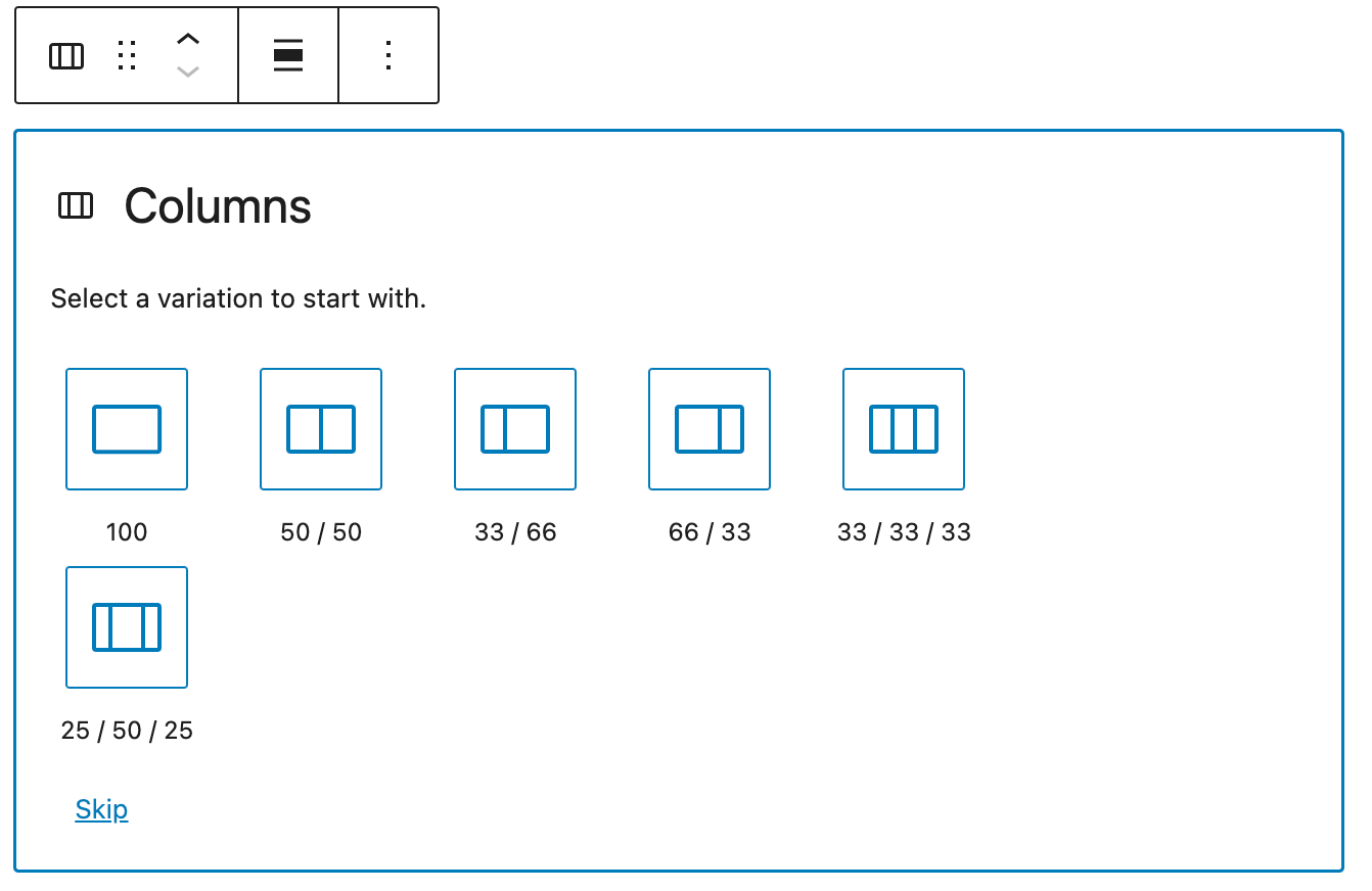
Once you add the Columns Block, you can choose a variation to start with (and you can change the number or add more columns later). If you want to use the default variation (50 / 50), you can click on the Skip option at the bottom.
Adding and removing columns
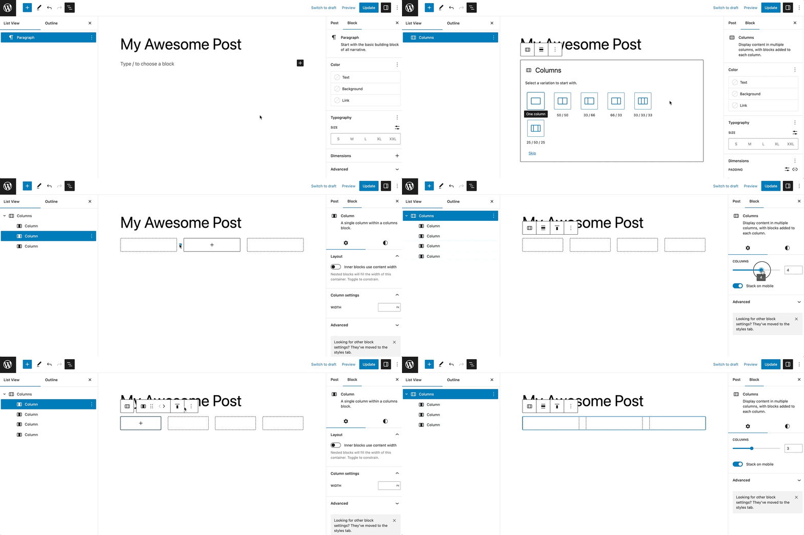
It is possible to add or remove columns. To do so, click outside the box, between the box and the sidebar, then change the number of columns (up to six is recommended). Alternatively, you can adjust the number of columns in the block setting section.
Adding content to the columns
Once you have defined the number of columns, you can add content to each column. The amazing thing about the columns block is that you can add other blocks into each of the columns.
For instance, you can use the Columns Block as the structure and add an image, heading, and paragraph block to create a grid of services.

Or you can use the Columns Block with the Cover Block to feature pages of your site.

You could also use the Columns Block with the Button Block to invite users to take some actions on your site.
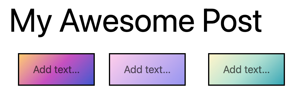
Block toolbar
Most blocks have their own block-specific controls that allow you to manipulate the block right in the editor.
The Columns Block shows the following buttons:
- Transform to
- Moving handles
- Change alignment
- Change vertical alignment
- More options

Transform to
You can transform columns into a Group block.
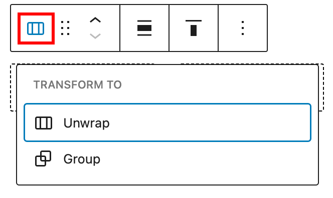
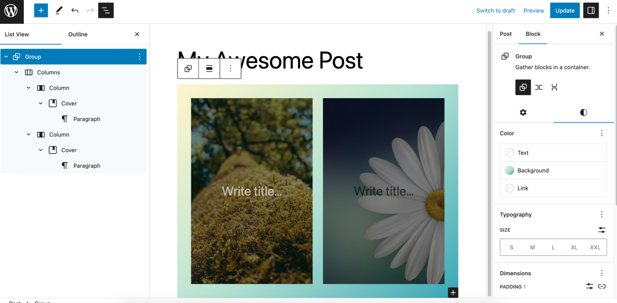
The Group would give you the ability to change the background color around the columns.
It’s also possible to unwrap the contents of Columns block
Moving handles
The dotted icons can be used to drag and drop a block to the place of your choosing. The up and down arrow icons can be used to shift a block up and down in your document.

Get more information about moving a block within the editor.
Change alignment
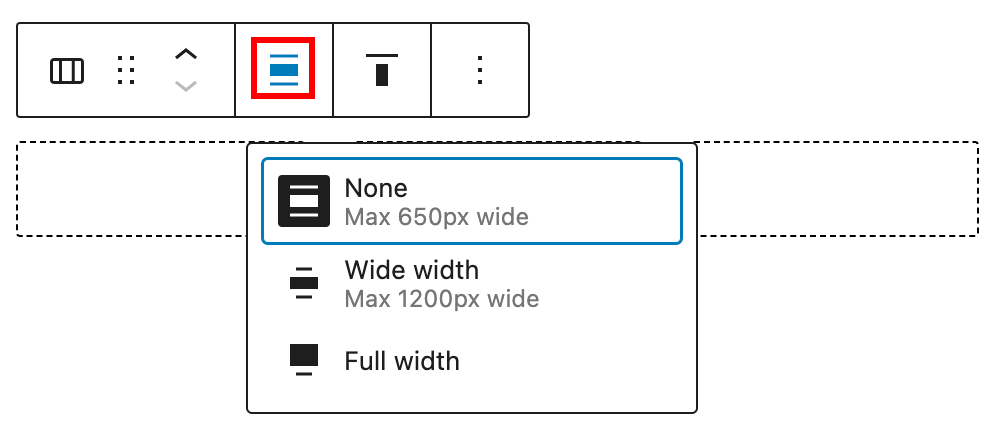
- None
- Wide width – Increase the width of the block beyond the content size.
- Full width – Extend the block to cover the full width of the screen.
Change vertical alignment
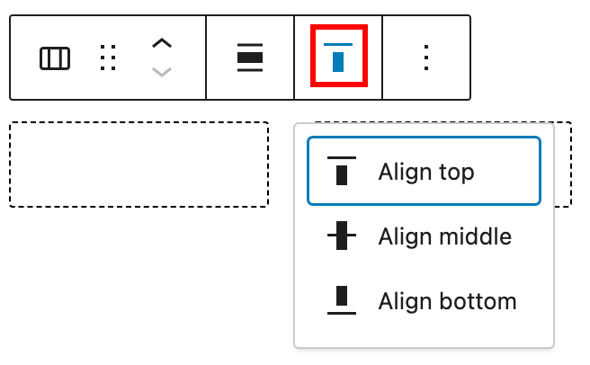
- Align top – Make the block vertically aligned top.
- Align middle – Make the block vertically aligned middle.
- Align bottom – Make the block vertically aligned bottom.
Options
The Options button on a block toolbar gives you more features to customize the block.
Read about these and other settings.
Block settings
The block settings panel contains customization options specific to the block. To open it, select the block and click the Settings button next to the Publish button.

Note that since the Columns Block has the ability to embed other blocks if you click specifically on one of the columns, the settings in the sidebar will change according to the block you added to the selected column (e.g. if you added an image to one of the columns when you click on the image the sidebar will display the options from the Image Block settings).
Here are the options for the Columns block:
Columns
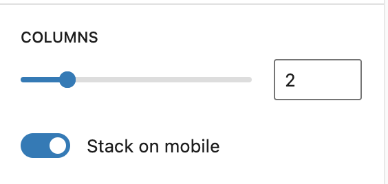
In the Columns settings, you can set the number of columns (1 to 6). You can edit the number of columns by clicking on the up and down arrows, dragging the slider to the right or left, or by typing the number directly in the field.
It’s also possible to change the Color, Typography, Dimensions, and Border settings. To access them, open the Styles section:
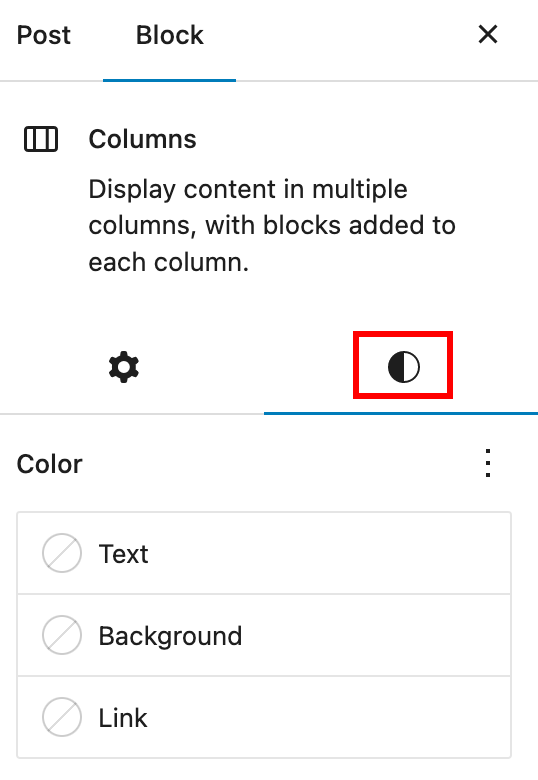
Color
With Color settings, you can change the color of the text in your block, the color of links, and the background color of your block. For the columns block, this means that you can style each column individually or both columns for consistency.
See this guide for more information about changing colors.
Typography
The Columns block provides typography settings to change the font family, appearance, line height, letter spacing, decoration, letter case, and font size.
For details, refer to this support article: Typography settings overview
Dimensions
The Columns block provides dimension settings options to add padding, margin, and block spacing.
For details, refer to this support article: Dimension settings overview
Border
The Columns block provides border settings options to add border color, style, width, and radius.
For details, refer to this support article: Border settings overview
Advanced
The Advanced tab lets you add HTML anchor and CSS class(es) to your block.
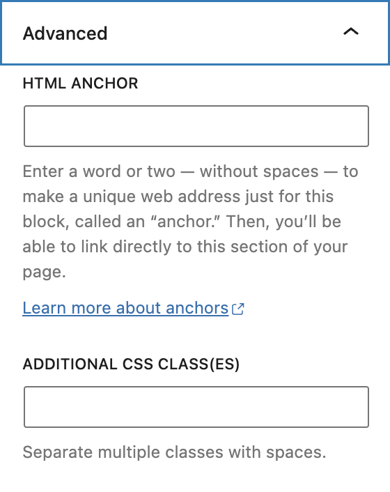
HTML anchor allows you to make a unique web address for a particular Columns Block. Then, you’ll be able to link directly to a Columns Block of your page.
The Additional CSS class(es) lets you add CSS class(es) to your block, allowing you to write custom CSS and style the block as you see fit.
For individual Column Blocks
For individual Column Blocks within the Columns Block, you can customize the width options as shown below. To make it easier to find and select the Column Block, it’s recommended to use List View.
The width option allows you to set the width of the individual column itself, in PX, %, EM, REM, VW or VH.
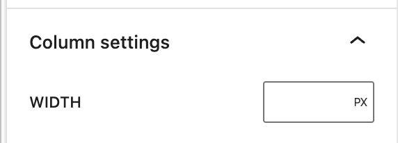
For individual Column Blocks within the Columns Block, you can also customize the Layout settings.
For details, refer to this support article: Layout settings overview
Changelog
- Updated 2022-05-09
- Content, screenshots, and video updated for 6.2
- Updated 2022-12-12
- Content, screenshots, and video updated for 6.1.
- Added block settings for Column block
- Updated 2022-11-21
- Aligned screenshots for mobile view
- removed redundant content
- Added alt text to some images
- Updated 2021-07-09
- Updated screenshots.
- Added in context around styling individual columns.
- Added information about spacing and width options for individual columns.
- Updated 2020-08-24
- Added “Go back to the list of Blocks” to the top of the page
- Updated 2020-08-21
- Screenshots and videos as per WordPress 5.5
- Added feature changes in Block Toolbar
- Added feature changes in Block Settings
- Created 2019-03-07
The Group block allows you to group different blocks together and customize them to your liking, including setting custom background colors, spacing, and more.

Adding a Group block
To add a Group block, click on the Block Inserter icon.
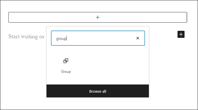
You can also type /group and hit enter in a new paragraph block to add one quickly. Row and Stack are also types of Group blocks, they just have a different layout style by default.
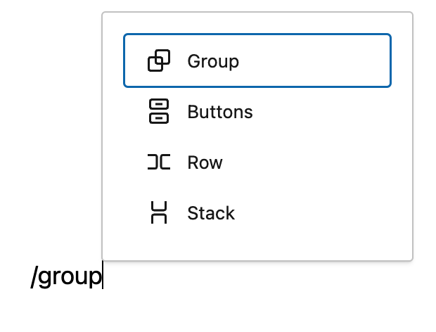
Block variations
When the Group block is created, you will find different variations to choose from: Group, Row, and Stack

Converting multiple blocks to a Group block
You can also create a group by selecting multiple blocks. Multiple blocks can be selected by dragging your mouse. You can also select multiple blocks by holding down the “shift” key and using your navigation arrows or clicking on multiple blocks. Once one or more blocks have been selected, you will notice that the group icons will appear. You can click on these icons or use the “more options” button to convert them into a single group, as seen in the video below:
Detailed instructions on adding blocks
Block toolbar
Most blocks have their own block-specific controls that allow you to manipulate the block right in the editor. The Group block offers standard block options as well as full-width and wide-width options, if the theme supports these alignment styles.
The Group block shows three buttons in addition to the “Group” block icon.
- Moving handles
- Change alignment
- More options
Moving handles
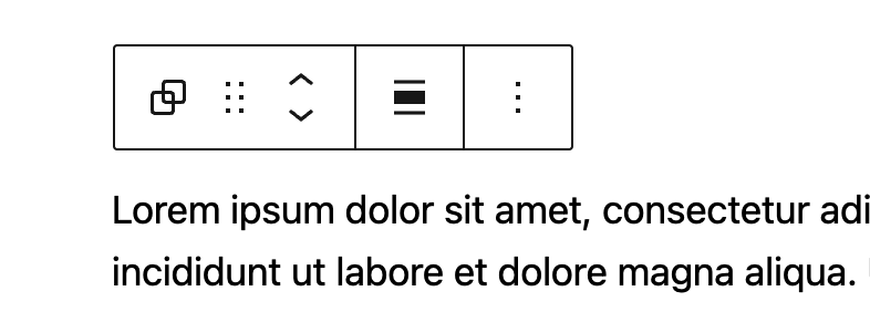
The up and down arrow icons can be used to shift a block up and down in your document.
Detailed instructions on moving a block within the editor can be found here.
Change alignment

None – Is the default width, the same as the main content.
Wide width – Increase the width of the post beyond the content size.
Full width – Extend the block to cover the full width of the screen, if supported by your site’s theme.
More options
These controls give you the option to copy, duplicate, and edit your block as HTML.
Read about these and other settings.
Editing the block
The nice thing about the Group block is that you can add any other blocks inside the group block and create a layout of your own. To add blocks to the Group block, click on the inserter icon inside the Group block.

Adding content
Inside the Group block, you can add a columns block, cover block or any other available block to create the layout of your choice.

The group block shown here has columns, heading, paragraph, image and button blocks.
Note that since the Group block has the ability to embed other blocks, if you click specifically on one of the blocks, the settings in the sidebar will change according to the block you added to the Group block. For example, if you added an image inside the Group block, when you click on the image the sidebar will display the options from the Image block settings.

Every block has specific options in the editor sidebar in addition to the options found in the block toolbar. If you do not see the sidebar, simply click the ‘Settings‘ icon next to the Publish/Update button. Within the Group block settings, you will see two tabs, one is for general settings and the other one is for styles.
Group block settings

Alignment
There are three alignment options for the Group block:
- Default
- Row (Horizontal)
- Stack (Vertical)
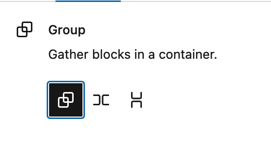

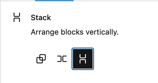
If you set a block to “Row”, you will see a number of new options to justify the items inside the row:

Items can be set to justify left, center, right or “space between items”. This last option will distribute the items inside the row to use all the available width. Additionally, by changing the “orientation” setting, you can have your items change from flowing horizontally to flowing vertically, as illustrated in the video below.
There is a second alignment option to specify how items should align vertically.
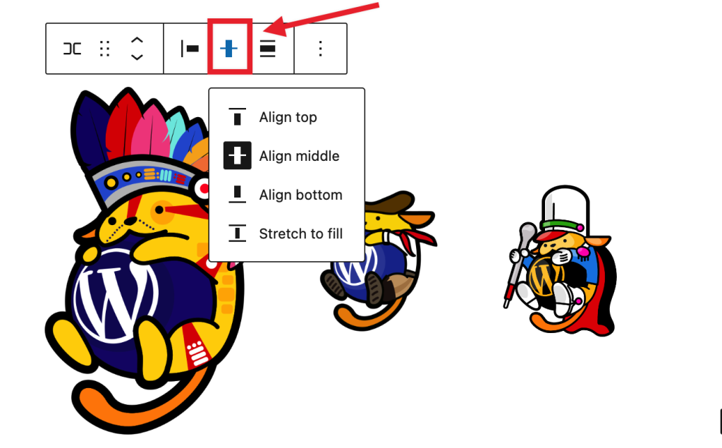
This is useful when the items inside the row have different heights, as seen in the example below:
Layout and content width
This is an advanced option that allows you to add custom content widths to the overall Group block for all blocks assigned to the center or wide columns. In many cases, you won’t need to use this option. When you toggle this option on, it allows the Group block to inherit the options set by your theme. When it’s toggled off, you can customize to your liking.
This article provides details about layout settings.
Position (sticky)

The “Position” group setting allows you make a group block stick to the top of the viewport instead of scrolling, as seen in the demo below:
Please note that only “top level” Group blocks can be set as sticky. If a Group block is embedded inside any other block, the “Position” setting will not be available in the settings.
Advanced
The “Advanced” tab lets you specify the HTML element used for the group and add HTML anchor & CSS class(es) to your block.

The HTML Element option allows you to select what HTML tag you want to use for that group. You can choose between the following tags:
- Div (default)
- Header
- Main
- Section
- Article
- Aside
- Footer
HTML anchor allows you to make a unique web address for a particular “Group” block. Then, you’ll be able to link directly to a “Group” block of your page.
The Additional CSS class(es) area lets you add CSS class(es) to your block, allowing you to write custom CSS and style the block as you see fit.
Group block styles
Color
When the group block is selected, you can see the color settings in the sidebar. You can select the text, background, and link colors to your liking.
See this guide for more information about changing colors.
Border
This option allows you to set a border around the Group block, including the color, the width, radius, and the style of the border.
Learn more about border settings.
Dimensions
The option to control block spacing and padding is enabled for the Group block. You can read more about these settings in the
Learn more about dimension controls.
Changelog
- Updated 2023-11-21
- Capitalization of headings to sentence case
- Updated 2023-04-04
- Added link to the list of blocks
- Updated 2023-03-29
- Updated to reflect the 6.2 changes
- Updated 2022-11-25
- Removed redundant content
- Added alt text to the some images
- Updated to include Dimension controls for WP 5.9 2022-01-17
- Updated with new images for WP 5.6 2020-11-27
- Created 2020-09-21
The More block is used to display a ‘Read More’ link to the full blog post, on the blog home page, or on the archive pages.
If your theme is set to show the post’s full content on archive pages or the blog home page, then a post using the More block truncates your blog entries so that only the part of the post before the More block is displayed on the home page and archive pages, followed by a “Read More” link. Clicking on the ‘Read More’ link directs the reader to the full blog post.
If your theme is set to show only the excerpts on the archives page and the blog home page, the More block is ignored. The excerpt displayed is the one manually entered for the post.
The More block can be placed anywhere in a post. You can customize the link to say whatever you want. You can only insert one More block in each Post.
The More Block works only for Posts, (not Pages).
And this is how it will look on your site (Styles may vary depending on your theme).
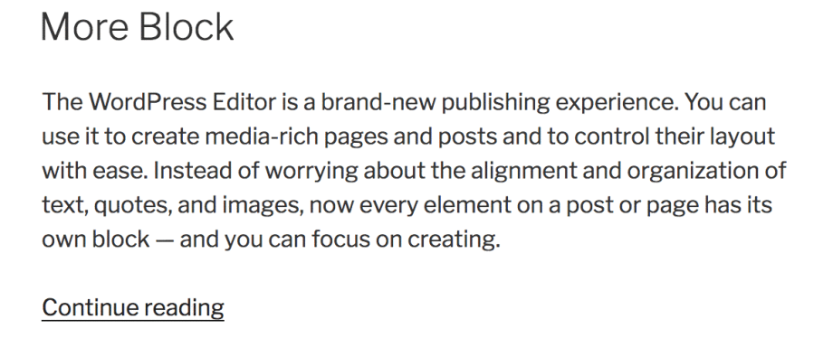
To add a More block, click on the Block Inserter icon.
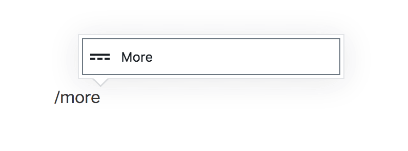
You can also type /more and hit enter in a new paragraph block to add one quickly.
Detailed instructions on adding blocks
Editing the Block
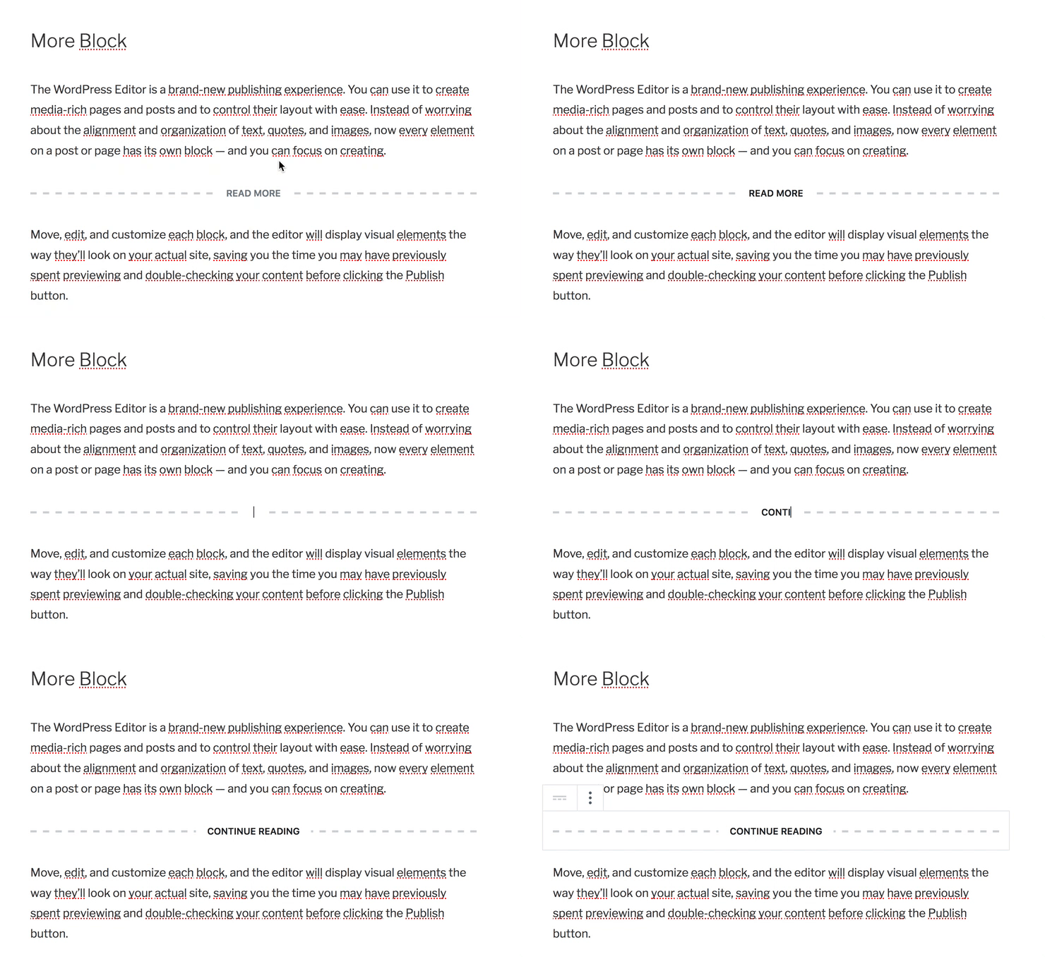
Once you add the block, you can edit the Read More text that appears by default by clicking in the middle of the dashed lines, erasing the text, and typing anything you want. To revert back to the default text that your theme displays, remove all the text from the More block and save your Post.
Block Toolbar
Each block has its own block-specific controls that allow you to manipulate the block right in the editor. The More block offers the following buttons on the Block toolbar:
Transform to
Drag icon
Move handles
More options

Transform to
Click on the “Transform” button to convert the More block into a “Columns” or “Group” block. “Group” gives you the ability to change the background color around the More block.

Drag icon

To drag and drop the block to a new location on the page template, click and hold the rectangle of dots, then drag to the new location. The blue separator line indicates where the block will be placed. Release the left mouse button when you find the new location to place the block.
Move handles
The up and down arrow icons can be used to shift a block up and down on the page.

Get more information about moving a block within the editor.
More options
These controls give you the option to copy, duplicate, and edit your block as HTML.
Read about these and other settings.
Block Settings
Every block has specific options in the editor sidebar in addition to the options found in the block toolbar. If you do not see the sidebar, simply click the ‘cog’ icon.

The Block Sidebar for the More block has a toggle switch to:
Hide the excerpt on a full content page

By enabling the ‘Hide the excerpt‘ toggle button, the content that appears before the More block will not display on the full post, once the user clicks on the More link after the excerpt.
This option is disabled by default. This feature is helpful if you would like to display custom excerpt on the homepage and archive pages but when the user clicks to read the full post, the excerpt is hidden.
Changelog
- 2022-11-27
- Removed redundant content
- Added headings
- Aligned images for mobile view
- Updated 2022-06-23
- Added content, images, video for 6.0
- Added ALT tags for the images
- Updated 2021-02-10
- Added Note section
- Created 2019-03-07
Use the page break block to separate your content into a multiple-page experience and add pagination, or page breaks, to a page or post. This can be useful if you are writing a step-by-step tutorial or if you’d like to split your page into multiple chapters, for instance.
In order to add a page break block, click on the Block Inserter icon.
You can also type /page-break and hit enter in a new paragraph block to add one quickly.

Detailed instructions on adding blocks
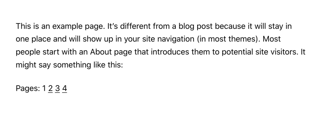
You can add as many page breaks as you want to your post or page. Each page break block adds a new number to the multi-page link that appears at the bottom, splitting the content into more pages.
Block Toolbar
Each block has its own block-specific controls that allow you to manipulate the block right in the editor. The page break block has the following options in the Block toolbar.

Transform to
You can transform a Page Break block into a Columns, or a Group block.

Block-moving tools

Use the block-moving tools to move the block up and down inside the editor. Use the six dots icon to drag and drop the Page Break Block and reposition it anywhere on the editor. Alternatively, click on the up and down arrows to move the block up or down the editor.
Get more information about moving a block within the editor.
More options
These controls give you the option to copy, duplicate, and edit your block as HTML.
Read about these and other settings.
Block Settings
Every block has specific options in the editor sidebar in addition to the options found in the block toolbar. If you do not see the sidebar, simply click the ‘cog’ icon next to the Publish button.
The page break block doesn’t have any additional options on the sidebar. Once you add it to your page or post you are all set!
Changelog
- Updated 2022-11-28
- Removed redundant content
- Aligned images for mobile view
- Updated 2022-08-03
- Screenshots, video and content updated for 6.0
- Added ALT tags for the images
- Created 2019-03-07
One way to enable this is by setting an HTML Anchor to a Heading block on your page and creating a link that jumps to the anchor. You can even jump to another page’s anchor.
This can also be accomplished with any other block that allows for an HTML Anchor to be set under “Advanced”. You can review which blocks have the HTML anchor field by reviewing the Core Blocks Reference and looking for blocks with the anchor attribute.
Create an HTML Anchor

- Use the Plus Icon to add a new block.
- Select Heading as the block type, or start typing
/headingas a shortcut (slash command) to the heading block. - Enter your heading text. You may leave blank in heading text if you do not want to display any text.
- On the right side under Block Settings, click on Advanced.
- Type a word that will become your link into the HTML Anchor field.
HTML Anchor Syntax
- HTML Anchor must be unique within a document.
- HTML Anchor is case-sensitive.
- HTML Anchor can include following symbols: hyphen(-), underscore(_), colon(:), period(.). It cannot include space.
- HTML Anchor must start in the alphabet.
Link to your HTML Anchor
- Type some text, or add an image or button that will become what you want your visitors to click on to go to another section.
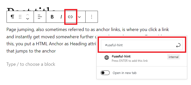
- Highlight the text, image or button, and select the link option from the block’s toolbar.
- Type in the HTML Anchor you created, starting with the pound (#) symbol. For example, if you created an Anchor named important-notice you would link to #important-notice.
Jumping to an anchor on another page
If you want to jump to another page’s anchor, then specify URL with HTML Anchor. For example, example.com/anotherpage#important-notice
Changelog
- 2023-07-25
- Update video URL
- 2022-10-28
- Added a little more information about Page Jump Links use cases and other available blocks
- Removed a note about jump links not working in Preview mode
- Added Video walkthrough of Page Jumps
- Updated screenshots through WordPress 6.0
- Updated Alt text for images
- Created 2019-06-15
Use the Row block to arrange blocks horizontally.
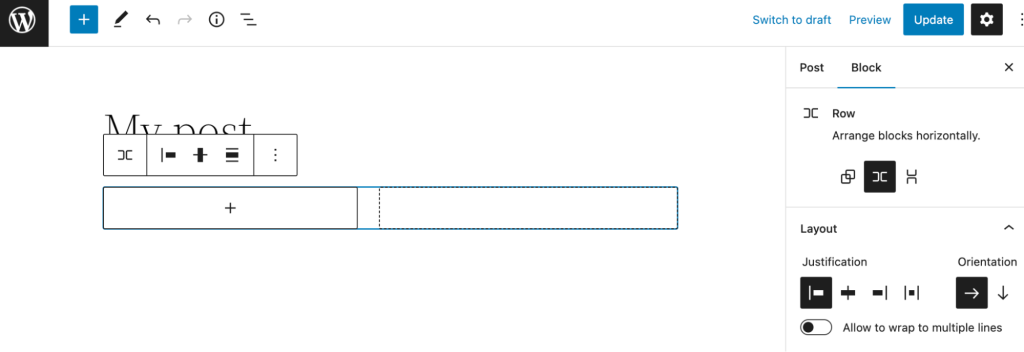
Click the (+) icon to open the block inserter pop-up window and search for the Row block.
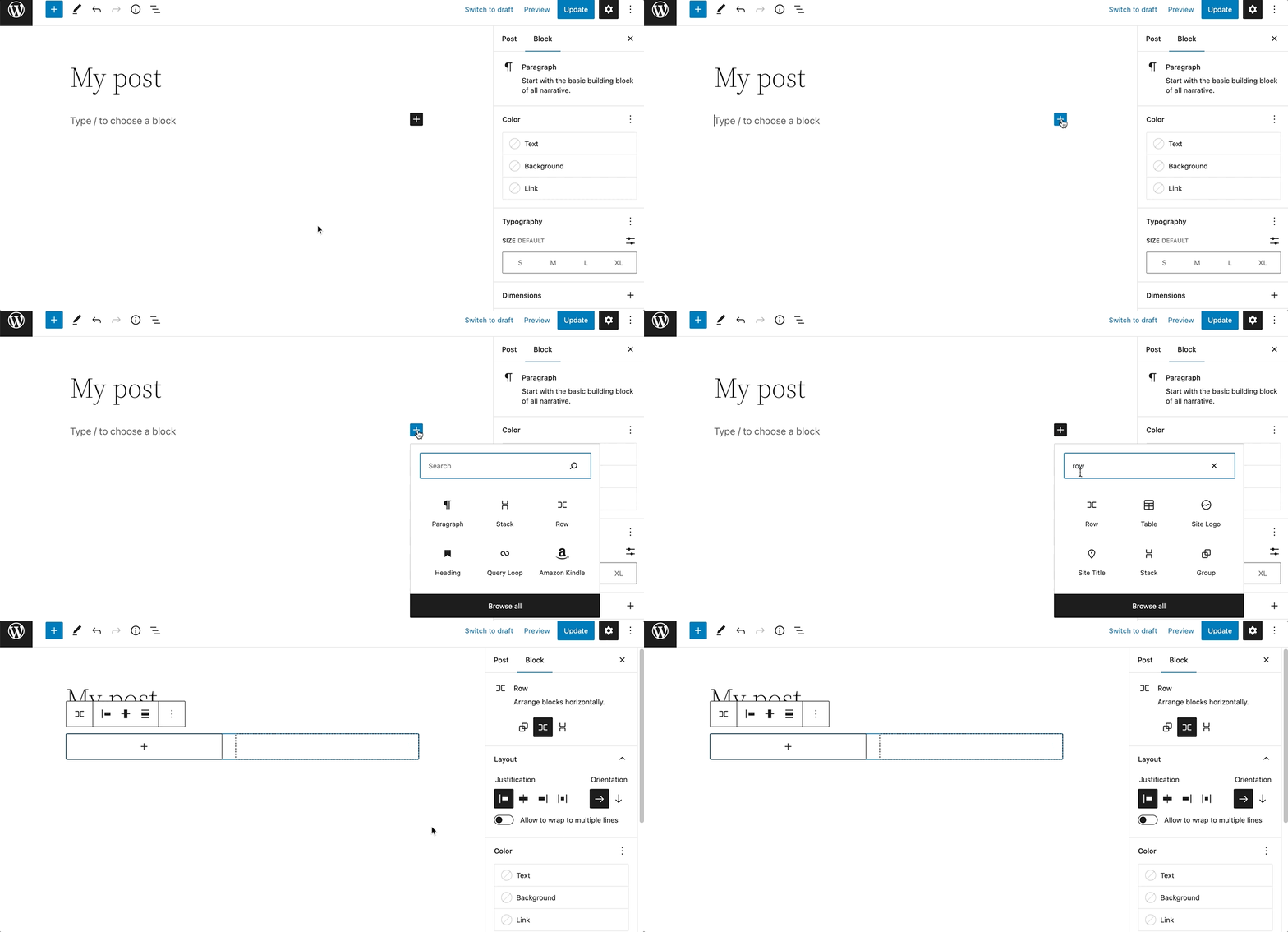
You can also use the keyboard shortcut /row-block to quickly insert a Row block.
Detailed instructions on adding blocks can be found here.
Block toolbar
To view the block toolbar, click on the block, and the toolbar will be displayed.
Every block comes with unique toolbar icons. These block-specific controls allow you to manipulate the block right in the editor.
The Row block shows six buttons in the block toolbar:

- Transform to
- Drag
- Move up/down
- Change items justification
- Change vertical alignment
- Align
- Options
Transform to
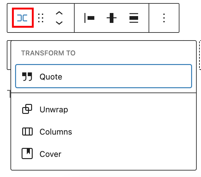
Click on the Transform button to convert the Row block into Quote, Columns, or Cover blocks. It’s also possible to unwrap the Row block.
Drag button

To drag and drop the block to a new location on the page template, click and hold the Drag button, then drag it to the new location. The blue separator line indicates where the block will be placed. Release the left mouse button when you find the new location to place the block.
Move arrows

The Move up and Move down buttons can be used to move the block up and down on the page.
Detailed instructions on moving a block within the editor can be found here
Change items justification
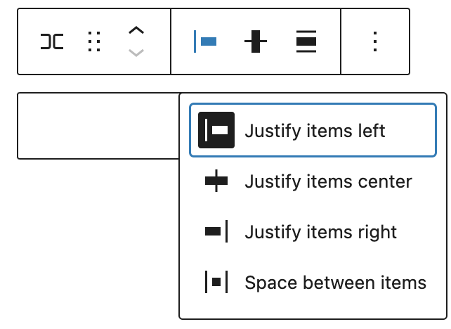
Click the Change items justification button in the Block toolbar to display the justification drop-down. You can justify the block text to the left, make it center-justified, align it to the right or leave a space between items.
Change vertical alignment
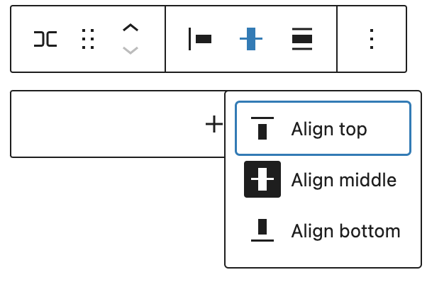
Use the Change vertical alignment tool to reposition the Row block. The following is a list of the block alignment options:
- Align top
- Align middle
- Align bottom
Change alignment
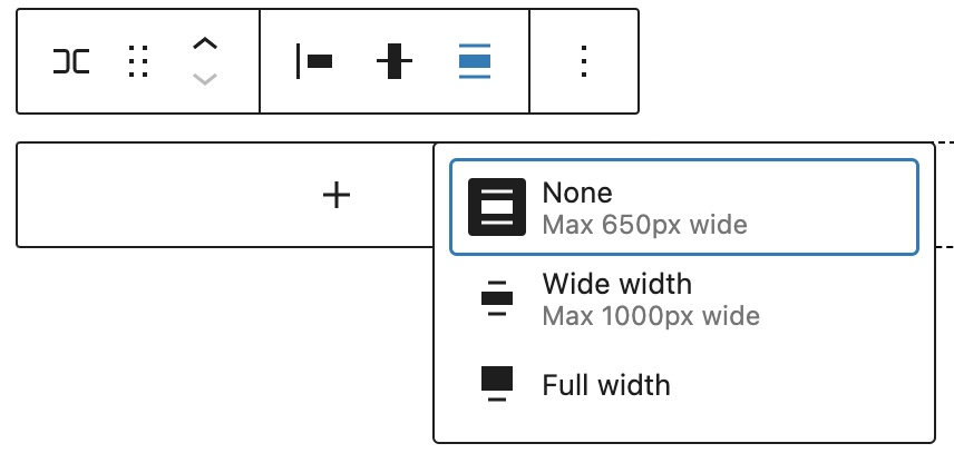
Use the Change alignment tool to change the width of the Row block. The following is a list of the block width options:
- None
- Wide width
- Full width
More options
The More option on a block toolbar gives you more features to customize the block.
Read about these and other settings.
Block Settings
The block settings panel contains customization options specific to the block. To open it, select the block and click the Settings button next to the Publish button.

Here are the options for the Row block:
Settings
Click the Group or Stack button in the Block Settings to transform the Row block to Group or Stack blocks.
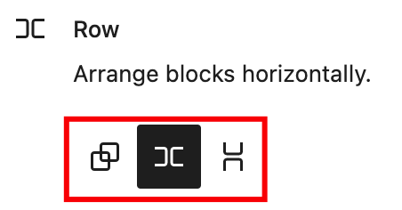
Layout
The Row block provides Layout settings options to change the justification or orientation of the text and to wrap to multiple lines.
For details, refer to this support article: Layout settings overview
Color
The Row block provides Color settings options to change the text, background, and link colors.
For details, refer to this support article: Color settings overview
Typography
The Row block provides typography settings to change the font family, appearance, line height, letter spacing, decoration, letter case, and font size.
For details, refer to this support article: Typography settings overview
Dimensions
The Row block provides dimension settings options to add padding and margin.
For details, refer to this support article: Dimension settings overview
Border
The Row block provides border settings options to add border color, width, and radius.
For details refer to this support article: Border settings overview
Advanced
The Advanced section lets you add CSS class(es) to your block. This will allow you to write custom CSS and styles to the block.

Changelog
- Updated 2022-11-25
- Added link to Border and layout settings overview page and removed content from this page
- Created 2022-11-24
The separator block creates a break between two blocks of content with a horizontal line. This helps to create a separation between ideas or sections on your post or page.
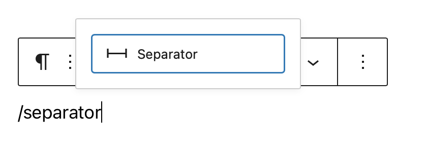
In order to add a separator block, click on the Block Inserter icon.
You can also type /separator and hit enter in a new paragraph block to add one quickly.
Detailed instructions on adding blocks
Block toolbar
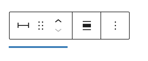
Each block has its own block-specific controls that allow you to manipulate the block right in the editor. The separator block has the following options in the Block toolbar.
Transform to
You can transform a Separator block into a Columns, or a Group block. You can also switch the styles from Default to Wide Line or Dots.

Block-moving tools

Use the block-moving tools to move the block up and down inside the editor. Use the six dots icon to drag and drop the Separator Block and reposition it anywhere on the editor. Alternatively, click on the up and down arrows to move the block up or down the editor.
Get more information about moving a block within the editor.
Change alignment
The change alignment tool lets you align the Separator block within the content. You can choose one of the following alignment options:

None: Leaves the block alignment as is.
Wide width: Increase the width of the block beyond the content size.
Full width: Extend the block to cover the full width of the screen (if supported by your site’s theme).
Align center: Align the block to the center of the content.
More options
These controls give you the option to copy, duplicate, and edit your block as HTML.
Read about these and other settings.
Block settings
Every block has specific options in the editor sidebar in addition to the options found in the block toolbar.?If you do not see the sidebar, simply click the ‘sidebar’ icon.

Styles
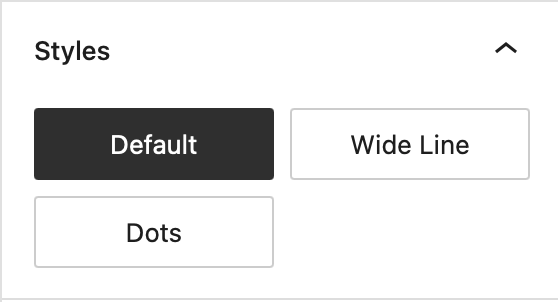
You can modify the Separator block’s look by choosing one of the styles available in the block’s settings on right-hand side under?Styles. You can either hover or focus click on each of the style buttons (e.g. ‘Default’, ‘Wide Line’ or ‘Dots’) to get a preview of the styles.
Note: The style options may vary based on your theme!
Color
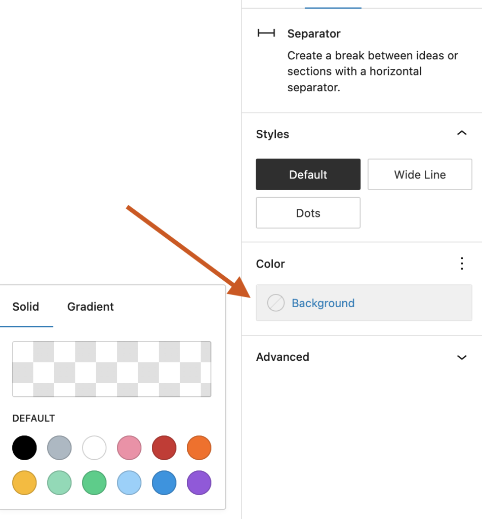
The color settings let you customize the color for the Separator block. Pick a color from the suggestions, or add a custom color using the color picker or by adding a color code.
See this guide for more information about changing colors.
Dimensions
The separator block provides the ability to add margin values via the Dimensions settings option, giving you more control over content separation.
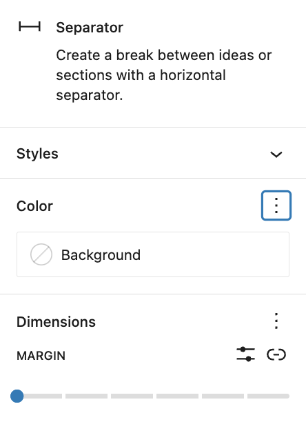
See this guide for more information about dimensions settings.
Advanced settings
The “Advanced” tab lets you add HTML anchor and CSS class(es) to your block.
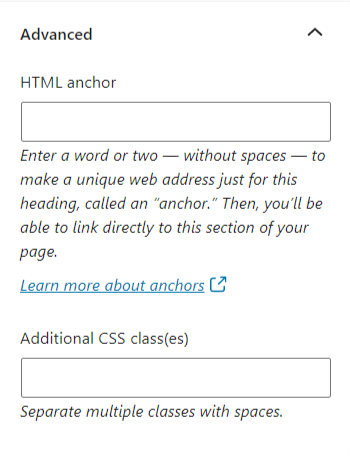
“HTML anchor” allows you to make a unique web address for a particular block. Then, you’ll be able to link directly to that block on your page.
The “Additional CSS class(es)” lets you add CSS class(es) to your block, allowing you to write custom CSS and style the block as you see fit.
When selecting one of the three styles available, this field is pre-populated with the CSS class that targets the chosen style. For example,
- The default separator adds
is-style-defaultCSS class - The wide line separator adds
is-style-wideCSS class - The dots separator adds
is-style-dotsCSS class
Changelog
- Updated 2023-06-28
- Updated video & screenshots for 6.2
- Added dimensions settings section
- Tweaked wording for Styles section to include preview on hover/focus click
- Updated 2022-11-22
- Removed redundant content
- Aligned images for mobile view
- Updated 2022-08-03
- Screenshot, content, and video updated for 6.0
- Added ALT tags for the images
- Updated 2020-08-23
- Updated images to WP 5.5
- Updated 2020-08-10
- Added link to the list of blocks
- Added changlog box
- Created 2019-03-07
A vertical spacer adds space between blocks in a column (as in a page or post).
A horizontal spacer adds space between blocks in a row (as in a Navigation block).
(Note: Using a Navigation block requires a block theme or a theme that has support for template editing.)
In this video, you can see how you can use the spacer block and the different settings to modify it.
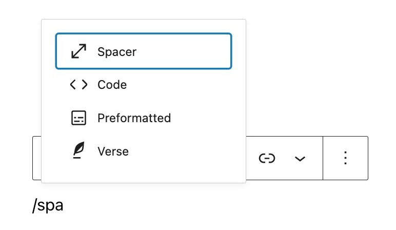
To add an spacer block, click on the Add Block icon.
You can also type /spacer and hit enter in a new paragraph block to add one quickly.
Block toolbar
In order to reveal the block toolbar, you can click on the block and the toolbar will display.
Every block comes with unique toolbar icons and blocks specific user controls that allow you to manipulate the block right in the editor.
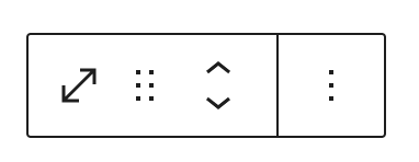
The Spacer block shows four buttons in the block toolbar:
- Transform to
- Drag icon
- Move arrows
- More options
Transform to:
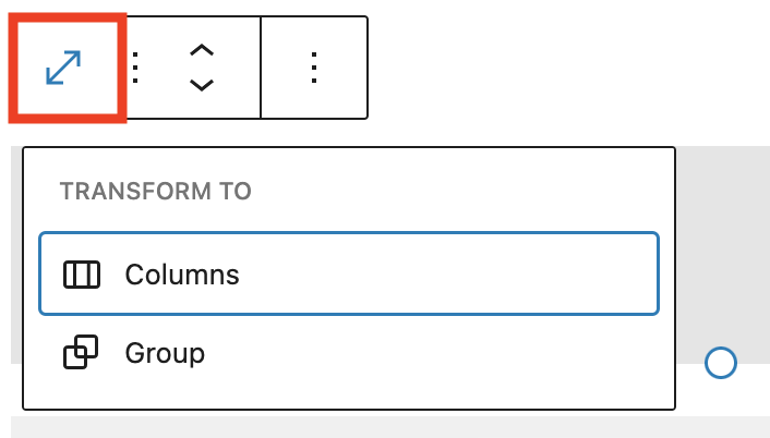
When you click on the “Transform” button you can convert the Spacer block into a “Columns” block or “Group” block. The “Group” would give you the ability to change the background color.
Drag icon:
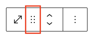
To drag and drop the block to a new location on the page template, click and hold the rectangle of dots, then drag to the new location. The blue separator line indicates where the block will be placed. Release the left mouse button when you find the new location to place the block.
Move arrows:
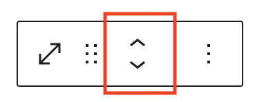
The up and down arrow icons can be used to move a block up and down in your document.
Get more information about moving a block within the editor.
More options
These controls give you the option to copy, duplicate, and edit your block as HTML.
Read about these and other settings.
Block settings
Every block has specific options in the editor sidebar in addition to the options found in the block toolbar. If you do not see the sidebar, simply click the ‘cog’ icon next to the Publish button.
Spacer settings
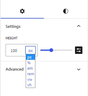
The Height setting adjusts the height of the space. The Width setting adjusts the width of the space. You can adjust the settings by either:
- Typing the number in the “Spacer Settings” box, or
- Dragging the handle at the bottom of the spacer (for the vertical spacer) or at the side of the spacer (for the horizontal spacer).
You can also change the unit by clicking on PX to display a dropdown with the other supported units- PX, %, EM, REM, VW, and VH.
When Spacer is a child of a flex layout block (Row, Stack, Navigation) custom size controls are removed and flex child controls added instead.
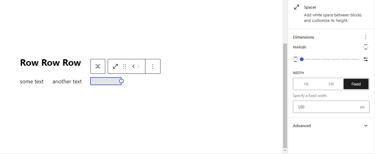
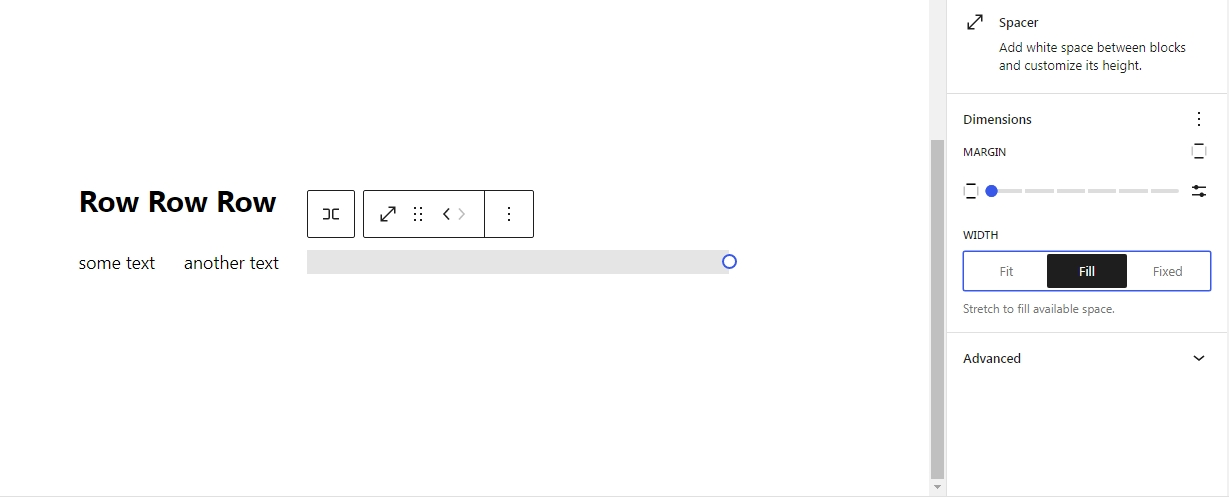
Dimensions
The paragraph provides dimension settings options to add padding and margin. For details refer to this support article:
Advanced
The “Advanced” tab lets you add HTML anchor and CSS class(es) to your block.
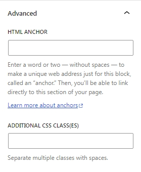
“HTML anchor” allows you to make a unique web address for a particular “Shortcode” block. Then, you’ll be able to link directly to a “Shortcode” block of your page.
The “Additional CSS class(es)” lets you add CSS class(es) to your block, allowing you to write custom CSS and style the block as you see fit.
Changelog
- Updated 2024-01-30
- Updated screenshots for 6.4
- Updated 2023-10-24
- Update screenshots for 6.3
- Add custom units for height and width
- The resizable box and controls
- Add dimnesions support for margin
- Add spacing presets
- Add flex child controls for Spacer
- Updated 2022-11-25
- Removed redundant content
- Added alt text
- Aligned images for mobile view
- Update 2022-03-21
- Updated all screenshots to WordPress 5.9
- Update 2021-06-22
- Updated more options block
- Updated 2020-09-28
- Updated 5.5 screenshots
- Updated the block toolbar
- Updated the block settings
- Created 2019-03-07