Use the Table block to easily create a table in any post or page.
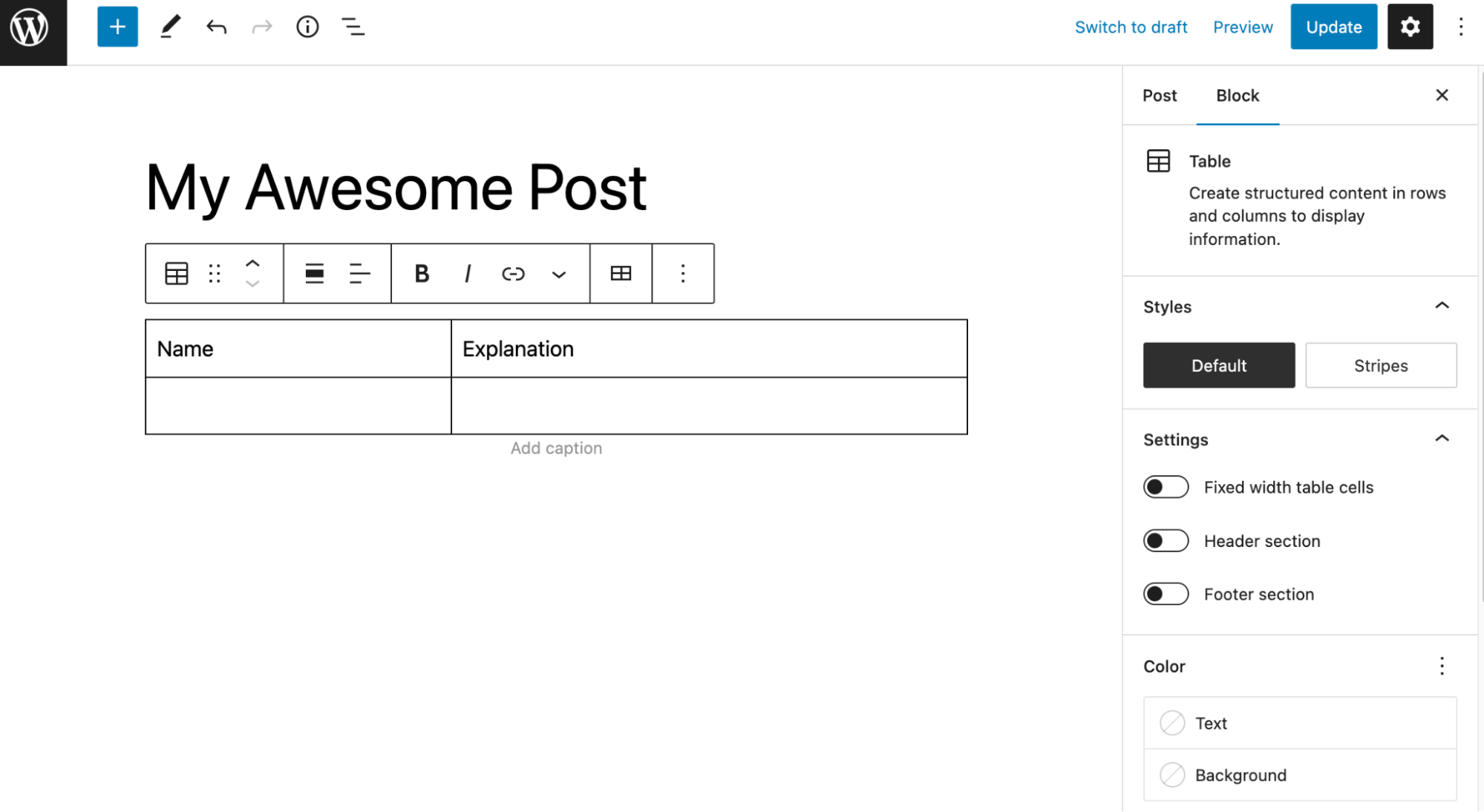
To add the Table block to a page, click the Add block button to open the block inserter pop-up window and choose the Table block.
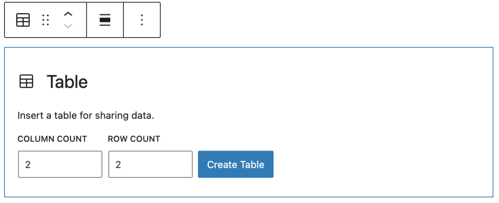
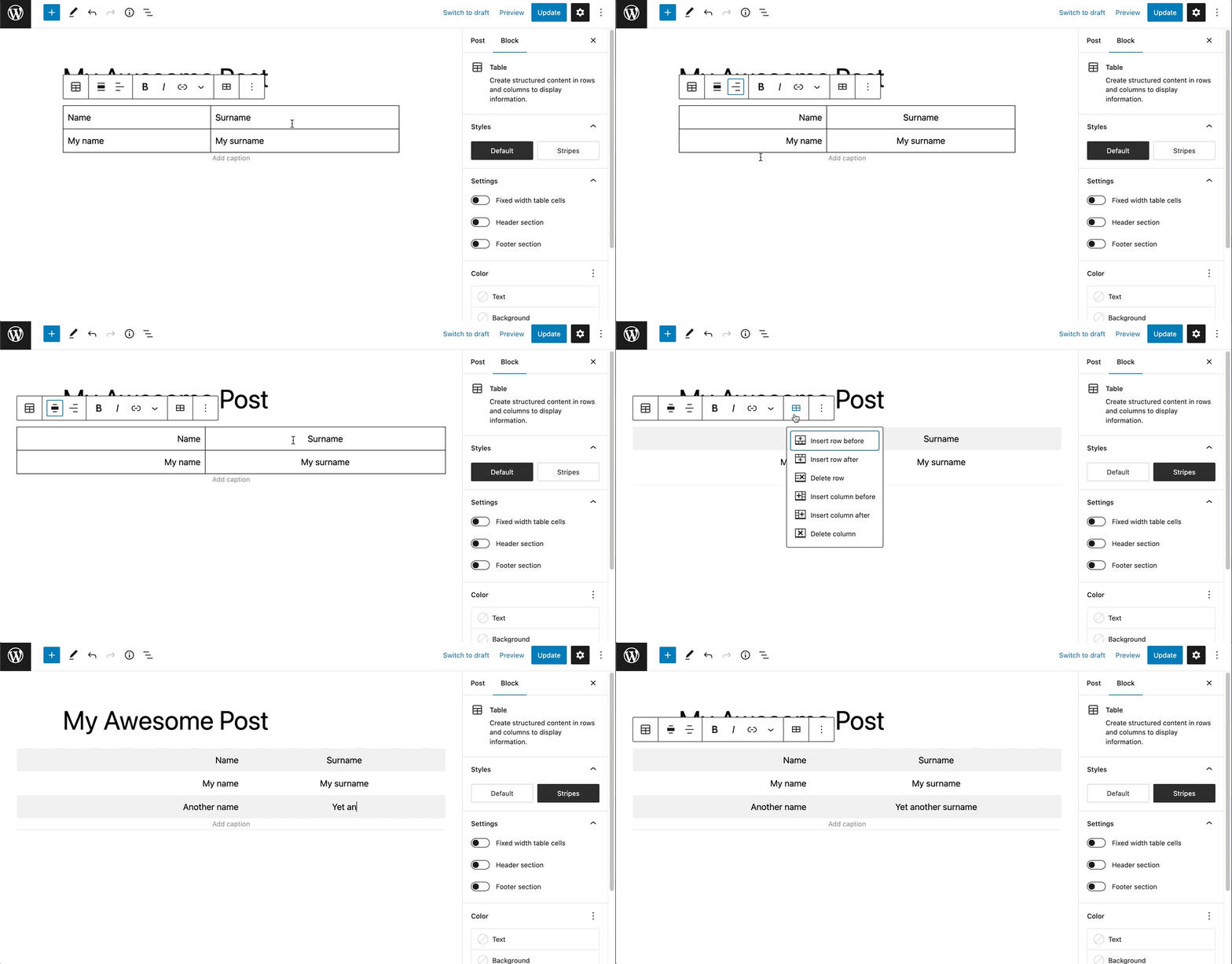
You can also use the keyboard shortcut /table to quickly insert a Table block. Remember that tables are best used for tabulated data rather than page design. For example, if you want columns, you can use the Columns Block.
Detailed instructions on adding blocks can be found here.
Block toolbar
To view the block toolbar, click on the block, and the toolbar will be displayed.
Every block comes with unique toolbar icons and blocks specific user controls that allow you to manipulate the block right in the editor.
The Table block shows 11 buttons in the block toolbar:

- Transform to
- Drag icon
- Move arrows
- Align
- Change column alignment
- Bold
- Italic
- Link
- More Rich Text controls
- Options
Transform to
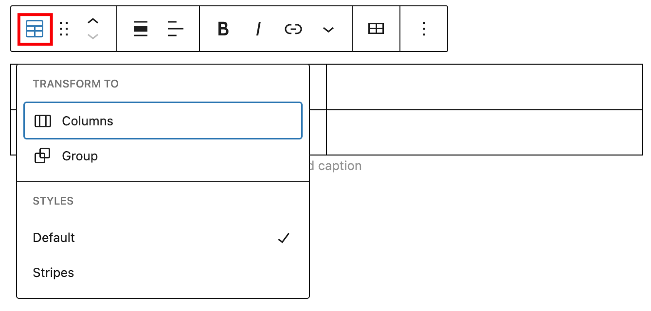
Click on the “Transform” button to convert the Table block into a “Group” or “Columns” block. It’s also possible to change the style of a table to “Default” or “Stripes”.
Drag icon

To drag and drop the block to a new location on the page template, click and hold the rectangle of dots, then drag it to the new location. The blue separator line indicates where the block will be placed. Release the left mouse button when you find the new location to place the block.
Move arrows

The up and down arrow icons can be used to move the block up and down on the page.
Detailed instructions on moving a block within the editor can be found here
Align
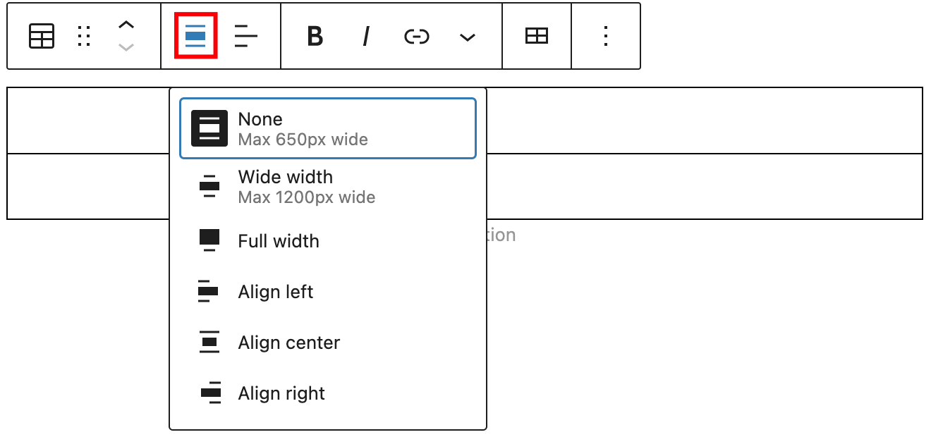
Use the change alignment tool to align the Table block. Choose one of the following options:
- None – leaves the block the current size.
- Wide width – increase the width of the block beyond the content size.
- Full width – extend the block to cover the full width of the screen.
- Align left – aligns the block left.
- Align center – aligns the block to the center.
- Align right – aligns the block right.
The “Wide width” and “Full width” alignment settings must be enabled by your WordPress theme.
Change column alignment

Use the change column alignment tool to align the columns of a Table block. Choose one of the following options:
- Align column left – aligns the column left.
- Align column center – aligns the column to the center.
- Align column right – aligns the column right.
Bold

You can select the text in the Table block and use the “Bold” option or “Ctrl+B” / “Cmd+B” on your keyboard to bold it, which is usually heavier than the surrounding text.
Italic

You can select the text in the Table block and use the “Italic” option or “Ctrl+I” / “Cmd+I” on your keyboard to italicize it, which usually appears slanted to the right.
Link
Use the link option to add a link to the table. It’s also possible to set it to open the link in a new tab.
Read about more link editing options.
More rich text options
The drop-down menu to the left of the More options menu contains a range of additional rich text editing options such as highlighting, inline code, strikethrough, and more.
Read about more rich text editing options.
Edit table
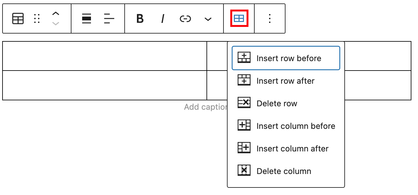
Use the edit table option to quickly manage rows and columns. It’s possible to insert a row or column before, insert a row or column after, and delete a row or a column.
More options
The Options menu represented by three vertical dots on the far right of the toolbar gives you more features such as the ability to duplicate or remove the block.
Read about these and other settings.
Block settings
The block settings panel contains customization options specific to the block. To open it, select the block and click the Settings button next to the Publish button.

Here are the options for the Table block:
Styles
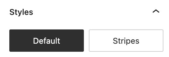
Choose between the “Default” and “Stripes” styles for your table. The “Default” style has a plain background and borders around the cells. The “Stripes” style has alternating row background colors.
The final appearance of the table may vary depending on your theme.
Settings
The settings section provides three possible options:
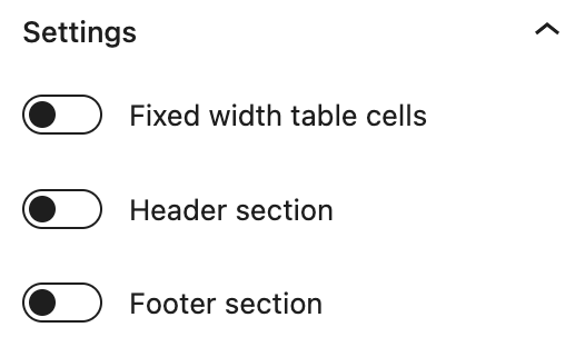
Fixed width table cells – means rather than adapting the column widths to the content of the table, all columns will be equal width. This option is also available when the Table block is still in the placeholder state.

Header section – adds a header section to the table.

Footer section – adds a footer section to the table.

Color
The Table block provides Color settings options to change the text and background colors.
For details, refer to this support article: Color Settings Overview
Typography
The Table block provides typography settings to change the font family, size, appearance, line height, letter case, letter spacing, and decoration.
For details, refer to this support article: Typography Settings Overview
Dimensions
The Table block provides dimension settings options to change padding and margin size.
For details, refer to this support article: Dimensions Settings Overview
Border
The Table block provides border settings options to add border color, width, and radius.
For details, refer to this support article: Border settings overview
Advanced
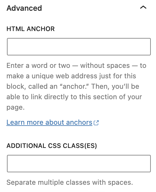
HTML anchor allows you to make a unique web address for a particular Table block. Then, you’ll be able to link directly to a Table block of your page.The Additional CSS class(es) lets you add CSS class(es) to your block, allowing you to write custom CSS and style the block as you see fit.
Changelog
- Updated 2023-08-09
- Replaced the link section with short summary linking to new dedicated page.
- Updated 2023-06-08
- Replaced “More rich text options” section with short summary linking to new dedicated page for rich text editing options.
- Updated 2023-03-07
- Revised formatting for the whole article
- Added detailed information about each block toolbar button
- Updated all the screenshots for 6.2
- Update 2022-04-20
- Update screenshots to 5.9