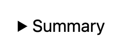
The Details block displays a text summary and an arrow button: When you click on the text or the button, the block opens and reveals additional content on the page.
This block provides a way to show or hide content on your site. This can be useful on faq pages, showing /hiding detailed event information etc.
The Summary is customizable by selecting the “Write summary…” placeholder text and adding your own text.
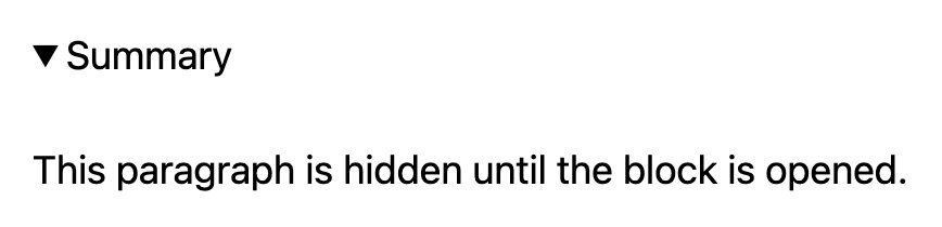
The additional content are blocks that you place inside the Details block that are hidden until you click on the summary text or the button. Because the content is hidden until you open the block, it is referred to as “hidden content”.
Closed state:
Open state:
To add a Details block, click on the Block Inserter (+) and select the Details block.
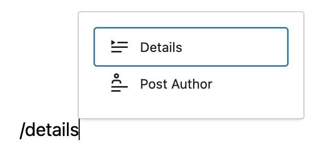
You can also type /details and hit enter in a new paragraph block to add one quickly.
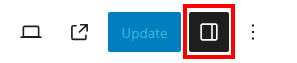
Block toolbar
Every block comes with unique toolbar icons and block-specific user controls that allow you to manipulate the block right in the editor.
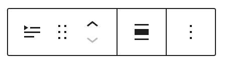
The Details block shows five buttons in the block toolbar:
- Transform to
- Drag icon
- Move arrows
- Change alignment
- Options
Transform to
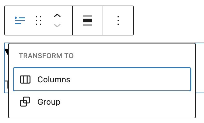
Click on the transform button to place the block inside a group or columns block.
Drag
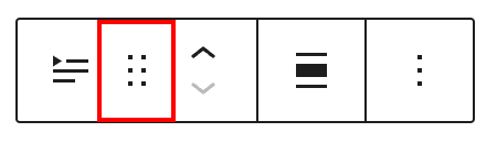
To drag and drop the block to a new location on the page template, click and hold the rectangle of dots, then drag to the new location. The blue separator line indicates where the block will be placed. Release the left mouse button when you find the new location to place the block.
Move
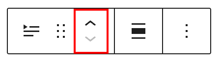
The up and down arrow icons can be used to move the block up and down on the page.
Detailed instructions on moving a block within the editor can be found here.
Change alignment
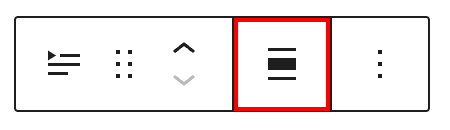
Change the alignment of the block to none, wide, or full width.
Options
The Options menu represented by three vertical dots on the far right of the toolbar gives you more features such as the ability to duplicate or remove the block.
Details about More options can be found in this support article.
Settings
The block settings panel contains customization options specific to the block. To open it, select the block and click the Settings button next to the Publish button.
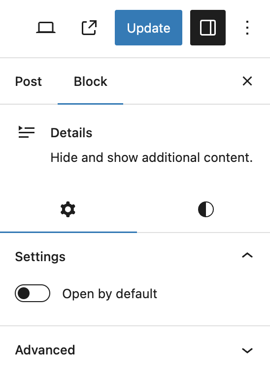
Open by default
Enabling this option keeps the block open and the hidden content will be disaplay until closed.
Advanced
The Advanced tab lets you add CSS class(es) to your block. This will allow you to write custom CSS and styles for the block.

Styles
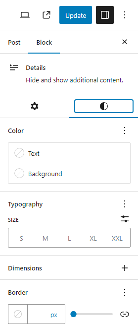
Color
The block provides dimension settings options to add text, background, and link color.
For details refer to this support article: Color settings overview
Typography
The block provides typography settings to change the font family, appearance, line height, letter spacing, decoration, letter case, and font size.
For details refer to this support article: Typography settings overview
Dimensions
The block provides dimension settings options to add padding and margin.
For details refer to this support article: Dimension settings overview
Border
The block provides border settings options to add border color, style, width, and radius.
For details refer to this support article: Border settings overview
Changelog
- 2024-06-13 Updated video to 6.5 version
- 2023-12-05 Headings case resolved
- Created 2023-08-08